Ebook Design: Layout and Cover Tips
Strong ebook design is what separates a download people actually finish from a PDF that gets a glance and a close. Whether you’re shipping a paid title or a free lead magnet, the same fundamentals apply: a cover that earns the click, a layout that’s easy to read on any screen, and the right format for how it’ll be consumed. This guide walks through trim sizes, EPUB versus PDF, layout and type rules, cover design, and the tools to build it all.
If your ebook is a free download offered for an email, also read our companion guide on lead magnet design, and see the broader complete guide to blog graphics for where the cover fits in your content system.
EPUB vs PDF: Choose the Format First
Format dictates almost every design decision, so settle it before you lay out a single page. The core difference is reflowable versus fixed.
| Format | Layout type | Best for | Trade-off |
|---|---|---|---|
| EPUB | Reflowable | E-readers, phones, long text-heavy reading | Less control over exact layout; text adapts to the device |
| Fixed | Lead magnets, design-rich guides, print | Doesn’t reflow; can be awkward on small screens |
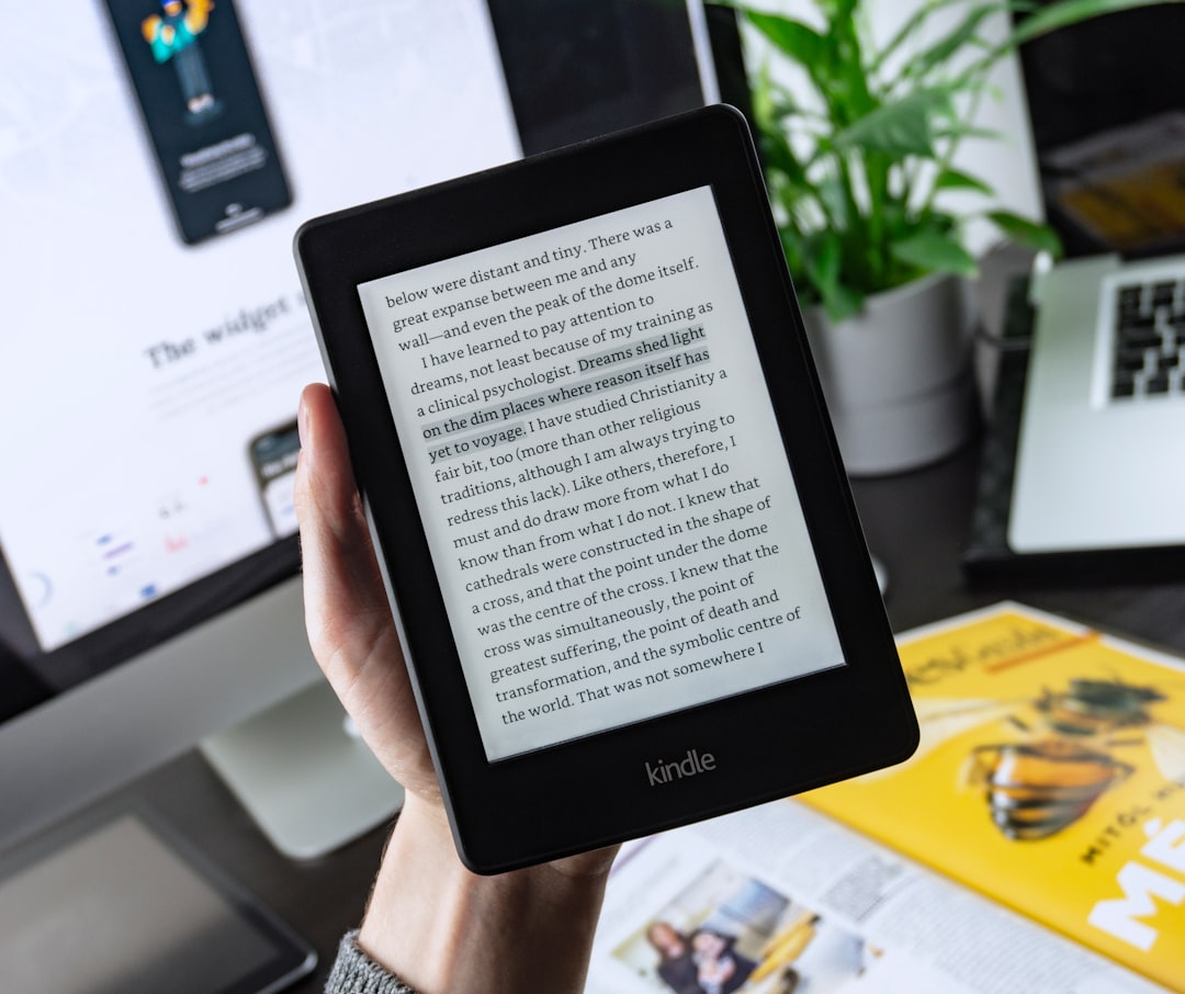
EPUB is reflowable — text resizes and rewraps to fit the reader’s screen and font preferences, which makes it ideal for novels and long-form reading on e-readers. PDF is fixed-layout — every page looks identical everywhere, which is perfect for design-heavy lead magnets, workbooks, and anything meant to be printed, but clumsy on a phone. Most marketing ebooks and lead magnets ship as PDF; most retail books ship as EPUB.
Ebook Trim and Page Sizes
For fixed PDFs you pick a page size up front. Two defaults cover almost everything in 2026 — note specs and reader expectations shift over time.
- US Letter (8.5 × 11 in / 2550 × 3300px at 300dpi) — the standard for North American lead magnets, workbooks, and printable PDFs.
- A4 (210 × 297mm) — the international equivalent; use it for audiences outside North America.
- 6 × 9 in — a common trim for book-style PDFs and print-on-demand titles.
EPUB has no fixed page size — it reflows — so you focus on clean semantic structure (headings, lists, paragraphs) rather than fixed dimensions.
Layout Rules for Readable Ebooks
Readability is the whole point. A few layout principles carry most of the weight.
- Set comfortable margins. Generous white space around the text block makes long reading far easier; cramped margins feel suffocating.
- Control line length. Aim for roughly 50–75 characters per line. Full-width text on a wide PDF page is tiring to read.
- Use a clear hierarchy. Distinct chapter titles, section headings, and body text so readers can scan and orient.
- Add breathing room between sections rather than running everything together.
- Include a table of contents for anything longer than a few pages, ideally with clickable links in PDFs.
- Use callout boxes, pull quotes, and visuals to break up dense text and emphasize key points.
Typography for Ebooks
Type choices shape both readability and perceived quality. Keep them disciplined.
- Pick a highly readable body face. A clean serif or humanist sans at a comfortable size with generous line height. Body text that’s too small or too tight kills completion rates.
- Limit to two typefaces — one for headings, one for body. Our font pairing guide covers combinations that work for long-form reading.
- Be consistent. Define styles for each text level and reuse them so the whole document feels coherent.
- Embed fonts in PDFs so the design looks identical on every device, regardless of what’s installed locally.
Designing the Cover
The cover is the single most important page because it’s what convinces someone to download or buy. It’s often viewed as a small thumbnail, so it has to work tiny.
- Make the title huge and legible at thumbnail size. If you can’t read it small, redesign it.
- Communicate the benefit in the title or subtitle — what the reader gets.
- Keep it visually simple. One strong focal element, high contrast, and your two brand fonts.
- Match your brand so the cover reinforces recognition with everything else you publish.
- Render a 3D mockup for landing pages — a tilted “book” mockup makes a digital download feel tangible and lifts conversions.
Tools for Designing Ebooks
Match the tool to the format and your design comfort.
| Tool | Best for | Output |
|---|---|---|
| Canva | Fast, template-driven PDF lead magnets | |
| Adobe Express | Quick branded covers and short guides | |
| Adobe InDesign | Professional layout, long books, precise typography | PDF, EPUB |
| Figma | Designing pages and covers, then exporting |
For a quick PDF lead magnet, Canva is the fastest path. For a polished long-form book or retail EPUB, Adobe InDesign gives you the typographic control and export options you’ll want.
Export and Optimization
Once the design is done, export thoughtfully. For PDFs, embed fonts, compress images so the file isn’t enormous to download, and keep clickable links in the table of contents and any URLs. For EPUBs, validate the file so it renders correctly across e-readers. Always export a separate flat cover image (commonly 1600px tall) for your landing page and store listings, optimized as WebP or JPEG for fast loading.
Designing the cover and promo graphics for an ebook overlaps directly with featured image design — the same legibility and brand rules apply.
Using Images and Visuals Inside an Ebook
Visuals do more than decorate an ebook — they break up dense text, explain ideas faster than prose, and signal production quality. But they also have to be handled carefully, especially in fixed-layout PDFs where a heavy image library can balloon the file.
- Use visuals to teach, not just fill space. Diagrams, screenshots, and charts earn their place when they make a concept clearer; purely decorative stock photos rarely do.
- Keep a consistent visual style. Matching icon and illustration styles across the book look intentional; a mix of clashing stock assets looks thrown together.
- Compress images before placing them. Export at a resolution appropriate to the output — screen PDFs don’t need 300dpi print-quality images, which bloat downloads.
- Caption and label clearly so visuals stand on their own and remain meaningful to readers who skim.
Accessibility in Ebook Design
Accessibility is easy to overlook in a downloadable file, but it widens your audience and is increasingly expected. The principles mirror good web practice. Use a logical heading structure so assistive technology can navigate the document, maintain strong contrast between text and background, and avoid setting body text too small. In tagged PDFs and EPUBs, add alternative text to meaningful images so screen readers can describe them, and ensure the reading order follows the visual order. A clickable, well-structured table of contents helps everyone, not only readers using assistive tech.
Common Ebook Design Mistakes
A few recurring errors are responsible for most amateur-looking ebooks. Avoiding them puts you ahead of the majority of free downloads.
- Cramped margins and full-width lines. Text that runs edge to edge is exhausting to read; give it room and cap line length.
- Too many fonts. More than two typefaces makes a document feel chaotic.
- An afterthought cover. The cover sells the download, so it deserves the most design attention, not the least.
- Not embedding fonts in PDFs, which causes the layout to break on devices that lack them.
- Ignoring file size, leaving a sluggish multi-megabyte download nobody wants to wait for.
- Picking the wrong format — shipping a design-heavy guide as a reflowable EPUB, or a long novel as an awkward fixed PDF.
Frequently Asked Questions
Should I use EPUB or PDF for my ebook?
Use EPUB for text-heavy reading on e-readers and phones — it reflows to fit any screen. Use PDF for design-rich guides, workbooks, lead magnets, and anything meant to be printed, since it preserves a fixed layout. Most marketing ebooks ship as PDF; most retail books ship as EPUB.
What page size should a PDF ebook be?
Use US Letter (8.5×11 in) for North American lead magnets and printable PDFs, or A4 (210×297mm) for international audiences. For book-style or print-on-demand titles, 6×9 in is common. EPUB has no fixed page size because it reflows to the reader’s device.
How do I design an ebook cover?
Make the title huge and legible at thumbnail size, communicate the reader’s benefit, keep the design visually simple with one focal element and high contrast, and match your brand fonts and colors. For landing pages, render a 3D book mockup so the digital download feels tangible and converts better.
What tools are best for ebook design?
Canva and Adobe Express are fastest for PDF lead magnets and short guides. Adobe InDesign is the professional choice for long books and precise typography, and it exports both PDF and EPUB. Figma works well for designing pages and covers before exporting to PDF.
How do I keep my ebook file size reasonable?
For PDFs, compress embedded images, embed only the fonts you use, and export at a screen-appropriate resolution rather than full print quality if it’s digital-only. Provide a separate optimized cover image (WebP or JPEG) for landing pages so visitors don’t download the full file just to see the cover.


