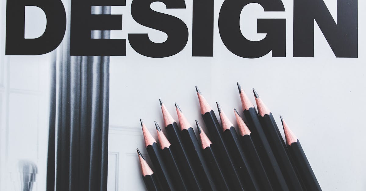
Gill Sans Font Pairing: 12 Best Combinations for British Elegance
Gill Sans is one of the defining typefaces of the twentieth century. Designed by Eric Gill in 1926 for the Monotype Corporation, it was conceived as a British answer to the geometric sans-serifs emerging from mainland Europe — a typeface with the clean modernity of Futura but warmer, more humanist, and grounded in the calligraphic tradition of the Roman alphabet. Its letterforms carry the influence of Edward Johnston’s typeface for the London Underground, which Gill studied closely, but where Johnston’s design was engineered for signage, Gill Sans was built for the printed page.
The typeface’s cultural footprint is extraordinary. The BBC adopted it as its corporate typeface. Penguin Books made it the standard for its iconic paperback covers. The Church of England, the British Railways system, and Tommy Hilfiger have all relied on it. That heritage gives Gill Sans a dual personality: it reads as both distinctly British and quietly universal, authoritative yet approachable. Its humanist construction — slightly calligraphic curves, an angled terminal on the lowercase ‘a’, and a distinctive flared uppercase ‘M’ — sets it apart from the mechanical rigidity of geometric sans-serifs like Futura and the neutral anonymity of neo-grotesques like Helvetica.
This dual personality is precisely what makes Gill Sans font pairing both rewarding and nuanced. Its warmth pairs naturally with traditional serifs, its modernism holds its own beside contemporary designs, and its distinctive British character adds personality without overwhelming a layout. The 12 combinations below cover serif body text, contemporary serifs, display pairings, complementary sans-serifs, and monospace options — with specific weight recommendations and CSS for the first three.
Key Principles for Pairing with Gill Sans
Before exploring specific combinations, understanding the structural traits that define Gill Sans will sharpen every pairing decision you make.
Lean Into the Humanist Warmth
Gill Sans is classified as a humanist sans-serif, meaning its stroke weights and letterforms carry traces of handwritten construction. The lowercase letters have subtle calligraphic details — the tail of the ‘a’, the ear of the ‘g’, the gentle flare of terminal strokes — that give the typeface warmth and personality. This humanist quality means Gill Sans pairs exceptionally well with traditional serifs that share the same calligraphic DNA. Old-style and transitional serifs feel like natural companions rather than forced contrasts. Understanding this principle is central to effective font pairing with humanist typefaces.
Avoid Other Humanist Sans-Serifs
Pairing Gill Sans with another humanist sans-serif — Frutiger, Myriad, Optima — creates the same problem as pairing two geometric sans-serifs together: the fonts are different enough to notice but too similar to justify. The reader perceives a mismatch rather than a contrast. If you need a second sans-serif in your system, choose one from a different classification: geometric for structural contrast, or neo-grotesque for tonal contrast.
Respect the Moderate X-Height
Gill Sans has a moderate x-height — neither as generous as Inter or Poppins nor as small as some classical serifs. This means companion fonts need proportions that sit comfortably beside it at the same point size. Fonts with very tall x-heights (like Verdana or Merriweather) may look oversized next to Gill Sans, while fonts with very small x-heights will appear diminished. The best fonts that go with Gill Sans tend to have similarly moderate proportions rooted in traditional type design.
Serif Body Companions
Serif typefaces are the most natural partners for Gill Sans. The British typographic tradition has always favoured the pairing of a clean sans-serif heading with a rich serif body, and Gill Sans was designed within that tradition. These five serifs cover the range from same-designer harmony to reliable editorial workhorses.
1. Gill Sans + Perpetua
Why it works: Perpetua was designed by the same hand — Eric Gill created both typefaces for Monotype in the late 1920s. This shared authorship produces a pairing with deep structural harmony. Both fonts carry the same calligraphic sensibility, the same sense of proportion, and the same quiet British elegance. Perpetua’s fine serifs and moderate stroke contrast complement Gill Sans’s clean lines without competing for attention. This is the quintessential Gill Sans combination — the pairing that feels most inevitable and least forced.
Best for: Book design, literary journals, museum catalogues, academic publishing, heritage branding, cultural institutions.
Recommended weights: Gill Sans Bold (700) for headings, Gill Sans Regular (400) for navigation and captions. Perpetua Regular (400) for body text, Perpetua Bold (700) for inline emphasis.
/* Gill Sans + Perpetua */
h1, h2, h3 {
  font-family: 'Gill Sans', 'Gill Sans MT', Calibri, sans-serif;
  font-weight: 700;
  letter-spacing: 0.01em;
}

body, p {
  font-family: Perpetua, 'Palatino Linotype', 'Book Antiqua', serif;
  font-weight: 400;
  line-height: 1.7;
  font-size: 1.0625rem;
}
2. Gill Sans + Baskerville
Why it works: Baskerville is the definitive English transitional serif — designed by John Baskerville in Birmingham in the 1750s, it represents the peak of British type design before the modern era. Paired with Gill Sans, you get two pillars of British typography working in concert. Baskerville’s higher stroke contrast and sharper serifs create clear visual separation from Gill Sans’s uniform strokes, while both typefaces share a common sense of classical proportion and understated refinement. The pairing reads as cultivated and authoritative without a hint of pretension.
Best for: Corporate communications, annual reports, law firms, university websites, premium publishing, British heritage brands.
Recommended weights: Gill Sans Bold (700) for primary headings, Gill Sans Regular (400) for subheadings and UI elements. Baskerville Regular (400) for body text, Baskerville Italic (400i) for pull quotes and emphasis.
/* Gill Sans + Baskerville */
h1, h2, h3, nav {
  font-family: 'Gill Sans', 'Gill Sans MT', Calibri, sans-serif;
  font-weight: 700;
}

body, p, blockquote {
  font-family: Baskerville, 'Baskerville Old Face', 'Libre Baskerville', serif;
  font-weight: 400;
  line-height: 1.75;
  font-size: 1.0625rem;
}
3. Gill Sans + Caslon
Why it works: Caslon is the oldest typeface in this guide, designed by William Caslon in the 1720s, and carries the old adage: “When in doubt, use Caslon.” Its warm, slightly irregular letterforms have a hand-cut quality that pairs beautifully with Gill Sans’s own calligraphic traces. Where Baskerville is crisp and precise, Caslon is textured and organic — giving this pairing a softer, more approachable feel. The combination of two fundamentally British typefaces from different centuries creates a sense of continuity and depth.
Best for: Trade publishing, independent bookshops, artisan brands, historical institutions, letterpress-inspired design, editorial longform.
Recommended weights: Gill Sans Bold (700) or SemiBold (600) for headings. Adobe Caslon Pro Regular (400) for body text, Adobe Caslon Pro Italic (400i) for emphasis and captions.
/* Gill Sans + Caslon */
h1, h2, h3 {
  font-family: 'Gill Sans', 'Gill Sans MT', Calibri, sans-serif;
  font-weight: 700;
  letter-spacing: 0.02em;
}

body, p {
  font-family: 'Adobe Caslon Pro', 'Big Caslon', 'Libre Caslon Text', Georgia, serif;
  font-weight: 400;
  line-height: 1.75;
}
4. Gill Sans + Garamond
Why it works: Garamond is a French old-style serif with a smaller x-height and more pronounced calligraphic influence than its English counterparts. Paired with Gill Sans, the combination crosses the Channel — British modernism meets Continental elegance. Garamond’s delicate hairlines and gentle curves soften Gill Sans’s directness, creating a pairing that feels literary and refined. The size difference between the two fonts’ x-heights requires a slight adjustment (Garamond set one or two points larger than Gill Sans), but the result is worth the calibration.
Best for: Luxury print, wine labels, fine dining, fashion lookbooks, art publications, poetry collections.
Recommended weights: Gill Sans Bold (700) for headings. Garamond Premier Pro Regular (400) for body text at 17-18px, Garamond Premier Pro Italic (400i) for emphasis. Consider EB Garamond as a free alternative.
5. Gill Sans + Plantin
Why it works: Plantin is a sturdy old-style serif with a robust colour on the page — thicker strokes and heavier serifs than Garamond or Caslon, designed to perform well on rougher paper stocks. This sturdiness makes it an excellent body companion for Gill Sans in print contexts where delicate serifs might break down. Plantin has a workmanlike reliability that complements Gill Sans’s own pragmatic elegance. The pairing has a mid-century British editorial quality — think broadsheet newspapers and Penguin Classics.
Best for: Newspaper design, print editorials, textbooks, catalogues, exhibition programmes, printed brochures.
Recommended weights: Gill Sans Bold (700) for headlines, Gill Sans Light (300) for standfirsts and deck heads. Plantin Regular (400) for body text, Plantin Bold (700) for subheadings within articles.
Contemporary Serif Companions
While Gill Sans has deep roots in tradition, it is versatile enough to work alongside contemporary serifs that bring a more modern sensibility to the page. These pairings bridge the gap between heritage and current design practice.
6. Gill Sans + Freight Text
Why it works: Freight Text, designed by Joshua Darden, is a contemporary serif with old-style proportions and a warm, slightly condensed character. Its moderate stroke contrast and generous x-height make it one of the most readable text serifs designed in the past two decades. Paired with Gill Sans, it creates a combination that honours typographic tradition while feeling thoroughly contemporary. Freight Text’s slightly compressed width also pairs well with Gill Sans’s own efficient proportions, making this combination space-effective in multi-column layouts.
Best for: Contemporary editorial, digital magazines, brand guidelines, design agency websites, cultural criticism, longform journalism.
Recommended weights: Gill Sans Bold (700) for headings, Gill Sans Regular (400) for captions and metadata. Freight Text Pro Book (400) for body text, Freight Text Pro Bold (700) for inline emphasis.
7. Gill Sans + Sabon
Why it works: Sabon, designed by Jan Tschichold in the 1960s, is a Garamond revival with a crucial difference: it was engineered for mechanical consistency across Monotype, Linotype, and hand-composition systems. This engineering gives Sabon an evenness and regularity that pure Garamond revivals lack, making it an outstanding body text face. Paired with Gill Sans, the combination reflects the mid-century modernist tradition — clean sans-serif headings over elegant serif body text — executed with impeccable craft. Both typefaces were released by Monotype, adding a shared institutional lineage.
Best for: Book interiors, scholarly journals, institutional reports, foundation communications, architectural monographs, museum publications.
Recommended weights: Gill Sans Bold (700) for chapter titles and section headings. Sabon Roman (400) for body text, Sabon Italic (400i) for titles of works and emphasis, Sabon Bold (700) for subheadings.
Display Pairings
Display typefaces bring visual drama to layouts where Gill Sans serves as the supporting workhorse. These combinations invert the typical role assignment: the serif commands attention at large sizes while Gill Sans handles body text, navigation, and interface elements with quiet competence.
8. Gill Sans + Bodoni
Why it works: Bodoni is a high-contrast modern serif with extreme thick-thin stroke variation, hairline serifs, and a vertical stress axis. Paired with Gill Sans, the contrast is dramatic: Bodoni’s mechanical elegance against Gill Sans’s humanist warmth. This pairing works because the two typefaces represent opposite ends of the serif and sans-serif spectrum while sharing a common commitment to refined proportion. Bodoni provides the visual impact for hero sections and display headings, while Gill Sans anchors everything else with understated clarity.
Best for: Fashion branding, luxury product pages, event invitations, gallery openings, cosmetics packaging, editorial covers.
Recommended weights: Bodoni Bold (700) or Poster for display headings at 48px and above. Gill Sans Regular (400) for body text, Gill Sans Light (300) for large supporting text, Gill Sans SemiBold (600) for navigation.
9. Gill Sans + Playfair Display
Why it works: Playfair Display is a freely available high-contrast transitional serif inspired by the European Enlightenment, with sharp, unbracketed serifs and pronounced stroke variation. Where Bodoni is cool and mechanical, Playfair is warmer and more characterful — making it a better match for Gill Sans’s own humanist personality. The pairing creates a rich visual hierarchy: Playfair Display’s ornate details dominate at headline sizes, while Gill Sans provides clean, modern body text. This is one of the most accessible Gill Sans pairings because Playfair Display is available free through Google Fonts.
Best for: Wedding stationery, boutique hotel websites, food and drink brands, lifestyle blogs, premium landing pages, invitation suites.
Recommended weights: Playfair Display Bold (700) or Black (900) for hero headings. Gill Sans Regular (400) for body text, Gill Sans Medium (500) for subheadings and navigation elements.
Complementary Sans-Serif
10. Gill Sans + Futura
Why it works: Futura is the geometric sans-serif that Gill Sans was partly designed in response to — Paul Renner’s 1927 Futura embodied the Bauhaus ideal of geometric purity, while Gill Sans offered a more humanist alternative rooted in British calligraphic tradition. Pairing the two together creates a dialogue between these two philosophies. Futura’s perfect circles and uniform strokes contrast visibly with Gill Sans’s organic curves and calligraphic details. The key to making this work is clear role separation: use one for headings and the other for body text, never interchanging them within the same hierarchy level.
Best for: Architecture studios, modernist branding, design retrospectives, exhibition graphics, poster design, gallery identity systems.
Recommended weights: Futura Bold (700) or Heavy for display headings. Gill Sans Regular (400) for body text and secondary elements. Alternatively, reverse the roles: Gill Sans Bold (700) for headings with Futura Book (400) for body text, though this works better in print than on screen.
Monospace Companions
Monospace typefaces create unmistakable contrast against proportional fonts like Gill Sans. The fixed-width characters, uniform spacing, and mechanical rhythm of a monospace face introduce a technical or literary dimension that expands what a Gill Sans-based design system can communicate.
11. Gill Sans + Courier
Why it works: Courier is the typewriter standard — a slab-serif monospace designed by Howard Kettler for IBM in 1955. Its association with typed manuscripts, official documents, and screenplays gives it a directness and authenticity that digital typefaces cannot replicate. Paired with Gill Sans, the combination evokes a mid-century institutional aesthetic: the clean modernism of Gill Sans headings over the honest, mechanical rhythm of Courier body text. The contrast is both structural (proportional vs. fixed-width) and cultural (designed refinement vs. mechanical utility).
Best for: Screenwriting and film production, literary websites, governmental or archival design, investigative journalism layouts, retro-inspired branding.
Recommended weights: Gill Sans Bold (700) for headings, Gill Sans Regular (400) for navigation. Courier New Regular (400) for body text and extended passages, though be aware that Courier’s low resolution rendering requires generous line-height (1.8 or above) and comfortable sizing (16px minimum).
12. Gill Sans + IBM Plex Mono
Why it works: IBM Plex Mono is a contemporary monospace typeface designed by Mike Abbink for IBM’s corporate identity — which means it shares institutional DNA with Gill Sans’s own history as a corporate workhorse. IBM Plex Mono has a warmer, more humanist character than most monospace faces, with subtle curves and open counters that improve readability at text sizes. Paired with Gill Sans, the combination feels simultaneously technical and refined — two typefaces with corporate heritage that transcend their institutional origins.
Best for: Developer portfolios, technical documentation, data journalism, API reference sites, fintech interfaces, code-heavy editorial content.
Recommended weights: Gill Sans Bold (700) for headings, Gill Sans Regular (400) for interface elements. IBM Plex Mono Regular (400) for code blocks, IBM Plex Mono Light (300) for large code displays, IBM Plex Mono SemiBold (600) for inline code emphasis.
Licensing and Availability
Gill Sans is a commercial typeface owned by Monotype. It is not available on Google Fonts and requires a licence for use in print and digital projects. However, it ships as a system font on macOS and is bundled with many Adobe and Microsoft products, which means it is available at no additional cost for projects targeting those platforms. For web use, you will need a Monotype licence or a web font subscription through services like Fonts.com or MyFonts.
If licensing is a constraint, consider Humanist 521 (Bitstream’s version of Gill Sans) or the open-source alternative Lato, which shares some of Gill Sans’s humanist warmth though with a more contemporary sensibility. For projects where budget is a concern but the Gill Sans aesthetic is essential, self-hosting from a macOS system font is viable for personal projects but not legally sound for commercial distribution. Always verify your licence terms before deploying. For a broader view of where Gill Sans sits within the sans-serif landscape, see our guide to the best sans-serif fonts.
Practical Tips for Working with Gill Sans Pairings
Mind the weight distribution. Gill Sans has a wide weight range, from Ultra Light to Ultra Bold, but the Regular and Bold weights are by far the most reliable. The lighter weights (Light, Thin) can feel spindly at small sizes, and the heaviest weights (Extra Bold, Ultra Bold) lose the typeface’s characteristic elegance. For most pairings, stick to Regular (400), Medium (500), and Bold (700) as your working range.
Use generous tracking in uppercase. Gill Sans’s uppercase letters — particularly the wide M, the distinctive R, and the classical Q with its sweeping tail — benefit from slightly increased letter-spacing when set in all caps. Add 0.05-0.1em of tracking for headers and navigation set in uppercase Gill Sans to let each letterform breathe.
Set body text at comfortable sizes. Gill Sans reads well at display sizes but can feel cramped in extended body text below 15px. If you are using Gill Sans for body text rather than headings, set it at 16-18px with a line-height of 1.6-1.7. For extended reading, however, the serif companions listed above will almost always outperform Gill Sans in body text roles. For more on how serif and sans-serif typefaces perform differently in body text, see our analysis of typography fundamentals.
Test fallback stacks carefully. Because Gill Sans is a system font on macOS but not on Windows or Linux, your CSS fallback stack matters. A robust stack might read: font-family: 'Gill Sans', 'Gill Sans MT', Calibri, 'Trebuchet MS', sans-serif;. Gill Sans MT is the Windows version (included with some Microsoft products), Calibri shares a similar humanist warmth, and Trebuchet MS is a reasonable last resort. Test your fallbacks on both platforms to ensure the design holds.
Frequently Asked Questions
What is the best font to pair with Gill Sans?
Perpetua is the most natural pairing for Gill Sans. Both typefaces were designed by Eric Gill for Monotype in the late 1920s, so they share the same calligraphic sensibility, sense of proportion, and quiet British elegance. Perpetua’s fine serifs and moderate contrast complement Gill Sans’s clean humanist lines without competing for attention. The combination works across book design, editorial layouts, branding, and institutional communications. For a more widely available alternative, Baskerville offers a similarly authoritative British pairing with broader system font availability.
Is Gill Sans a good font for body text?
Gill Sans can work as body text at sizes of 16px and above with generous line-height (1.6-1.7), but it performs best in headings, navigation, and short-form text. Its humanist construction gives it better readability than geometric sans-serifs at text sizes, but for extended reading — articles, books, documentation — a serif companion like Perpetua, Baskerville, or Caslon will provide a more comfortable reading experience. Gill Sans’s true strength is in display and heading roles, where its distinctive personality and clean letterforms have maximum impact.
What is the difference between Gill Sans and Futura?
Gill Sans is a humanist sans-serif with calligraphic influences and organic curves; Futura is a geometric sans-serif built on strict circles, triangles, and uniform strokes. Gill Sans was designed by Eric Gill in England in 1926 as a warmer, more characterful alternative to the geometric sans-serifs emerging from the Bauhaus movement in Germany. Futura, designed by Paul Renner in 1927, embodies that geometric ideal. The practical difference is visible in letters like the lowercase ‘a’ (single-story in Futura, double-story in Gill Sans), the ‘o’ (a perfect circle in Futura, a subtly squared oval in Gill Sans), and the overall rhythm of text (mechanical in Futura, organic in Gill Sans). For a broader comparison of sans-serif classifications, see our guide to the best sans-serif fonts.
Can I use Gill Sans for free on my website?
Gill Sans is a commercial typeface, so web use requires a licence from Monotype (available through Fonts.com or MyFonts). However, Gill Sans ships as a system font on macOS, meaning it will render without a web font file for Mac users. For cross-platform web projects, you need either a web font licence or a fallback strategy using system fonts like Gill Sans MT (available on some Windows installations) and Calibri. If licensing cost is a concern, consider the open-source humanist sans-serif Lato as an alternative that captures some of Gill Sans’s warmth and proportional elegance at no cost.


