Grid Principles: Structure for Layouts
Good layout rarely looks like an accident, and that is the point of grid principles. A grid is the invisible framework that controls where columns sit, how wide the gutters are, and where the margins fall — so that text blocks, images, and headlines all snap to the same underlying logic. Master the grid and you stop guessing where things go; the structure tells you. These ideas sit at the heart of our wider guide to design principles, and they pair closely with composition and layout principles.
What are the building blocks of a grid?
Every grid is assembled from a small set of parts. Learn these four and you can read or build almost any layout system.
- Columns — the vertical divisions that content sits within. Web layouts commonly use a 12-column grid because 12 divides cleanly into halves, thirds, quarters, and sixths.
- Gutters — the consistent space between columns. Gutters keep adjacent blocks from touching and give the eye breathing room.
- Margins — the outer space framing the whole layout, separating content from the edge of the page or viewport.
- Baseline grid — a horizontal rhythm of evenly spaced lines that text sits on, so type lines up across columns regardless of size.
The relationship between these parts is what creates order. When columns, gutters, and margins stay consistent from page to page, a multi-page document or a multi-screen product feels like one coherent system rather than a set of unrelated layouts.
What are the main types of grids?
There are four classic grid types, and most real-world layouts are one of them or a hybrid. Choosing the right type is the single most important grid decision you make.
| Grid type | Structure | Best used for |
|---|---|---|
| Manuscript grid | A single large text block with margins | Books, essays, long-form documents |
| Column grid | Multiple vertical columns | Magazines, newsletters, editorial web |
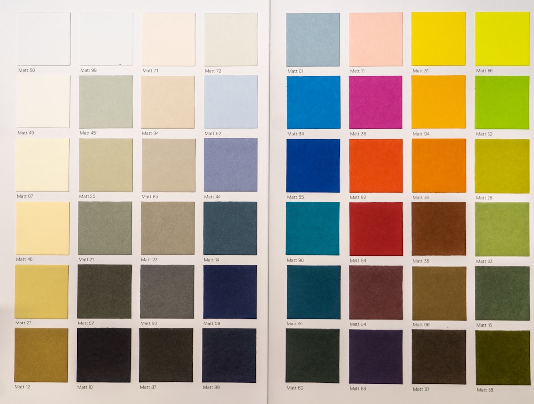
| Modular grid | Columns plus rows, forming modules | Catalogues, dashboards, image-heavy galleries |
| Hierarchical grid | Irregular zones sized to content | Posters, landing pages, complex one-offs |
The manuscript grid is the simplest: one block of running text inside generous margins, as in a novel. The column grid splits the page into vertical tracks, ideal when you mix text and images at editorial scale. The modular grid adds horizontal rows so you get a matrix of cells — perfect for product grids and data-dense interfaces. The hierarchical grid abandons strict regularity, fitting custom zones around content that demands a bespoke arrangement.
Why is the baseline grid worth the effort?
A baseline grid is a set of evenly spaced horizontal lines — usually tied to your body text’s line height — that all text aligns to. Its payoff is vertical rhythm: headlines, captions, and body copy across separate columns share the same horizontal beat, so the page feels tuned rather than loose.
To set one up, pick a baseline unit (often the body leading, say 24px) and make every vertical measurement a multiple of it. Margins, spacing between paragraphs, and image heights all snap to the same increment. The discipline takes practice, but it is what separates merely “aligned” work from layouts that feel genuinely composed. If you are tuning type sizes to fit that rhythm, our type scale calculator helps you generate a harmonious set of sizes.
How does the 12-column web grid work?
On the web, the 12-column grid has become the default for good reason: 12 is highly divisible. A full-width hero spans all 12 columns; a two-up layout uses 6 and 6; a three-card row uses 4, 4, and 4; a sidebar-plus-content split might run 3 and 9. Because the same grid yields halves, thirds, and quarters, you can build endlessly varied layouts that still align to one structure.
Most modern CSS frameworks and design tools ship with a 12-column grid baked in, with adjustable gutters and responsive breakpoints. The principle scales down too — on narrow screens columns collapse and stack, but the gutter and margin logic carries over, which is why grid thinking is inseparable from responsive design. For the technical depth on this, see our overview of grid systems in graphic design.
Where did modern grid theory come from?
The systematic grid we use today was codified by the Swiss Style designers of the mid-twentieth century. Josef Müller-Brockmann’s book Grid Systems in Graphic Design (1981) remains the canonical reference, laying out how columns, modules, and margins create objective, repeatable order. The Swiss approach treated the grid not as a constraint but as a tool for clarity and neutrality — letting content, not decoration, carry the message.
That lineage still shapes contemporary practice. When you reach for a clean column grid in a newsletter or a strict modular grid in a dashboard, you are applying ideas that were formalized to make information faster to read and easier to trust.
When should you break the grid?
A grid is a guide, not a cage. Once the structure is established, deliberately breaking it — letting an image bleed past a margin, or pulling a pull-quote across columns — creates emphasis precisely because it interrupts the expected rhythm. The trick is that the break only reads as intentional when the rest of the layout is firmly on-grid.
So the working rule is: establish order first, break it second, and break it rarely. A page where everything ignores the grid just looks chaotic; a page that is 95% on-grid with one bold exception looks confident. Balance that tension thoughtfully, and lean on related ideas like balance in design to keep the broken element from destabilizing the whole.
Frequently Asked Questions
What are the basic principles of a grid?
The basic grid principles are consistent columns, gutters, and margins, plus an optional baseline grid for vertical rhythm. Together they divide a layout into a repeatable structure so every element aligns to the same framework, making the design feel ordered, intentional, and easy to scan.
What is the difference between a column grid and a modular grid?
A column grid divides a layout into vertical tracks only, ideal for text-led editorial pages. A modular grid adds horizontal rows, creating a matrix of cells. The modules suit image-heavy or data-dense work like catalogues and dashboards, where both vertical and horizontal alignment matter.
Why is the 12-column grid so popular on the web?
Twelve divides evenly into halves, thirds, quarters, and sixths, so a single 12-column grid can produce two-up, three-up, and four-up layouts that all stay aligned. That flexibility, plus built-in support in most CSS frameworks and design tools, makes it the practical web default.
Do I always need a baseline grid?
No. A baseline grid pays off most in text-heavy, multi-column work like magazines and reports, where shared vertical rhythm matters. For simple single-column pages or quick layouts, a consistent column-and-margin grid is usually enough, and a strict baseline grid can add unnecessary friction.
Is it ever okay to break the grid?
Yes, and intentionally breaking the grid is a powerful emphasis technique. Let an image bleed past a margin or run a quote across columns to create a focal point. The break only reads as deliberate when the surrounding layout stays firmly on-grid, so break it rarely.