Hero Section Design: Examples and Tips
Strong hero section design does one job well: it tells a first-time visitor what you offer, why it matters to them, and what to do next, all in the few seconds before they decide to stay or leave. The hero is the most valuable real estate on any page, and the biggest mistake is trying to make it do too much. The best heroes say one thing clearly and point to one action.
This guide breaks down the anatomy of an effective hero, the common patterns, and the performance and accessibility constraints that shape it. It fits within our broader overview of web design trends for 2026, where clarity beats spectacle across the board.
What a Hero Section Must Do
A hero exists to answer three questions fast: What is this? Why should I care? What do I do next? Everything in the section should serve one of those answers. When a hero is vague, “Welcome to our website” or a headline that describes the company instead of the user’s outcome, it wastes the page’s most prominent space and pushes the visitor to bounce.
The core components are consistent across good heroes regardless of industry:
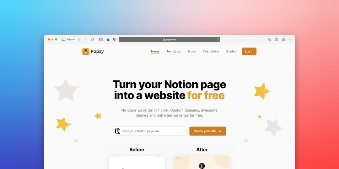
- Headline: a specific value proposition focused on the user’s outcome, not your company description.
- Subheadline: one or two lines that clarify or qualify the promise.
- Primary CTA: a single, prominent call to action describing what happens next.
- Supporting visual: an image, illustration, or product shot that reinforces the message.
- Optional proof: a short trust signal such as a rating, customer logos, or a brief testimonial.
Write a Value Proposition, Not a Slogan
The headline is the hardest and most important element. A good value proposition is specific and benefit-led: it names who it is for and what they get. “Project management for design teams that ship on time” beats “Work better together.” Specificity builds trust because it signals you understand the visitor’s problem. Avoid clever wordplay that requires a second read; the hero is not the place for ambiguity.
Keep it scannable. Most visitors read the headline and almost nothing else before deciding, so it has to carry the message on its own. The subheadline then handles the nuance, the qualifier, the second benefit, or the proof point, that the headline could not fit.
One Primary CTA
A hero should have a single primary call to action. Two equally weighted buttons create a decision the visitor is not ready to make and dilute the path you most want them to take. If a secondary action is genuinely useful, “See how it works” alongside “Start free trial”, make it visually secondary: a ghost or text button next to the solid primary one, so the hierarchy is unmistakable.
Write the button to describe the outcome. “Start free trial” or “Get the template” tells the user what they get; “Submit” or “Learn more” does not. The primary CTA should be the most visually prominent interactive element in the entire section.
Performance: The Hero Is Your LCP
The hero almost always contains the page’s Largest Contentful Paint (LCP) element, the largest image or text block visible above the fold, which is a Core Web Vitals metric Google uses. This is the single biggest reason heavy hero video has fallen out of favor: an autoplaying background video tanks load performance and the LCP score, punishing exactly the mobile users you most want to keep.
Favor a fast, optimized image over video. Serve modern formats such as WebP or AVIF, size images responsively for the viewport, and prioritize loading the hero image so it paints quickly. If you must use motion, keep it lightweight, lazy-load anything below the fold, and respect prefers-reduced-motion. A hero that looks impressive but loads in four seconds loses to a clean one that paints instantly.
Hero Patterns and When to Use Them
| Pattern | Layout | Best for |
|---|---|---|
| Split / two-column | Text one side, visual the other | Products needing a clear visual |
| Centered | Centered text, single CTA, minimal visual | Simple, message-led landing pages |
| Image background | Text overlaid on a photo | Lifestyle, brand-led sites (watch contrast) |
| Product-led | Large product screenshot or demo | SaaS and apps where the product sells itself |
If you overlay text on an image, contrast is non-negotiable: add a scrim or gradient so text meets the WCAG 2.2 AA minimum of 4.5:1 for body text and 3:1 for large text. A beautiful photo that makes the headline unreadable is a failed hero.
Typography and Visual Hierarchy
The hero lives or dies on typographic hierarchy. The headline should be unmistakably the largest, most prominent text on the screen, with the subheadline clearly subordinate and the CTA distinct from both. Resist the urge to set the headline so large it wraps awkwardly or pushes the CTA below the fold on mobile; a value proposition the user has to scroll to finish is a value proposition they may never read.
For the headline, a typeface with strong presence and clear letterforms carries the message; for UI and body text in and below the hero, a neutral grotesque with a high x-height such as Inter (free, open source, from Google Fonts) keeps everything legible. Use a sensible type scale so sizes relate to one another deliberately rather than by guesswork, and keep the number of weights small to protect performance.
Common Hero Mistakes
Most weak heroes fail in predictable ways. Knowing the failure modes makes them easy to avoid:
- Vague headline. “Welcome” or a company description instead of a user-focused value proposition.
- Competing CTAs. Two or more equally weighted buttons with no clear primary action.
- Heavy media. Autoplaying video or huge unoptimized images that wreck LCP.
- Unreadable overlay text. Text on a busy photo with no scrim, failing contrast.
- Too much content. Paragraphs, feature lists, and badges crammed above the fold, burying the one message that matters.
The fix for almost all of these is subtraction. When a hero feels weak, the answer is usually to remove an element, sharpen the headline, and let the single most important message and action breathe.
Mobile and Accessibility Considerations
On a phone, the hero is often the entire first screen, so the message must land in a single narrow column with the CTA reachable in the thumb zone. Design the mobile hero first, then expand it; this is the core of a mobile-first design approach. Keep the CTA button at least 44 by 44px, ensure the headline uses a real, structured <h1>, and confirm color and overlay contrast pass, which ties into our web accessibility designer’s guide.
Frequently Asked Questions
What should a hero section include?
An effective hero section includes a specific, benefit-led headline (value proposition), a clarifying subheadline, a single prominent primary call to action, a supporting visual that reinforces the message, and optionally a short trust signal such as a rating or customer logos. Every element should answer what it is, why it matters, or what to do next.
How many CTAs should a hero have?
One primary call to action. Two equally weighted buttons split the visitor’s attention and weaken the path you most want them to take. If a secondary action is useful, style it as visually subordinate, such as a text or ghost button, so the primary CTA remains the clear, dominant choice.
Should I use video in my hero section?
Usually no. Hero video commonly contains the Largest Contentful Paint element and hurts load performance and Core Web Vitals, especially on mobile. A fast, optimized image in WebP or AVIF nearly always performs better. If you use motion, keep it lightweight and respect the prefers-reduced-motion setting.
How do I keep overlaid hero text readable?
When placing text over an image, add a scrim, gradient, or solid panel behind the text so it meets WCAG 2.2 AA contrast: at least 4.5:1 for body text and 3:1 for large text. Test against the busiest part of the image, not the easiest, and never sacrifice legibility for a photo.