Hunter Green vs Forest Green Compared
The hunter green vs forest green comparison separates two dark greens that look almost identical at a glance but diverge in temperature and depth. Hunter green is darker and leans subtly blue, giving it a polished, almost navy-adjacent character; forest green is a fraction lighter and reads as a more straightforward dark green. Below we compare hex values, undertones, and where each belongs.
What is the difference between hunter green and forest green?
Both are dark, low-saturation greens, but hunter green is deeper and cooler. Hunter green carries a noticeable blue undertone that makes it feel refined and traditional — close to the dark greens used on classic cars, leather-bound books, and country-club branding. Forest green stays a touch lighter and more neutral-green, evoking dense woodland rather than tailored heritage. The distinction is subtle but real, and because neither name is a fixed standard, exact values vary by source.
| Attribute | Hunter Green | Forest Green |
|---|---|---|
| Hex code | #355E3B | #228B22 |
| RGB | 53, 94, 59 | 34, 139, 34 |
| CMYK | 44, 0, 37, 63 | 76, 0, 76, 45 |
| Undertone | Cool, blue-leaning | Neutral green |
| Hue family | Very dark blue-green | Dark green |
| Best used for | Heritage, luxury, formal branding | Outdoor, natural, broad-purpose dark green |
| Mood/feel | Refined, traditional, sophisticated | Grounded, natural, stable |
What does hunter green look like?
Hunter green takes its name from the muted dark greens worn for hunting in the 19th century. The representative value #355E3B is darker than forest green and leans cool, with a blue component that gives it a buttoned-up, heritage feel. It sits comfortably next to navy and reads as upscale and conservative.
This makes hunter green a natural choice for luxury and heritage branding, formal interiors, academic and country-club identities, and anything that wants to feel established and refined. It pairs handsomely with gold, cream, oxblood, and dark wood tones. If you want a brighter jewel green for contrast, our emerald vs forest green comparison covers the vivid end of the family.
What does forest green look like?
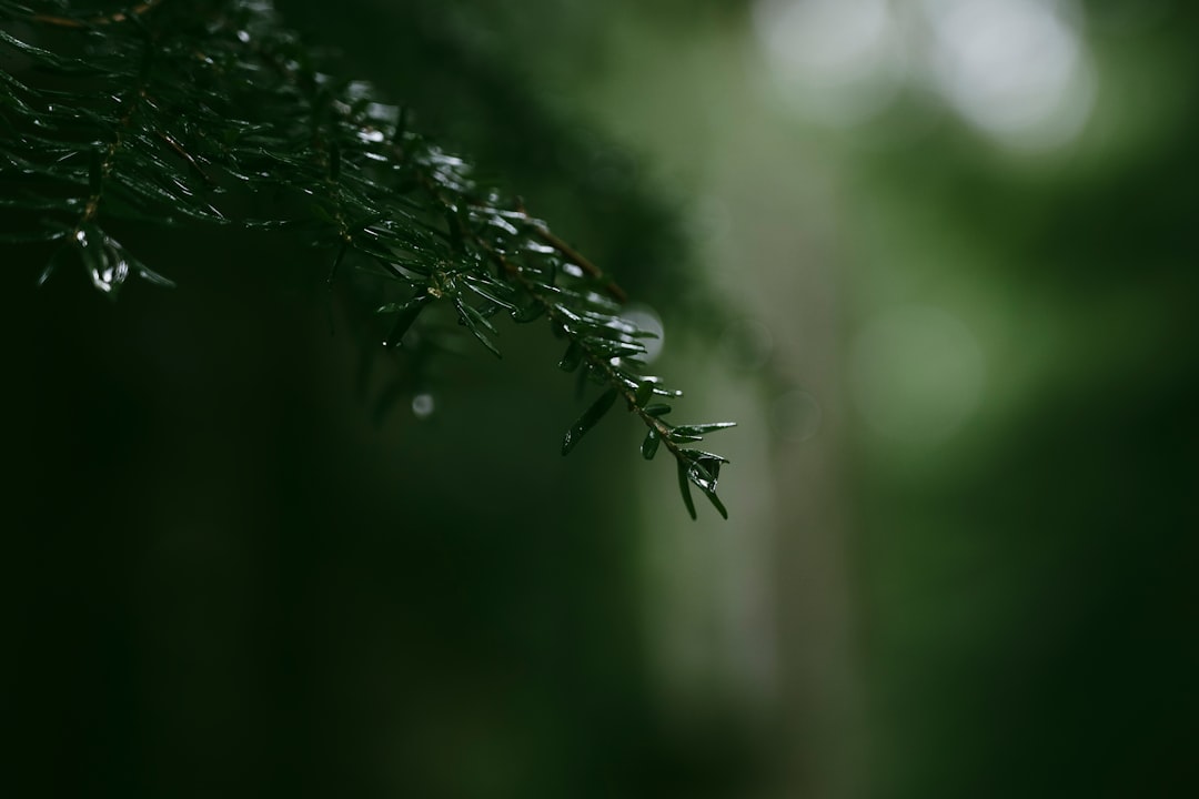
Forest green is the more neutral, slightly lighter dark green of the two. The common #228B22 value reads as a straightforward, leafy dark green — the color of a shaded tree canopy. It is warmer and a touch brighter than hunter green, and it leans less blue, which makes it feel more organic and outdoorsy.
Forest green is the more general-purpose dark green. It suits outdoor and conservation brands, natural-product packaging, cozy interiors, and dark-mode UI backgrounds. Because it is desaturated and dark, it rarely clashes and works across a wide range of palettes. It behaves almost like a deep neutral while still reading unmistakably green.
When should you use hunter green vs forest green?
Choose based on the personality you want. Hunter green’s blue lean and extra depth make it the right call for formal, heritage, or luxury contexts. Forest green’s warmer, more neutral character suits natural, outdoor, and broad-purpose uses where you want depth without the buttoned-up formality.
- Use hunter green for: luxury and heritage brands, academic and club identities, formal interiors, refined dark-UI accents.
- Use forest green for: outdoor and conservation brands, natural products, cozy interiors, general-purpose dark backgrounds.
- Use them together: layering hunter green and forest green builds a rich tonal green scheme with subtle depth and quiet contrast.
Both are cool-leaning, but hunter green’s blue cast is stronger. To balance a dark-green-dominant palette with warmth, see our warm vs cool colors guide. For an earthy, muted alternative to these deep greens, compare olive vs army green.
How do hunter green and forest green perform in print and web?
Both dark greens are print-stable thanks to their low saturation and high darkness — they reproduce reliably across stocks with minimal shift. Hunter green’s blue component can deepen slightly in CMYK, so proof it if the exact tone matters. On the web, both make excellent dark backgrounds and pass contrast checks easily against white or light text. Hunter green reads more formal in UI; forest green reads more natural and approachable.
Which colors pair well with hunter green and forest green?
Both are dark green anchors, but their slightly different temperatures suggest different companions. Hunter green is at its best with refined, classic partners: gold and brass for prestige, cream and ivory for contrast, and oxblood or burgundy for a rich, club-like depth. Its blue lean means it also sits comfortably beside navy, creating a deep, sophisticated, almost nautical-heritage scheme. Because hunter green reads formal, pair it with materials and tones that reinforce that — dark wood, leather, and muted metallics.
Forest green is warmer and more organic, so it pairs naturally with warm woods, tan, kraft brown, and off-white for an outdoorsy, grounded feel. It also handles brighter accents well — mustard, rust, or a pop of orange feel autumnal against it. As a dark background it makes warm neutrals glow, which is why it works so nicely in cozy interiors and natural-product packaging.
For a brand system, let the personality decide the lead. Hunter green signals tradition, formality, and luxury; forest green signals nature, comfort, and stability. You can also use them together as a tonal pair — hunter green for the deepest accents and forest green for slightly lighter fields — to build quiet, monochromatic depth without introducing a second hue.
Frequently Asked Questions
Is hunter green darker than forest green?
Yes, generally. Hunter green (around #355E3B) is typically darker and cooler than forest green (around #228B22), with a stronger blue undertone. Forest green is a touch lighter, warmer, and more clearly green. The difference is subtle but visible when the two are placed side by side.
Which is better for a luxury brand?
Hunter green is usually the better luxury choice because its deep, blue-leaning, refined character signals heritage and sophistication. It pairs especially well with gold and cream. Forest green can work for luxury too, but its warmer, more natural tone leans toward outdoor and organic positioning rather than formal prestige.
Do hunter green and forest green go together?
Yes. Because they share a dark, muted green character but differ slightly in depth and temperature, they layer into a cohesive tonal palette. Use hunter green for the deepest elements and forest green for slightly lighter areas to create subtle, sophisticated contrast within a green-dominant scheme.
Are these hex codes official?
No. Neither hunter green nor forest green is a single fixed standard, so values vary by source. Forest green has a common web value of #228B22, while hunter green is often cited around #355E3B. Treat both as representative and confirm against your brand or Pantone reference for production work.


