Ligatures in Typography Explained
Ligatures are single glyphs that fuse two or more letters into one designed character, most famously the “fi” and “fl” pairs where a dotted “i” or an arching “f” would otherwise collide. They exist to solve a real spacing problem, not to look fancy, and knowing when they help versus when they distract is a quiet mark of typographic literacy.
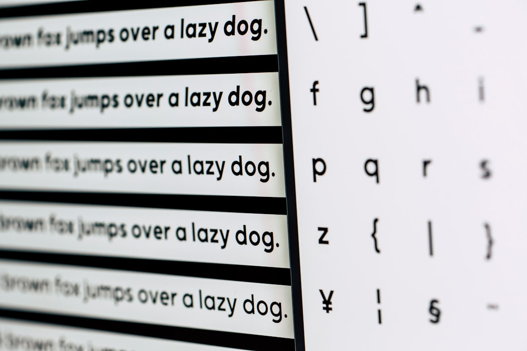
This is a deep-dive in the Made Good Design Collective typography fundamentals cluster. For the full vocabulary, start with our typography terms glossary, then come back here for the detail.
What a Ligature Actually Solves
Look closely at the lowercase “f” followed by “i” in many serif typefaces. The “f” finishes with a hook or terminal that swings to the right, and the dot of the “i” sits right where that hook wants to go. Without intervention, they clash, the hook crashes into the dot, or an ugly gap opens up to avoid it.
A ligature redraws that combination as one harmonious glyph: the “f” flows into the body of the “i,” and the separate dot is often absorbed or removed. The result reads cleanly and looks intentional. The same logic applies to “fl,” “ff,” “ffi,” and “ffl,” collectively the f-ligatures that show up most in running text.
Standard vs Discretionary Ligatures
This is the single most important distinction, and it’s where most confusion lives. Ligatures split into two functional groups.
| Type | Purpose | OpenType tag | Default state |
|---|---|---|---|
| Standard ligatures | Fix functional collisions (fi, fl, ff, ffi, ffl) | liga |
Usually on by default |
| Discretionary ligatures | Decorative flourishes (ct, st, sp, Th) | dlig |
Always off by default |
Standard ligatures are the workhorses. They’re meant to be invisible, you shouldn’t notice them, you should just notice that the text looks clean. Most applications and browsers enable them automatically for body text, and you generally want them on.
Discretionary ligatures are the showpieces: an elegant joined “ct” or “st,” a swashy “Th.” They draw attention to themselves, which is exactly why they’re off by default. They belong in wedding invitations, logos, and editorial display work, not in a paragraph of body copy where they’d look distracting and inconsistent.
How OpenType Ligatures Work
Ligatures are an OpenType feature, meaning they’re alternate glyphs baked into the font file that get substituted automatically when the feature is active. The font’s “GSUB” table tells the rendering engine: when you see “f” followed by “i,” and the liga feature is on, swap both for the single fi-glyph.
Crucially, the underlying text doesn’t change. The characters are still “f” and “i” at the data level, so copying, searching, and screen readers all work normally. Only the visual rendering substitutes the combined glyph. This is why ligatures are safe to use in real text, unlike, say, typing a special Unicode ligature character by hand.
Turning ligatures on and off
Where you control them depends on the tool:
- Adobe InDesign / Illustrator — Ligatures toggle in the Character panel menu; discretionary ligatures via the OpenType submenu.
- CSS on the web —
font-feature-settings: "liga" 1;or the friendlierfont-variant-ligatures: common-ligatures;for standard, anddiscretionary-ligaturesfor decorative. - Figma — Type details panel exposes OpenType features per text layer when the font supports them.
When to Turn Ligatures Off
Ligatures aren’t always welcome. There are clear cases for switching them off:
- Monospaced and coding fonts — ligatures can break the strict one-character-one-cell expectation. Some programming fonts offer coding ligatures (turning
!=into a single ≠-style glyph), which is a stylistic preference many developers disable. - Letterspaced text — when you add tracking, the letters are deliberately separated, so a fused fi-glyph looks wrong sitting tight while everything around it is loose. Most apps suppress ligatures past a tracking threshold automatically.
- Across word boundaries — well-made fonts and layout engines already avoid ligating across, say, the compound “shelfful,” but cheaper fonts may not, and you’ll want to override.
Real Typefaces and Their Ligatures
Ligature quality varies enormously between typefaces, and it’s a good signal of how carefully a font was made.
- Garamond and other classic serifs ship rich ligature sets, both standard and discretionary, because they descend from a tradition where ligatures were essential to good metal typesetting.
- Hoefler Text is famous for its generous discretionary ligatures, a favorite for designers wanting an old-style, crafted feel.
- Inter, the popular open-source UI face, includes well-tuned standard ligatures plus optional contextual and discretionary sets, exactly what you’d want in a modern variable font.
- Many free or hastily made fonts include no ligatures at all, which is why “fi” looks pinched in them, a quick tell of a low-effort typeface.
A Brief History of Ligatures
Ligatures predate the printing press. Medieval scribes joined letters to save time and space on expensive parchment, and many of those combinations carried straight into early metal type. The ampersand itself (&) is a ligature, a fused “et,” the Latin word for “and.” So is the German ß (eszett), which evolved from a long-s and z combination.
When metal type gave way to phototypesetting and then digital fonts, many ligatures were lost because early digital formats had no good mechanism for automatic substitution. OpenType, introduced in the late 1990s and now universal, fixed that by building substitution rules directly into the font file. The result is that in 2026 we have richer, more reliable ligature support than at any point since the heyday of hand-set metal type, you just have to know the features exist and turn on the right ones.
Ligatures, Legibility, and Good Judgment
The practical takeaway: leave standard ligatures on for nearly all text, they make your typography quietly better and cost you nothing. Reach for discretionary ligatures only in display contexts where a deliberate flourish suits the piece, and even then, use them sparingly and consistently. A single elegant “st” ligature in a headline can be lovely; the same ligature scattered randomly through a paragraph just looks like a glitch.
For display work where ligatures shine, it helps to understand the broader rules of large-size type, covered in our display fonts guide. And since ligatures interact with stroke weight, you may also want font weights explained nearby.
Frequently Asked Questions
What are ligatures in typography?
Ligatures are single glyphs that combine two or more letters into one designed character, such as “fi” or “fl.” They exist to prevent letters from colliding awkwardly, most often where a lowercase “f” would crash into the dot of an “i,” producing cleaner, more intentional-looking text.
Should I turn ligatures on or off?
Leave standard ligatures (fi, fl, ff) on for nearly all text, they improve typography invisibly. Keep discretionary ligatures off by default and enable them only in display or editorial work where a deliberate decorative flourish suits the piece. Disable ligatures in coding fonts and heavily letterspaced text.
What’s the difference between standard and discretionary ligatures?
Standard ligatures fix functional collisions like “fi” and “fl” and are usually on by default. Discretionary ligatures are decorative flourishes like a joined “ct” or “st,” always off by default because they draw attention to themselves and belong only in display contexts, not body text.
Do ligatures affect copying and searching text?
No. Ligatures are an OpenType rendering feature, so the underlying characters remain unchanged at the data level. A fi-ligature is still stored as separate “f” and “i,” meaning copy-paste, find-and-replace, and screen readers all continue to work normally despite the combined visual glyph.
What are coding ligatures?
Coding ligatures are special ligatures in programming fonts that fuse multi-character operators, turning !=, =>, or >= into single combined symbols. They’re a stylistic preference, some developers find them clearer, others disable them because they obscure the literal characters being typed.


