Wedding Invitation Design: Tips and Trends
Wedding invitation design sets the tone for the entire event — it is the first physical thing guests hold, and they decide “formal black-tie” or “backyard celebration” within seconds of opening the envelope. Done well, the suite communicates the date, the dress code, and the couple’s taste all at once. This guide covers the full suite, the etiquette that keeps it correct, and the trends shaping wedding stationery in 2026.
If you are designing event stationery for the first time, start with our complete guide to invitation design for the fundamentals on sizes, paper, and print methods — this article builds on those basics for weddings specifically.
Anatomy of a Wedding Invitation Suite
A wedding suite is a coordinated family of cards, not a single invitation. At minimum you need the main card and a reply card; a full formal suite layers in several enclosures, all sharing one type system and palette.
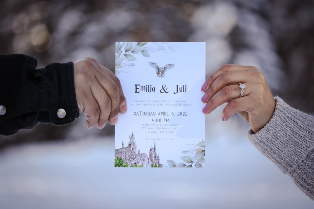
- Main invitation — the hero card, almost always a flat 5×7 in an A7 envelope.
- RSVP card — an A1 (3.5×4.875) reply card with its own pre-stamped, pre-addressed A1 envelope.
- Details card — accommodations, transport, and wedding-website URL, usually A2 (4.25×5.5).
- Reception card — when the reception is at a different venue or time.
- Envelopes — outer mailing envelope plus optional inner envelope; liners add color.
Designing every piece on the same grid — identical margins, type sizes, and ornament — is what makes the suite feel intentional. Mismatched enclosures are the fastest way to make an expensive suite look thrown together.
Choosing Paper and Print Method
Weddings are where premium materials earn their cost, because the card becomes a keepsake. The classic combination is cotton stock at 110–130lb with letterpress printing — the deep, tactile impression in soft cotton is unmistakably high-end. Foil stamping in gold, rose gold, or silver adds shine for monograms and names, and thermography mimics the raised look of engraving at a lower price point.
A practical budgeting move: letterpress or foil the main invitation, then print the RSVP and details cards digitally in a matching palette. Guests notice the hero card and rarely register that the enclosures were produced more cheaply. For cards guests write on — the RSVP especially — keep an uncoated surface so pen ink takes cleanly.
| Card | Size (in) | Envelope |
|---|---|---|
| Main invitation | 5 × 7 | A7 |
| RSVP / reply | 3.5 × 4.875 (A1) | A1 |
| Details / reception | 4.25 × 5.5 (A2) | A2 |
Typography That Carries the Romance
Wedding type almost always follows one formula: a calligraphic script for the couple’s names paired with a refined serif for the rest of the information. The script delivers the emotion; the serif keeps the date, time, and venue effortlessly legible. Limit yourself to those two families and build hierarchy with size and letterspacing rather than introducing a third font.
Set all-caps lines — like the host line or “TOGETHER WITH THEIR FAMILIES” — with generous tracking for the engraved look. Keep body copy at 9–11pt and resist shrinking text to fit; if it does not fit, the layout needs editing, not a smaller point size. For a deeper framework on combining a script with a serif without clashing, see our font pairing guide.
Wedding Invitation Etiquette
Etiquette is half of wedding invitation design — the wording signals formality as strongly as the paper does. A few rules that consistently matter:
- Host line first. Whoever is hosting (traditionally the bride’s parents) is named at the top.
- Spell things out. Formal invitations write dates and times in full: “Saturday, the fourteenth of June.”
- State the dress code subtly. A lower-corner line (“black tie”) or the formality of the design itself.
- Give a clear RSVP deadline. Typically three to four weeks before the date.
- Mail early. Send invitations six to eight weeks ahead, longer for destination weddings.
Wedding Invitation Trends for 2026
Trends should serve the couple, not override them, but a few directions are clearly defining 2026 stationery:
- Vellum overlays — a translucent printed sheet wrapped over the main card, often held with a wax seal, for a layered reveal.
- Bold serifs and condensed type — editorial, magazine-style headlines replacing delicate scripts for modern couples.
- Saturated and moody palettes — deep burgundy, forest, and inky navy on natural cotton, away from blush pastels.
- Edge painting and colored bevels — a stripe of color on the card’s thick edge as a quiet luxury detail.
- Illustrated venue art — a custom line drawing of the venue used across the suite as a unifying motif.
Coordinating the Whole Stationery Suite
Wedding stationery extends well beyond the invitation, and the couples whose weddings feel most polished treat every printed piece as one design system. The invitation establishes the type pairing, the palette, and any motif (a monogram, a venue illustration, a botanical), and every later piece inherits those elements. That continuity is what makes guests feel the event was art-directed rather than assembled.
- Save the dates — sent months earlier, previewing the palette and type.
- Ceremony programs — the order of service, in the same type family.
- Menus and place cards — carrying the motif onto the reception table.
- Signage and thank-you cards — bookending the day with the same identity.
Plan the suite as a budget too. Decide early which pieces justify a premium method and which can run digitally in the matching palette, so the spend lands where guests notice it most — the invitation and the reception table.
Common Mistakes to Avoid
The errors that undermine wedding suites are almost always avoidable. Crowding too much copy onto the main card is the most common — move secondary information to the details card. Using more than two fonts dilutes the hierarchy. Skipping a printed proof leads to color surprises, especially in deep navies that shift in CMYK. And the unforgivable one: a typo in the date or venue. Always have at least two people proof the final files before printing.
Once your invitations are set, keep the look consistent across every touchpoint — coordinate with your save the date design ahead of the suite and your reception menu design on the day so the whole event reads as one cohesive identity.
Frequently Asked Questions
What size is a standard wedding invitation?
The standard wedding invitation is a flat 5×7 card that fits an A7 envelope. Supporting pieces are smaller: the RSVP card is typically A1 (3.5×4.875) and the details or reception card is A2 (4.25×5.5). Designing all cards on a shared grid keeps the suite cohesive.
When should wedding invitations be mailed?
Mail wedding invitations six to eight weeks before the wedding date, and ten to twelve weeks ahead for destination weddings so guests can arrange travel. Set the RSVP deadline three to four weeks before the day, giving your caterer and venue an accurate headcount with time to spare.
What is the best print method for wedding invitations?
Letterpress on cotton stock gives the deepest, most luxurious tactile impression and is the classic premium choice, with metallic foil stamping a close second for shine. To save money, use the premium method on the main invitation only and print enclosure cards digitally in a matching palette.
How many fonts should a wedding invitation use?
Use two fonts: a calligraphic script for the couple’s names and a refined serif for the details. The script carries the romance while the serif keeps logistics legible. Build hierarchy with size and letterspacing rather than adding a third typeface, which makes the card look cluttered.
What goes in a wedding invitation suite?
A full suite includes the main 5×7 invitation, an RSVP reply card with its own pre-addressed envelope, and a details card covering accommodations and the wedding website. A reception card is added when the reception is at a separate venue. All pieces share one type system and color palette.


