Invitation Design: A Complete Guide
Invitation design is the discipline of making a single sheet of paper feel like an event before the event even happens. Get the size, stock, type pairing, and print method right and a card reads as deliberate and expensive; get any one of them wrong and it reads as a coupon. This guide walks through every decision — from trim size to ink — so your next invitation looks like it came from a studio, whether it is a wedding suite, a gallery opening, or a child’s birthday party.
We will cover the full pipeline: standard sizes and the suite that surrounds the main card, paper weights and finishes, the type pairings that carry the whole piece, the print methods that justify the price, and the layout rules that keep everything readable. By the end you should be able to spec a job and hand it to a printer with confidence.
Start With the Format and Size
Almost every invitation problem is really a size problem. Pick the wrong trim and your envelopes, your liner, and your postage all fight you. The dominant size in the United States is the flat 5×7 card — it fits an A7 envelope, holds a generous amount of type, and photographs well on social. The 4×6 is the budget-friendly workhorse for casual parties and save the dates, while a smaller A2 (4.25×5.5) is the classic note-card and reception-card size.
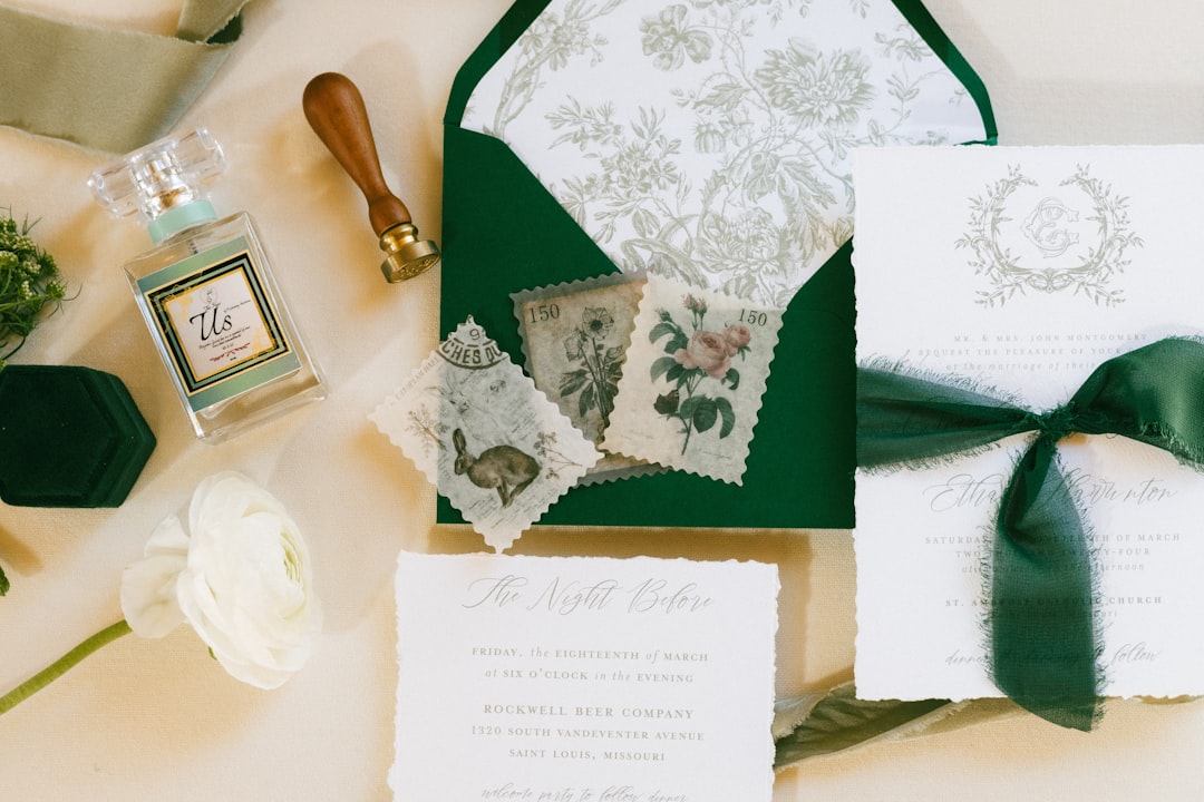
The supporting pieces in a formal suite have their own conventions. The RSVP card is typically an A1 (3.5×4.875) that slips into a pre-addressed A1 reply envelope. Details and directions cards usually match the RSVP or sit at A2. Designing the whole family to a shared grid — same margins, same type sizes — is what makes a suite feel like a suite rather than a pile of unrelated cards.
| Card | Trim size (in) | Envelope | Typical use |
|---|---|---|---|
| Main invitation | 5 × 7 | A7 | Weddings, formal events |
| Casual / save the date | 4 × 6 | A6 | Parties, postcards |
| Reception / note | 4.25 × 5.5 (A2) | A2 | Enclosures, thank-yous |
| RSVP / reply | 3.5 × 4.875 (A1) | A1 | Reply cards |
Whatever size you choose, build your artwork with a bleed of 0.125 in on every edge and keep critical text at least 0.25 in inside the trim. Backgrounds that run to the edge must extend into the bleed, or you risk thin white slivers after cutting.
Choose the Right Paper Stock
Paper does more emotional work than any font. The tactile difference between a thin 80lb text sheet and a thick cotton card is the difference between “flyer” and “keepsake.” For invitations, specify in pounds-per-cover, not text weight. A practical floor for a card people will hold is 110lb cardstock; for a premium feel, move to 130lb or a double-thick duplex.
- Cotton stock — soft, slightly toothy, takes letterpress beautifully. The default for high-end weddings.
- Smooth/eggshell cardstock (110–130lb) — versatile, prints crisp digital and foil, affordable.
- Vellum overlays — a translucent sheet bound or wrapped over the card for a soft, layered intro to the type beneath.
- Handmade / deckled-edge — irregular torn edges signal craft; pair with letterpress and you have a museum piece.
Finish matters too. An uncoated stock feels warm and writable; a soft-touch or matte laminate feels luxe but resists pen ink for handwritten names. If guests will write on the card — RSVPs especially — keep that surface uncoated.
Nail the Typography
Type is where invitations live or die, which is why it deserves its own discipline. The reliable formula is a display face for the names or the headline paired with a workhorse text face for everything else. A common and timeless move is pairing an elegant calligraphic script with a refined serif — the script carries romance, the serif carries the information. For a deeper framework on building these combinations, see our complete guide to font pairing.
Resist the urge to use more than two type families. Build hierarchy with size, weight, and spacing instead. Set the body in a generous size — 9 to 11pt for formal copy — with letterspacing (tracking) opened up slightly on all-caps lines, which is the classic engraved-look detail. Names and dates can go large; the venue and time should be unmistakable at a glance.
Type pairing cheat sheet
- Romantic / wedding: calligraphic script for names + a high-contrast serif for details.
- Modern / minimal: a single clean sans in two weights, lots of white space, tight grid.
- Editorial / gallery: a confident serif headline + a neutral grotesque for captions and logistics.
Pick a Print Method
The print method sets the ceiling on perceived quality. The four you will actually choose between are digital, foil, letterpress, and thermography — and the right one depends on budget, quantity, and the look you are after.
| Method | Look & feel | Relative cost | Best for |
|---|---|---|---|
| Digital (flat) | Smooth, full color, no texture | $ | Photos, color art, short runs |
| Thermography | Raised, glossy ink | $$ | Engraved look on a budget |
| Foil stamping | Metallic shine, pressed | $$$ | Gold/silver accents, logos |
| Letterpress | Deep tactile impression | $$$$ | Premium suites on cotton |
A money-saving strategy designers use constantly: print the main invitation with the expensive method (foil or letterpress) and run the enclosure cards digitally in a matching palette. Guests register the wow on the hero card and rarely notice the supporting pieces are cheaper to produce.
Layout and Hierarchy Rules
Every invitation answers five questions — who, what, when, where, and how to respond — and your layout should guide the eye through them in order. The host line sits at top, the invitation phrase and honoree names take the center as the visual anchor, then date, time, and venue, and finally the response instruction.
- Establish one focal point. Usually the names or the event title, set largest.
- Group related information. Date and time together; venue and address together.
- Use white space deliberately. Crowding is the single biggest tell of an amateur card.
- Align to a grid. Centered or flush-left, but commit — mixed alignment looks accidental.
- Proof every detail. A misspelled venue or wrong date is the one error you cannot recall after printing.
Color, Ink, and Accents
Restraint reads as luxury. Most refined invitations use two ink colors at most plus the paper color as a third “color.” If you are printing spot colors (letterpress, foil), choose specific Pantone references rather than approximations so the printer matches them exactly. For digital full-color work, request a printed proof — screen color and CMYK output diverge constantly, especially in deep navies and warm reds.
Accents like edge painting (a stripe of color on the card’s edge), envelope liners, and wax seals are inexpensive ways to add perceived value. One well-chosen accent beats three competing ones.
Envelopes, Liners, and the Mailing Outer
The envelope is the first thing a guest touches, so it deserves real attention rather than being treated as packaging. Match the envelope size to the card — an A7 for a 5×7, an A2 for a folded note — and consider a euro flap (the deep pointed flap) for a more formal silhouette. An envelope liner in a contrasting color or pattern is one of the cheapest ways to add perceived value, since it reveals a pop of color the moment the flap opens.
Two production details save heartache. First, confirm the finished mailing weight and thickness with the post office before you commit — rigid embellishments, wax seals, and square formats often trigger surcharges. Second, if you want addressing to look as considered as the card, build the addressing into the same type system: digital printing or calligraphy on the outer envelope, never a sticker label, on a formal suite.
Proofing and Pre-Press
The most expensive mistake in invitation design is one you cannot undo after the run prints. Build proofing into the schedule as a real step, not an afterthought.
- Order a physical proof for any premium job. Screen color and printed CMYK diverge most in deep navies, warm reds, and greens.
- Read the copy aloud with a second person — dates, day-of-week, venue spelling, and times are the high-cost errors.
- Check the bleed and safe margins in the exported PDF, not just on screen in your layout file.
- Confirm spot-color references (Pantone) with the printer so foil and letterpress inks match exactly.
- Verify quantities — order 10–15% extra for addressing errors, keepsakes, and last-minute additions.
Tools for Designing Invitations
For production-grade work where you control bleeds, spot colors, and multi-card suites, Adobe InDesign is the standard, with Illustrator for any vector ornament or monogram. If you are not a full-time designer, Canva handles single cards well and exports print-ready PDFs — just confirm the trim and bleed settings before sending to a printer. Whatever the tool, always export as a high-resolution PDF/X with fonts embedded and images at 300 DPI. A reliable workflow is to design in your layout tool, export a PDF/X-1a, open it once more to eyeball the bleed and overprint, then send that exact file to the printer rather than a re-export, so what you proof is what gets made.
Explore the Full Cluster
Invitation design spans more than the main card. Dive deeper into each event-design discipline:
- Wedding invitation design: tips and trends — the full suite, etiquette, and 2026 looks.
- Save the date design ideas and templates — the first impression before the invitation.
- Greeting card design: how to design cards — folded cards, sentiment, and inside layouts.
- Menu design for restaurants that sells — typography and pricing psychology on the table.
- Event program design: layouts and tips — multi-page programs, agendas, and order of service.
Frequently Asked Questions
What is the most popular invitation size?
The flat 5×7 card is the most popular invitation size in the United States. It fits a standard A7 envelope, holds plenty of type without crowding, and photographs cleanly for social sharing. The 4×6 is the common budget alternative for casual events and postcard-style mailings.
What paper weight should an invitation be?
Use at least 110lb cardstock so the card feels substantial in hand, and step up to 130lb or a double-thick cotton stock for premium events. Lighter text weights under 100lb feel like flyers. For RSVP cards guests write on, choose an uncoated surface that accepts pen ink.
Which print method looks the most expensive?
Letterpress on cotton stock delivers the deepest tactile impression and the highest perceived value, followed by metallic foil stamping. To control cost, apply the premium method to the main invitation only and print enclosure cards digitally in a matching color palette.
How many fonts should an invitation use?
Limit an invitation to two type families: a display or script face for the names or headline and a clean workhorse face for the details. Build hierarchy through size, weight, and letterspacing rather than adding more fonts, which quickly makes a card look cluttered and amateur.
What software is best for invitation design?
Adobe InDesign is the professional standard for managing bleeds, spot colors, and multi-card suites, paired with Illustrator for monograms and ornaments. Canva works well for single cards and exports print-ready PDFs — just verify the trim and bleed settings before sending the file to your printer.


