Greeting Card Design: How to Design Cards
Greeting card design is deceptively simple — four small panels and one sentiment — yet most homemade cards look homemade for the same fixable reasons: wrong fold size, thin paper, and crowded type. This guide walks through how to design a folded card that feels personal and professionally printed, from picking the size to laying out the inside spread.
If you are new to event and card stationery, our complete guide to invitation design covers the shared fundamentals of sizes, paper, and printing that apply to cards too. This article focuses on the folded greeting card specifically.
The Anatomy of a Folded Card
A standard greeting card has four panels: the front cover, the inside-left, the inside-right (where the message lives), and the back panel. Designing all four as one coordinated spread — rather than treating the front in isolation — is what separates a considered card from a clip-art collage.
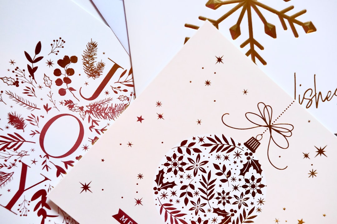
- Front cover: one strong image or headline. Resist clutter; this is the hook.
- Inside-left: often left blank, or carries a printed sentiment or supporting art.
- Inside-right: the primary message and space for a handwritten note.
- Back panel: a small credit, logo, or motif — the equivalent of a colophon.
Card Sizes and Folds
The most common greeting card is the A2, which folds to a finished 4.25×5.5 from an 8.5×5.5 flat sheet and fits an A2 envelope — the same size used for note cards and reception cards. The larger 5×7 folded card (from a 10×7 flat) gives more room for photos and is standard for holiday and photo cards.
| Card | Flat size (in) | Folded size (in) | Envelope |
|---|---|---|---|
| A2 folded | 8.5 × 5.5 | 4.25 × 5.5 | A2 |
| 5×7 folded | 10 × 7 | 5 × 7 | A7 |
| Square folded | 10 × 5 | 5 × 5 | Square (extra postage) |
Folds come in two main styles: the side fold (taller than wide, opens like a book) and the top fold (wider than tall, opens upward), the latter common for landscape photo cards. Decide the fold before you lay out artwork, because it determines which panel is the cover.
Paper Stock and Finish
A greeting card has to fold crisply and stand on a mantel, so weight matters. Aim for 110–130lb cardstock — heavy enough to stand without slumping but still scoreable for a clean fold. Always score the fold line before folding; folding heavy stock without scoring cracks the surface and looks cheap.
- Uncoated cardstock — warm, writable inside surface for handwritten messages.
- Matte or soft-touch cover — premium feel on the front; pair with an uncoated interior.
- Cotton stock — for letterpress or foil cards that double as keepsakes.
If guests or you will write inside, keep the interior uncoated so pen ink does not smear. A coated front with an uncoated inside is the best of both worlds.
Typography and Layout
Greeting cards reward warmth and restraint. The reliable formula pairs a display or script face for the cover sentiment (“Congratulations,” “Thank You”) with a clean text face for any body copy inside. A calligraphic script on the cover paired with a refined serif inside reads as elegant; a bold sans pairing reads as modern and playful. Limit yourself to two families and let scale create hierarchy.
For the inside-right message, leave generous white space so there is room for a handwritten note — a card printed wall-to-wall with text gives the sender nowhere to write. For help choosing combinations that hold together, see our font pairing guide.
How to Design a Card, Step by Step
- Pick the size and fold first — A2 side-fold or 5×7 top-fold are safe defaults.
- Set up the document with bleed. Lay out all four panels with 0.125 in bleed and 0.25 in safe margins.
- Design the cover as the hook. One image or one sentiment, not both competing.
- Lay out the inside spread together. Balance the left and right panels as a pair.
- Leave writing space. Keep the inside-right open for a handwritten message.
- Add a back-panel credit. A small logo or motif finishes the card.
- Export print-ready. A 300 DPI PDF with fonts embedded and a marked fold line.
Writing the Sentiment
The words on a greeting card are part of the design, not an afterthought bolted on at the end. The strongest cards keep the cover sentiment short and let the inside carry the warmth. On the cover, one or two words (“Thank You,” “Congratulations,” “With Sympathy”) read better than a full sentence and give the type room to be beautiful. Save any longer printed line for the inside-left, where it can support rather than compete with the handwritten message.
Tone should match the occasion and the recipient. A celebration card can be playful and loose; a sympathy or formal card calls for quieter type, more white space, and a restrained palette. If you are designing cards to sell rather than for one person, write a printed inside line that is open enough to fit many situations, and still leave blank space for the buyer to personalize — a card that is fully pre-written gives the sender nothing to add.
Color and Finishing Touches
Greeting cards reward small, tactile flourishes. A foil accent on the cover word, a deckled (torn) edge, a belly band wrapping the card, or a colored envelope liner each add perceived value for little cost. As with invitations, restraint reads as quality: pick one accent and execute it well rather than stacking three. Keep the color story to two inks plus the paper color, and if you are printing spot colors for foil or letterpress, specify exact Pantone references so the result matches your intent.
Print Methods for Cards
For short runs and photo cards, digital printing is fast, full-color, and affordable. For premium occasion cards, letterpress on cotton gives a tactile cover impression and foil adds metallic shine to a single word or monogram. As with invitations, you can mix methods — foil the cover word and print the rest digitally — to control cost while keeping the wow.
Tools-wise, Adobe InDesign handles multi-panel layouts and fold marks cleanly, Illustrator is ideal for vector cover art, and Canva works for simple single cards with print-ready export. Whatever you use, confirm the fold orientation in the exported PDF before ordering.
Designing cards for a specific occasion? The same craft carries across the cluster — see our save the date design guide for announcement cards and the event program design guide for multi-page printed pieces.
Frequently Asked Questions
What is the standard greeting card size?
The most common greeting card is the A2, which folds to 4.25×5.5 inches from an 8.5×5.5 flat sheet and fits an A2 envelope. The larger 5×7 folded card, made from a 10×7 flat sheet, is standard for photo and holiday cards because it gives images more room.
What paper weight is best for greeting cards?
Use 110–130lb cardstock so the card stands upright without slumping yet still folds cleanly. Always score the fold line before folding heavy stock, since folding it unscored cracks the surface. Keep the inside surface uncoated so handwritten messages take pen ink without smearing.
How do you lay out a folded card?
A folded card has four panels: front cover, inside-left, inside-right, and back. Design all four as one coordinated spread with 0.125 in bleed and 0.25 in safe margins. Make the cover a single strong hook, balance the inside spread as a pair, and leave the inside-right open for a handwritten note.
How many fonts should a greeting card use?
Limit a greeting card to two type families: a display or script face for the cover sentiment and a clean text face for any inside copy. Build hierarchy with size rather than adding more fonts. A calligraphic script with a refined serif reads elegant; a bold sans pairing reads modern.
What software is best for designing greeting cards?
Adobe InDesign handles multi-panel layouts and fold marks most cleanly, with Illustrator for vector cover art. Canva works for simple single cards and exports print-ready PDFs. Whatever the tool, export a 300 DPI PDF with fonts embedded and confirm the fold orientation before sending it to print.

