LinkedIn Banner Design: Sizes and Ideas
A polished LinkedIn banner is the most-seen, least-used piece of design real estate on your profile. It sits behind your photo at the top of the page, and most people leave it on the default blue gradient. Get the dimensions right and add a clear, on-brand design, and you immediately look more intentional than the majority of profiles. This guide gives you the exact size, the safe zones, layout ideas, and the tools to build one.
Your banner is one piece of a larger visual identity. The same design discipline that shapes a strong resume applies here, so it helps to read it alongside our resume design guide.
The Exact LinkedIn Banner Size
The single most important fact: the LinkedIn personal profile banner is 1584 × 396 pixels. Design at that size and your image fills the space cleanly with no stretching or cropping surprises.
| Spec | Value |
|---|---|
| Recommended dimensions | 1584 × 396 pixels |
| Aspect ratio | 4:1 |
| File format | PNG or JPG |
| Maximum file size | 8 MB |
| Color mode | RGB |
Use PNG when your design has crisp text or flat shapes, since it keeps edges sharp. Use JPG for photographic backgrounds, where it compresses more efficiently. Always export at exactly 1584 × 396 so LinkedIn does not rescale and soften your work.
Mind the Safe Zone
The biggest layout trap is that your profile photo and name overlap the banner. On desktop, your circular photo sits in the lower-left, and your name and headline render on top of the lower portion of the image. On mobile, the crop is different again, trimming the top and sides.
- Keep critical content centered and slightly right. The lower-left is covered by your profile photo on desktop.
- Leave breathing room at the edges. Mobile crops the sides, so avoid placing text or logos near the far edges.
- Avoid the bottom strip. Your name and headline overlay the bottom of the banner; keep important elements above it.
- Test on both desktop and mobile. Preview before you commit, because the two crops differ noticeably.
LinkedIn Banner Design Ideas
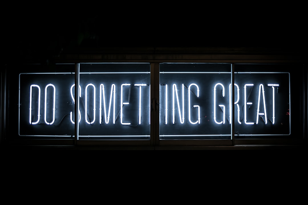
A banner should reinforce who you are and what you do in one glance. A few reliable directions, from simplest to most involved:
- Clean color field with a tagline. A solid or subtly gradient background in your brand color, with a short value statement set in the safe zone. Hard to get wrong, always looks deliberate.
- Skill or service summary. Three to five keywords describing what you do, laid out as a clean horizontal list.
- Contact and call to action. Website, email, or “Open to work” framed simply, useful for freelancers and job seekers.
- Brand pattern or texture. An abstract geometric or subtle texture that matches your wider visual identity without competing with your face.
- Work showcase. For designers and photographers, a strip of your work as the background — kept muted so overlaid text stays legible.
Whatever you choose, restraint wins. A banner crammed with text, logos, and icons reads as noise at this small height.
Typography and Color for Banners
Banner text is small once rendered, so legibility is everything. Use a clean, high-contrast typeface and keep the word count low. Sans-serifs read best at banner scale.
- Inter: open-source, tall x-height, exceptionally crisp on screen — an ideal banner font, free from Google Fonts.
- Helvetica (or Arial): neutral and authoritative, reads cleanly small.
- Calibri: friendly and modern if you want a softer tone.
Hold the line on contrast: light text on a dark field or dark text on a light field, never light gray on white. Use one accent color, ideally the same accent that runs through your resume and cover letter. For combining two typefaces with intent, see our font pairing guide.
Tools to Make a LinkedIn Banner
- Canva: The fastest path; it has a preset at the correct 1584 × 396 size and a large template library. Ideal for non-designers.
- Figma: Precise control for designers; set a 1584 × 396 frame and build with full freedom.
- Adobe InDesign / Photoshop: Best for photographic or richly designed banners where you need fine control over imagery and type.
- Google Drawings: A free, no-install option for a simple color-field banner.
Banner Ideas by Profession
The strongest banners say something specific about what you do. A few directions tuned to common goals show how the same canvas adapts:
- Job seekers: A clean color field with a short headline of your target role and one line of value (“Product Designer focused on accessible, scalable systems”). Pair it with the “Open to work” frame on your photo for a clear signal.
- Freelancers and consultants: Treat the banner as a mini billboard — your service in three words, a website, and one accent color. The goal is to make hiring you feel obvious within a glance.
- Designers and photographers: A muted strip of your own work as the background, kept low-contrast so any overlaid text stays legible. The banner itself becomes proof of craft.
- Corporate professionals: A subtle branded pattern or your company-adjacent palette with a concise positioning line. Restraint reads as seniority here.
- Career changers: Lead with the destination, not the past. A forward-looking tagline reframes your profile before anyone reads your history.
Across all of these, one accent color and a few words beat a busy collage. The banner is a glance, and its job is to set a tone, not to tell your whole story.
Other LinkedIn Image Sizes Worth Knowing
The personal banner is the headline, but a coherent profile gets a few other dimensions right too. Keeping these in mind prevents blurry, mis-cropped images elsewhere on the page.
| Image | Recommended size |
|---|---|
| Personal profile banner | 1584 × 396 px |
| Profile photo | 400 × 400 px (square, displays as a circle) |
| Company page banner | 1128 × 191 px |
| Shared link preview image | 1200 × 627 px |
Note that the company page banner is a different ratio from the personal one, so a personal banner reused on a company page will crop awkwardly. Design each surface at its native size rather than stretching a single image to cover them all.
Common LinkedIn Banner Mistakes
- Using the default banner. It signals you have not invested in your profile.
- Ignoring the safe zone. Text hidden behind the profile photo or cropped on mobile defeats the design.
- Low-resolution images. Uploading below 1584 × 396 produces a blurry, unprofessional result.
- Too much text. A banner is a glance, not a paragraph; keep it to a few words.
- Off-brand visuals. A banner that clashes with your resume and profile photo breaks the sense of a unified identity.
Fitting the Banner Into Your Brand
Your LinkedIn banner should not be a one-off. Match its color and typeface to your resume and cover letter design so a recruiter who moves between your documents and your profile sees one consistent voice. That coherence across every touchpoint is exactly what a deliberate personal branding system delivers.
Frequently Asked Questions
What is the correct LinkedIn banner size?
A LinkedIn personal profile banner should be exactly 1584 × 396 pixels, a 4:1 aspect ratio. Export as PNG for crisp text and flat shapes, or JPG for photographic backgrounds, keeping the file under 8 MB. Designing at the exact dimensions prevents LinkedIn from rescaling and softening your image.
Where should I place text on a LinkedIn banner?
Keep important text centered and slightly to the right, since your profile photo covers the lower-left corner on desktop and your name overlays the bottom strip. Leave margin at the edges because mobile crops the sides. Always preview on both desktop and mobile before saving, as the two crops differ.
What font works best on a LinkedIn banner?
Use a clean sans-serif that stays legible at small sizes, such as Inter, Helvetica or Arial, or Calibri. Inter is especially crisp on screen thanks to its tall x-height. Keep the word count low, use high contrast between text and background, and limit yourself to one accent color that matches your resume.
How do I make a LinkedIn banner for free?
Canva offers a free preset at the correct 1584 × 396 pixel size with a large template library, making it the fastest option for non-designers. Figma and Google Drawings are also free. Designers wanting full control can use Photoshop or InDesign. Always export at the exact dimensions to keep the image sharp.


