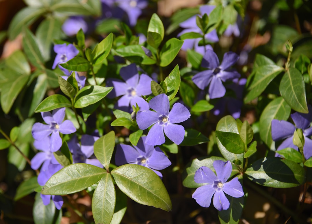
Periwinkle Color Meaning and Symbolism
Periwinkle is a soft, pale blue-violet named after the small five-petaled flower of the same name. The periwinkle color meaning sits at the gentle meeting point of blue and purple, borrowing blue’s calm and reliability while picking up violet’s imagination and grace. At around #CCCCFF , periwinkle feels airy and nostalgic, evoking spring skies, twilight and pressed-flower keepsakes rather than bold statements.
What does periwinkle symbolize?
Periwinkle symbolizes serenity, balance, tenderness and quiet whimsy. Because it merges a cool primary with a creative secondary, it represents harmony between logic and imagination, and many people read it as both soothing and gently playful. The periwinkle flower itself has long stood for friendship, fond memories and lasting affection, which adds a layer of nostalgia and sentimental attachment to the color. It is rarely aggressive or loud; instead it suggests softness, sincerity and emotional ease.
Because periwinkle is so balanced between two hues, it also symbolizes openness and adaptability, a willingness to bridge moods rather than commit to a single extreme. This makes it a natural choice for representing thoughtful, sensitive and creative personalities. Where a strong primary blue can feel corporate and a bright violet can feel theatrical, periwinkle stays gentle and unassuming, which is precisely why it reads as so calming and quietly reassuring.
The psychology of periwinkle
Psychologically, periwinkle is calming and stabilizing. The blue component lowers a sense of urgency and encourages relaxation, while the violet component invites daydreaming and mild creativity, so the overall effect is restful without being sleepy. Its paleness keeps it approachable and unthreatening, often reading as innocent, youthful or wistful. Designers use periwinkle when they want a space or product to feel peaceful and reassuring, a soft alternative to brighter blues that draws on the same trust signals discussed in color psychology.
Periwinkle symbolism across cultures
Periwinkle’s cultural meanings vary and often trace back to the flower. In parts of European folklore the periwinkle plant was associated with remembrance, fidelity and protection, sometimes woven into garlands or planted at gravesites to symbolize enduring memory. In the language of flowers popular in the Victorian era, periwinkle blooms signified blossoming friendship and early, tender affection. As a blue-violet, the color can also inherit blue’s broad associations with calm and trust and violet’s links to spirituality and imagination, so its precise reading depends on context and tradition.
Positive and negative associations of periwinkle
| Positive | Negative |
|---|---|
| Serenity and calm | Indecision or wishy-washiness |
| Nostalgia and fond memory | Excessive sentimentality |
| Whimsy and creativity | Perceived immaturity |
| Gentleness and balance | Coldness or aloofness if overused |
Periwinkle in branding and marketing
Brands turn to periwinkle when they want to feel approachable, modern and soothing. It is popular in wellness, beauty, baby and lifestyle products, where softness and trust matter, and it has become a contemporary favorite in tech and fashion seeking a friendlier alternative to corporate navy. Periwinkle reads as gender-neutral and gentle, helping a brand seem inclusive and calming. Because it is light, it works well as a background or supporting hue, paired with deeper accents to provide contrast and keep designs from feeling washed out. Its selection as a “color of the year” by major institutions has further boosted its visibility, cementing periwinkle as a fashionable signal of optimism, friendliness and forward-looking calm in contemporary design.
Colors that go well with periwinkle
Periwinkle harmonizes beautifully with soft, nature-inspired and warm-accent partners. Pale yellow (#FFF1A8) brings a cheerful, springlike contrast that flatters periwinkle’s coolness. Soft sage green (#9CAF88) creates a calm, botanical pairing perfect for serene interiors. Warm coral or rose (#FF8FA3) adds gentle energy and romance, while crisp white (#FFFFFF) keeps everything fresh. These combinations rely on the balance principles outlined in color theory.
Shades and variations of periwinkle
Periwinkle spans a delicate range of blue-violets. Lavender (#E6E6FA) is lighter and leans slightly pinker. Cornflower blue (#6495ED) is a deeper, bluer cousin. Wisteria (#C9A0DC) shifts toward purple. Light periwinkle (#C5CBE1) is even paler and more grayed, while periwinkle blue (#8F99FB) is more saturated and vivid. Pale violet (#CCBBFF) tips the balance toward purple, and a dusty periwinkle (#A7A6CB) reads as muted and vintage.
Frequently Asked Questions
What does the color periwinkle mean?
Periwinkle means serenity, calm, nostalgia and gentle whimsy. As a pale blue-violet it blends blue’s trust and tranquility with violet’s creativity and grace. Tied to the periwinkle flower, it also carries meanings of friendship, fond memory and lasting affection, giving it a soothing, sentimental character.
What emotions does periwinkle evoke?
Periwinkle evokes calmness, comfort, tenderness and quiet daydreaming. It relaxes without dulling, and its softness can stir wistful, nostalgic feelings. Many people find it reassuring and friendly, which is why it appears so often in wellness, beauty and lifestyle design.
What colors go with periwinkle?
Periwinkle pairs well with pale yellow for cheerful contrast, sage green for a botanical calm, coral or rose for warmth and romance, and white for a fresh, airy look. Adding a deeper accent helps anchor periwinkle’s lightness and gives a design balance.
Is periwinkle warm or cool?
Periwinkle is a cool color. Despite its softness, its blue-violet base places it on the cool side of the wheel, giving it a calming, receding quality. See our guide to warm versus cool colors for more on this distinction.
Is periwinkle blue or purple?
Periwinkle is both, sitting between blue and purple as a pale blue-violet. Depending on its exact mix and surrounding colors, it can appear more blue or more lavender. This in-between quality is exactly what gives periwinkle its soft, balanced and slightly nostalgic character.


