Photo Editing Basics Every Designer Should Know
You do not need to be a photographer to need photo editing skills, you need to be anyone who places images in a layout. Designers crop, color-correct, retouch, and clean up photos constantly, and getting those fundamentals right is the difference between a polished comp and one that looks slightly off in a way clients sense but cannot name. This guide covers the core editing skills in the order you actually use them, from a non-destructive setup through exposure, color, retouching, background removal, and export.
The goal here is durable understanding, not button-pushing in one app. These principles carry across Photoshop, Lightroom, Affinity Photo, GIMP, and the web editors, so you can apply them wherever you work. We will link out to deeper guides on the specific tools and tasks as we go.
Work Non-Destructively (This Is the Whole Game)
Before any single adjustment, internalize one principle that separates amateurs from professionals: edit non-destructively. That means never permanently altering your original pixels. Instead, stack your changes as adjustment layers, smart objects, and masks so every decision stays editable and reversible. The opposite, flattening and painting directly onto the original, locks in mistakes and makes the inevitable client revision a nightmare.
Three habits make an edit non-destructive:
- Adjustment layers for exposure, color, and contrast, so each change sits on its own editable layer.
- Layer masks instead of the eraser, so you hide pixels rather than delete them and can paint them back.
- Smart objects / duplicated layers so the original pixels are always recoverable underneath.
Always keep an untouched copy of the original file too. Adopt this from day one and every other skill below becomes safe to experiment with.
Crop and Straighten First
Composition comes before color, because there is no point grading a photo you are about to crop in half. Straighten any tilted horizon or vertical, then crop to strengthen the composition, removing dead space, repositioning the subject off-center using the rule of thirds, and cropping to the aspect ratio your layout actually needs. Cropping to a target ratio early (square for social, 16:9 for hero banners, the exact frame in your grid) saves rework later.
One caution: cropping discards pixels, so a heavy crop on a low-resolution image leaves you too little to work with. Know your output size before you commit, the resolution and file-size considerations are covered in our image compression guide, which explains how much detail you actually need for screen versus print.
Fix Exposure and Tone
With composition set, correct the light. Exposure and tonal adjustments are where most photos improve the fastest, and the core controls are consistent across every editor:
- Exposure / Brightness — overall lightness; fix an image that is globally too dark or too bright.
- Contrast — the spread between darks and lights; adds punch or softens.
- Highlights & Shadows — recover detail in blown-out skies or crushed shadow areas independently.
- Whites & Blacks — set the true white and black points so the image uses the full tonal range.
- Levels & Curves — the precise tools; Curves in particular gives surgical control over any tonal region.
Learn to read a histogram, the graph of tonal distribution from black on the left to white on the right. A histogram bunched at one end signals under- or over-exposure; one spread across the range usually means a well-balanced image. The histogram tells you the truth your monitor’s brightness might be hiding.
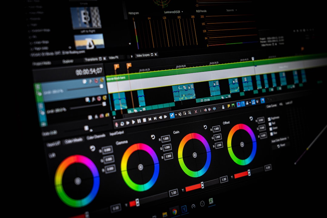
Correct and Grade Color
Color work splits into two jobs that beginners often conflate. Color correction fixes what is wrong, neutralizing a color cast (the orange tint of indoor light, the blue of shade) so whites read white and skin tones look natural. White balance is the primary tool here. Color grading is the creative second step, deliberately pushing the palette toward a mood (warm and golden, cool and clean, muted and filmic) for stylistic effect.
Do correction before grading, always: you cannot judge a creative look on top of an image that is still fighting a color cast. The key controls are white balance (temperature and tint), saturation and the more forgiving vibrance, and HSL (hue, saturation, luminance) adjustments that let you tune individual color ranges, deepening a sky without touching skin, for instance. Restraint matters; oversaturated color is the fastest tell of an inexperienced edit.
Sharpen and Reduce Noise
Two corrective steps round out tonal and color work. Sharpening enhances edge contrast to make a photo look crisper, but it is easy to overdo, producing crunchy halos around edges. Apply it modestly and, crucially, last, after resizing for output, since sharpening interacts with image dimensions. Noise reduction smooths the grainy speckle that appears in photos shot in low light or at high ISO, at the cost of some fine detail, so it is a balance, not a maximize. Both are finishing touches, not headline fixes.
Retouch and Clean Up
Retouching removes distractions and imperfections, a stray hair, a dust spot, a power line cutting across a sky, a blemish on a product. The workhorse tools across editors are the same in concept:
- Healing / Spot Healing — blends a sampled area over a flaw, matching texture and tone automatically.
- Clone / Stamp — copies pixels from one area to another for precise, manual fixes.
- Content-aware fill — analyzes surroundings to fill a removed object intelligently.
- Frequency separation — an advanced portrait technique that smooths tone while preserving skin texture.
The ethic of retouching is restraint and honesty. Cleaning up a dust spot or an unflattering distraction is routine; reshaping bodies or fabricating reality is a different responsibility, and for any editorial or commercial work you should know where that line sits for the brief you are on.
Remove and Replace Backgrounds
Isolating a subject from its background is one of the most common design tasks, for product shots on white, for compositing, for cut-outs in a layout. Modern tools (AI-powered “select subject” features and one-click removers) have made this dramatically faster than the old pen-tool-and-mask grind, though hair and fine edges still reward manual refinement. Because it is such a frequent need, we have a dedicated walkthrough: see our guide on how to remove an image background for the cleanest methods across tools, including handling tricky edges.
Export Correctly for the Destination
An edit is only as good as its export. The right settings depend entirely on where the image is going, and getting this wrong, exporting a print-resolution TIFF for a web banner, or a compressed JPEG for a print job, undoes careful editing. Two decisions govern it: the file format and the compression.
| Destination | Format | Notes |
|---|---|---|
| Web photos | JPEG or WebP | Compressed for fast loading; sRGB color |
| Web graphics / transparency | PNG or WebP | For flat graphics or cut-outs needing transparency |
| TIFF or high-quality PDF | CMYK, no lossy compression, full resolution | |
| Master / archive | PSD / TIFF | Keep layers for future editing |
Choosing among formats is its own topic, and the differences between JPEG, PNG, WebP, and the rest matter more than most designers assume; our image file formats guide breaks down when to use each. For balancing quality against file size on the web specifically, the image compression guide covers lossy versus lossless and how far you can push compression before it shows.
The Editing Workflow, In Order
Put together, a reliable editing sequence looks like this, and following the order prevents redoing work:
- Duplicate the original and work non-destructively.
- Crop and straighten to composition and target ratio.
- Correct exposure and tone using the histogram.
- Correct color casts, then grade for mood.
- Retouch flaws and remove distractions.
- Remove or replace the background if needed.
- Sharpen and reduce noise last, after resizing.
- Export in the correct format and compression for the destination.
Choosing Your Tools
The skills above transfer across software, but you still have to pick something. Adobe Photoshop remains the industry standard for pixel editing and compositing; Lightroom excels at exposure and color across large photo sets; Affinity Photo is a strong one-time-purchase alternative; and free options like GIMP and a range of web editors cover most everyday needs. If you are starting from zero, the most common on-ramp is Photoshop, and our practical Photoshop for beginners guide walks through the interface and the core tools step by step. For free and browser-based choices, see our roundup of the best free photo editors.
Frequently Asked Questions
What are the basics of photo editing?
The basics of photo editing are working non-destructively, cropping and straightening, correcting exposure and tone using the histogram, correcting then grading color, retouching flaws, removing or replacing backgrounds, and exporting in the right format. Following them in that order prevents rework, and the principles carry across Photoshop, Lightroom, Affinity Photo, and free editors.
What is non-destructive editing?
Non-destructive editing means making changes without permanently altering the original pixels, using adjustment layers, layer masks, and smart objects so every edit stays reversible and editable. It is the single most important habit in photo editing because it keeps client revisions easy and protects you from locking in mistakes. Always keep an untouched copy of the original too.
What is the difference between color correction and color grading?
Color correction fixes what is wrong, neutralizing color casts so whites read white and skin tones look natural, primarily using white balance. Color grading is the creative step that follows, deliberately pushing the palette toward a mood like warm, cool, or filmic. Always correct before grading, since you cannot judge a creative look on an image still fighting a color cast.
What software is best for photo editing?
Adobe Photoshop is the standard for pixel editing and compositing, Lightroom excels at color and exposure across many photos, Affinity Photo is a strong one-time-purchase alternative, and GIMP plus various web editors cover most everyday needs for free. The right choice depends on your budget and tasks, but the core editing skills transfer across all of them.
In what order should I edit a photo?
Edit in this order: duplicate the original and work non-destructively, crop and straighten, correct exposure and tone, correct then grade color, retouch flaws, remove or replace the background if needed, then sharpen and reduce noise last after resizing, and finally export in the correct format. Following the sequence avoids redoing work, since later steps depend on earlier ones.


