Poster Design: Composition, Type and Color
Poster design is the discipline of making a single image stop someone from across a room and deliver its message in a few seconds. Unlike a brochure or a web page, a poster gets no second chance and no scrolling, everything important has to land in one glance. This guide breaks poster design into its three load-bearing parts, composition, typography, and color, and finishes with the print details that make or break the final piece.
The throughline is hierarchy. A poster works when the eye knows exactly where to look first, second, and third. Get the hierarchy right and even a simple poster commands attention; get it wrong and a beautifully crafted one becomes visual noise.
Start With One Clear Message
Before any layout, decide the single thing the poster must communicate. A concert poster‘s job might be the band name and date; an event poster‘s might be “what, when, where.” Posters fail when they try to say everything with equal weight, leaving the viewer with nowhere to land.
Rank your content ruthlessly into three tiers: the one element that must be seen from across the room (the hook), the supporting details someone reads once the hook draws them in (the what and when), and the fine print they only need up close (URLs, sponsors, terms). This ranking drives every size and placement decision that follows.
Composition and Visual Hierarchy
Composition is how you arrange elements so the eye travels in the order you intend. A few principles do most of the work:
- Dominant focal point. One element, an image, a huge headline, a bold shape, should clearly win the page and grab attention first. Competing focal points cancel each other out.
- Scale contrast. Make the most important thing dramatically larger than everything else. Timid size differences read as flat; bold ones create instant hierarchy.
- Alignment and a grid. Even expressive posters benefit from an underlying grid. Aligned elements feel intentional; misaligned ones feel like a mistake.
- Whitespace. Empty space is not wasted space. It gives the focal point room to breathe and makes the poster feel confident rather than cluttered.
- Visual flow. Guide the eye from the hook down through the details using size, position, and the natural top-to-bottom, left-to-right reading path.
A reliable test: squint at your poster or shrink it to thumbnail size. If you can still tell what it is about and where to look first, the hierarchy is working. If it turns to mush, the composition needs more contrast.
Typography on Posters
Type carries most of the message on a poster, and it has to read at distance. This changes how you handle it compared with body-heavy design:
- Pick a strong display face for the headline. Posters are one of the few places a bold, characterful display type belongs. A heavy grotesque sans or a striking slab serif can carry an entire poster.
- Limit yourself to two type families. A display face for impact plus a clean, legible face for the supporting details is plenty. More than that fragments the design.
- Size for distance. The headline should be readable from wherever the poster will be seen, across a hallway, down a street. When in doubt, go bigger.
- Mind the spacing. Large headline type usually needs tighter tracking and careful kerning, since gaps that are invisible at body size become glaring when blown up.
- Keep the fine print legible. Even the smallest text must be readable up close. Do not shrink details below comfortable reading size to fit them in.
Color With Impact
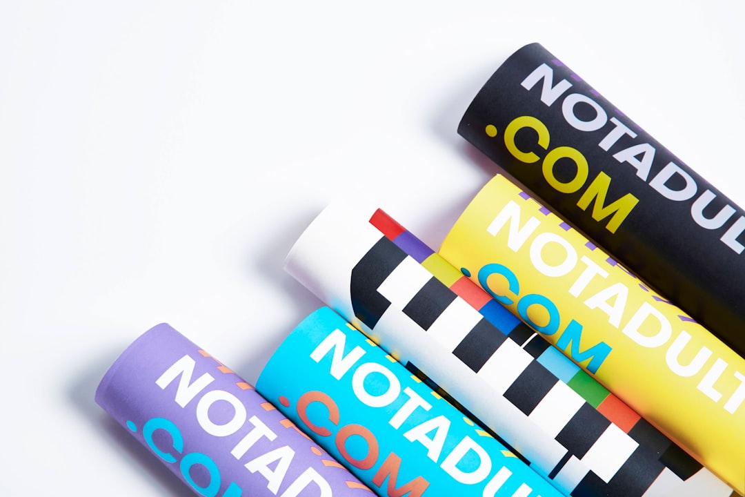
Posters reward bold, confident color because they have to compete for attention in busy environments. Restraint still matters, but the contrast should be punchier than in most other design work:
- Build a tight palette. Two or three strong colors usually outperform a full rainbow. A limited palette reads as deliberate and is easier to make harmonious.
- Lead with high contrast. Strong contrast between the headline and its background is what makes a poster legible from a distance. Dark type on a light field or light type on a saturated field both work.
- Use one accent for the hook. Reserve your boldest color for the single most important element so it leaps off the page.
- Set a mood. Color should match the event or message, warm and saturated for a festival, cool and restrained for a corporate talk. Grounding these choices in color theory basics helps you build palettes that feel intentional rather than accidental.
Remember posters are often viewed in imperfect light, taped to a wall, behind glass, under fluorescent tubes. Generous contrast is insurance against all of it.
Combining Image and Type
Many posters pair a strong image with type, and the relationship between them is where craft shows. The image and text should feel integrated, not stacked.
- Leave room for type when choosing or shooting an image. A busy photo edge to edge gives text nowhere to live legibly.
- Ensure contrast where text sits. If the headline overlaps the image, darken or lighten that area, or add a subtle overlay, so the type stays readable.
- Let one lead. Either the image dominates with type in a supporting role, or bold type leads with imagery as accent. A 50/50 fight between them weakens both.
Sizes, Bleed, and Print Setup
A poster only succeeds if it prints correctly, so set the file up for production from the start:
- Work at the final size and high resolution. Design at the actual dimensions (common sizes include A2, A1, and 18×24 inches) at 300 DPI for print, or build it in vector so it scales cleanly.
- Add bleed. Extend any color or image that runs to the edge about 3mm (1/8 inch) past the trim line, so trimming never leaves a thin white sliver.
- Keep a safe margin. Pull important text and elements in from the edge so nothing critical gets cut off.
- Use CMYK for print. Design and export in CMYK so on-screen RGB colors do not shift unexpectedly on paper. Order a proof for large runs.
- Export print-ready PDF. A press-ready PDF with bleed and embedded fonts is the standard handoff to a printer.
These production fundamentals apply to most printed pieces, not just posters. For a deeper treatment of resolution, color modes, bleed, and prepress, see our broader print design guide, which covers the technical setup that keeps a great design from falling apart at the printer.
Frequently Asked Questions
What makes a good poster design?
A clear visual hierarchy with one dominant focal point, a single main message, bold typography readable from a distance, a tight high-contrast color palette, and clean composition with generous whitespace. The test is whether a viewer can grasp the point and know where to look first within a few seconds from across a room.
What size should a poster be?
Common poster sizes include A2 and A1 in the metric system and 18×24 or 24×36 inches in the US. Design at the final size at 300 DPI for print, or build in vector so it scales cleanly. Always add about 3mm of bleed and keep important elements inside a safe margin.
How many fonts should a poster use?
Two type families are usually ideal: a bold display face for the headline to create impact and a clean, legible face for supporting details. Limiting yourself to two keeps the design cohesive, while more than two tends to fragment the hierarchy and weaken the overall effect.
Should posters be designed in RGB or CMYK?
Design and export printed posters in CMYK, since that is how presses reproduce color, and working in CMYK prevents the color shifts that happen when bright RGB screen colors are converted for print. For large runs, order a physical proof to confirm the colors before printing the full batch.


