Product Label Design: Tips and Best Practices
A label has a brutal job: communicate a brand, a product, and a legal panel on a surface that curves, gets wet, and competes with twenty rivals at arm’s length. Strong product label design treats those constraints as the brief, not as obstacles to wish away. This guide covers the practical decisions that decide whether a label looks considered on the shelf or peels at the corner in a customer’s fridge, from hierarchy and type through material, adhesive, dieline, and print.
Labels sit inside the wider packaging system, so before you design one in isolation, it helps to understand how it fits the whole journey. Our packaging design process guide maps that end to end; this article zooms into the label itself.
Start With the Container, Not the Artwork
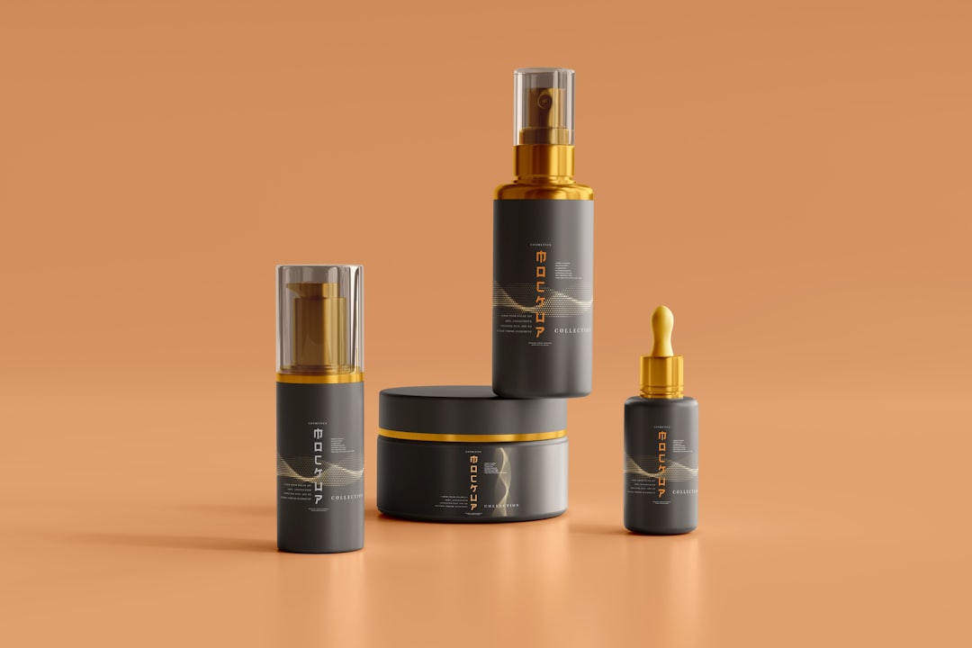
The container dictates the label. A cylindrical bottle curves, so anything near the edges distorts and the back of the label is never seen straight-on. A squeezable pouch flexes, which rules out brittle finishes that crack. A jar has a small wraparound band and almost no flat face. Measure the real container, mock up the label flat and wrapped, and you will avoid the classic error of designing a perfect rectangle that warps the moment it meets glass.
Decide label type early too. A single wrap-around label, a front-and-back pair, or a front, back, and neck band each change how you split content and where the brand lands. The label format is a structural decision, the same way carton style is for a box, covered in our box packaging design guide.
Nail the Visual Hierarchy
Shoppers read a label in roughly this order, fast: what is it, whose is it, why should I care. Your hierarchy should match. The product name or category usually deserves the most weight, the brand mark sits close behind, and a single supporting line (the flavor, scent, variant, or key claim) does the rest. Everything else, ingredients, directions, net weight, recedes to the back or a side panel.
- Primary: product name or category, readable from a meter away.
- Secondary: brand mark and the one differentiating claim or variant.
- Tertiary: net quantity, simple descriptor, certifications.
- Mandatory/back: ingredients, warnings, barcode, manufacturer details.
The most common label failure is treating every element as equally important, which makes all of them equally ignorable. Pick what wins, and let the rest support it.
Typography and Color on a Small, Curved Surface
Type on a label has to work small and often curved, so favor typefaces with a generous x-height and open letterforms that hold up at six or seven points for the legal panel. Reserve display or script faces for the brand name where size and spacing let them breathe. Keep the mandatory information in a clean, plain face; legibility there is frequently a legal requirement, not a style choice.
Color needs the same shelf-distance test as any pack, plus one label-specific trap: many labels print on clear or metallic films, where the substrate shows through unless you lay down a white ink base first. A color that looks rich on a printed mockup can turn translucent on clear film without that white layer. Specify it deliberately.
Material and Adhesive: The Decisions Customers Feel
Material is where labels are won or lost after purchase. The big split is paper versus film. Paper (often with a matte or textured finish) reads natural and craft-forward but absorbs moisture and scuffs; it suits dry goods and premium spirits with a heavier textured stock. Film (BOPP, polypropylene) is waterproof, scuff-resistant, and essential for anything chilled, frozen, or bath-and-body. Choosing paper for a shower product is a returns-and-reviews problem waiting to happen.
Adhesive matters just as much and is easy to forget. Permanent adhesive is the default; removable suits reusable containers; freezer-grade or wet-strength adhesive is non-negotiable for refrigerated and condensation-prone products. Tell your converter the full environment, surface material, temperature, moisture, and whether the container gets handled with wet hands, and let them spec the adhesive for it.
| Use case | Material | Adhesive |
|---|---|---|
| Dry goods, premium spirits | Textured/matte paper | Permanent |
| Beverages, chilled products | BOPP film | Wet-strength / freezer-grade |
| Bath, body, cosmetics | Clear or white film | Permanent, waterproof |
| Reusable containers | Paper or film | Removable |
Build to a Proper Dieline
Labels need a dieline just like cartons do, defining the cut shape, the bleed, and the safe margin that keeps text from being trimmed off or distorting around the curve. Pressure-sensitive labels also have a repeat and a web layout your printer specifies. Designing to a guessed rectangle and hoping the printer sorts it out is how you get text crowding the die edge. Our full walkthrough on packaging dielines covers cut versus safe zones and how to set up the file so it survives prepress.
Front and Back: Splitting the Content
Most labels divide labor between a front (or principal) panel and a back panel, and getting that split right keeps the front clean. The front carries the brand, the product name, and the single differentiating claim, the elements that sell from a distance. The back absorbs the dense, necessary content: ingredients or composition, directions for use, warnings, the barcode, and manufacturer details. Resist the temptation to pull back-panel information forward to look “complete”; a crowded front loses the glance-test battle on the shelf, and the customer who wants detail will turn the product over.
On a wrap-around label there is no true back, so plan the content flow around the cylinder instead: lead with the brand face, let the eye travel to supporting detail as the container turns, and place the barcode where it will not collide with the seam or distort on the curve. The barcode deserves specific care, it needs adequate quiet zones, sufficient contrast, and a flat-enough area to scan reliably, and a barcode that will not scan at the till is a problem no amount of visual polish fixes.
Print, Finish, and Proof
Most labels print digitally for short and medium runs or via flexography at high volume. Digital needs no plates and handles variants and short runs economically; flexo wins on per-unit cost once quantities climb. Finishing options, spot UV, foil, embossing, soft-touch laminate, work on labels much as they do on boxes and can lift a plain bottle into premium territory with a single restrained accent.
Whatever you choose, get a physical proof on the actual material and, ideally, apply it to the real container before approving the run. A label that looks right flat on a desk can read completely differently wrapped around glass under store lighting. Proof on the substrate, on the container, every time.
Frequently Asked Questions
What makes a good product label design?
A good product label has a clear hierarchy (product name, brand, then one differentiating claim), type that stays legible small and curved, a material and adhesive matched to the product’s real environment, and a clean legal panel. It is designed to the container’s actual shape and proofed on the real material before printing.
What is the best material for product labels?
Use textured or matte paper for dry goods and premium spirits where a natural, craft feel matters, and BOPP film for anything wet, chilled, frozen, or bath-and-body, because film is waterproof and scuff-resistant. The container’s environment, not appearance alone, should drive the choice, since the wrong material peels or scuffs after purchase.
Do product labels need a dieline?
Yes. A label dieline defines the cut shape, bleed, and safe margins, and for pressure-sensitive labels it also sets the repeat and web layout. Designing without one risks text being trimmed off or distorting around a curved container. Always request the dieline and print specs from your label converter before building the artwork.
How do I keep label text legible on a curved bottle?
Keep important text toward the center of the label where curvature is least, use a typeface with a generous x-height and open letterforms, and avoid placing critical words near the edges where they distort and fall out of view. Mock the label up wrapped on the actual container before finalizing to catch distortion early.


