Proximity in Design Explained
Proximity in design is the principle that elements placed near each other are perceived as related, and elements set apart are perceived as separate. It is the most economical tool a designer has for creating structure: you organize an entire layout using nothing but space, by deciding what sits close and what sits apart. The viewer does the rest automatically.
Proximity is one of the core principles of design, and it draws directly on how human perception works. This article covers what proximity is, the Gestalt research behind it, how it reduces clutter, how it pairs with white space, and the spacing mistakes that confuse a layout.
What is proximity in design?
Proximity is the use of distance to signal relationship. When you group a heading, an image, and a caption tightly together, the viewer reads them as one unit. When you push the next group away with extra space, the gap announces that a new, separate idea has begun. No borders, no background colors, no dividing lines are required — the spacing alone carries the meaning.
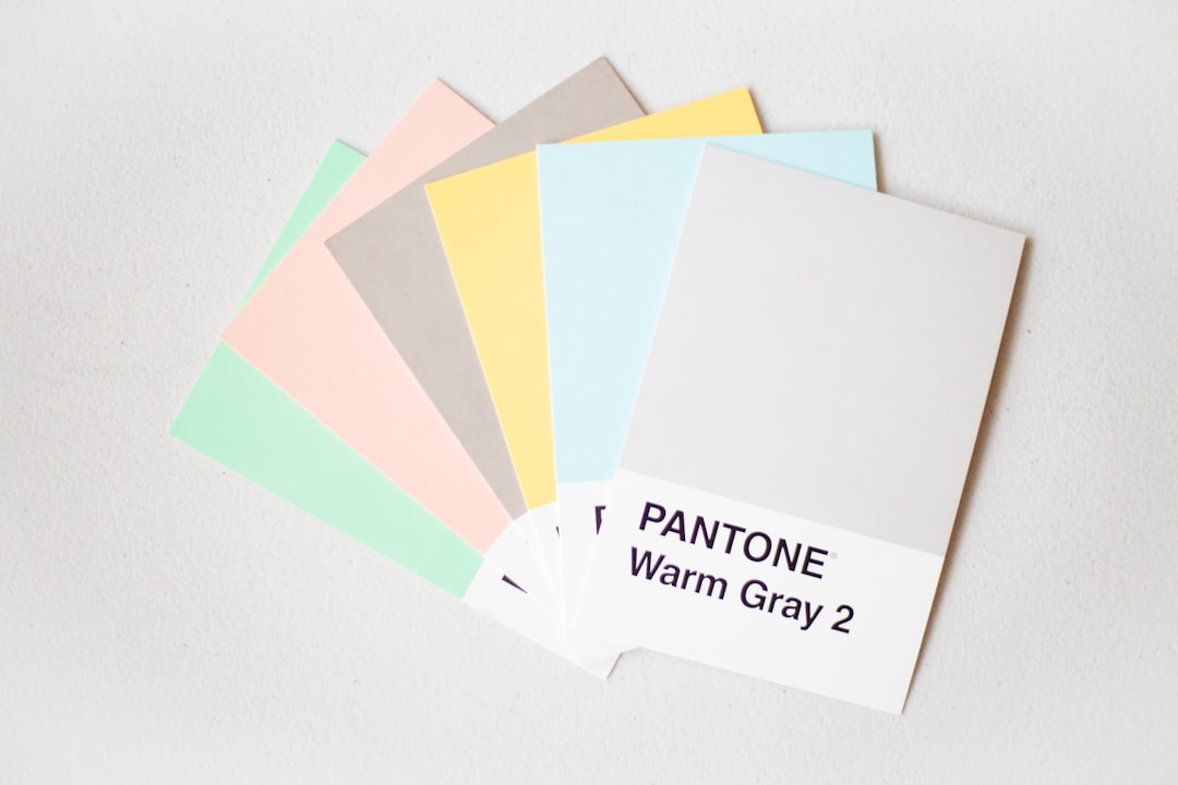
This is why proximity is so efficient. A contact card with the name, title, phone, and email clustered together reads as one block of information instantly. Spread those same four lines evenly down a page and the relationship dissolves; the viewer can no longer tell that they form a single set.
Why is proximity a Gestalt principle?
Proximity comes from Gestalt psychology, an early-twentieth-century body of research into how the human mind organizes what it sees. The Gestalt principles describe the brain’s habit of grouping visual information into wholes rather than reading every element in isolation, and the law of proximity is one of the most reliable among them.
The law of proximity states that objects near one another are perceived as a group. The brain does this pre-attentively — before conscious thought — which is why proximity works so dependably across cultures and contexts. As a designer, you are not persuading the viewer to see groups; you are supplying a pattern their perception will organize automatically. Proximity often works alongside alignment in design, which strengthens grouping further by giving the clustered items a shared edge.
How does proximity reduce clutter?
Clutter is rarely caused by having too many elements. It is usually caused by elements that are evenly spaced, so the eye can’t tell which ones belong together. When everything is equidistant, the viewer has to read each item individually and work out the relationships, which feels overwhelming even when the content is simple.
Proximity solves this by chunking. Group related items, separate the groups, and a page of forty elements suddenly reads as five clean clusters. The amount of content hasn’t changed — only the spacing — but the cognitive load drops sharply. This is the core move behind clean forms, readable menus, and scannable layouts everywhere.
| Spacing approach | What the viewer perceives | Result |
|---|---|---|
| Even spacing everywhere | No clear groups | Cluttered, hard to scan |
| Tight within groups, loose between | Distinct, related clusters | Organized, easy to scan |
| Random spacing | Accidental, false relationships | Confusing, misleading |
How does proximity work with white space?
Proximity and white space in design are two sides of the same coin. The space you remove between related items pulls them together; the space you add between groups pushes them apart. You are always managing both at once — tightening here, opening up there — and the contrast between the two distances is what makes grouping legible.
The practical rule is that the gap between groups should be clearly larger than the gap within a group. If a heading sits as far from its own paragraph as it does from the next section, the structure collapses. Keep a label close to the field it describes and well away from the next field, and the relationship becomes obvious without any other cue.
Where proximity shows up in real work
Proximity does quiet, heavy lifting across almost every kind of design. In a web form, each label must sit close to its own field and clearly apart from the next, or users guess which label belongs to which input and make errors. In a navigation menu, grouping links by category with extra space between groups turns a long list into a few scannable sections. In editorial layout, a photo, its caption, and its credit cluster tightly so they read as one unit, distinct from the surrounding body text.
The same logic governs business cards, infographics, and dashboards. On a card, the name and title group together while contact details form a second cluster. In an infographic, related statistics sit close so the viewer reads them as a set rather than as scattered numbers. On a dashboard, controls that act on the same data are grouped so users find them as a unit. In every case the designer is doing nothing more exotic than deciding what sits close and what sits apart — and letting perception supply the structure.
Common proximity mistakes
- Even spacing throughout. Equal gaps everywhere erase all grouping. Vary the distance to signal relationships.
- Headings closer to the wrong content. A subhead floating midway between two sections attaches to the wrong one. Bind it tightly to the content it introduces.
- Over-grouping. Cramming unrelated items together implies a relationship that doesn’t exist, which misleads the viewer.
- Insufficient separation. Groups that are only slightly farther apart than their internal spacing don’t read as distinct. Make the between-group gap clearly bigger.
- Relying on lines instead of space. Reaching for borders and dividers when proximity alone would organize the content cleaner and quieter.
A quick workflow for using proximity
Start by mapping which elements genuinely belong together — a label and its input, a headline and its deck, an image and its caption. Pull each set tight so the relationship is unmistakable. Then add clearly larger gaps between the sets, making sure every between-group space is visibly bigger than any within-group space. Finally, squint at the result: you should see a handful of distinct clusters rather than an even field of items. If the groups don’t pop, increase the separation before adding any lines or boxes — space almost always does the job better.
Frequently Asked Questions
What is proximity in design?
Proximity in design is placing related elements close together and unrelated ones farther apart, so viewers instantly perceive what belongs with what. It organizes a layout using distance alone, with no lines or boxes needed. Strong proximity reduces clutter and makes content far easier to scan and understand.
Why is proximity a Gestalt principle?
Proximity comes from Gestalt psychology, which studies how the mind groups visual information into wholes. The Gestalt law of proximity states that objects near one another are perceived as a group, and the brain does this automatically before conscious thought. Designers rely on it because the grouping happens without any effort from the viewer.
How does proximity reduce clutter?
Clutter usually comes from evenly spaced elements that give no clue about what belongs together. Proximity chunks content into groups, so a page of many items reads as a few clean clusters. The amount of content stays the same, but grouping it with space sharply lowers the effort needed to read it.
What is the difference between proximity and alignment?
Proximity uses distance to group related elements, while alignment lines up edges to create order and connection. They often work together: items in a group are placed close and also share an alignment line. Proximity tells the viewer what belongs together; alignment makes that grouping look tidy and deliberate.