Quote Graphics: How to Make Quote Images
Quote graphics are one of the highest-return graphics you can make: a single strong sentence, set in clean type, becomes a shareable image that spreads your ideas and your brand across social feeds. They’re cheap to produce, endlessly reusable, and they punch above their weight because people share words that resonate. This guide shows you exactly how to make quote images that get saved and shared — the type rules, the right sizes, the tools, and a fast workflow.
Quote graphics are one slice of a complete content system; see our complete guide to blog graphics for how they fit alongside featured images and pins.
What Makes a Quote Graphic Work
Because a quote graphic is almost entirely typography, its success rides on legibility and restraint. The best ones share four traits.
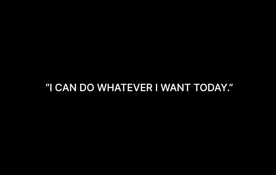
- High contrast. Dark text on a light background or light text over a darkened image. If it’s hard to read at a glance, it won’t get shared.
- Big type. The quote should dominate the frame and read clearly at thumbnail size.
- Short copy. One punchy sentence beats a paragraph. If the quote runs long, trim it to its sharpest line.
- Brand consistency. The same fonts, colors, and logo placement across every quote makes the graphic instantly recognizable as yours.
Quote Graphic Sizes
Match the size to where the graphic will be shared. A square works almost everywhere, but tall and vertical formats earn more space on the platforms that favor them.
| Format | Dimensions (px) | Aspect ratio | Best for |
|---|---|---|---|
| Square | 1080 × 1080 | 1:1 | Instagram, Facebook, LinkedIn — the safe default |
| Vertical story | 1080 × 1920 | 9:16 | Instagram and Facebook Stories, Reels covers |
| Pinterest pin | 1000 × 1500 | 2:3 | Driving traffic from Pinterest |
| Landscape | 1200 × 630 | 1.91:1 | Twitter/X, link cards, blog embeds |
Export everything in RGB. If you only make one, make the 1080×1080 square — it displays cleanly in the most places.
Typography: The Whole Game
A quote graphic is a typography exercise, so type choices carry the design. This is where a quote image either looks considered or looks like a default template.
- Choose two fonts at most. A characterful display or serif for the quote itself, and a quiet sans for the attribution. Our font pairing guide is built for exactly this kind of pairing.
- Set generous size and line height. Let the quote breathe; cramped text reads as cheap.
- Use emphasis sparingly. Bolding or coloring one key word can guide the eye, but don’t decorate every line.
- Attribute clearly. Put the speaker’s name in smaller type below the quote, and never misattribute — citing the wrong source is an easy way to lose credibility.
Layout Patterns for Quotes
You can cover almost every quote with a handful of layouts. Build each as a template once.
- Solid background. A brand color or simple gradient behind centered text — the cleanest, most legible option.
- Photo overlay. A relevant image with a dark scrim and the quote on top. Great when the visual adds context.
- Quotation-mark accent. An oversized, low-opacity quote mark behind the text adds character without clutter.
- Split frame. Color block for the quote, a thin band for the attribution and your handle.
Where to Source Quotes
The best quote graphics often come from your own content. Pull the sharpest sentence from each article you publish — you already wrote it, and it’s on-brand by definition. Beyond that, you can use lines from interviews you’ve conducted, testimonials from customers (with permission), or genuinely public-domain quotations. Always verify attribution before publishing; spreading a misattributed quote undermines trust faster than a typo.
Tools for Making Quote Graphics
Quote graphics are template-friendly, so favor tools that let you reuse layouts.
- Canva — fastest for non-designers, with square presets and brand kits.
- Adobe Express — quick branded quotes with good type controls.
- Figma — ideal for a reusable quote-template component you fill in repeatedly.
- Photoshop — for photo-overlay quotes needing precise editing.
A Step-by-Step Quote Graphic Workflow
- Pull one strong sentence from your article and trim it to its sharpest form.
- Open your quote template (start with the 1080×1080 square).
- Set the quote in your display font, big, with generous line height.
- Add the attribution in your supporting sans below.
- Place your logo or handle subtly in a corner for brand recognition.
- Export as WebP or PNG in RGB, then resize to other formats from the same design.
Optimizing and Repurposing
Keep file sizes light by exporting as WebP where supported, and add descriptive alt text that includes the quote text so screen readers and search engines can read it. The real efficiency win is repurposing: design once at square, then resize the same quote to a vertical story and a 2:3 pin to cover multiple platforms from one idea. To extend the same brand system, pair this with our guides to Pinterest pin design and featured image design.
Color and Contrast Choices
Color does two jobs on a quote graphic: it sets the mood and it guarantees legibility. Get the contrast wrong and even a brilliant line goes unread in a fast-scrolling feed.
- Start from your brand palette. Two or three colors used consistently make every quote instantly recognizable as yours.
- Prioritize contrast over prettiness. A dark quote on a light background, or white text on a deep brand color, almost always reads better than a low-contrast pastel-on-pastel combination.
- Tame busy backgrounds. Over a photo, add a semi-transparent dark or brand-colored scrim so the type never competes with the image behind it.
- Use accent color with intent. Coloring a single pivotal word can guide the eye, but coloring everything cancels the effect.
Building a Quote Series
The real payoff of quote graphics comes from treating them as a recurring format rather than a one-off. A consistent series — same template, same fonts, same color rules, posted regularly — becomes a recognizable part of your brand that audiences come to expect. It also turns content you’ve already written into a steady stream of social posts with almost no extra production cost.
Set up a simple pipeline: each time you publish an article, pull two or three quotable lines into your quote template before you move on. Keep a running bank of finished quote graphics so you always have shareable material ready to schedule. Because they’re built on the same template, a batch of ten quotes can be produced in well under an hour, and the visual consistency makes the whole series feel intentional.
A quote series also doubles as a low-pressure testing ground for your typography. Because the format is so type-driven, you’ll quickly learn which display fonts and pairings read best at small sizes — knowledge that carries straight over to your other graphics.
Frequently Asked Questions
How do I make a quote graphic?
Pull one strong sentence from your content and trim it, open a square (1080×1080) template, set the quote in a large display font with generous line height, add the attribution in a quiet sans, place your logo subtly, and export as WebP or PNG in RGB. Then resize for other platforms.
What size should a quote graphic be?
A 1080×1080px square (1:1) is the safest default and displays cleanly almost everywhere. Use 1080×1920 (9:16) for stories, 1000×1500 (2:3) for Pinterest, and 1200×630 (1.91:1) for Twitter/X and blog embeds. Export all formats in RGB.
What fonts work best for quote graphics?
Use two fonts at most: a characterful display or serif for the quote and a quiet sans for the attribution. Choose a display face that stays legible at large sizes and pairs cleanly with your brand sans. Set generous size and line height so the quote breathes rather than feeling cramped.
How do I make quote graphics readable?
Prioritize high contrast (dark text on light or light text over a darkened image), use big type that reads at thumbnail size, and keep copy short — one punchy sentence. Add subtle emphasis to a single key word at most, and avoid busy backgrounds that compete with the text.
Where can I get quotes to use?
The best source is your own content — pull the sharpest sentence from each article you publish. You can also use lines from your interviews, customer testimonials (with permission), or genuinely public-domain quotations. Always verify attribution before publishing, since a misattributed quote quickly damages credibility.


