Rose Quartz vs Pink: What’s the Difference?
The rose quartz vs pink question is a category-versus-member comparison: rose quartz is a particular soft pink, while pink is the whole hue family. Rose quartz is a pale, gently muted pink tied to the quartz gemstone and famous as a 2016 Pantone Color of the Year. Pure pink is simply a light tint of red. Side by side, rose quartz looks softer and slightly grayer, while pink looks cleaner and a touch brighter.
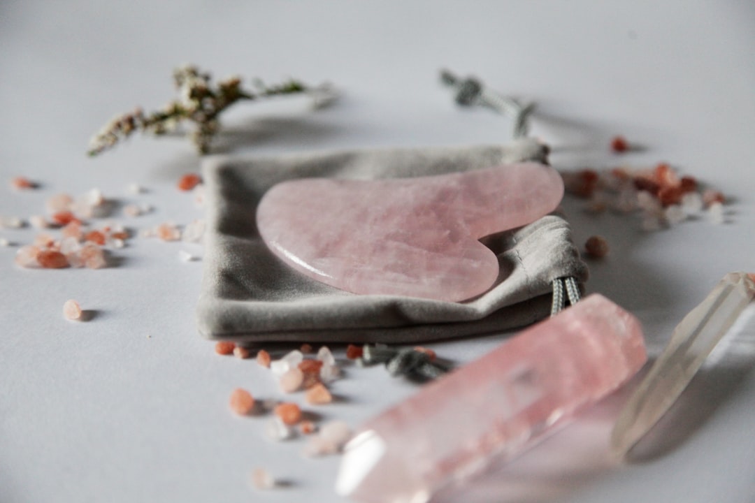
What is rose quartz?
Rose quartz is a pale, soft pink named after the rose quartz gemstone, with a gently muted, slightly warm character. A widely cited value is #F7CAC9, the tone Pantone popularized as one of its 2016 Colors of the Year (paired with Serenity blue). The defining quality is its delicate, dusty softness — it reads calm, romantic, and understated rather than sweet or loud. That gentle warmth pairs naturally with gray, cream, gold, sage, and soft blue.
If you are weighing rose quartz against other soft pinks, our comparisons of blush vs pink and rose vs pink cover the lightness and undertone distinctions in detail.
What is pink?
Pink is not a spectral hue but a light tint of red — red mixed with white. The HTML/CSS keyword “pink” is #FFC0CB, a clean, light pink with a slight warm lean. As a hue family, “pink” spans everything from pale baby pink and blush to bubblegum, coral-pink, and hot magenta; rose quartz is one soft, slightly muted point within it. Pure pink is the reference tint, which is why we describe other pinks as “dustier,” “brighter,” “warmer,” or “deeper” relative to it.
The defining contrast: rose quartz is one specific, gently muted soft pink, while pink is the entire hue category. For the associations behind the family, our pink color meaning guide explains how pinks signal softness, warmth, and romance.
What’s the difference between rose quartz and pink?
The defining differences are scope and saturation. Rose quartz is a narrow, pale, slightly grayed shade; pure pink is the broad, cleaner parent tint. Rose quartz reads dusty and refined; pure pink reads fresh and sweet. Here is a side-by-side with representative values — neither is a fixed brand standard, so exact hexes vary.
| Property | Rose Quartz | Pink |
|---|---|---|
| Hex code | #F7CAC9 | #FFC0CB |
| RGB | 247, 202, 201 | 255, 192, 203 |
| CMYK | 0, 18, 19, 3 | 0, 25, 20, 0 |
| Undertone | Soft, slightly muted/dusty warm | Clean, light warm tint |
| Hue family | Pink (soft jewel/dusty tone) | Pink (the parent tint) |
| Best used for | Romantic/refined branding, weddings, soft palettes | Playful branding, baby products, sweet accents |
| Mood/feel | Calm, romantic, refined, understated | Soft, sweet, friendly, gentle |
When should you use each?
Use rose quartz when you want softness with sophistication — a dusty, refined pink that feels grown-up and romantic. Its muted character suits wedding and beauty branding, calm wellness palettes, premium packaging, and editorial designs where the pink should whisper. Rose quartz pairs elegantly with gray, cream, gold, sage, and soft blue.
Use pure pink when you want a clean, friendly, slightly sweeter tint. Its freshness suits playful and youthful branding, baby and gift products, and approachable accents where the pink should feel warm and cheerful rather than dusty. Pure pink pairs happily with white, mint, light blue, and bright accents.
To tell them apart in practice, check saturation and dustiness. Rose quartz is slightly grayer and more muted; pure pink is cleaner and a touch brighter. Both are warm-leaning, but if you are pairing them with cool tones, our guide to warm vs cool colors explains how to balance a pink palette.
How are rose quartz and pink used across design?
In branding, rose quartz signals calm, refinement, and modern romance — it appears in beauty, wellness, and lifestyle brands that want a soft, premium identity. Pure pink signals friendliness, sweetness, and approachability, favored by playful, youthful, and gift-oriented brands. The choice maps onto whether a brand wants to read refined-romantic or sweet-playful, a distinction explored in our color psychology guide.
In fashion and weddings, rose quartz is a sophisticated, dusty pink for elegant gowns, bridesmaid palettes, and minimal styling. Pure pink is a brighter, sweeter tone for casual and youthful pieces. Both are soft pinks, but rose quartz reads understated while pure pink reads cheerful.
In interiors and web design, rose quartz works beautifully as a calming wall color or large UI area because its muted softness is easy to live with. Pure pink is slightly brighter and reads younger, so it suits accents and playful sections. Print behavior differs subtly: both are pale tints that can lose definition on uncoated stock, so rose quartz’s dusty character may need a touch more pigment to register as intended.
Do rose quartz and pink go together?
Yes — because rose quartz is a member of the pink family, the two layer naturally in a soft, tonal scheme. Pure pink adds a slightly brighter, fresher highlight while rose quartz grounds it with dusty calm, creating gentle depth without clashing. Add gray, cream, or gold to refine the combination, and keep a clear hierarchy: use rose quartz for broad areas and pure pink for sweeter accents. See our rose vs pink comparison for a related pink pairing.
Frequently Asked Questions
Is rose quartz the same as pink?
No. Rose quartz is a specific pale, slightly muted pink (around #F7CAC9, a 2016 Pantone Color of the Year), while “pink” is the broad hue family and its pure reference tint (around #FFC0CB). Rose quartz is always pink, but most pinks are not rose quartz. The difference is scope: rose quartz is one dusty, refined member of the larger pink category.
Is rose quartz warm or cool?
Rose quartz is a warm-leaning pink, though its gentle, slightly grayed character softens that warmth into something balanced and calm. Pure pink is also warm-leaning but cleaner and a touch brighter. In comparison, rose quartz reads dustier and more muted, while pure pink reads fresher and sweeter.
What is the hex code for rose quartz?
A commonly cited value is #F7CAC9, the soft pink Pantone named one of its 2016 Colors of the Year alongside Serenity blue. Rose quartz is not a single fixed standard, so brand and paint versions vary slightly. The CSS keyword “pink” is the separate, cleaner #FFC0CB. Always confirm against brand guidelines for production.
Which is better for a calming, refined look?
Rose quartz is better for a calm, refined look because its dusty, muted softness reads sophisticated and grown-up. Pure pink is fresher and sweeter, which suits playful or youthful contexts. For weddings, beauty, and premium wellness palettes, rose quartz’s understated character is usually the stronger choice.
Do rose quartz and pink go together?
Yes, very well. Because rose quartz belongs to the pink family, the two form a natural tonal pairing. Pure pink adds a brighter highlight while rose quartz grounds it with dusty calm. The combination reads soft and cohesive; refine it with gray, cream, or gold and keep a clear hierarchy between the two pinks.


