Serif vs Sans Serif: When to Use Each (Complete Guide)
The serif vs sans serif debate is one of the most searched and most misunderstood topics in typography. Should your body text be a serif font? Is sans serif better for screens? Does serif make a brand look old-fashioned? These are questions every designer faces, and the answers are more nuanced than the simple rules of thumb that circulate online. This complete guide breaks down the real differences between serif and sans-serif typefaces — their origins, their anatomy, what research actually says about readability, the psychological associations each carries, and a practical decision framework for choosing between them in any project.
Serif vs Sans Serif: The Fundamental Difference
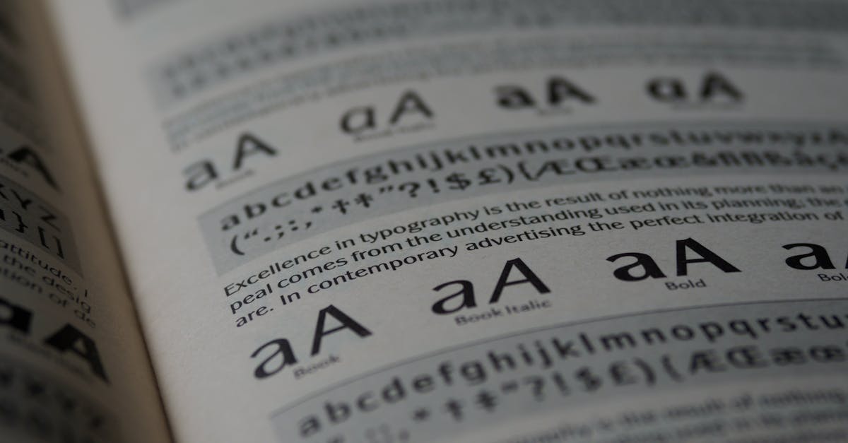
The distinction is structural and simple. A serif typeface has small strokes, projections, or finishing details at the ends of the main strokes of its letters. These small features are called serifs. Look at the bottom of a capital T in Times New Roman — those small horizontal feet extending left and right from the base of the vertical stem are serifs.
A sans-serif typeface lacks these features. The term “sans serif” comes from the French sans, meaning “without.” In a sans-serif face like Helvetica or Arial, the strokes of a capital T end cleanly, with no additional projections. The stems and strokes terminate without ornamentation.
But within these two broad categories lies enormous variation. Serifs can be hairline-thin (as in Bodoni), thick and slab-like (as in Rockwell), gently bracketed (as in Garamond), or wedge-shaped (as in Meridien). Sans-serif typefaces can be rigidly geometric (Futura), humanist and warm (Gill Sans), or neutrally grotesque (Helvetica). Saying “I’ll use a serif font” is like saying “I’ll paint the room a warm color” — you have narrowed the field, but you still have thousands of choices that will produce wildly different results.
A Brief History: Where Serif and Sans-Serif Type Came From
The Ancient Origins of Serifs
Serif letterforms predate typography by more than a thousand years. The capital letters inscribed on Roman monuments — most famously the base of Trajan’s Column in Rome (113 AD) — feature elegant, flared terminals at the ends of strokes. There are several theories about why Roman stonemasons added these features. One proposes that serifs result naturally from the brush strokes used to paint letterforms onto stone before carving. Another suggests they were added to create clean, finished endings where chisel cuts met the stone surface. A third theory holds that serifs improve the legibility of inscriptions read from below and at a distance.
Whatever their origin, serifs became an intrinsic feature of the Roman capital alphabet, and when printing arrived in the fifteenth century, the earliest typefaces naturally incorporated them. From Gutenberg’s blackletter through Jenson’s roman type and on through Garamond, Caslon, Baskerville, Bodoni, and their countless descendants, serif typefaces dominated Western typography for four centuries. [LINK: /what-is-typography/]
The Emergence of Sans Serif (1816)
The first documented sans-serif typeface appeared in a type specimen catalogue published by the London foundry of William Caslon IV in 1816. It consisted only of capital letters and was labeled “Two Lines English Egyptian” — though the connection to Egypt was more about the era’s fascination with Egyptian aesthetics following Napoleon’s campaigns than any genuine Egyptian influence.
The design was considered ugly and eccentric. Early sans-serifs were called “grotesque” — literally meaning “ugly” or “cave-like” — and the name stuck as a classification term that persists to this day. Vincent Figgins issued a sans-serif labeled “sans-surryphs” around the same time. For decades, sans-serif type was considered suitable only for advertising and display work — too crude and artless for body text.
It took over a century for sans-serif typefaces to gain serious typographic respectability. Edward Johnston’s typeface for the London Underground (1916) demonstrated that sans-serif could work as a functional, everyday lettering system. Paul Renner’s Futura (1927), inspired by Bauhaus geometric principles, proved that sans-serif could be beautiful and systematic. And the Swiss/International Typographic Style of the 1950s and 1960s, championed by designers like Josef Muller-Brockmann, elevated the sans-serif — particularly Helvetica (1957) and Univers (1957) — to the dominant voice of modern corporate communication.
The Serif vs Sans Serif Readability Debate
No topic in typography generates more confident assertions and less actual consensus than the readability of serif vs sans serif typefaces. Let us examine what research actually shows — and what it does not.
The Traditional Claim: “Serifs Are Better for Print”
For decades, typographic convention held that serif typefaces are easier to read in body text, particularly in print. The commonly cited mechanism is that serifs create a visual “rail” along the baseline that guides the eye horizontally across lines of text. This hypothesis seems intuitive and is repeated in countless design textbooks, blog posts, and university courses.
The evidence, however, is far from definitive. A widely cited 2002 meta-analysis by Alex Poole (“Which Are More Legible: Serif or Sans Serif Typefaces?”) reviewed over fifty studies on the topic and concluded that the research is “far too inconclusive to make any definitive claims” about the superiority of either category. Many studies found no significant difference. Those that did find differences often failed to control for confounding variables — they compared a specific serif font to a specific sans-serif font, and the observed differences could be attributed to x-height, weight, stroke contrast, spacing, or any number of factors other than the presence or absence of serifs.
The Digital-Era Claim: “Sans Serif Is Better for Screens”
When the web emerged in the 1990s, a new rule quickly formed: sans-serif fonts are better for screens because the low resolution of early monitors could not render the fine details of serifs without awkward pixel artifacts. This was genuinely true for 72-96 DPI CRT monitors displaying text at 10-14px — the thin strokes and small serifs of faces like Times New Roman became blurry, uneven blobs of pixels.
But this rule has not been technically valid for years. Modern screens range from 110 DPI (a standard desktop monitor) to over 400 DPI (a smartphone), with Retina and equivalent displays rendering text at effective resolutions comparable to laser printing. At these resolutions, serif typefaces render as beautifully on screen as they do on paper. Georgia, designed specifically for screen use, proved as early as 1996 that a well-crafted serif could be highly readable on low-resolution monitors — its large x-height, sturdy serifs, and generous spacing were optimized for the pixel grid.
Today, some of the most readable screen type is set in serif faces. Apple uses New York (a serif) alongside San Francisco (a sans-serif) in its system fonts. Medium.com built its reputation on a comfortable serif reading experience. The idea that “sans-serif is better for screens” is a holdover from a technological era that no longer exists.
What Actually Determines Readability
If the presence or absence of serifs is not the decisive factor, what is? Research and professional practice point to several variables that matter far more:
X-height: Typefaces with a larger x-height (the height of lowercase letters like x, a, e, o) appear larger and are more legible at small sizes. Verdana (sans-serif) and Georgia (serif) are both highly readable largely because of their generous x-heights. [LINK: /what-is-typography/]
Counter openness: Open counters — the spaces inside and around letters like c, e, a, s — help the eye distinguish letterforms. Typefaces designed for readability (whether serif or sans-serif) tend to have large, open counters.
Stroke contrast: Extreme contrast between thick and thin strokes (as in Bodoni or Didot) can reduce readability at small sizes because the thin strokes disappear. Moderate, consistent stroke weight aids legibility.
Spacing: Generous, even spacing between letters and words, and appropriate line-height relative to line length, affects readability far more than serif presence. A tightly tracked sans-serif is harder to read than a well-spaced serif.
Familiarity: Readers are fastest and most comfortable with letter shapes they have encountered frequently. This is why “readability” studies tend to favor whatever style was dominant in the reader’s culture — serif in populations raised on printed books, sans-serif in populations raised on digital interfaces.
The honest conclusion: both serif and sans-serif typefaces can be highly readable or poorly readable. The choice between them should be based on context, audience, tone, and the specific typeface under consideration — not on categorical claims about readability.
Psychological Associations: Serif vs Sans Serif Impressions
While the readability differences are minimal, the psychological associations of serif and sans-serif typefaces are real, documented, and practically significant. Research in typeface perception consistently shows that people attribute different qualities to text based on its typographic style — often without being consciously aware of the influence.
Serif Font Associations
Serif typefaces tend to evoke:
- Tradition and heritage: Serifs’ centuries-long history connects them to institutions, history, and established authority. Universities, law firms, government agencies, and legacy media brands overwhelmingly use serif typefaces.
- Elegance and luxury: High-contrast serifs (Bodoni, Didot) in particular carry associations with fashion, sophistication, and premium positioning. The mastheads of Vogue, Harper’s Bazaar, and Elle are all set in didone serifs.
- Reliability and trust: Newspapers and financial institutions have historically relied on serif typefaces, creating a deep association between serifs and credible, trustworthy communication.
- Intellectualism and education: Academic publishing, literary fiction, and serious non-fiction are predominantly set in serif type. This association runs so deep that a 2012 study by Errol Morris in The New York Times found that readers rated statements set in Baskerville as more believable than the same statements set in other typefaces.
- Formality: Serif typefaces feel more formal than most sans-serif options. A wedding invitation, a legal document, a diplomatic letter — these contexts call for serif type because informality would feel inappropriate.
Sans-Serif Associations
Sans-serif typefaces tend to evoke:
- Modernity and innovation: Because sans-serif type rose to prominence alongside the modernist movement and later the digital revolution, it carries strong associations with forward-thinking, progress, and contemporary design. Nearly every major tech company (Google, Apple, Microsoft, Meta, Amazon) uses a sans-serif wordmark or system typeface.
- Cleanliness and simplicity: The absence of serifs creates a visually “clean” impression. Brands in healthcare, science, and technology leverage this association to communicate clarity and precision.
- Friendliness and approachability: Rounded, humanist sans-serifs in particular feel warm and approachable. This is why brands targeting broad consumer audiences — from Airbnb (Cereal) to Spotify (Circular) — overwhelmingly choose sans-serif type.
- Youth and energy: The association of sans-serif with digital culture means it also carries connotations of youth, dynamism, and relevance. Startups, gaming companies, and lifestyle brands gravitate toward sans-serif.
- Neutrality and objectivity: Neo-grotesque sans-serifs like Helvetica were explicitly designed to be “invisible” — to present content without adding stylistic flavor. This makes them popular for wayfinding signage, government forms, and any context where the typography should not call attention to itself.
It is important to note that these associations are cultural, not inherent. They can be reinforced or subverted through design context. A serif typeface used on a startup’s website with bold colors and contemporary photography will not feel stuffy. A geometric sans-serif on a gallery invitation with generous whitespace will not feel casual. But understanding the default associations gives you a starting point for making intentional, strategic choices.
When to Use a Serif Font
Serif typefaces are typically the stronger choice in these contexts:
Editorial and Publishing
Books, magazines, long-form articles, and any extended reading context benefit from the rhythmic texture that serif typefaces create. The serifs and stroke variation generate a visual pattern that helps the eye track through dense text. Serif typefaces like Garamond, Caslon, Minion, and Lyon have been refined over centuries for exactly this purpose. If your project involves serious, sustained reading — a novel, a report, a feature article — a serif should be your starting point. [LINK: /best-fonts-for-print/]
Luxury and Premium Brands
Luxury fashion houses (Burberry, Dior, Tiffany, Cartier), high-end hospitality (Four Seasons, Ritz-Carlton), and premium consumer goods consistently use serif typefaces to communicate refinement and exclusivity. The high-contrast didone serifs (Bodoni, Didot) are particularly associated with luxury, but transitional serifs (Baskerville) and refined old-style serifs (Garamond) also work effectively. [LINK: /best-fonts-for-logos/]
Law, Finance, and Government
Institutions that need to project authority, credibility, and permanence lean heavily on serif type. Legal briefs are set in Century or Times New Roman. Financial reports use Garamond or Minion. Government communications often use transitional serifs. The message is: we are established, we are serious, we can be trusted.
Wedding and Formal Invitations
The formality of serif typefaces makes them a natural fit for weddings, galas, and other ceremonial communications. Didone serifs are popular for their drama, while old-style serifs offer warmth and tradition. Paired with a script for names or accent elements, a serif body typeface creates the elegance these occasions demand.
Academic and Scientific Publication
Academic journals, university publications, and scientific papers predominantly use serif type. The tradition is deeply embedded — Times New Roman remains the default in many academic style guides, though alternatives like Charter, STIX, and Crimson Pro are gaining ground. The serif signals seriousness, rigor, and continuity with scholarly tradition.
When to Use a Sans-Serif Font
Sans-serif typefaces are typically the stronger choice in these contexts:
Technology and Software
Tech companies use sans-serif typefaces almost universally, both in branding and in product interfaces. The association between sans-serif and innovation is so strong that a serif logo on a tech company would read as deliberately contrarian. System UI typefaces are exclusively sans-serif: San Francisco (Apple), Segoe UI (Microsoft), Roboto (Google/Android). [LINK: /best-ui-fonts/]
Startups and Modern Brands
The geometric and humanist sans-serif styles dominate startup branding. The clean, contemporary impression of these typefaces signals that a company is new, nimble, and forward-looking. Circular, Graphik, Gilroy, and Poppins are ubiquitous in startup visual identities.
User Interface Design
UI elements — buttons, labels, navigation items, form fields, tooltips, data tables — almost always use sans-serif type. The clean geometry of sans-serifs works well at the small sizes and constrained spaces typical of interface components. Sans-serif letterforms also tend to scale more predictably across the wide range of sizes found in a typical design system. [LINK: /best-fonts-for-websites/]
Healthcare and Science Communication
When communicating with the general public (as opposed to academic journals), healthcare and science organizations frequently use humanist sans-serif typefaces. The clarity and approachability of faces like Frutiger, Open Sans, and Lato help make complex information feel accessible rather than intimidating.
Children’s Brands and Education
Typefaces for young audiences tend to be sans-serif, often with rounded terminals and a geometric construction that matches the simplified letterforms children learn to write. Rounded sans-serifs like Nunito, Quicksand, and Varela Round feel warm, inviting, and age-appropriate.
Signage and Wayfinding
Airport signs, highway signs, transit maps, and building directories overwhelmingly use sans-serif typefaces. The clean, open letterforms maintain legibility at a distance, at speed, and under imperfect conditions (glare, motion, peripheral vision). Frutiger, designed for Charles de Gaulle Airport signage in 1975, became the archetype for wayfinding typography.
Combining Serif and Sans Serif: The Classic Pairing Strategy
One of the most reliable approaches in typography is pairing a serif with a sans-serif. The contrast between the two categories creates natural hierarchy and visual interest while maintaining coherence. This is the most common font pairing strategy and the one most likely to succeed for designers at any experience level. [LINK: /how-to-pair-fonts/]
The Principles of Serif + Sans-Serif Pairing
Contrast, not conflict: The serif and sans-serif you pair should be clearly different (that is the point of combining them) but should share an underlying structural compatibility. This usually means similar x-heights, similar proportions (both narrow, both wide, or both medium), and compatible “moods.” A warm, humanist serif pairs well with a warm, humanist sans-serif; a sharp, modern serif pairs well with a geometric or neo-grotesque sans-serif.
Clear role assignment: Each typeface should have a defined job. The most common arrangement is sans-serif for headlines and serif for body text — the sans-serif grabs attention while the serif provides comfortable reading. But the reverse also works beautifully: a serif headline (especially a display serif) paired with a clean sans-serif body. The key is consistency — do not switch roles mid-project.
Weight compatibility: Ensure the regular weight of both typefaces has a similar visual density. If the serif looks noticeably heavier or lighter than the sans-serif at the same size, the pairing will feel unbalanced.
Top Serif + Sans-Serif Pairings
Here are pairings that work reliably across a wide range of projects:
Playfair Display + Source Sans Pro: Playfair’s high contrast and elegant serifs pair beautifully with Source Sans Pro’s clean neutrality. Excellent for editorial, lifestyle, and fashion-adjacent projects. Both are available on Google Fonts. [LINK: /playfair-display-font-review/]
Lora + Inter: Lora is a contemporary serif with calligraphic roots, and Inter is a UI-optimized humanist sans-serif. This pairing works equally well on blogs, portfolios, and corporate sites. Both are free. [LINK: /inter-font-review/]
Merriweather + Open Sans: Two Google Fonts workhorses that pair naturally. Merriweather’s sturdy, screen-optimized serifs and Open Sans’s friendly, neutral character create a readable, professional combination suitable for content-heavy websites. [LINK: /open-sans-font-review/]
Libre Baskerville + Montserrat: The classic elegance of Baskerville with the geometric modern character of Montserrat. This pairing bridges traditional and contemporary, making it versatile for portfolios, agency sites, and editorial projects. [LINK: /montserrat-font-review/]
Bodoni + Futura: A bold pairing for fashion, art, and luxury contexts. Bodoni’s extreme contrast and Futura’s geometric purity create a striking, high-impact combination. Best for display and headline use rather than heavy body-text settings.
Georgia + Verdana: The original web-safe pairing, and still remarkably effective. Both were designed by Matthew Carter specifically for screen readability, and their proportions and x-heights are deliberately harmonized. A bulletproof choice when system font performance matters.
Serif vs Sans Serif: A Decision Framework
When choosing between serif and sans serif for a project, run through this practical framework:
1. What is the primary function? If the project involves long-form reading (books, articles, reports), lean serif. If it involves scanning, navigation, and interaction (apps, dashboards, signage), lean sans-serif.
2. Who is the audience? A traditional, older, or professional audience may respond more positively to serif. A younger, tech-savvy, or casual audience may respond more to sans-serif. An international or multicultural audience may be better served by the simplicity of sans-serif, which tends to work well across Latin, Cyrillic, and Greek scripts.
3. What tone does the brand need? Authority, tradition, luxury, formality, intellectualism: lean serif. Innovation, friendliness, simplicity, modernity, youth: lean sans-serif. Of course, many brands need to communicate both sets of qualities, which is where combining serif and sans-serif becomes the answer.
4. What is the medium? For printed books and long documents, serif has a strong track record. For user interfaces and mobile apps, sans-serif is the practical standard. For web body text, either works well on modern screens — choose based on brand and tone rather than technical necessity. For signage and wayfinding, sans-serif is the clear winner for distance legibility.
5. What does the competitive landscape look like? If every competitor in a space uses sans-serif (as in tech), a serif might help a brand stand out. If a category is saturated with serifs (as in law or academia), a clean sans-serif might signal that your brand is more modern and approachable than the competition. Differentiation matters.
6. Do you need both? In many cases, the answer is not either/or but both. A serif/sans-serif combination gives you maximum flexibility: one for headlines, one for body; one for print, one for digital; one for the logo, one for the UI. This is arguably the most versatile typographic strategy available.
The Blurring Line: Typefaces That Bridge the Gap
It is worth noting that the serif/sans-serif binary, while useful, is not absolute. Several significant typeface families deliberately blur the line:
Slab serifs like Rockwell, Clarendon, and Archer have thick, blocky serifs that feel closer in spirit to sans-serifs than to delicate old-style faces. They combine the structural clarity of sans-serif with the “something extra” of serif detailing.
Semi-serif and flared typefaces like Albertus, Optima, and Clearface have strokes that flare or thicken at the terminals without forming distinct serifs. They occupy a typographic middle ground.
Superfamilies like IBM Plex, Noto, Source, and PT contain both serif and sans-serif members designed to work together seamlessly, with matching x-heights, proportions, and stylistic DNA. These families make the serif/sans-serif pairing decision almost foolproof by guaranteeing compatibility.
The increasing popularity of superfamilies reflects a design reality: the choice between serif and sans serif is less about picking a side and more about having the right tool for each specific context within a cohesive design system. [LINK: /best-sans-serif-fonts/]
Common Myths About Serif and Sans-Serif Fonts
Before closing, let us dispel some persistent myths that continue to circulate in design communities:
Myth: Serifs are always more readable than sans-serifs for body text. Reality: Research does not support this as a universal claim. Readability depends on specific typeface design, size, spacing, line length, and reader familiarity — not on the mere presence or absence of serifs.
Myth: Sans-serif fonts are required for web/screen use. Reality: This was partially true for 72-96 DPI screens in the 1990s and early 2000s. On modern screens (especially Retina/HiDPI), serif typefaces render beautifully. Georgia, Literata, Lora, and many others are excellent for screen body text.
Myth: Serif fonts look old-fashioned. Reality: Contemporary serif designs like Canela, Noe Display, Tiempos, and Styrene are thoroughly modern in feel. Serif is a structural category, not a historical period. Whether a serif feels modern or traditional depends on the specific design, not the presence of serifs.
Myth: Sans-serif fonts all look the same. Reality: The range of expression in sans-serif typography is enormous — from the warmth of Gill Sans to the severity of DIN to the playfulness of Fredoka to the elegance of Didot Sans. Sans-serif is as diverse as serif.
Myth: You should never combine two serifs or two sans-serifs. Reality: While serif + sans-serif is the easiest pairing strategy, skilled designers combine typefaces within the same category all the time. The key is sufficient contrast: pair an old-style serif with a high-contrast modern serif, or a geometric sans-serif with a humanist sans-serif. What fails is pairing two typefaces that are similar but not identical — the differences feel like mistakes rather than choices.
Frequently Asked Questions
Is serif or sans serif easier to read?
Neither category is inherently easier to read than the other. Decades of research have failed to establish a definitive readability advantage for either serif or sans-serif type. What matters far more is the specific typeface’s x-height, counter openness, stroke contrast, spacing, and the size and context in which it is used. A well-designed serif like Georgia and a well-designed sans-serif like Verdana are both extremely readable. A poorly spaced, overly stylized typeface in either category will be difficult to read. Choose based on tone, audience, and context rather than readability myths.
Should I use serif or sans serif for my website?
Either works well on modern screens. The old rule that “sans-serif is better for screens” dates from the era of low-resolution monitors and is no longer technically valid. For body text, choose based on your brand’s personality: serif for authority, tradition, and editorial sophistication; sans-serif for modernity, simplicity, and tech-forward energy. For UI elements (navigation, buttons, labels), sans-serif is the practical standard. Many successful websites use both — a serif for content and a sans-serif for interface elements. [LINK: /best-fonts-for-websites/]
What is the most popular serif font?
Times New Roman is likely the most widely used serif font in the world due to its long history as a system default and its specification in academic style guides. Among professional designers, Garamond (in its many versions), Caslon, and Baskerville remain foundational choices. In digital and web design, Georgia, Merriweather, Lora, and Libre Baskerville are extremely popular. For contemporary editorial and branding work, commercial typefaces like Tiempos, Canela, Noe Display, and GT Sectra are widely used by top studios. [LINK: /best-serif-fonts/]
Can I mix serif and sans-serif fonts in one design?
Absolutely — this is one of the most common and effective typographic strategies. The contrast between a serif and a sans-serif creates natural visual hierarchy and prevents monotony. The key is to choose faces that are clearly different but structurally compatible (similar x-heights and proportions), assign each a clear role (one for headlines, one for body text, or similar), and apply the pairing consistently throughout the project. Superfamilies like IBM Plex, Source, and PT make this even easier by offering serif and sans-serif members designed to work together perfectly. [LINK: /how-to-pair-fonts/]
Why did so many brands switch from serif to sans-serif logos?
Between roughly 2017 and 2023, many high-profile brands — including Burberry, Saint Laurent, Balmain, Warner Bros., and dozens of others — replaced their serif or custom logos with simple, all-caps sans-serif wordmarks (often in fonts resembling Futura or Helvetica). Several factors drove this trend: the need for logos that work at any size on digital screens, a broader cultural shift toward minimalism and “blanding,” the desire to appear modern and relevant, and frankly, herd behavior within industries. However, a counter-trend is now emerging, with some brands returning to more distinctive, characterful serif or custom logos as the sameness of generic sans-serif wordmarks becomes a competitive liability.


