Shades of Plum: Names and Hex Codes
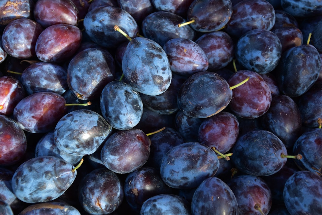
This is a practical reference for the most useful shades of plum, with accurate hex codes, RGB values, and notes on character and use. Plum is a deep, slightly reddish purple named after the fruit — richer than violet, warmer than indigo, and more grounded than magenta. Small shifts toward red, brown, or pink turn it from a soft pastel plum into a deep eggplant or a vivid mulberry, so the right plum depends entirely on the mood you want. Use the table below as a citable palette, then read on for how the shades group together.
For how plum compares with its close relatives, see plum vs purple and plum vs eggplant; for the symbolism, read color psychology. The softer greyed purples that pair with it are covered in our shades of mauve reference, and the blue-purples in shades of periwinkle.
Shades of plum: full table
| Shade name | Hex | RGB | Notes |
|---|---|---|---|
| Plum | #8E4585 | 142, 69, 133 | Rich red-purple baseline. |
| Light Plum | #DDA0DD | 221, 160, 221 | CSS plum; soft pastel pink-purple. |
| Dark Plum | #4E1A3D | 78, 26, 61 | Deep wine-toned plum. |
| Eggplant | #614051 | 97, 64, 81 | Muted brown-purple eggplant. |
| Mulberry | #770F5C | 119, 15, 92 | Vivid deep magenta-plum. |
| Victoria Plum | #8B2F6E | 139, 47, 110 | Saturated rosy plum. |
| Old Plum | #673147 | 103, 49, 71 | Antique wine-plum. |
| Dusty Plum | #B784A7 | 183, 132, 167 | Muted greyed plum. |
| Bright Plum | #A04B8C | 160, 75, 140 | Vivid pink-purple plum. |
| Dark Purple Plum | #36013F | 54, 1, 63 | Near-black deep plum. |
| Pale Plum | #C599B6 | 197, 153, 182 | Light dusty pink-plum. |
| Wine Plum | #580F41 | 88, 15, 65 | Deep wine-leaning plum. |
| Royal Plum | #843179 | 132, 49, 121 | Rich regal plum. |
| Plum Grey | #503750 | 80, 55, 80 | Greyed neutral deep plum. |
| Soft Plum | #9C5A8C | 156, 90, 140 | Gentle balanced plum. |
| Deep Plum | #5A2A48 | 90, 42, 72 | Dark muted plum. |
| Magenta Plum | #B23A8C | 178, 58, 140 | Bright magenta-leaning plum. |
| Plum Blossom | #E0B0D5 | 224, 176, 213 | Very pale pink-plum tint. |
| Mid Plum | #6B3A5B | 107, 58, 91 | Balanced true plum. |
| Damson | #7B3F61 | 123, 63, 97 | Earthy purple damson-plum. |
| Aubergine Plum | #42213D | 66, 33, 61 | Deepest aubergine-plum. |
| Rose Plum | #A86B97 | 168, 107, 151 | Pink-rose leaning plum. |
| Spiced Plum | #5D3954 | 93, 57, 84 | Warm muted deep plum. |
| Heather Plum | #8E5572 | 142, 85, 114 | Muted heathery plum. |
| Byzantium Plum | #702963 | 112, 41, 99 | Deep imperial purple-plum. |
| Orchid Plum | #D8A0C8 | 216, 160, 200 | Soft orchid-pink plum. |
Light and pastel plums
The lightest plums read as soft and floral. Light Plum (#DDA0DD), Plum Blossom (#E0B0D5), Pale Plum (#C599B6), and Dusty Plum (#B784A7) are the gentle, low-saturation pink-purples that feel delicate and romantic. The CSS named Light Plum at #DDA0DD is far lighter than the fruit it is named for, which is why it reads as a soft lilac rather than a deep plum. Softer pink variants like Orchid Plum (#D8A0C8) push the family toward a floral blush for cosmetics and stationery. These pale plums are popular in beauty and wellness branding because they feel calm and feminine, pairing beautifully with cream, sage, and soft grey, and they make gentle tinted backgrounds that let darker plum accents pop without any harshness.
True mid plums
The defining plums sit in rich red-purple territory. Plum (#8E4585), Victoria Plum (#8B2F6E), Royal Plum (#843179), Soft Plum (#9C5A8C), and Mid Plum (#6B3A5B) are the saturated, fruit-true tones most people picture. The named Plum at #8E4585 is the reliable default — purple enough to feel regal, red enough to feel warm. These mid plums are the workhorses of luxury and editorial palettes. For how plum separates from a true purple, see plum vs purple.
Deep and wine plums
The richest plums go dark and wine-toned. Dark Plum (#4E1A3D), Wine Plum (#580F41), Deep Plum (#5A2A48), Dark Purple Plum (#36013F), and Aubergine Plum (#42213D) are the deep, luxurious tones that read as opulent and dramatic. Imperial variants such as Byzantium Plum (#702963) carry historic, regal associations that suit heritage and luxury marks. These deep plums anchor premium packaging, beauty branding, and moody interiors where a pale plum would feel too slight, pairing beautifully with gold, blush, and deep green for a rich, jewel-toned scheme. Because they read almost as neutral darks at small sizes, they also work well for typography and UI chrome where pure black would feel too stark.
Brown and earthy plums
Pull plum toward brown and grey and it becomes the eggplant family. Eggplant (#614051), Old Plum (#673147), Plum Grey (#503750), Spiced Plum (#5D3954), and Damson (#7B3F61) carry enough warmth and grey to read as earthy and antique. Push instead toward bright magenta and you get Mulberry (#770F5C), Magenta Plum (#B23A8C), and Bright Plum (#A04B8C), which feel bolder and more theatrical. For where plum and eggplant diverge, see plum vs eggplant.
Most popular shades of plum
The plums most people name and use are Plum (#8E4585) as the rich baseline, Light Plum (#DDA0DD) for a soft pastel, Dark Plum (#4E1A3D) for a deep wine anchor, Eggplant (#614051) for an earthy brown-purple, and Mulberry (#770F5C) for a vivid magenta-plum. Together they cover pastel through rich to deep, which is why they anchor most luxurious, jewel-toned palettes.
How to use shades of plum in design
Plum signals luxury, depth, and quiet drama, so it lifts palettes that want richness without going loud. Use light plums like Light Plum and Plum Blossom for backgrounds and supportive fills; use true plums like Plum and Royal Plum as the primary jewel tone; and reserve deep plums like Dark Plum and Aubergine for anchors, headers, and accents. Plum pairs beautifully with gold, blush, sage green, cream, and deep teal, evoking opulence and sophistication. The main risk is that deep plums can read as heavy across large areas, so balance them with a clean cream or a metallic gold and reserve the darkest tones for anchors. A reliable approach treats a deep plum as your anchor, a true plum as the primary, and a pale plum or neutral for backgrounds. Because plum reads as rich and refined, it suits beauty, fashion, wine, and premium brands particularly well. For digital work, a deep plum makes an excellent dark-mode surface or header background, softer and warmer than charcoal, while a single bright plum or mulberry accent supplies the interactive highlight without ever tipping into a harsh neon.
Frequently Asked Questions
What is the hex code for plum?
The most common hex code for plum is #8E4585 (RGB 142, 69, 133), a rich red-purple. The CSS named color “plum” is much lighter at #DDA0DD, a soft pink-purple. For a deep version use Dark Plum (#4E1A3D), and for an earthy brown-purple use Eggplant (#614051).
What is the difference between plum and eggplant?
Plum is a brighter, redder purple that reads as a fruit color, while eggplant is darker, browner, and more muted. Plum leans toward magenta and wine; eggplant leans toward brown and near-black. The two overlap in deep tones, but plum stays more vivid and eggplant more grounded.
How many shades of plum are there?
Plum variations are effectively limitless because plum spans the red-purple band into brown, but designers typically reference 20 to 30 named shades. This list includes 24 of the most recognized, from pale pastel plums through rich fruit tones to deep wine, eggplant, and mulberry shades.
What colors go well with plum?
Plum pairs naturally with gold, blush, sage green, and cream for a rich, elegant palette. For high contrast, combine plum with mustard or teal. Soft and dusty plums also work alongside grey and dusty blue for a refined, muted scheme.


