Shades of Terracotta: Names and Hex Codes
This is a practical reference for the most useful shades of terracotta, with accurate hex codes, RGB values, and notes on character and use. Terracotta is a warm, earthy orange-brown named after fired clay — softer than pure orange, warmer than brown, and far more grounded than coral. Small shifts toward brown, pink, or red turn it from a soft clay tint into a deep burnt sienna or a dusty rosy clay, so the right terracotta depends entirely on the mood you want. Use the table below as a citable palette, then read on for how the shades group together.
For how terracotta compares with its close relatives, see terracotta vs rust and terracotta vs brown; for the symbolism, read color psychology. The warm golden yellows that pair with it are covered in our shades of mustard reference, and the calming greens in shades of sage.
Shades of terracotta: full table
| Shade name | Hex | RGB | Notes |
|---|---|---|---|
| Terracotta | #C36F4E | 195, 111, 78 | Warm clay orange-brown baseline. |
| Light Terracotta | #E2725B | 226, 114, 91 | Bright coral-leaning terracotta. |
| Burnt Terracotta | #A0522D | 160, 82, 45 | Deep burnt earthen terracotta. |
| Clay | #B66A50 | 182, 106, 80 | Soft muted clay-brown. |
| Sienna | #A0522D | 160, 82, 45 | CSS sienna; classic earth-brown. |
| Rust Terracotta | #B7410E | 183, 65, 14 | Deep red-orange rust tone. |
| Pottery Terracotta | #CB6843 | 203, 104, 67 | Classic fired-pot terracotta. |
| Soft Terracotta | #E08A6E | 224, 138, 110 | Gentle muted clay-pink. |
| Saddle Brown | #8B4513 | 139, 69, 19 | CSS saddlebrown; deep earth. |
| Adobe | #D2876A | 210, 135, 106 | Warm sun-baked adobe clay. |
| Dark Terracotta | #9A4F33 | 154, 79, 51 | Rich deep terracotta. |
| Brick Terracotta | #CC7357 | 204, 115, 87 | Warm brick-toned terracotta. |
| Burnt Sienna | #E97451 | 233, 116, 81 | Classic burnt sienna pigment. |
| Deep Clay | #7E3F23 | 126, 63, 35 | Dark earthy clay-brown. |
| Dusty Terracotta | #D98B6F | 217, 139, 111 | Muted dusty clay-pink. |
| Ochre Terracotta | #B5651D | 181, 101, 29 | Yellow-leaning earthen clay. |
| Earthen Terracotta | #A95C44 | 169, 92, 68 | Grounded muted terracotta. |
| Pale Terracotta | #EFA08B | 239, 160, 139 | Light blush clay tint. |
| Terracotta Brown | #6E3620 | 110, 54, 32 | Deepest brown-terracotta. |
| Red Terracotta | #C75D45 | 199, 93, 69 | Red-leaning warm terracotta. |
| Sand Terracotta | #DC9B7E | 220, 155, 126 | Sandy warm clay tone. |
| Terracotta Black | #5C2E1A | 92, 46, 26 | Near-black deepest terracotta. |
| Tuscan Terracotta | #BC6B4C | 188, 107, 76 | Warm Mediterranean clay. |
| Spiced Terracotta | #9C5840 | 156, 88, 64 | Deep spiced clay-brown. |
| Canyon Terracotta | #C2755A | 194, 117, 90 | Warm desert-canyon clay. |
| Umber Terracotta | #864E33 | 134, 78, 51 | Deep umber-brown clay. |
Light and dusty terracottas
The lightest terracottas read as soft and rosy. Light Terracotta (#E2725B), Pale Terracotta (#EFA08B), Dusty Terracotta (#D98B6F), Soft Terracotta (#E08A6E), and Sand Terracotta (#DC9B7E) are the gentle, blush-leaning clay tones that feel warm and approachable. These light terracottas are everywhere in modern interiors and lifestyle branding because they read as cozy and organic without being heavy. Warmer desert variants like Canyon Terracotta (#C2755A) push the same family toward a sun-baked southwestern feel. They pair beautifully with cream, sage, and warm white for a soft, sun-faded palette, and because they sit close to skin tones they flatter lifestyle and product photography without competing with the subject.
True clay terracottas
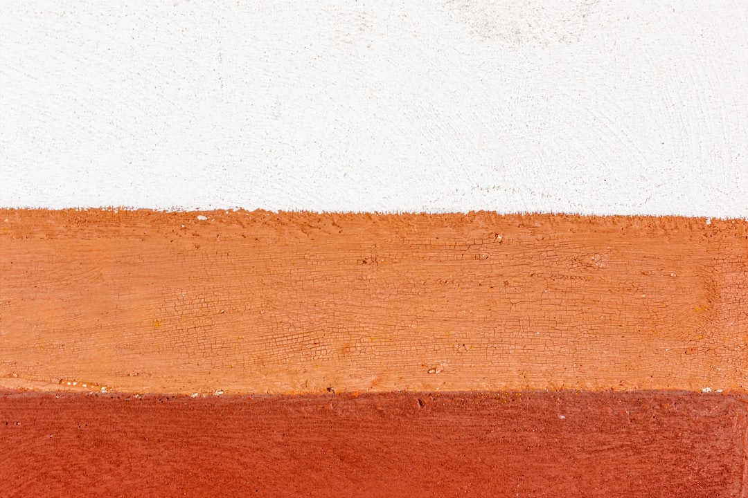
The defining terracottas sit in warm mid-tones. Terracotta (#C36F4E), Clay (#B66A50), Pottery Terracotta (#CB6843), Brick Terracotta (#CC7357), and Tuscan Terracotta (#BC6B4C) are the fired-clay tones most people picture. The named Terracotta at #C36F4E is the reliable default — orange enough to feel warm, brown enough to stay earthy. These true terracottas are the workhorses of Mediterranean and earthy palettes, anchoring branding that wants warmth and craft.
Burnt and deep terracottas
The richest terracottas go dark and burnt. Burnt Terracotta (#A0522D), Sienna (#A0522D), Dark Terracotta (#9A4F33), Deep Clay (#7E3F23), Terracotta Brown (#6E3620), and Terracotta Black (#5C2E1A) are the deep, earthen tones that read as grounded and substantial. Sienna and Burnt Sienna (#E97451) take their names from the classic painter’s pigment. Umber-leaning variants such as Umber Terracotta (#864E33) bridge clay and chocolate for the richest anchors. These deep terracottas work as anchors, headers, and rich backgrounds where a pale clay would feel too slight, and they ground a warm palette the way a deep brown would while keeping a little more orange life in the color. For where terracotta tips fully into brown, see terracotta vs brown.
Rust and ochre-leaning terracottas
Terracotta tilts in two directions from its center. Push it toward red-orange and you get Rust Terracotta (#B7410E), Red Terracotta (#C75D45), and Burnt Sienna (#E97451), which feel bolder and more fiery. Push it toward yellow and you reach Ochre Terracotta (#B5651D), Adobe (#D2876A), and Spiced Terracotta (#9C5840), which feel dustier and more sun-baked. The rust end borders on true rust — for where that line falls, see terracotta vs rust.
Most popular shades of terracotta
The terracottas most people name and use are Terracotta (#C36F4E) as the warm baseline, Light Terracotta (#E2725B) for a brighter coral-clay, Burnt Terracotta (#A0522D) for a deep earthen anchor, Clay (#B66A50) for a soft muted tone, and Sienna (#A0522D) for the classic pigment. Together they cover light through clay to burnt, which is why they anchor most warm, earthy palettes.
How to use shades of terracotta in design
Terracotta signals warmth, craft, and natural grounding, so it lifts palettes that want to feel earthy and inviting. Use light terracottas like Light Terracotta and Dusty Terracotta for backgrounds and large surfaces; use true clay terracottas like Terracotta and Clay as the primary warm color; and reserve burnt terracottas like Burnt Terracotta and Deep Clay for anchors, headers, and accents. Terracotta pairs beautifully with sage green, cream, mustard, deep teal, and warm white, evoking Mediterranean warmth and handmade character. The main risk is that too many warm clay tones can feel muddy, so build contrast with a cool green or a clean cream. A reliable approach treats a burnt terracotta as your anchor, a true terracotta as the primary, and a pale clay or neutral for backgrounds. Because terracotta reads as warm and crafted, it suits home, lifestyle, hospitality, and artisan brands particularly well. To keep a terracotta palette from feeling one-note, vary the tones across the full range rather than repeating one mid-clay, letting a pale terracotta, a true terracotta, and a burnt anchor create depth the way a single fired pot shifts in color across its surface.
Frequently Asked Questions
What is the hex code for terracotta?
The most common hex code for terracotta is #C36F4E (RGB 195, 111, 78), a warm clay orange-brown. For a brighter version use Light Terracotta (#E2725B), for a deeper one use Burnt Terracotta (#A0522D), and for the classic pigment use Sienna (#A0522D). Terracotta is defined by its earthy, fired-clay warmth.
What is the difference between terracotta and rust?
Terracotta is a warmer, more orange clay tone, while rust is darker, redder, and more oxidized. Terracotta reads as soft and earthen; rust reads as deep and metallic. The two meet at the burnt end of terracotta, but terracotta always leans more orange and rust more red-brown.
How many shades of terracotta are there?
Terracotta variations are effectively limitless because terracotta spans the orange-brown earth band, but designers typically reference 20 to 30 named shades. This list includes 24 of the most recognized, from pale clay tints through true terracottas to deep burnt and rust-leaning tones.
What colors go well with terracotta?
Terracotta pairs naturally with sage green, cream, mustard, and warm white for an earthy, Mediterranean palette. For more contrast, combine terracotta with deep teal or navy. Dusty and soft terracottas also work alongside blush and dusty blue for a warm, organic scheme.


