Terracotta vs Brown: What’s the Difference?
Terracotta and brown both live in the warm earth-tone family, but terracotta carries far more orange and sits lighter. Terracotta is a soft, earthy orange-brown named after fired clay — warm, muted, and pinkish-orange. Brown is the deeper, more neutral parent color with less orange glow. The terracotta vs brown difference is undertone and value: terracotta is a lighter, clay-orange brown, while brown is darker and more balanced.
What is terracotta?
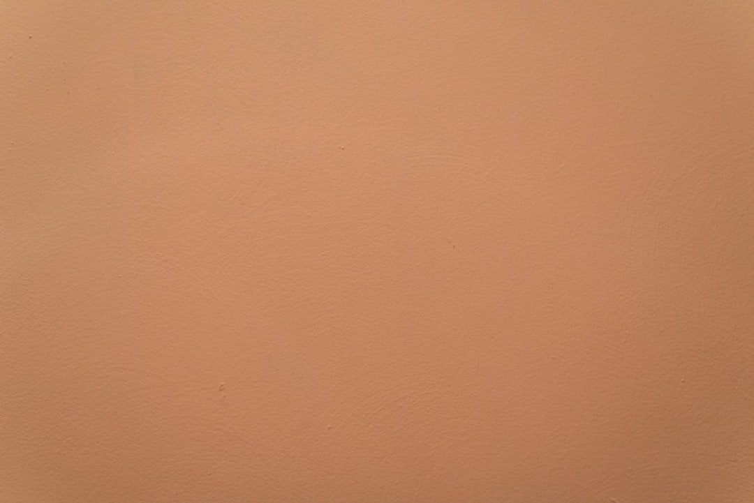
Terracotta is a warm, earthy orange-brown named after the fired clay used for pottery and roof tiles. A representative value is #C36F4E. Its muted orange character — softened with a hint of pink and brown — gives it a natural, Mediterranean, artisan feel. Terracotta reads as warm and grounded but lighter and more orange than a deep brown, which is why it’s a favorite in interiors, ceramics, and earthy modern palettes.
Terracotta sits very close to rust; the two are often confused. For that distinction, see terracotta versus rust. To understand the grounded symbolism terracotta shares with the brown family, visit our brown color meaning page.
What is brown?
Brown is a dark, warm earth color — essentially a low-value, low-saturation orange. A representative value is #964B00. Brown is grounded, stable, and natural, evoking wood, soil, coffee, and leather. It is darker and less obviously orange than terracotta, reading as a deep neutral rather than a clay tone. Browse named variations in shades of brown.
What’s the difference between terracotta and brown?
The difference is undertone and lightness. Terracotta is a lighter, more orange clay-brown; brown is a darker, more neutral earth tone. Both share the same orange root, but terracotta holds more orange and sits higher in value, while brown reads deep and balanced. Here’s the side-by-side with representative values, since both names cover a range.
| Property | Terracotta | Brown |
|---|---|---|
| Hex code | #C36F4E | #964B00 |
| RGB | 195, 111, 78 | 150, 75, 0 |
| CMYK | 0, 43, 60, 24 | 0, 50, 100, 41 |
| Undertone | Warm orange with a pink lean | Warm orange (more neutral) |
| Hue family | Earthy orange-brown (clay) | Deep brown (earth tone) |
| Best used for | Warm interiors, artisan branding, Mediterranean palettes | Grounding anchors, rich earthy branding |
| Mood/feel | Warm, organic, inviting, artisan | Grounded, warm, stable, premium |
Is terracotta a type of brown?
Partly. Terracotta belongs to the broad brown-orange family but carries enough orange and pink that many designers treat it as its own clay color rather than a brown. It’s lighter and noticeably more orange than a neutral brown, which is what gives terracotta its soft, sun-warmed clay glow. That lighter, more orange character also makes terracotta feel inviting and approachable, where a deep brown feels solid and reserved. The way a small shift in undertone and value changes a color’s emotional read is a recurring theme in our color psychology guide.
When should you use each?
Use terracotta when you want warmth and organic softness. Its clay-orange glow makes it ideal for interiors, artisan and wellness branding, Mediterranean and bohemian palettes, and accents that should feel inviting and natural. Terracotta brings warmth and a handmade quality where a plain brown would feel heavier.
Use brown when you want grounding, depth, and a premium earthy feel. Its darkness makes it ideal for anchor colors, type, and branding in coffee, leather, and heritage categories. Brown delivers stability and richness without terracotta’s lighter, more decorative warmth.
A simple way to choose: if you want the color to feel soft, warm, and inviting, pick terracotta; if you want it to anchor and add depth, pick brown. Because they share an orange root, they pair beautifully — brown for the deep structure and terracotta for the warm, light field gives a palette both gravity and glow.
How do terracotta and brown work in design?
In branding, brown signals craftsmanship and natural quality for coffee, leather, and heritage brands, while terracotta adds artisan warmth popular in ceramics, skincare, and modern earthy identities. In web and UI design, brown anchors as a deep heading or background color, and terracotta works as a warm accent or soft section background. In interiors and fashion, terracotta is a leading warm neutral for walls, tile, and textiles, while brown adds the deep contrast — often with cream, olive, and rust. For a closely related comparison from this batch, see rust versus brown, and for the temperature framework see warm vs cool colors.
The consistent thread is that brown supplies depth and terracotta supplies warm, light approachability. Whether you’re designing packaging, a site, or a room, choosing brown for the elements that should feel substantial and terracotta for the surfaces that should feel warm and open keeps an earthy palette balanced.
How can you tell terracotta from brown at a glance?
The clearest signal is the orange-clay glow. Terracotta reads visibly orange, with a soft pinkish warmth like a sun-baked roof tile or a clay pot, while neutral brown sits darker and far less orange. Lightness is the second test: terracotta is noticeably higher in value, so it feels lighter and more decorative, whereas brown feels deep and grounding. If a swatch makes you picture Mediterranean architecture, unglazed pottery, or autumn pumpkins, it’s terracotta; if it makes you picture walnut wood, espresso, or dark leather, it’s brown. Because terracotta carries both more orange and more lightness, it almost always reads as the warmer, friendlier of the two. One more reliable cue is context: terracotta tends to appear as a featured wall, tile, or fabric color precisely because it is decorative, whereas brown more often does the structural work of furniture, framing, or typography. When in doubt, ask whether the color is meant to be noticed and enjoyed, which points to terracotta, or meant to anchor and support, which points to brown.
Frequently Asked Questions
What is the hex code for terracotta versus brown?
A representative terracotta is #C36F4E, a warm earthy orange-brown. A representative brown is #964B00, a deeper, more neutral earth tone. Both trace to the same orange root, but those values capture the core contrast: terracotta is lighter and more orange, while brown is darker and more balanced.
Is terracotta a brown or an orange?
Terracotta sits between the two. It’s an earthy orange-brown — more orange than a neutral brown but more muted and grounded than a pure orange. The fired-clay reference is why it carries that soft, pinkish-orange warmth rather than reading as a plain brown or a bright orange.
Can terracotta and brown be used together?
Yes, beautifully. They share the same orange root, so they form a natural earthy pairing. Use brown as the deep anchor and terracotta as the lighter, warmer field, then add cream and olive or sage to complete a Mediterranean or modern earthy palette.
What undertone does terracotta have?
Terracotta has a warm orange undertone with a subtle pink lean, derived from fired clay. That pinkish warmth is what softens it and separates terracotta from a harsher rust or a neutral brown, giving it its inviting, sun-warmed character.
Which is lighter, terracotta or brown?
Terracotta is lighter. It sits higher in value with more visible orange, while brown is darker and more neutral. That lightness is part of why terracotta reads as soft and decorative, whereas brown reads as deep and grounding.


