Slate vs Gray: What’s the Difference?
Slate and gray are nearly the same lightness, but they feel different because of undertone. Slate is a medium gray with a noticeable blue (sometimes blue-green) cast, named after the layered stone. Gray is the textbook neutral — equal parts of all colors, with no lean in any direction. The whole slate vs gray question hinges on that one variable: slate is a gray that became a color, while gray stays perfectly neutral.
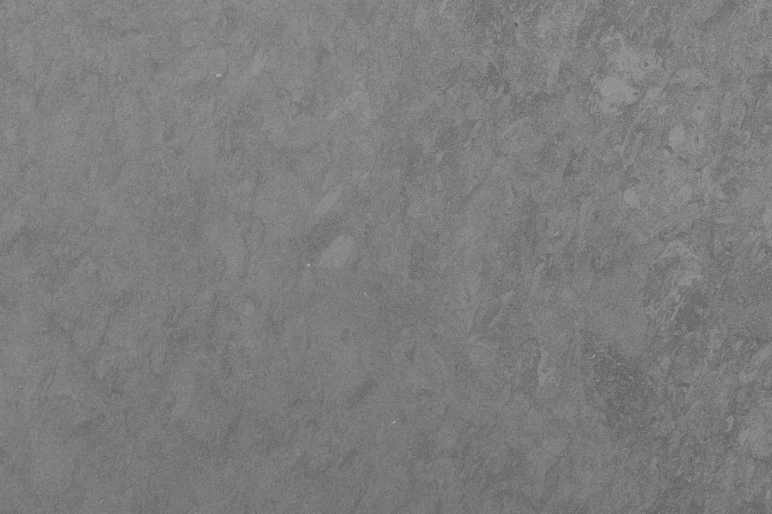
What is slate?
Slate is a cool, medium gray with a blue undertone, named after the natural gray stone. The classic web value “slate gray” is #708090. That blue cast is slate’s signature — it’s what makes slate feel like a color rather than a pure neutral, lending it a calm, atmospheric, sophisticated quality. Slate is popular in UI design, interiors, and branding that want quiet refinement with a hint of cool color.
Because of its blue lean, slate pairs naturally with navy, teal, and other cool tones. For the darker end of the slate family, see slate versus charcoal.
What is gray?
Gray is the quintessential neutral — a balanced mix of black and white with no color cast. The standard mid value is #808080, sitting exactly halfway between white and black. True gray is calm, versatile, and quiet; it carries no temperature of its own, which is what makes it the ultimate background and pairing color. In practice many “grays” lean slightly warm or cool, but pure neutral gray is the reference point. Explore the family on our gray color meaning page and browse variations in shades of gray.
What’s the difference between slate and gray?
The difference is undertone. Slate is a gray with a clear cool blue cast; gray is a true neutral with no cast at all. At similar lightness, slate reads cooler and more “colored,” while gray reads balanced and quiet. Here’s the side-by-side with representative values, since neither name is rigidly fixed.
| Property | Slate | Gray |
|---|---|---|
| Hex code | #708090 | #808080 |
| RGB | 112, 128, 144 | 128, 128, 128 |
| CMYK | 22, 11, 0, 44 | 0, 0, 0, 50 |
| Undertone | Cool blue (sometimes blue-green) | None — true neutral |
| Hue family | Blue-gray | Neutral gray |
| Best used for | Cool sophisticated UI, calm interiors, refined branding | Backgrounds, neutrals, balanced versatile palettes |
| Mood/feel | Calm, refined, atmospheric, cool | Neutral, balanced, quiet, versatile |
Is slate a blue or a gray?
Slate is a gray with a cool blue undertone, so the most accurate label is blue-gray. The blue cast is subtle enough that slate still functions as a neutral in most contexts, but pronounced enough to make slate feel cooler and more refined than pure gray. Put a slate swatch next to a true gray and the difference is obvious: slate visibly leans blue while the neutral gray sits flat. That undertone is the single thing that separates them, and it’s the reason slate reads as having character while gray reads as a clean backdrop. Whether a gray leans cool like slate or stays neutral connects to the broader warm vs cool colors framework.
When should you use each?
Use slate when you want a sophisticated mid-gray with a touch of cool color. It works beautifully as a UI surface or secondary text color, in calm interior schemes, and in brand palettes aiming for understated, modern refinement. Slate adds quiet personality where a pure neutral would feel sterile.
Use gray when you want maximum neutrality and flexibility. True gray is the safest background and pairing color because it doesn’t push a temperature onto the rest of your palette. It’s ideal for text, UI scaffolding, and any design where the gray should support — not influence — the other colors.
How do slate and gray work in design?
In web and UI design, gray is the default for text, borders, and surfaces because its neutrality keeps focus on content, while slate adds a cool, considered tone to backgrounds and secondary elements that want subtle sophistication. In branding, gray communicates balance, professionalism, and modern restraint, whereas slate adds intelligence and calm with its blue undertone — useful for tech and premium identities. In interiors, slate reads atmospheric and refined on walls and cabinetry, while gray stays flexible and timeless. The two also layer well together within a cool-leaning grayscale. For a related neutral comparison from this batch, see tan versus brown.
Frequently Asked Questions
What is the hex code for slate versus gray?
A representative slate is #708090, a medium gray with a cool blue undertone. Standard neutral gray is #808080, sitting exactly between black and white. Both names span ranges, but those values capture the key contrast: slate leans blue, gray stays neutral.
Is slate cooler than gray?
Yes. Slate’s blue undertone makes it read distinctly cooler than a true neutral gray, which has no temperature of its own. If you compare them side by side, slate looks like a cool blue-gray while pure gray looks balanced and flat. That coolness is slate’s defining feature.
Can slate and gray be used together?
Yes, and they layer well. Because slate is essentially a cool-leaning gray, it sits naturally alongside neutral gray in a tonal scheme. Use gray for the neutral base and slate for accents or surfaces that need a touch of cool sophistication, then add white and one accent color.
Why does slate look bluish?
Because slate contains a small amount of blue in its mix, inherited from the gray-blue stone it’s named after. That blue component shifts slate away from true neutrality toward a cool cast. Remove the blue and you’re left with plain gray — the blue undertone is exactly what makes slate slate.
Which is more versatile for backgrounds?
Neutral gray is the more versatile background because its lack of undertone won’t clash with or tint the colors placed on top of it. Slate is excellent when you specifically want a cool, refined backdrop, but its blue lean makes it slightly less universally flexible than pure gray.


