Sports Graphic Design: Creating High-Energy Visual Identities
Few design disciplines carry the same raw emotional charge as sports graphic design. When a fan sees their team’s crest, the reaction is immediate — loyalty, pride, rivalry, memory. When a broadcast graphic flashes a score update, millions of eyes lock onto the screen. When a matchday poster hits social media, it sets the tone for an event before a single whistle has blown.
Sports design operates in a world of intensity. The visual language must match the energy of competition itself: bold, fast, aggressive, and unmistakable at a glance. This is not a field that rewards subtlety for its own sake. Every logo, every jersey number, every Instagram countdown graphic exists to amplify the drama that makes sport so compelling. It is a specialty within graphic design that demands its own set of instincts, tools, and creative reflexes.
What follows is a thorough look at the discipline — the key areas of work, the typographic and color principles that define it, the tools professionals rely on, and the career paths available to designers who want to work where design meets competition.
What Makes Sports Graphic Design a Distinct Specialty
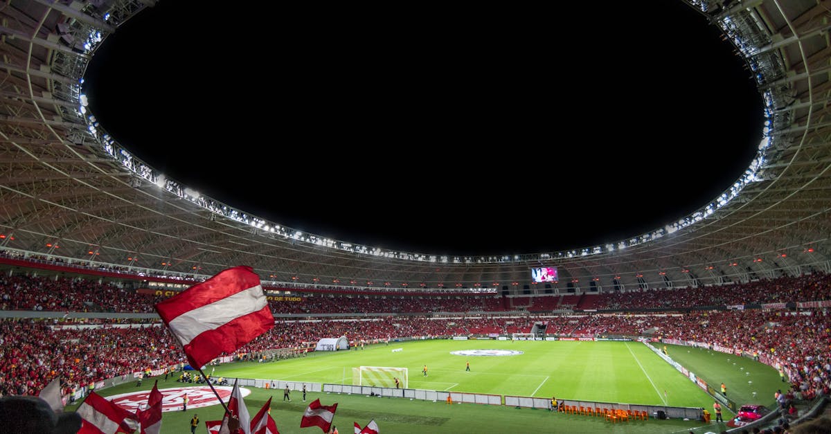
All graphic design styles respond to context, but sports design responds to a context unlike any other. The audience is passionate to the point of irrationality. The stakes feel life-or-death even when they are not. The content cycles at extraordinary speed — a new game every week, a new season every year, a new narrative every day on social media.
This creates specific demands. Sports graphics must communicate instantly, because fans are scanning feeds, glancing at screens, and processing information in fractions of a second. They must carry emotional weight, because the entire purpose of sports branding is to deepen the connection between fans and the teams, events, or athletes they follow. And they must be versatile enough to work across a staggering range of formats — from a stadium jumbotron to a phone screen, from an embroidered cap to a motion graphic transition.
The result is a design discipline built on energy, speed, and clarity. Designers who thrive in sports design tend to think in systems rather than single pieces. A logo is never just a logo. It is the seed of an entire visual identity that must hold together across hundreds of applications, many of which have not been invented yet when the identity is first designed.
Team Identity and Branding
The foundation of sports graphic design is the team identity. A logo, a color system, a mascot, a wordmark — these are the building blocks that every other piece of sports design draws from. Getting them right is the single most consequential design task in the entire field.
Logos and Marks
A sports logo needs to work harder than almost any other kind of logo. It must read clearly at the size of a favicon and at the scale of a stadium banner. It must look sharp embroidered on a cap, printed on a jersey, animated on a broadcast, and rendered as a social media avatar. It must communicate identity, geography, and attitude in a single mark.
The best sports logos achieve this through simplicity and distinctiveness. The NBA has pushed its franchises toward cleaner, more versatile marks over the past two decades. The Premier League’s lion icon works across every medium without losing clarity. The NFL’s team logos — from the Cowboys’ star to the Steelers’ hypocycloids — are among the most recognized symbols in American culture, not because they are complex but because they are iconic and endlessly reproducible.
Recent rebranding efforts reveal the direction the industry is moving. Teams increasingly adopt modular identity systems — a primary logo, a secondary mark, a wordmark, and a set of alternate logos, all designed to work independently and together. The goal is not a single perfect logo but a flexible visual toolkit.
Color Systems
Team colors are not arbitrary. They carry decades or centuries of meaning, and changing them is one of the most controversial decisions a franchise can make. A team’s colors are its emotional signature — the shorthand that fans use to identify themselves and distinguish their tribe from every other.
Designing within a team’s color system requires understanding how those colors behave across media. A royal blue that looks electric on screen may appear dull on fabric. A gold that shines on a jersey may wash out in a social media graphic. Sports designers become experts in color translation, ensuring consistency from pixel to thread to ink.
Mascots and Wordmarks
Mascots give a team personality. They range from realistic animal illustrations to stylized characters to abstract figures, and their design must balance intimidation with approachability — fierce enough for adults, appealing enough for children. Wordmarks, meanwhile, give a team its typographic voice. The lettering style of a team name communicates as much as the name itself: sharp angles suggest aggression, curves suggest speed, serifs suggest tradition.
Jersey and Uniform Typography
If you want to understand how seriously sports design takes typography, look at the numbers on the back of a jersey. What appears to be a simple task — putting numerals on fabric — is actually one of the most demanding typographic challenges in all of design.
Custom Number Fonts
Most major sports leagues and teams commission custom typefaces for their player numbers. These are not off-the-shelf fonts. They are purpose-built letterforms designed to be readable from hundreds of feet away, to look distinctive on camera, and to embody the team’s identity in every stroke. The NFL, NBA, and Premier League teams all invest in bespoke number fonts that become as recognizable as the logos themselves.
The design constraints are unforgiving. Numbers must be identifiable from the nosebleed seats of a 70,000-capacity stadium. They must read correctly on high-definition broadcasts. They cannot be confused with one another — the distinction between a 6 and an 8, or a 3 and an 8, must be absolute at every viewing distance. These are the kinds of challenges that push font design to its functional limits.
Name Lettering
Player name lettering follows similar principles. It must be readable, distinctive, and consistent with the broader identity. But it also must accommodate names of wildly different lengths — from “Li” to “Lewandowski” — without looking stretched, compressed, or awkward. The spacing, weight, and sizing must flex while maintaining visual consistency.
Technical Constraints
Jersey typography must survive real-world conditions that no screen-based design ever faces. The fabric stretches. The letters are applied through heat transfer, embroidery, or sublimation, each of which affects how fine details render. Players sweat, slide, and collide, subjecting the lettering to physical stress. A beautiful typeface that cannot survive a full match is a failed typeface. Function is inseparable from form.
Matchday and Social Media Graphics
This is where sports graphic design operates at its highest velocity. The matchday graphics engine — the stream of content that surrounds every game — has become one of the most prolific and visible areas of design work in the industry.
The Content Engine
A single game can generate dozens of individual graphics: the matchday announcement, the starting lineup, halftime stats, in-game score updates, highlight stills, post-match results, player-of-the-match features, and quote graphics. Multiply that by a 30-, 40-, or 80-game season, and you have a content operation that requires not just design talent but design systems.
Teams and leagues that do this well build template systems — flexible frameworks that allow designers to produce high volumes of on-brand content quickly. The templates establish the typography, color usage, layout structure, and photographic treatment. The designer then populates each template with game-specific data and imagery. The system ensures consistency; the designer ensures each piece still feels energetic and intentional.
Social Media Formats
Sports social media graphics must work across platforms with different aspect ratios, different audience behaviors, and different visual environments. An Instagram carousel operates differently from an X (formerly Twitter) single image, which operates differently from a TikTok cover frame. Designers must think in multiple formats simultaneously, often producing the same content in three or four aspect ratios for a single post.
The visual language of sports social content has developed its own conventions. Diagonal lines suggest speed and dynamism. Cut-out player photos create a sense of depth and presence. Bold condensed typography delivers information quickly. High-saturation color treatments amplify energy. These are not arbitrary aesthetic choices — they are functional responses to the demand for content that stops a thumb mid-scroll.
Real-Time Design
Some of the most demanding sports design work happens in real time. A goal is scored, and within minutes a graphic celebrating it must be live on social media. A player reaches a milestone, and the commemorative graphic needs to feel crafted, not rushed. This kind of reactive design demands preparation — having assets, templates, and workflows ready so that quality does not collapse under time pressure.
Broadcast Design
Broadcast sports design is where graphic design meets motion, and where millions of viewers encounter sports branding in its most immersive form. Every element the viewer sees on screen during a live broadcast — beyond the actual footage of the event — is the work of broadcast designers.
Score Bugs and Lower Thirds
The score bug — the persistent on-screen graphic showing the score, time, and other game information — is one of the most viewed design elements in the world. During a Premier League match or an NFL game, tens of millions of people stare at that graphic for hours. It must be instantly readable, visually unobtrusive, and aesthetically aligned with the broadcast’s overall identity. It is a masterclass in information design under extreme constraints.
Lower thirds — the graphics that identify players, commentators, and other on-screen figures — follow similar principles. They appear briefly, deliver information, and disappear. Their typography must be legible at every screen size. Their animation must be smooth enough to feel professional but distinctive enough to reinforce the broadcast brand.
Transitions and Motion Graphics
The transitions between segments — going to commercial, returning from halftime, introducing a replay — are where broadcast design becomes most expressive. These are short motion graphics sequences, typically two to five seconds long, that maintain the visual energy of the broadcast. They often incorporate the league or event’s branding, dynamic typography, and kinetic effects that echo the physicality of the sport itself.
Data Visualization
Modern sports broadcasts are increasingly data-driven, and designers are responsible for turning statistics into visual stories. Pass maps, heat maps, speed comparisons, historical records — all of this data must be presented in ways that are both accurate and visually engaging. The best broadcast data graphics make complex information feel intuitive, allowing viewers to absorb insights without conscious effort.
Event Branding
The largest events in sports — the Olympics, the FIFA World Cup, the Super Bowl, Grand Slam tennis tournaments — create visual identities that must work on a global scale. Event branding is sports graphic design at its most ambitious and most complex.
Building Visual Systems for Mega-Events
An Olympic identity must work across dozens of sports, hundreds of venues, thousands of wayfinding signs, millions of pieces of merchandise, and billions of broadcast impressions. It must feel unified while accommodating enormous variety. It must honor the host city’s culture while remaining internationally legible. And it has a fixed lifespan — once the closing ceremony ends, the identity’s active life is over, though its legacy endures.
The Tokyo 2020 Olympics used a geometric checkered pattern inspired by traditional Japanese design, applied across every touchpoint from tickets to stadium wrapping. The Paris 2024 identity combined an Art Deco-influenced medal graphic with a custom typeface. Each edition of the Games creates a self-contained visual world that must feel both timeless and of-the-moment.
The Super Bowl and World Cup
The Super Bowl’s annual identity redesign is a case study in event branding. Each year’s logo must balance the NFL’s established brand architecture with a design that reflects the host city. The World Cup follows a similar pattern, with each host nation’s visual culture woven into a global identity system. These projects require designers who can think at scale — who can envision how a single design concept will translate across stadiums, broadcast packages, retail merchandise, digital platforms, and urban environments.
Fan Merchandise and Retail
Sports merchandise is a multi-billion-dollar industry, and graphic design is at its core. Every t-shirt, cap, scarf, phone case, and limited-edition collaboration requires design work that balances brand consistency with commercial appeal.
Apparel Graphics
The graphic on a fan t-shirt serves a different purpose than a logo on a jersey. Jersey design is about identity on the field. Apparel graphics are about identity in daily life — they allow fans to express their allegiance in a way that feels personal and stylish rather than merely branded. The best sports apparel graphics treat the team’s visual assets as raw material for creative expression, reinterpreting logos, mascots, and typography in ways that feel fresh while remaining recognizable.
Limited Editions and Collaborations
The intersection of sports and streetwear has created a thriving market for limited-edition merchandise. Collaborations between sports teams and fashion brands, artists, or cultural figures produce pieces that function as collectibles. The design of these collaborations often pushes beyond the team’s standard visual identity, experimenting with color, texture, and graphic treatment in ways that the core brand guidelines would not normally allow. This is where sports design borrows from — and contributes to — broader visual culture.
Retail Environment Design
Team stores, pop-up shops, and online retail experiences all require graphic design that extends the brand into physical and digital commercial spaces. Wayfinding, point-of-sale graphics, packaging, and e-commerce interfaces must all feel like natural extensions of the team’s visual identity. The design challenge is creating an environment that makes fans feel closer to the team while also functioning as an effective retail space.
Typography in Sports Design
Typography is the backbone of sports graphic design. The typographic choices in this field are distinct from almost every other area of design, shaped by the unique demands of communicating speed, power, and competition.
Bold Condensed Faces
The workhorse of sports typography is the bold condensed sans-serif. Fonts in this category — tight, vertical, heavy — pack maximum visual impact into minimum horizontal space. They read well at large sizes on stadium signage and at small sizes in broadcast graphics. Their compressed proportions suggest urgency and forward momentum. Nearly every major sports brand uses some variation of a bold condensed face as a primary display font.
Custom Display Typefaces
Increasingly, teams and leagues commission custom typefaces rather than licensing existing ones. A custom font ensures that the team’s typographic voice is unique — no other brand will share the same letterforms. These bespoke typefaces are designed to work across the full range of sports design applications, from jersey lettering to social media headlines to broadcast graphics. The investment in custom type reflects how seriously the industry takes typography as a branding tool.
Italics and Obliques for Speed
Italic and oblique letterforms appear constantly in sports design. The forward lean of italic type creates a visual metaphor for speed and motion. It is one of the simplest and most effective ways to inject dynamism into a static composition. Many sports-specific typefaces are designed exclusively in italic or with an exaggerated forward slant, because the upright versions simply do not carry the same energy.
Contrast and Hierarchy
Sports typography relies heavily on contrast — between weights, between sizes, between styles. A massive bold headline paired with a small lightweight subhead creates immediate visual hierarchy. The viewer knows instantly what to read first. This is critical in a field where information must be absorbed in seconds: the score, the player name, the game time, the team — all organized through typographic scale and weight so that the eye navigates the content without effort.
Color Psychology in Sports Design
Color in sports design is never decorative. It is tribal. A team’s colors are the most emotionally charged element of its identity — the first thing fans recognize, the last thing they forget, and the most powerful tool for creating instant allegiance or instant opposition.
Team Colors as Identity
Red communicates aggression and passion — think Liverpool, Manchester United, the Chicago Bulls. Blue suggests reliability and strength — Chelsea, the Dallas Cowboys, the Los Angeles Dodgers. Black and gold connote prestige and power — the New Zealand All Blacks, the Pittsburgh Steelers. These associations are not accidental. They have been reinforced over decades of use until the colors themselves carry the emotional weight of the teams they represent.
Rivalry and Differentiation
Color in sports design must also account for opposition. A team’s colors must be instantly distinguishable from its rivals’. This is both a practical requirement — officials and viewers need to tell teams apart — and a psychological one. The visual contrast between rival teams amplifies the drama of competition. Designers working in sports must always consider how a team’s colors interact with the broader chromatic landscape of its league.
Energy and Atmosphere
Beyond team identity, color is used in sports graphics to set emotional tone. Warm, saturated colors create urgency and excitement — ideal for matchday announcements and highlight graphics. Cooler, darker palettes suggest seriousness and gravitas — appropriate for historical retrospectives or memorial content. Neon and fluorescent accents inject contemporary energy into social content. The color treatment of a graphic tells the viewer how to feel before they have read a single word.
Tools of the Trade
Sports graphic designers work across a range of software tools, each suited to different aspects of the discipline.
Adobe Photoshop
Photoshop remains the primary tool for image-based sports graphics. Player cut-outs, photo compositing, texture work, and the highly produced social media graphics that define modern sports content — most of this work lives in Photoshop. Its layer-based workflow and powerful masking tools make it indispensable for the kind of image manipulation that sports design demands.
Adobe Illustrator
Logo design, icon systems, jersey typography, and any work that requires clean vector output happens in Illustrator. Sports identity designers spend much of their time here, building the scalable assets that form the foundation of a team’s visual system. The precision and scalability of vector artwork makes Illustrator essential for any element that must reproduce across wildly different sizes and media.
Adobe After Effects
Broadcast design, animated social content, motion graphics transitions, and any work involving movement belongs to After Effects. As sports content has shifted increasingly toward video — Instagram Reels, TikTok, broadcast packages — After Effects proficiency has become a core requirement for sports designers rather than an optional skill.
Figma
For template systems, collaborative workflows, and digital-first design, Figma has gained significant ground in sports design studios. Its real-time collaboration features are particularly valuable in team environments where multiple designers need to work within the same system simultaneously. Many sports design teams now use Figma for building and maintaining the template libraries that power their matchday content engines.
Career Paths in Sports Graphic Design
Working in sports design is a viable and growing career path. The routes in vary, but the destinations share a common thread: design work fueled by competition, passion, and cultural relevance.
In-House Team Design
Most major professional sports teams now employ in-house design teams responsible for social media content, matchday graphics, merchandise design, and brand management. These roles offer deep immersion in a single team’s identity and the satisfaction of seeing your work consumed by millions of dedicated fans. The pace is relentless — particularly during the season — but the connection to the culture is direct and immediate.
League and Governing Body Design
Leagues like the NFL, NBA, Premier League, and UEFA employ designers and commission agencies for identity work, broadcast design, event branding, and digital platforms. These roles involve working at a higher level of abstraction — designing systems that encompass multiple teams and events rather than serving a single franchise.
Agency Work
Several design agencies specialize in sports branding and visual identity. Firms that focus on sports clients offer the variety of working across multiple teams, leagues, and events. Agency work tends to emphasize identity design, brand strategy, and campaign-level creative over the day-to-day content production that characterizes in-house roles.
Freelance and Independent Work
The sports design community on social media — particularly on platforms like Instagram and Behance — has created opportunities for freelance designers to build reputations through concept work, fan art, and speculative redesigns. A strong graphic design portfolio focused on sports work can attract attention from teams, leagues, and agencies. Some of the most prominent names in sports design built their careers by posting unsolicited concept work that went viral within the sports design community.
Building the Right Portfolio
A sports design portfolio should demonstrate range within the discipline: identity work, social media graphics, broadcast concepts, and merchandise design. It should also show an understanding of sports culture — the rivalries, the narratives, the emotional cadences of a season. Technical skill matters, but so does the ability to capture the feeling of sport in a static or moving image. Clubs and agencies want designers who understand the game as well as the grid.
Frequently Asked Questions
What does a sports graphic designer actually do?
A sports graphic designer creates visual content for teams, leagues, events, broadcasts, and merchandise. Day-to-day work can include designing matchday social media graphics (starting lineups, score updates, highlight posts), developing or maintaining team brand identity systems (logos, color palettes, typography), creating jersey and uniform typography, producing broadcast graphics (score bugs, lower thirds, transitions), designing event branding for tournaments and championships, and developing merchandise graphics for fan apparel and retail. The specific mix depends on the role — an in-house designer at a football club will spend most of their time on social content and brand applications, while a designer at a branding agency might focus on identity systems and large-scale event branding. The common thread across all sports design roles is the need to create high-energy, visually distinctive work that resonates with passionate fan bases.
What skills and software do I need to break into sports graphic design?
The core technical skills are proficiency in Adobe Photoshop (for image compositing and social media graphics), Adobe Illustrator (for logo and identity work), and Adobe After Effects (for motion graphics and broadcast design). Figma is increasingly important for collaborative template systems. Beyond software, you need strong fundamentals in typography, color theory, composition, and brand identity design. An understanding of sports culture — the rhythms of a season, the dynamics of fan engagement, the conventions of sports media — is equally important. Many successful sports designers also develop skills in 3D rendering (Cinema 4D or Blender) for creating dimensional mockups and immersive visual content. Start by building a portfolio of concept work: redesign a team’s identity, create a matchday graphic series for a real club, or develop a broadcast package for a fictional league.
How is sports graphic design different from other types of graphic design?
Sports graphic design differs from other design disciplines in several key ways. The emotional intensity is higher — fans have deep, often lifelong attachments to teams, so the visual work carries more emotional weight than most commercial design. The production pace is faster — during a season, designers may produce dozens of graphics per week, often under tight real-time deadlines during live events. The range of applications is broader — a single team identity must work on jerseys, stadium signage, broadcast graphics, social media, merchandise, and digital platforms simultaneously. The audience is also uniquely engaged and critical — sports fans notice every design detail and are not shy about expressing opinions on changes to their team’s visual identity. Finally, the visual language is distinct: bold condensed typography, high-energy color palettes, dynamic compositions, and a consistent emphasis on movement and competition set sports design apart from corporate, editorial, or cultural design work.
Can I work in sports graphic design without a formal design degree?
Yes. Sports graphic design is one of the more portfolio-driven corners of the design industry. What matters most is the quality and relevance of your work, not the credentials behind it. Many working sports designers are self-taught or came from non-traditional educational backgrounds. The sports design community on social media — particularly Instagram, Behance, and X — is active and visible, and posting strong concept work consistently can attract attention from teams and agencies. That said, a formal design education provides foundational knowledge in typography, color theory, composition, and design history that self-taught designers must acquire through other means. Whether you pursue a degree or not, the path into sports design runs through the portfolio. Build one that demonstrates both technical skill and a genuine understanding of sports culture, and the opportunities will follow.


