Sunset Color Palette: Hex Codes and Ideas
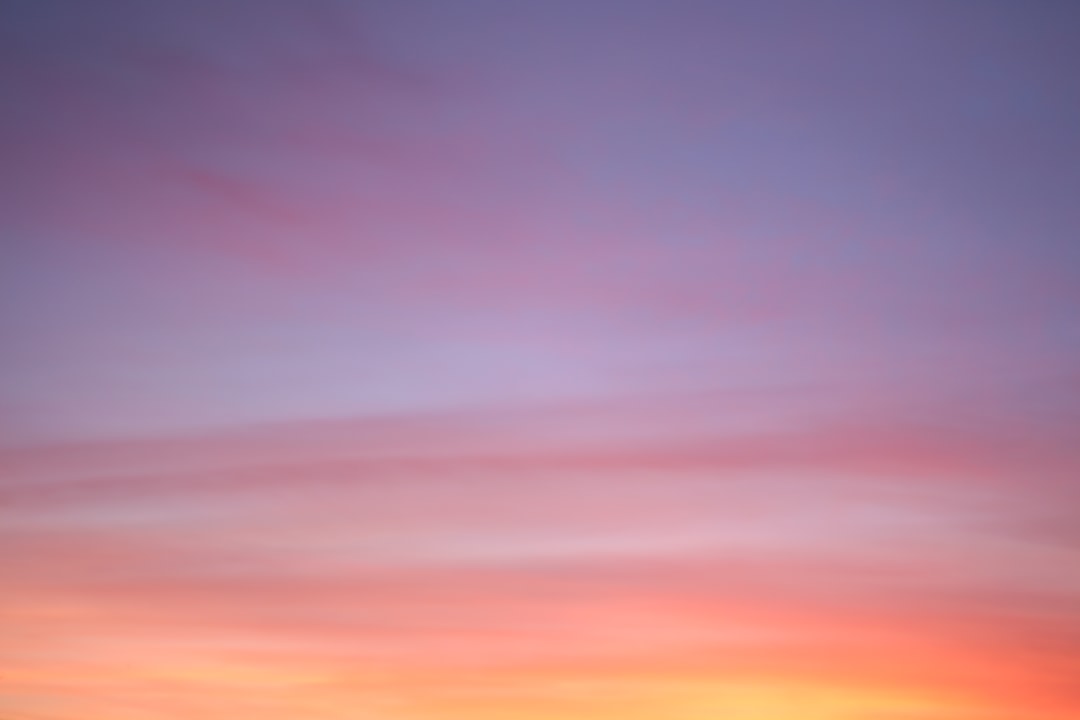
A sunset color palette captures the gradient of a sky at dusk: hot corals and golds near the horizon fading up through pink and purple into deep evening blue. Below are real hex codes, five ready-to-use palettes, and a reference table so you can build that warm-to-cool glow into a brand, gradient, or layout.
What makes a sunset palette distinctive is the deliberate temperature shift. Most palettes pick a side; a sunset spans warm and cool in one continuous run, which is exactly why it reads as a sky rather than a flat color scheme.
What colors are in a sunset color palette?
The sunset family moves across the warm end of the spectrum and resolves into cool. The anchors are coral , peach , magenta-pink and gold on the warm side, cooling into purple and deep blue .
The warm-to-cool span is what gives sunsets their emotional pull; see color psychology for why warm pinks read as romance and energy while the deep blue grounds them. For more pink range to mix in, browse shades of pink.
Core sunset colors (with hex codes)
| Color name | Hex | RGB | Role |
|---|---|---|---|
| Coral | #FF6F61 | 255, 111, 97 | Primary |
| Peach | #FFB07C | 255, 176, 124 | Neutral |
| Magenta-pink | #FF4F81 | 255, 79, 129 | Accent |
| Gold | #FFC04D | 255, 192, 77 | Accent |
| Purple | #6A0572 | 106, 5, 114 | Primary |
| Deep blue | #1B3B6F | 27, 59, 111 | Neutral |
5 sunset color palettes (with hex codes)
Classic Sunset
The full gradient: gold #FFC04D, coral #FF6F61, magenta-pink #FF4F81, purple #6A0572 and deep blue #1B3B6F. Reads left-to-right as a real sky — perfect for gradient hero sections and event branding.
Tropical Sunset
Magenta-pink #FF4F81, coral #FF6F61, peach #FFB07C, gold #FFC04D with a single purple anchor. Hot and saturated — great for festivals, cocktails, and beauty brands. Pair it with our tropical color palette for resort campaigns.
Soft Dusk
A muted, pastel sunset: peach #FFB07C, blush #F4A6A0, mauve #C792B8, dusty violet #8E7CA8 and warm white #FFF4E6. Calm and romantic — ideal for weddings, wellness, and lifestyle brands.
Golden Hour
All-warm: gold #FFC04D, peach #FFB07C, coral #FF6F61, amber #E8853A and warm white. Drops the cool end for a glowing, optimistic feel — strong for food, travel, and summer launches.
Dramatic Twilight
Magenta-pink #FF4F81, orchid #A8327D, purple #6A0572, deep blue #1B3B6F and midnight #0E1A3C. The cool, late-sunset end — moody and premium for music, nightlife, and tech.
Why these sunset colors work together
A sunset palette holds together because it traces a continuous path across the color wheel rather than jumping between unrelated hues. Gold, coral, magenta-pink, purple, and deep blue are sequential — each is a near-neighbor of the next — so moving through them feels like a single sweep rather than a collision. This is why a sunset reads as one event: the colors are literally the wheel’s warm-to-cool arc laid out in order, the same order the sky actually produces as the sun drops.
The temperature shift also creates built-in contrast without any clash. The warm end (gold, coral) advances toward the viewer while the cool end (purple, deep blue) recedes, producing depth and a sense of distance — exactly the spatial illusion of a real horizon. Designers exploit this constantly: place warm colors where you want attention and cool colors where you want the background to fall away. A sunset palette gives you that push-pull for free.
Finally, the saturation is deliberately uneven. The pinks and golds run hot and bright, while the purple and blue are deeper and quieter. That imbalance is what stops the palette from feeling like a flat rainbow stripe. The eye lands on the vivid warm band first and treats the cool darks as the anchor, which is why deep blue (#1B3B6F) makes such a reliable text and footer color in a sunset scheme — it grounds all the warm energy above it.
How to use a sunset palette in design
Sunset palettes are happiest as gradients. Order the colors by their natural sky position — gold and coral at the warm base, purple and blue at the cool top — and let them blend rather than sit as hard blocks. As a flat palette, treat the warm pinks and golds as your dominant 70%, purple as the accent, and deep blue as the grounding neutral for text and footers.
The main pitfall is that several of these colors are highly saturated, so a full-strength sunset can overwhelm. Give it room with plenty of white or warm-white space, and avoid layering bright pink text on bright orange — the lack of value contrast kills legibility. Reserve deep blue or midnight for any text that must be read.
Sunset palette for branding, web and interiors
Branding: sunsets work for beauty, travel, hospitality, events, and music — anything trading on warmth, romance, or escapism. Build the identity on a coral-to-pink core and use purple as a memorable accent. If this is a long-term brand decision, run it through how to choose brand colors to confirm the saturated palette suits your market.
Web: sunset gradients are a go-to for hero banners and buttons. Keep body text on a near-white or deep-blue background, and use the gradient for accents only — long passages of text over a multicolor gradient are hard to read and inconsistent across devices.
Interiors: peach and coral walls with gold accents and a single deep-purple or navy feature create an inviting, golden-hour room. Keep the saturated pinks to textiles and art rather than full walls.
For a warmer, grounded alternative compare the autumn color palette; for the cool counterpart see the winter color palette.
Frequently Asked Questions
What colors make up a sunset?
A sunset palette runs from warm to cool: coral (#FF6F61), peach (#FFB07C), magenta-pink (#FF4F81) and gold (#FFC04D) near the horizon, fading up into purple (#6A0572) and deep blue (#1B3B6F). The warm-to-cool gradient is what makes it read as a sky rather than a flat scheme.
What is the hex code for sunset coral?
Sunset coral is commonly written as #FF6F61 (RGB 255, 111, 97), a warm pink-orange that sits at the heart of most sunset palettes. It pairs naturally with gold (#FFC04D) on the warm side and purple (#6A0572) on the cool side.
How do I make a sunset gradient?
Order your colors by sky position — gold and coral at the base, magenta-pink in the middle, purple and deep blue at the top — and blend them in a linear gradient running bottom to top. Three to five stops usually looks smoother than two; add peach between gold and coral for a softer transition.
Are sunset palettes warm or cool?
Both, by design. A sunset spans the temperature spectrum, starting warm with coral, peach and gold and resolving cool into purple and deep blue. That deliberate warm-to-cool shift is the defining feature; palettes that stay all-warm read as golden hour rather than a full sunset.
Which colors should I use for text in a sunset scheme?
Use deep blue (#1B3B6F) or midnight (#0E1A3C) for body text, since the warm pinks, corals and golds are too light and too saturated to stay legible at small sizes. Reserve the bright hues for headings, accents and gradient backgrounds, and keep long passages of copy on a near-white or deep-blue field for comfortable reading.


