What Font Does Tool Use?
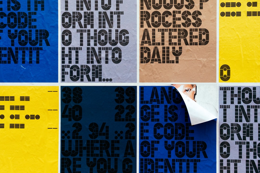
For a band famous for visual complexity, the tool band font is strikingly plain, and that is the point. Tool deliberately keeps its typography minimal so the surreal cover art, the Adam Jones paintings, the H.R. Giger-inspired imagery, the optical illusions, takes center stage. Below we explain the band’s understated lettering, whether a free version exists, and which open-license sans fonts match the look. For more identity breakdowns, see our famous brand fonts hub.
What font is the Tool logo?
Tool does not maintain a flashy, fixed logo the way most rock bands do. The four-letter name is typically rendered in a clean, simple sans-serif, sometimes plain capitals, sometimes a subtly customized wordmark, with no decorative effects. This restraint is intentional: the band’s visual identity lives in the artwork and packaging rather than the typography. Albums like Lateralus and 10,000 Days are remembered for their intricate cover designs and even physical lenticular and stereoscopic packaging, not for any signature font. When the name does appear, it tends to be quiet, modern, and almost corporate in its simplicity, a deliberate contrast to the dense, mysterious imagery surrounding it.
Is there a free Tool font?
There is no official Tool typeface, and because the band’s lettering is so plain, there is little for fans to recreate, no ornate glyphs or custom flourishes to copy. That actually makes the look easy to reproduce: rather than searching for a “Tool font” download, you simply pick a clean, neutral sans-serif and set the name in caps. The minimalism is the style, so any well-made geometric or humanist sans will get you most of the way there without needing a specialized file.
Free fonts that look like the Tool font
The table pairs Tool’s understated typographic approach with free, well-licensed alternatives. The goal is clean and neutral, letting imagery dominate.
| Use case | Tool uses | Free alternative |
|---|---|---|
| Logo / wordmark | Clean simple sans-serif caps | Inter, Jost, Questrial |
| Album / merch | Minimal modern lettering | Archivo, Manrope, thin geometric sans |
| Body | Neutral readable text | Source Sans, Work Sans |
For the most authentic feel, set TOOL in capitals using Inter or a thin geometric sans with wide tracking, then place it over strong, surreal imagery. If you want the opposite end of the spectrum, compare the heavier looks in our Pantera font guide and our roundup of the best bold fonts.
Why does Tool use this kind of type?
Tool’s whole aesthetic is built on mystery, depth, and visual immersion. Loud, flashy typography would compete with the meticulously crafted artwork that defines their releases, so the band strips the lettering back to near-invisibility. A plain sans-serif reads as neutral and modern, almost anti-design, which paradoxically makes the elaborate imagery feel more powerful by contrast. The minimalism also reinforces the band’s enigmatic reputation: by refusing the usual rock-logo theatrics, Tool signals that the real content is deeper than surface branding. The font is quiet on purpose, because everything around it is meant to be loud.
This restraint also reflects the band’s relationship with sacred geometry and proportion. Tool’s music famously plays with unusual time signatures and mathematical patterns, and the clean, geometric character of a sans-serif quietly echoes that precision. A typeface with no ornament feels engineered rather than decorated, which suits a band that approaches songwriting like architecture. The plainness is not laziness; it is the same disciplined, less-is-more thinking that runs through their albums, where every element is placed with intent and nothing is wasted.
Can I use the Tool font for my own project?
Free sans fonts like Inter, Jost, and Manrope ship with open licenses, so you can use them in personal and commercial work without issue. The Tool name and any specific custom wordmark, however, are trademarked and belong to the band, so you cannot use them to brand or sell a product. Since Tool’s look relies on a generic clean sans, recreating the typographic style is easy and legal, just avoid implying any official association. Always check a font’s license before commercial use. Our font licensing guide explains the boundaries clearly.
Frequently Asked Questions
Does Tool have an official logo font?
Not a distinctive one. The band name is set in a plain, clean sans-serif with no decorative styling, because Tool intentionally keeps typography minimal so the album artwork dominates. There is no signature font to download; the understated look can be reproduced with any neutral free sans like Inter or Jost.
What font is on the Lateralus album?
Lateralus is celebrated for its intricate translucent overlay packaging rather than its lettering, which is minimal and clean. The text is a simple sans-serif that stays out of the way of the artwork. A free geometric sans like Jost or Inter reproduces the restrained, modern feel of the band name.
Why is Tool’s font so plain?
The minimalism is deliberate. Tool’s identity lives in elaborate, surreal cover art and packaging, so a flashy logo would compete with it. A neutral sans-serif keeps attention on the imagery and reinforces the band’s mysterious, anti-commercial reputation. The quiet typography is a design choice, not an oversight.
What free font looks like Tool’s lettering?
A clean, neutral sans works best. Inter, Jost, Questrial, and Manrope all capture Tool’s understated, modern style. Set the name in capitals with generous letter spacing over strong imagery, and you will closely match the band’s minimal typographic approach without needing any specialized font file.
Can I use a Tool-style logo commercially?
You can use free sans fonts like Inter for commercial projects, but you cannot use the Tool name or imply an official connection to the band, since the name is trademarked. Because the style is just a generic clean sans, recreating the look is straightforward and legal as long as you keep your project clearly independent.