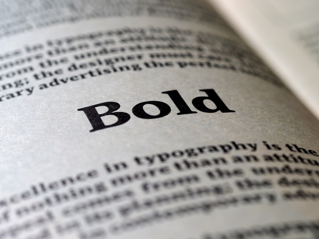
Best Bold Fonts for Headlines
Bold type exists to grab attention and set hierarchy. The best bold fonts are heavy display or condensed sans faces with thick strokes, tight spacing and strong presence at large sizes. The core principle: bold fonts are headline tools, not body text. Use them in short bursts where weight does the work, and keep supporting copy in a lighter, readable face.
The category splits roughly into three families. Tall condensed sans faces pack maximum word into minimum width and dominate posters and social graphics. Wide grotesque blacks feel modern and brand-forward. Heavy slab serifs read as rugged and vintage. Knowing which feel you want, tight and urgent versus broad and confident versus chunky and retro, narrows your shortlist quickly before you start testing real headlines.
What makes a good bold font?
A strong headline font has dense, confident strokes, minimal counters that stay legible when filled with color, and enough weight to dominate a layout without becoming a black blob. Condensed bold faces pack more characters into a line, which is great for posters and short punchy titles. Look for sturdy, even proportions and good performance in all caps, since most bold headlines are set uppercase.
Best bold fonts
This list runs from tall condensed sans to chunky slab serifs and playful rounded display faces. Most are free; the one notable premium pick is flagged in the table.
| Font | Best for | Price |
|---|---|---|
| Bebas Neue | Tall condensed headlines | Free (OFL) |
| Anton | Posters and hero text | Free (OFL) |
| Archivo Black | Solid grotesque titles | Free (OFL) |
| Oswald | Editorial condensed heads | Free (OFL) |
| Alfa Slab One | Heavy slab impact | Free (OFL) |
| Montserrat Black | Geometric bold branding | Free (OFL) |
| Fjalla One | Compact UI headings | Free (OFL) |
| Bungee | Signage and urban display | Free (OFL) |
| Titan One | Playful chunky headlines | Free (OFL) |
| Druk | Editorial fashion impact | Paid (Commercial Type) |
1. Bebas Neue
Bebas Neue is the go-to free condensed display sans, with tall, narrow all-caps letters that pack a clean, modern punch. It is everywhere in posters, social graphics and branding because it is versatile and free under the SIL Open Font License.
2. Anton
Anton is a single-weight, ultra-bold condensed sans built specifically for headlines. Its dense strokes and tight spacing make it dominate a layout instantly. Free on Google Fonts under the OFL.
3. Archivo Black
The heaviest cut of the Archivo family, Archivo Black is a sturdy grotesque sans that feels confident and contemporary in titles and logos. It is more squared and neutral than the condensed options. Free under the OFL.
4. Oswald
Oswald is a reworking of the classic gothic condensed style, optimised for screens. Its bold weight is excellent for editorial headlines and stacked title treatments. Free on Google Fonts under the OFL.
5. Alfa Slab One
Alfa Slab One is an extra-heavy slab serif with thick blocky serifs that read as rugged and loud. It is perfect for vintage-inspired posters and bold display moments. Free under the OFL.
6. Montserrat Black
The black weight of Montserrat brings geometric, fashion-forward boldness to branding and headlines. It stays clean and modern even at heavy weights. Free on Google Fonts under the OFL.
7. Fjalla One
Fjalla One is a medium-contrast condensed sans that works well for compact UI headings and short labels where space is tight. It is sturdy without being overpowering. Free under the OFL.
8. Bungee
Designed for urban signage, Bungee is a chunky display face built to work vertically as well as horizontally. Its bold, blocky forms suit street-style and signage-inspired layouts. Free on Google Fonts under the OFL.
9. Titan One
Titan One is a rounded, chunky display face with a friendly, almost cartoonish weight. It is great for playful headlines, kids’ brands and bold promotional graphics. Free under the OFL.
10. Druk
Druk, from Commercial Type, is the premium designer favorite for ultra-bold editorial impact, with super-condensed and wide cuts used across fashion magazines. It is a paid commercial license, so budget for it if you want that high-end look. A free alternative for a similar effect is Anton or Bebas Neue.
Free vs premium bold fonts
Most heavy display faces you need are free under the SIL Open Font License, including Bebas Neue, Anton and Archivo Black. Premium faces like Druk justify their cost with broader width ranges, finer optical tuning and a distinctive editorial pedigree. If budget is tight, the free options deliver plenty of impact; just confirm each license before commercial use. Our font licensing guide covers what OFL and commercial desktop licenses allow.
How to use bold fonts well
Bold type works best in short, punchy phrases set large, paired with a calm body font so the contrast lands. Tighten letter-spacing on condensed faces, keep line counts low, and avoid mixing two heavy display fonts in one layout. For elegant or neutral body partners, browse the best sans serif fonts. If your project needs refined contrast alongside the punch, the best elegant fonts make graceful companions.
Frequently Asked Questions
What is the boldest free font?
Anton and Alfa Slab One are among the boldest free fonts available, with extremely heavy strokes designed for maximum headline impact. Anton is a condensed sans, while Alfa Slab One is a chunky slab serif. Both are free on Google Fonts under the SIL Open Font License and can be used commercially.
What font do most posters use?
Condensed display sans faces like Bebas Neue, Anton and Oswald are extremely common on posters because their tall, narrow letters fit big words into a single line and read clearly from a distance. They are free, versatile and pair easily with simpler body fonts for supporting details.
Is Druk worth paying for?
Druk is worth it if you need its specific super-condensed and wide editorial styles, which are widely used in fashion and culture magazines. For most projects, free alternatives like Anton or Bebas Neue deliver comparable boldness. Buy Druk when its distinctive look is central to your brand and the budget allows.
Should bold fonts be used for body text?
No. Heavy display fonts are designed for short headlines and lose readability in long passages, where dense strokes tire the eye. Use a bold font only for titles and key callouts, and set body copy in a regular or medium weight of a more neutral, readable typeface for comfortable reading.
How do I make a headline feel bolder without a heavier font?
Increase the size, set it in all caps, tighten the letter-spacing, and use strong color contrast against the background. Reducing surrounding clutter and adding white space also makes a headline feel more dominant. These techniques can amplify impact even with a medium-weight font, no ultra-black face required.
What is the difference between a condensed and a wide bold font?
Condensed bold fonts like Bebas Neue and Anton have narrow letters that fit long words onto a single line, creating tall, urgent headlines ideal for posters. Wide bold faces like Archivo Black take up more horizontal space and feel calmer and more brand-forward. Choose condensed for punch and space efficiency, wide for a steadier, modern presence.