Unity in Design: Making It Cohesive
Unity in design — also called harmony or cohesion — is the sense that everything in a composition belongs together. When a layout has unity, the type, color, imagery, and spacing all feel like they came from the same place and were made for one another. When it lacks unity, the same elements read as a pile of unrelated parts, and the viewer feels the friction even if they can’t explain it.
Unity is often described as the goal that the other principles of design serve. Balance, alignment, proximity, and repetition are all means; unity is the end. This article covers what unity is, why it matters, the specific tools that create it, the balance between unity and variety, and the mistakes that fracture a design.
What is unity in design?
Unity is the principle that a design should be perceived as a single, coherent whole. Every element relates to the others through some shared quality — a common color, a repeated shape, a consistent type system, a shared grid. Those shared qualities are the threads that tie the parts together so the eye reads one thing, not many.
It helps to separate two closely related terms. Harmony describes elements that agree with one another and feel pleasant together; unity describes the larger result of that agreement — a whole that holds together. In practice the words are used interchangeably, and both point at the same target: a design that feels intentional and complete.
Why does unity matter?
A unified design is easier to process. When elements share visual traits, the brain recognizes the pattern quickly and stops working to make sense of the relationships. A disjointed design forces the viewer to reconcile clashing parts, which feels effortful and, often, untrustworthy. Cohesion reads as competence.
Unity is also what makes a brand feel like a brand across many touchpoints. A business card, a website, and a billboard that share the same type, color, and spacing system feel like one voice, building recognition with every appearance. Without unity, each piece looks like it belongs to a different company, and recognition never compounds.
How do you create unity in design?
Unity is built by giving elements shared qualities and removing needless differences. The most reliable tools are below; most cohesive designs lean on several at once.
- Repetition. Repeating a color, shape, font, or spacing value across a layout ties distant elements together. Repetition is the single strongest unifier.
- Consistency. Using the same styles, sizes, and rules throughout means nothing feels out of place. A consistent system is a unified system.
- Alignment. Shared edges create the invisible connections that bind elements into a structure.
- Proximity. Grouping related items into clean clusters makes the overall layout read as organized parts of one thing.
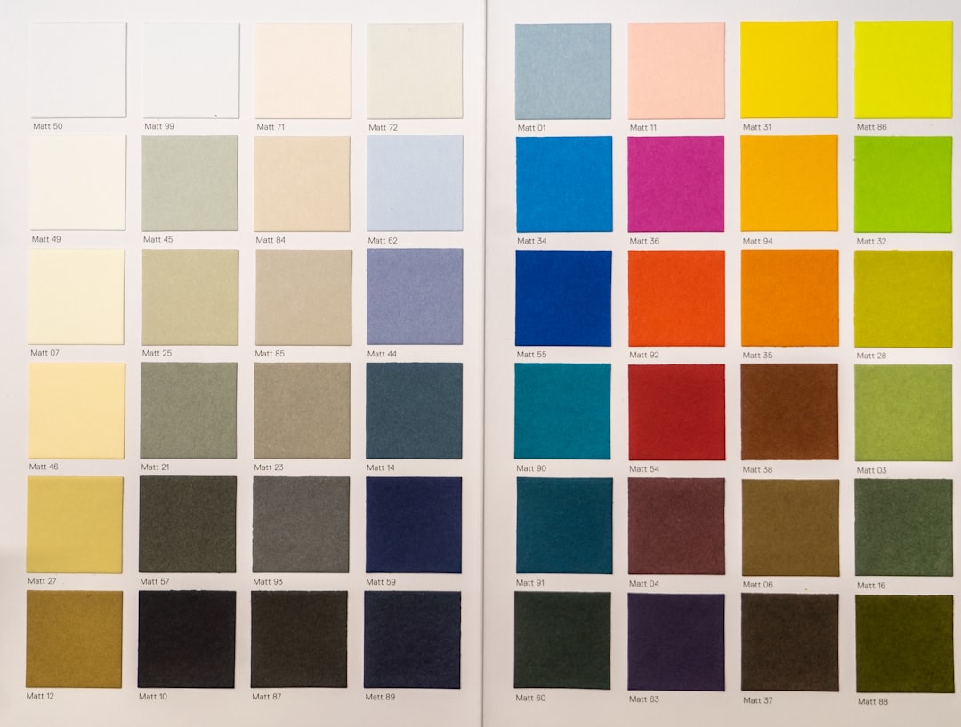
- A limited palette and type set. Restraint unifies. Two typefaces and a tight color palette cohere far more easily than five of each.
- A shared grid. One underlying structure gives every element a common reference, so the whole layout speaks with one logic.
Notice that several of these are themselves design principles. Unity is the result you get when alignment in design and proximity in design are working together — repetition then carries that order across the entire piece.
What role does repetition play?
If unity has a single engine, it is repetition. Repeating a visual element creates a rhythm of recognition: every time the viewer sees the recurring color, shape, or style, it reinforces that all these pieces belong to one family. A repeated accent color on every call to action, a consistent corner radius on every card, a single heading font throughout — each repetition is a thread stitching the design together.
| Tool | How it builds unity | Example |
|---|---|---|
| Repetition | Recurring traits tie distant elements together | One accent color used on every link and button |
| Consistency | Same rules everywhere remove odd notes | Identical card style across a whole page |
| Limited palette | Fewer variables means easier cohesion | Two fonts, three colors, used throughout |
| Shared grid | Common structure gives one logic | All sections built on a 12-column grid |
Unity versus variety: the balance
Total unity with no variation is monotonous. A layout where every element is identical has perfect cohesion and zero interest — the eye has nothing to catch on. The craft of unity is balancing sameness with enough variety to stay engaging, without letting the variety fracture the whole.
The guideline is to unify the foundation and vary the accents. Keep the grid, type system, and palette consistent, then introduce variety through scale, an occasional accent, or a single standout image. That standout depends on cohesion to read as special: a focal point only works because the surrounding field is unified, which is how unity supports emphasis in design. Variety is the seasoning; unity is the dish.
Common unity mistakes
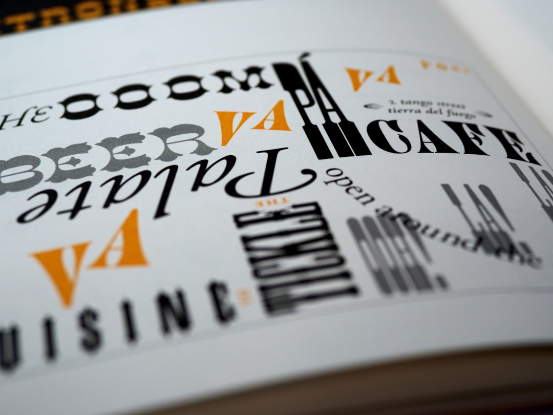
- Too many fonts. Three or four typefaces fighting for attention shatter cohesion. Limit yourself to one or two and use weight for variety.
- Inconsistent spacing. Random margins and gaps make a layout feel assembled by accident. Standardize a spacing scale.
- An unrelated palette. Colors with no relationship clash and split the design. Build from a deliberate, limited palette.
- No repeated elements. With nothing recurring, there are no threads tying the parts together. Repeat something on purpose.
- Variety without a unified base. Lots of difference and no shared foundation reads as chaos, not richness.
A quick workflow for building unity
Begin by defining your shared system: pick one or two typefaces, a limited palette, a spacing scale, and a grid, and write them down so they stay consistent. Build every element from that system. Then introduce repetition deliberately — choose a few traits, like an accent color or a card style, and reuse them across the whole piece. Finally, step back and ask whether the design looks like one thing or several. If any element feels like a visitor from another project, bring it into the system or remove it. Cohesion comes from restraint as much as from craft.
Frequently Asked Questions
What is unity in design?
Unity in design is the quality of all elements feeling like parts of one cohesive whole rather than separate, unrelated pieces. It is created through repetition, consistency, alignment, and proximity. A unified design reads as intentional and trustworthy, and it is easier for viewers to take in because the parts clearly belong together.
What is the difference between unity and harmony?
Harmony describes elements that agree and feel pleasant together, while unity describes the larger result — a design that holds together as a single whole. In everyday use the terms are interchangeable, and both point at the same goal of a cohesive, intentional composition. Harmony among parts produces unity in the whole.
How does repetition create unity?
Repetition reuses a visual trait — a color, shape, font, or spacing value — across a layout, and each recurrence signals that the elements belong to one family. It is the strongest unifier because it ties even distant elements together. A repeated accent color or a consistent card style stitches a whole design into one coherent piece.
How do you balance unity and variety?
Unify the foundation and vary the accents. Keep the grid, type system, and palette consistent so the design coheres, then add interest through scale, a standout image, or an occasional accent. Variety keeps a layout engaging, but it depends on a unified base to read as deliberate rather than chaotic.