What Font Does Adidas Use?
The Adidas font question has two layers: the logo is custom lettering, while the brand’s text runs on proprietary typefaces. This article explains what AdiHaus and Adineue are, what the wordmark actually descends from, and which free fonts get you closest to the clean, athletic Adidas look.
Adidas is a good example of a brand that built its mark in the neo-grotesque tradition and later commissioned bespoke faces. For how this compares with other major logos, see our pillar on famous brand fonts and what the big logos use.
What font is the Adidas logo?
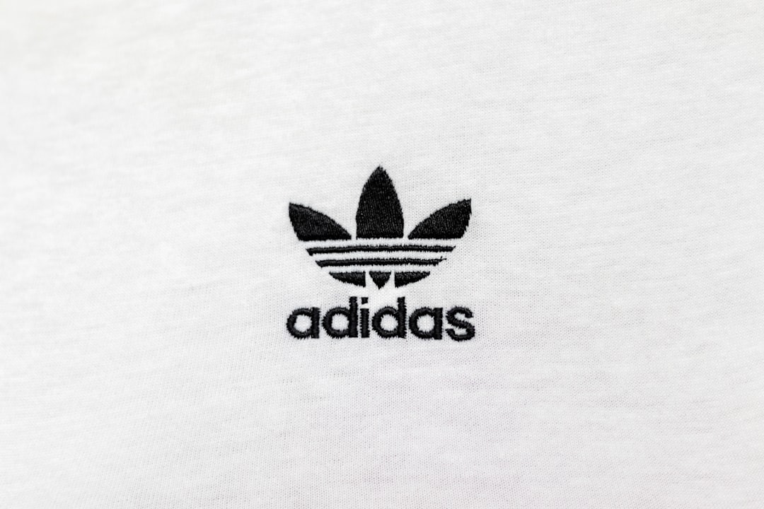
The Adidas wordmark — the lowercase “adidas” beside the three stripes or the Trefoil — is custom lettering, not an off-the-shelf font. Its clean, even, slightly condensed sans forms sit firmly in the neo-grotesque tradition, which is why people so often say “the Adidas font is Helvetica.” The older logo in particular evokes Helvetica and the geometric ITC Avant Garde, but the actual wordmark was drawn and tuned for the brand, so it isn’t either of those exactly.
The Trefoil and three-stripe marks are graphic devices, not type. So when people ask for “the Adidas logo font,” the precise answer is bespoke lettering with strong neo-grotesque DNA — a font-identifier tool will point you toward Helvetica-family faces but never the exact letters.
What fonts does Adidas use in its branding?
For headlines, campaigns, and product materials, Adidas relies on two custom typefaces:
- AdiHaus — the brand’s bespoke neo-grotesque sans, used widely across retail, packaging, and signage. Its name nods to the Bauhaus/Haus heritage and it carries a clean, sporty, Helvetica-adjacent character.
- Adineue — a more contemporary custom family (the “neue” signaling its modern update), used across digital and campaign work for a sharper, current feel.
Both are proprietary to Adidas and not available to the public. Like most large sportswear brands, Adidas controls its type so the identity stays consistent worldwide. Before using any commercial typeface in your own work, check our font licensing guide.
Can you download the Adidas font?
No. The wordmark is custom and AdiHaus and Adineue are proprietary, so there’s nothing official to download. Fan-made imitations exist for personal mockups, but they’re clones — and reproducing the Adidas wordmark, Trefoil, or three stripes is a trademark issue regardless of which font you use. For commercial work, the safe route is a licensable or free neo-grotesque, not a logo clone.
What’s a free Adidas font alternative?
The Adidas look is defined by clean, even, neo-grotesque sans letterforms. The best free options are:
- Inter (free) — a neutral, Helvetica-adjacent sans on Google Fonts with excellent spacing; the closest free stand-in for the wordmark’s clean grotesque feel, and free for commercial use.
- Archivo (free) — a grotesque family with condensed widths, good for the tall, athletic headline look.
- Roboto Condensed (free) — a condensed neo-grotesque for punchy, sporty type.
You can read more about the typeface the wordmark evokes in our guide to Helvetica, and pair any of these with a body font using the font pairing guide. For another athletic-brand comparison, see what font Nike uses.
Adidas fonts vs. the free alternatives
| Use case | Font | Style | Free alternative |
|---|---|---|---|
| Logo wordmark | Custom lettering (Helvetica-like) | Neo-grotesque sans | Inter |
| Brand typeface | AdiHaus | Custom neo-grotesque | Inter / Roboto |
| Digital & campaigns | Adineue | Modern custom sans | Archivo |
| Condensed headlines | AdiHaus Condensed (custom) | Condensed grotesque | Roboto Condensed |
What makes the Adidas type distinctive?
The wordmark’s personality comes from restraint. The lowercase letters are even, tightly fitted, and stripped of ornament, so the type stays quiet and lets the three stripes do the talking. That neo-grotesque neutrality reads as efficient, modern, and disciplined — athletic without shouting. AdiHaus extends the same logic across the brand, while Adineue sharpens it for screens. The consistency is the point: nothing in the type fights the iconography.
That clean, tuned neutrality is why font-identifier tools point toward Helvetica and Inter but never the exact wordmark. For real projects this is fine: the even, condensed, grotesque qualities are all reproducible with a free font, and the wordmark, Trefoil, and stripes are trademarks you shouldn’t copy anyway.
How to get the Adidas look on a budget
To capture Adidas’s clean, athletic type feel without proprietary fonts, follow this approach:
- Start with Inter. Its Helvetica-adjacent neutrality gives you the wordmark’s grotesque base for free; use a regular or medium weight set in lowercase.
- Tighten the spacing. The wordmark’s compact, even fit is core to its look — reduce tracking slightly.
- Use condensed widths for headlines. Swap to Archivo or Roboto Condensed for tall, sporty campaign text.
- Pair with a clean body font and lean on bold black-and-white contrast — see our font pairing guide.
This gets you a disciplined, athletic look that’s entirely original and safe to use commercially.
Why does Adidas use a Helvetica-style font?
Neo-grotesque type reads as neutral, modern, and trustworthy — qualities that let the three stripes and Trefoil carry the brand. By building the wordmark in that tradition and commissioning AdiHaus and Adineue, Adidas keeps a coherent, understated voice worldwide. It’s a different route from brands that lead with a bold custom display face like Pepsi, but the goal is the same: an ownable, unmistakable identity.
Frequently Asked Questions
What font does the Adidas logo use?
The Adidas logo uses custom lettering in the neo-grotesque tradition, not a downloadable font. It closely evokes Helvetica and ITC Avant Garde, especially in older versions. The brand’s text runs on the proprietary AdiHaus and Adineue typefaces. For a free match, Inter is the closest stand-in.
Is the Adidas font Helvetica?
Not exactly, but it’s close. The Adidas wordmark is custom lettering drawn in the neo-grotesque style that Helvetica defines, which is why the two look similar. The brand uses its own AdiHaus and Adineue typefaces rather than Helvetica itself. A free Helvetica-adjacent font like Inter is the easiest legal match.
What is the Adidas font called?
Adidas uses two custom brand typefaces: AdiHaus, a neo-grotesque sans used across retail and packaging, and Adineue, a more modern family used in digital and campaign work. Both are proprietary to Adidas and not available to the public. The logo wordmark itself is separate, bespoke lettering.
What free font looks like the Adidas logo?
Inter is the best free match because it shares the clean, even, neo-grotesque character of the wordmark. For condensed athletic headlines, Archivo and Roboto Condensed work well. All three are on Google Fonts and free for commercial use, though you should never recreate the Adidas wordmark, Trefoil, or three stripes.
Can I use AdiHaus for my own project?
No. AdiHaus is proprietary to Adidas and is not licensed to the public. For a similar clean, athletic look on your own original branding, use a free neo-grotesque such as Inter or a licensable Helvetica. Imitating the Adidas wordmark or marks is trademark infringement regardless of font — review our font licensing guide first.


