What Font Does CNN Use? The CNN Font Explained
Wondering what the CNN font is? CNN’s identity runs on a proprietary typeface called CNN Sans — a custom grotesque commissioned in 2016 — while the instantly recognisable red logo is its own bespoke lettering. Neither is a font you can install. This guide explains the brand face, the logo, and the free fonts that get you closest to CNN’s authoritative, news-grade look.
CNN is a textbook case of a global news brand using neutral, no-nonsense type to project credibility. For the wider picture, browse our overview of fonts used by famous brands.
What font is the CNN logo?
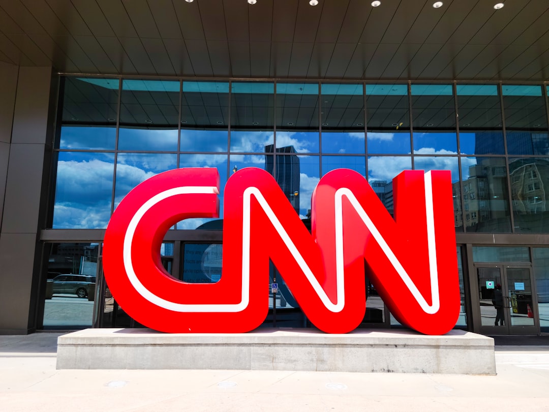
The bold red “CNN” letters are custom lettering — a trademarked, bespoke wordmark rather than typed from a stock font. The forms are heavy, slightly condensed grotesque capitals refined for maximum impact on screen, especially in the corner “bug” that sits on broadcasts. Because the mark is proprietary, it cannot be legally reproduced. The red colour and the specific letterforms together do the brand-recognition work, so the logo functions as a single locked graphic asset.
What is CNN Sans, the brand typeface?
For everything beyond the logo — on-screen graphics, lower thirds, headlines, and digital products — CNN uses CNN Sans, a custom typeface created by London studio Brody Associates and rolled out from 2016 as part of a wider identity refresh. It is a contemporary grotesque sans-serif whose proportions nod to both Gotham and the Helvetica lineage: clean, even, and highly legible at the small sizes news graphics demand. As a corporate face, CNN Sans is licensed for CNN’s internal brand use and is not sold to the public, so you cannot download it for your own work.
Why does CNN use a neutral grotesque?
News brands lean on neutral grotesques because the type has to disappear so the information can lead. A clean sans in the Helvetica tradition reads instantly across crawling tickers, mobile feeds, and large-format studio screens, and it carries no editorial tone of its own — exactly what an outlet pursuing impartial credibility wants. The same instinct drives other broadcasters and publishers; compare it with our breakdown of the ESPN font and the HBO font.
Can I use the CNN font?
No. Both the red logo lettering and CNN Sans are proprietary brand assets, so you cannot license or reuse them for your own projects. The good news is that the look is easy to approximate with free, legal grotesques. Before you ship anything, check the terms of whatever you choose — our font licensing guide walks through desktop, web, and app licensing so you do not get caught short.
Free and paid alternatives to the CNN font
You cannot license CNN Sans, but several clean grotesques deliver the same neutral, news-grade feel. Helvetica (paid) and Gotham (paid) are the obvious paid references given CNN Sans’s heritage. For free options, Inter and Arimo (a metric-compatible Arial/Helvetica substitute) are excellent stand-ins.
| Use case | Font (paid reference) | Free alternative |
|---|---|---|
| CNN-style headline / wordmark | Gotham (paid) | Inter (free) |
| On-screen body / captions | Helvetica Neue (paid) | Arimo (free) |
| UI / app text | Akkurat (paid) | Inter (free) |
| Condensed tickers / lower thirds | Helvetica Condensed (paid) | Roboto Condensed (free) |
If you license a paid grotesque such as Gotham or Helvetica Now, confirm your tier covers web embedding and app use as well as desktop, especially for broadcast-style motion graphics.
How do I get the CNN look in my own design?
Set headlines in a bold Inter or licensed Gotham, keep the colour palette tight and high-contrast (CNN’s red on white or dark backgrounds), and lean on strong alignment and generous spacing. The point is authority through restraint: limited weights, consistent margins, and clean baselines read as trustworthy. For another grotesque-driven media identity, see our breakdown of the Vogue font.
How has the CNN identity evolved?
CNN launched in 1980 and its bold red wordmark has been remarkably stable ever since — a rare example of a logo that has barely changed across more than four decades, which is itself a strength in a category where most brands churn through redesigns. The big typographic shift came in 2016, when CNN moved away from licensed third-party faces to its own bespoke CNN Sans for everything around the logo. That decision unified an enormous output — broadcast graphics, the website, mobile apps, social formats — under one coherent voice, and saved on per-platform licensing. The logic mirrors what other large media organisations did in the same era: commission a custom face to lock down consistency and control. Through it all the red wordmark stayed put, anchoring recognition while the supporting type modernised around it. That split — a fixed, iconic logo plus an evolving, screen-tuned brand face — is a pattern you will see across many of the brands in our famous brand fonts roundup.
Inter, Arimo, or Gotham: which alternative fits?
All three sit near CNN Sans’s neutral-grotesque family, but they serve different needs. Inter is the best free all-rounder: open-source, screen-tuned, with a huge character set and many weights — ideal for UI, web, and modern brand work. Arimo is metrically compatible with Arial and Helvetica, so it is the safe free pick when you need to substitute into existing layouts without reflowing text. Gotham (paid) is the closest in spirit to CNN Sans’s geometric heritage, but it carries licensing costs. For most new projects chasing the CNN look, Inter is the pragmatic choice.
Frequently Asked Questions
What font does the CNN logo use?
The red “CNN” letters are custom lettering — heavy, slightly condensed grotesque capitals drawn specifically for the brand. It is a trademarked, bespoke wordmark, not a downloadable retail font, so it cannot be legally reproduced for your own use.
What is CNN’s brand font?
CNN’s brand typeface is CNN Sans, a custom grotesque introduced in 2016 by Brody Associates with a Gotham and Helvetica heritage. It is used across on-screen graphics, headlines, and digital products, and is licensed for internal brand use rather than sold publicly.
Is the CNN font free?
No. Both the logo lettering and CNN Sans are proprietary and not publicly available. For a free, legal substitute with the same clean grotesque feel, use Inter or Arimo, or license Gotham or Helvetica for a closer reference match.
Is the CNN font Helvetica?
Not exactly, but it shares DNA with it. CNN Sans is a custom grotesque whose proportions draw on both Gotham and the Helvetica lineage, which is why Helvetica, Inter, and Arimo all make convincing alternatives for the look.
Can I use the CNN font for commercial work?
You cannot use the CNN logo lettering or CNN Sans commercially, as they are protected brand assets. You can use free alternatives like Inter and Arimo, or a licensed Gotham or Helvetica, for your own projects as long as you hold the correct license.


