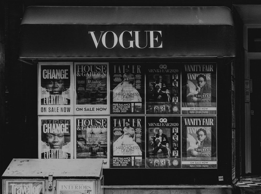
What Font Does Vogue Use? The Vogue Font Explained
If you have ever asked what font the Vogue font actually is, the short version is that the famous wordmark is custom Didone lettering, not an off-the-shelf typeface. It belongs to the high-contrast serif tradition popularised by Didot and Bodoni in the late 18th century — the look that has defined fashion typography ever since. This guide breaks down the masthead, the brand’s editorial type, and the fonts you can legally use to get close.
Vogue sits firmly in the luxury-publishing typographic tradition. If you are researching how the world’s biggest names build identity through type, our overview of fonts used by famous brands is the best place to start.
What font is the Vogue logo?
The Vogue logo is a piece of custom lettering in the Didone (sometimes called Modern) serif classification. Didone faces are defined by extreme contrast between thick and thin strokes, flat unbracketed serifs, and vertical stress — the elegant, slightly austere quality you see across high fashion. The Vogue wordmark is widely associated with Didot, the family designed by Firmin Didot in Paris around 1800, though the masthead has been refined and redrawn over the magazine’s long history rather than simply typed in a single retail font.
Because it is bespoke, you cannot download “the Vogue font” and reproduce the logo legally. The wordmark is a protected brand asset. What you can do is reach for a Didot- or Bodoni-style Didone serif and capture the same spirit.
What typeface does Vogue use in the magazine?
Inside the magazine and across editorial work, Vogue and other Condé Nast fashion titles have relied heavily on Didone serifs — Didot in particular for headlines and display — paired with cleaner sans-serifs for captions and running text. The pairing logic is consistent across luxury publishing: a high-contrast serif carries the glamour up top, while a quiet, legible sans handles the practical reading. The exact cuts shift between issues and art directors, so treat any single “Vogue uses X” claim with healthy skepticism; the through-line is the Didone genre, not one fixed file.
Why does Vogue use a Didone serif?
High-contrast serifs read as expensive. The thin hairlines demand good paper and sharp printing, which historically signalled premium production. The vertical stress and refined proportions feel formal and composed — exactly the register a fashion authority wants. This is why so much of the luxury world converges on the same look; see how it plays out for jewellery in our breakdown of the Rolex font, another heritage brand that leans on a refined serif.
Free and paid alternatives to the Vogue font
You cannot license the Vogue wordmark, but you can get strikingly close with Didone-genre typefaces. Playfair Display (free, Google Fonts) is the most accessible substitute — a high-contrast transitional-to-Didone serif made for headlines. For a more authentic match, license a true Didot or Bodoni.
| Use case | Font | Free alternative |
|---|---|---|
| Vogue-style masthead / headline | Didot (proprietary, paid) | Playfair Display (free) |
| Editorial display serif | Bodoni (paid) | Libre Bodoni (free) |
| Luxury body / subhead serif | Didot Text (paid) | Cormorant (free) |
| Clean caption sans pairing | Futura / Avenir (paid) | Jost (free) |
Before you ship anything using a paid Didone, confirm the desktop, web, and embedding rights you need. Our font licensing guide walks through exactly what each license tier covers so you do not over- or under-buy.
How do I get the Vogue look in my own design?
Set your headline in Playfair Display or a licensed Didot at a large size with tight, confident tracking — Didone faces look best big, where the thin strokes can sing. Keep weights deliberate: a single elegant display weight beats a noisy mix. Pair it with a restrained sans like Jost for captions, give the layout generous white space, and let the contrast do the work. For more brand-by-brand teardowns, our piece on the Ferrari font shows how another luxury name handles custom type.
A short history of the Vogue masthead
Vogue launched in 1892, and its masthead has been redrawn many times since, but the Didone DNA has stayed remarkably constant. The high-contrast serif look was already the language of fashion plates and society journals when the magazine began, so adopting it positioned Vogue inside an established tradition of taste and authority. Over the decades the wordmark has been tightened, the proportions adjusted, and the weight balanced for modern printing and screens, yet a reader from any era would recognise it. That consistency is the whole point: a masthead is a promise of editorial identity, and changing the genre would break the brand’s century-long visual contract. It is worth remembering that “Didot” here is shorthand for a family of cuts and revivals rather than one fixed file, which is exactly why the brand keeps its lettering custom rather than relying on a retail download.
Didot vs Bodoni: which should you use?
Both are Didone serifs, but they differ in temperament. Didot tends to feel sharper and more vertical, with crisp hairlines that read as cool and Parisian — the more “Vogue” of the two. Bodoni is a touch rounder and warmer, with slightly heavier serifs, giving it a more classical, almost bookish authority. If you want the icy fashion-masthead edge, lean Didot (or free Playfair Display set tight). If you want something a little softer for longer headlines or covers, Bodoni — or free Libre Bodoni — is the better call. Either way, set them large; Didone faces depend on size to show off their contrast.
Frequently Asked Questions
What font does the Vogue logo use?
The Vogue logo uses custom Didone lettering, a high-contrast serif most often associated with Didot. It is bespoke artwork refined over the magazine’s history, not a downloadable retail font, so it cannot be legally reproduced as the official wordmark.
Is the Vogue font free?
No. The actual Vogue masthead is proprietary custom lettering. For a free, legal substitute that captures the same fashion-Didone feel, use Playfair Display from Google Fonts, or license a true Didot or Bodoni for a closer match.
Is Vogue’s font Didot or Bodoni?
Both belong to the Didone genre, and Vogue is most often associated with Didot. The brand has used Didot-family display type across editorial work. Bodoni is a close cousin with the same high contrast, which is why designers reach for either to evoke the look.
What is the closest free alternative to the Vogue font?
Playfair Display is the closest free alternative. It is a high-contrast serif built for headlines and captures the elegant, fashion-magazine character of the Vogue masthead. Libre Bodoni and Cormorant are strong free options for a Bodoni-leaning variation.
Can I use the Vogue font for commercial work?
You cannot use the actual Vogue wordmark commercially, as it is a protected brand asset. You can use Didone-style typefaces such as a licensed Didot or free Playfair Display for your own projects, provided you hold the correct license for your intended use.