What Font Does Ferrari Use? The Ferrari Font Explained
If you are asking what the Ferrari font is, the honest answer is that it is custom. The angular “Ferrari” script and the brand’s logotype are bespoke designs developed for the marque, not a single retail typeface you can install. Over the years Ferrari’s marks have flirted with serif and Friz Quadrata-style letterforms, and the modern identity centres on a proprietary custom face. This guide separates what is documented from what is myth, and points you to legal alternatives.
Ferrari is one of the strongest examples of a brand whose type is inseparable from its identity. For the wider picture, see our overview of fonts used by famous brands.
What font is the Ferrari logo?
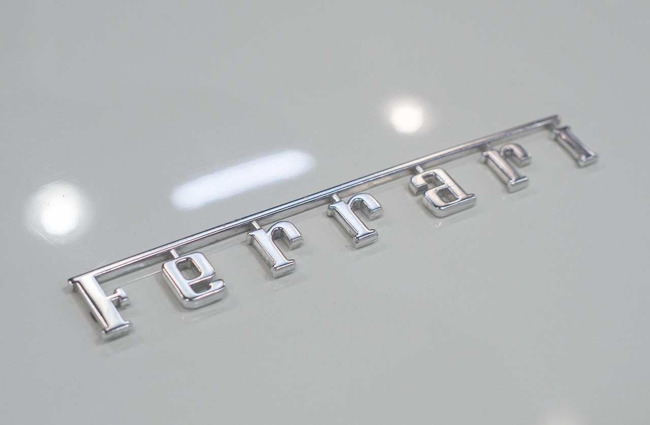
The Ferrari logo is built from custom lettering. The “Ferrari” wordmark — most familiar in its slanted, italic-leaning form beneath the prancing horse (Cavallino Rampante) — is bespoke artwork, not a typed line of a stock font. Because it is custom and trademarked, no off-the-shelf typeface will match it exactly, and the official mark cannot be legally reproduced. Designers chasing the look usually reach for a strong italic serif or a bold, slightly flared sans depending on which era of Ferrari branding they are referencing.
Has Ferrari used Friz Quadrata?
Some Ferrari-associated marks and supporting type have historically drawn on the Friz Quadrata family — a flared, glyphic typeface with subtle serif-like terminals that bridges serif and sans. It carries a refined, engraved quality that suits a heritage performance brand. Treat this as historical context rather than a blanket “Ferrari uses Friz Quadrata” claim: the brand’s typography has shifted across eras and applications, and the current identity is built on a proprietary custom typeface rather than any single retail face.
Why does Ferrari use custom type?
For a brand this protective of its identity, custom type is non-negotiable. A bespoke typeface guarantees the marque looks unmistakably Ferrari across cars, merchandise, racing liveries, and signage, with no risk of a competitor using the same font. Custom type also lets the design team fine-tune every detail — the slant, the terminals, the weight — to match the brand’s performance-luxury positioning. This is the same logic that drives other premium marques; see how it plays out in our guide to the BMW font.
Free and paid alternatives to the Ferrari font
You cannot license Ferrari’s custom type, but you can evoke its spirit. For the slanted, sporty wordmark feel, a bold italic sans or a flared glyphic serif gets you closest. Your choice depends on whether you are matching the italic script energy or the more engraved, Friz Quadrata-style marks.
| Use case | Font | Free alternative |
|---|---|---|
| Sporty italic wordmark | Friz Quadrata (paid) | Oswald Italic (free) |
| Flared / glyphic display | Albertus (paid) | Cinzel (free) |
| Bold performance headline | Eurostile (paid) | Saira Condensed (free) |
| Clean supporting sans | Helvetica (paid) | Inter (free) |
If you license a paid display face like Friz Quadrata or Eurostile, confirm the rights for your medium first. Our font licensing guide breaks down desktop, web, and embedding terms so you buy exactly what you need.
How do I get the Ferrari look in my own design?
Lean into motion and confidence. Use a bold italic or condensed sans for a racing feel, or a flared glyphic serif like free Cinzel for the more heritage, engraved register. Keep the palette tight — Ferrari’s red and black do a lot of the work — and pair the display type with a clean neutral sans for detail. Avoid copying the prancing horse or the actual wordmark; build your own mark in the same energy. For a related teardown, see our piece on the Red Bull font.
Why is the Ferrari font so hard to pin down?
Ferrari’s typography resists a single clean answer for a good reason: the brand spans road cars, Formula 1, merchandise, and heritage celebration, and each context has called for different lettering over the decades. The slanted “Ferrari” script most people picture is custom, but you will also find serif and flared glyphic forms across older marks, dealer signage, and model badges. On top of that, the brand has tightened into a proprietary custom typeface for its modern identity. So when someone says “the Ferrari font,” they may be picturing any of several distinct things. The accurate framing is that Ferrari uses bespoke type, informed at various points by serif and Friz Quadrata-style influences, rather than one nameable retail font you can buy.
How does Ferrari’s type compare to other performance brands?
Performance and luxury brands tend to pick one of two routes. Some, like BMW, lean on neutral grotesques to signal engineering precision and let the product speak. Others, like Ferrari, commission expressive custom type that carries personality and motion in the letterforms themselves. Ferrari’s slanted, energetic lettering puts it closer to the emotional, motorsport end of the spectrum than the cool corporate end. That choice fits a brand selling passion and exclusivity rather than rational efficiency — the type is meant to feel like the car, not like a spec sheet. It is the same expressive instinct you see in energy and sport brands more broadly.
Frequently Asked Questions
What font does the Ferrari logo use?
The Ferrari logo uses custom lettering, not an off-the-shelf font. The slanted “Ferrari” wordmark beneath the prancing horse is bespoke, trademarked artwork developed for the brand, so it cannot be legally reproduced with any downloadable typeface.
Is the Ferrari font Friz Quadrata?
Not exactly. Some Ferrari-associated marks and supporting type have historically drawn on the Friz Quadrata family, but the main wordmark is custom and the current identity uses a proprietary typeface. Friz Quadrata is best seen as historical influence, not the official Ferrari font.
Is the Ferrari font free?
No. Ferrari’s type is custom and trademarked, with no free official version. For the look, use free alternatives such as Cinzel for a glyphic feel or Oswald Italic for a sporty wordmark, or license a paid face like Friz Quadrata or Eurostile.
What is the closest free alternative to the Ferrari font?
It depends on the mark. For the flared, engraved heritage feel, Cinzel is a strong free choice. For a sporty, slanted wordmark energy, Oswald Italic or Saira Condensed work well. None are exact matches, since the real Ferrari type is bespoke.
Can I use the Ferrari font for commercial work?
You cannot use Ferrari’s actual wordmark, logo, or custom type commercially, as they are protected trademarks. You can use the alternative typefaces above for your own projects, provided you hold the correct license for your intended use.