What Font Does BMW Use? The BMW Font Explained
Asking what the BMW font is? BMW runs on a proprietary corporate typeface called BMW Type — a custom grotesque sans-serif clearly influenced by Helvetica — while the famous blue-and-white roundel uses its own custom “BMW” lettering. Neither is a font you can install. This guide covers the corporate face, the badge, and the free fonts that get you closest to BMW’s clean, engineered look.
BMW is a strong example of a precision-engineering brand expressing itself through neutral, confident type. For the bigger picture, browse our overview of fonts used by famous brands.
What font is the BMW logo?
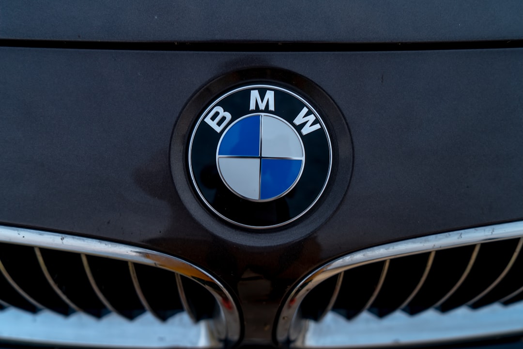
The “BMW” letters inside the circular roundel are custom lettering — clean, bold grotesque capitals refined into a trademarked badge rather than typed from a stock font. The forms are close in spirit to a classic grotesque like Helvetica, which is why the badge reads as so neutral and timeless, but the actual mark is bespoke and cannot be legally reproduced. The roundel itself (with its blue-and-white quadrants) is a separate graphic asset from the lettering.
What is BMW Type, the corporate typeface?
For everything beyond the badge — advertising, signage, vehicle interfaces, and print — BMW uses BMW Type, a custom corporate typeface (you will also see it referenced under the BMW Group identity). It is a grotesque sans-serif in the Helvetica lineage: clean, even, low-contrast, and engineered for clarity across screens and large-format applications. The choice reflects BMW’s brand promise of precision and modernity. As with most corporate faces, BMW Type is licensed for internal brand use and is not sold to the public, so you cannot download it for your own work.
Why does BMW use a Helvetica-style grotesque?
A neutral grotesque communicates exactly what BMW wants: engineering, order, and modern confidence, with no decorative noise. Grotesque sans-serifs in the Helvetica tradition are highly legible at every size, which matters for dashboards, signage, and dense technical copy. The restraint also lets the product lead — the type stays out of the way. This is the same instinct behind other premium automotive identities; compare it with our guide to the Ferrari font, which takes a more expressive, custom route.
Free and paid alternatives to the BMW font
You cannot license BMW Type, but several clean grotesques deliver the same neutral, engineered feel. Helvetica (paid) is the obvious paid reference. For free options, Inter and Arimo (a metric-compatible Arial/Helvetica substitute) are excellent stand-ins.
| Use case | Font | Free alternative |
|---|---|---|
| BMW-style wordmark / headline | Helvetica Now (paid) | Inter (free) |
| Clean corporate body text | Helvetica Neue (paid) | Arimo (free) |
| UI / dashboard text | Akkurat (paid) | Inter (free) |
| Condensed signage | Helvetica Condensed (paid) | Roboto Condensed (free) |
If you license a paid grotesque such as Helvetica Now, check that your tier covers web embedding and app use as well as desktop. Our font licensing guide explains each license type so you do not get caught short.
How do I get the BMW look in my own design?
Set headlines and body in Inter or licensed Helvetica, keep weights tight (a regular and a bold is usually enough), and let alignment and white space carry the structure. Avoid decorative flourishes — BMW’s typographic discipline is the point. Stick to a restrained palette and consistent spacing for that engineered, premium feel. For another grotesque-driven identity, see our breakdown of the Red Bull font.
How has the BMW identity evolved?
BMW’s visual identity has been refined repeatedly, but its typographic philosophy has stayed consistent: clarity over decoration. The roundel itself dates to 1917, and while the badge has been flattened and modernised over the years — most recently into a transparent, two-dimensional treatment for digital — the “BMW” lettering has always stayed clean, bold, and neutral. The corporate typeface has likewise evolved toward better screen performance as BMW’s communications moved from print to interfaces and connected-car displays. Through every update, the goal has been the same: type that reads instantly, scales perfectly, and never competes with the product. That discipline is why BMW’s branding feels coherent across a century of very different media.
Helvetica, Inter, or Arimo: which alternative fits?
All three sit in the neutral-grotesque family, but they serve slightly different needs. Helvetica is the authentic paid reference and the closest in feel to BMW Type’s heritage, but it carries licensing costs and was not originally optimised for screens. Inter is the best free all-rounder: open-source, screen-tuned, with a large character set and many weights — ideal for UI, web, and modern brand work. Arimo is metrically compatible with Arial and Helvetica, so it is the safe free pick when you need to substitute into existing layouts without reflowing text. For most new projects chasing the BMW look, Inter is the pragmatic choice.
Frequently Asked Questions
What font does the BMW logo use?
The “BMW” letters in the roundel are custom lettering — clean grotesque capitals close in spirit to Helvetica but drawn specifically for the badge. It is a trademarked, bespoke mark, not a downloadable retail font, so it cannot be legally reproduced.
What is BMW’s corporate font?
BMW’s corporate typeface is BMW Type (referenced under the BMW Group identity), a custom Helvetica-influenced grotesque sans-serif. It is used across advertising, signage, and interfaces, and is licensed for internal brand use rather than sold to the public.
Is the BMW font free?
No. Both the roundel lettering and BMW Type are proprietary and not publicly available. For a free, legal substitute with the same clean grotesque feel, use Inter or Arimo, or license Helvetica for a closer reference match.
Is the BMW font Helvetica?
Not exactly, but it is strongly Helvetica-influenced. BMW Type is a custom grotesque in the same family of neutral sans-serifs as Helvetica, which is why Helvetica, Inter, and Arimo are the most convincing alternatives for the look.
Can I use the BMW font for commercial work?
You cannot use the BMW roundel lettering or BMW Type commercially, as they are protected brand assets. You can use free alternatives like Inter and Arimo, or a licensed Helvetica, for your own projects as long as you hold the correct license.