What Font Does Puma Use?
The Puma font question usually means the slanted “PUMA” wordmark beside the leaping-cat logo. Like most major sportswear marks, it isn’t an off-the-shelf font — it’s custom lettering engineered to look fast, bold, and dynamic. Below we break down what the wordmark is, what it’s based on, and the free alternatives that get you close. For how other athletic brands handle their type, see our hub on famous brand fonts.
What font is the Puma logo?
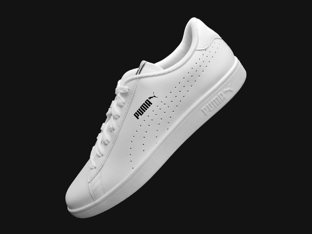
The “PUMA” wordmark is custom bold italic lettering — a heavy, forward-slanting sans-serif drawn specifically for the brand. The italic slant is the key feature: it implies speed and motion, exactly what a performance-sport company wants beside its leaping puma. The letters are clean and confident with strong, even weight and a slight condensation that gives the mark momentum. Because it is bespoke and trademarked, there is no downloadable “Puma font” — any file by that name online is an unofficial imitation. It’s best described as a custom bold italic sans rather than a single licensable typeface.
Is the Puma font based on a known typeface?
Puma’s wordmark sits in the broad family of bold italic grotesques that sport brands favor, but the exact letterforms are customized for the mark rather than lifted straight from a retail font. People often compare it to heavy, slightly condensed sans-serifs with an aggressive forward slant. We should be honest and hedge here: there is no widely confirmed single “this is the font” answer for the Puma wordmark, so treat it as bespoke lettering in the bold-italic-sans tradition rather than a named typeface. If you want the closest legitimate match, a commercial athletic sans with a true italic is the route, which we cover below.
Why does Puma use bold italic lettering?
Italic, condensed, heavy type reads as fast, energetic, and athletic — the slant literally leans the word forward, suggesting movement and momentum. For a performance-sport brand, that’s a perfect emotional cue: it pairs with the leaping-cat logo to communicate speed and power in a single glance. Bold weight also ensures the wordmark holds up on footwear, apparel, and small tags where it has to read instantly. It’s the same logic that drives many sportswear identities toward dynamic, slanted sans-serifs. For other athletic and retail breakdowns, see our siblings on what font Vans uses and what font Shopify uses.
Free fonts that look like the Puma font
You can’t use Puma’s custom wordmark, but free bold italic and condensed sans-serifs capture the same fast, athletic energy. Match the role: a heavy slanted sans for a wordmark or headline, with strong condensation for momentum.
| Use case | Puma uses | Free / paid alternative |
|---|---|---|
| Logo / wordmark look | Custom bold italic sans | Saira Condensed Italic (free) |
| Athletic headlines | Heavy slanted grotesque | Oswald + italic styling (free) |
| Bold condensed body | Condensed sans system | Archivo Narrow (free) |
| Closest paid match | Custom sport lettering | Commercial athletic sans (paid) |
Saira Condensed in its bold italic styles is the best free match — a condensed sans with a true italic that delivers the forward-leaning, fast feel of the Puma wordmark. Oswald is a free, widely available condensed grotesque that works well for athletic headlines (apply an italic/oblique treatment for the slant), and Archivo Narrow handles bold condensed body and labels. All are free on Google Fonts for commercial use. For an exact likeness, a licensed commercial sport face is the closest route — flag it as paid, not free.
One detail worth getting right: prefer a font that ships with a genuine italic rather than relying on a software-applied oblique. A true italic is drawn at the slant, so its curves and joins stay clean and confident, while a faked slant on an upright font can look smeared at heavy weights. Saira Condensed includes real italic styles, which is a big part of why it reads as athletic rather than awkward. Pair it with a single strong accent color and tight, all-caps spacing, and you capture the momentum of the Puma mark without copying it.
How to recreate the Puma look
To echo Puma’s identity for free, set your wordmark in a heavy condensed sans like Saira Condensed, apply a consistent italic slant, and keep letter-spacing tight so the word reads as one fast, unified shape. Use bold weight, all caps, and a strong single accent color against black or white — sportswear branding thrives on high contrast and motion. The slant is doing the heavy lifting, so make sure the obliqueness looks intentional and even.
If you need the genuine article, remember the Puma wordmark is custom, trademarked lettering and is not available to download — and the brand name and leaping-cat logo are protected, so use these fonts for your own original sport-style identity rather than to imitate Puma. Our font licensing guide covers the line between licensing a typeface and infringing a trademark, and our font pairing guide helps you balance a bold condensed display face with a readable body sans.
Frequently Asked Questions
What font does Puma use in its logo?
Puma’s wordmark uses custom bold italic lettering — a heavy, forward-slanting sans-serif drawn specifically for the brand to suggest speed and motion. It is proprietary and trademarked, so it is not a downloadable font. Free bold italic condensed sans-serifs like Saira Condensed offer a similar athletic look.
Can I download the Puma font?
No. The Puma wordmark is bespoke, trademarked lettering and is not available to download. Any “Puma font” on a free-font site is an unofficial imitation. For a similar look you can legally use, try Saira Condensed Italic or Oswald, both free on Google Fonts for commercial projects.
What font is closest to the Puma logo?
Saira Condensed in bold italic is the closest easy free match, delivering the condensed, forward-leaning feel of the Puma wordmark. Oswald with an italic treatment is another strong option for athletic headlines. For the closest exact likeness, a licensed commercial sport sans is the paid route.
Is the Puma font based on a specific typeface?
Not a single confirmed one. The Puma wordmark is custom lettering in the broad bold-italic-grotesque tradition that sport brands favor, rather than an off-the-shelf typeface. Treat it as bespoke design in that style; there is no widely verified “exact font” answer, so we recommend free condensed italic alternatives instead.
Why does Puma use italic letters?
The italic slant suggests speed, energy, and motion — ideal for a performance-sport brand. Leaning the wordmark forward pairs naturally with the leaping-cat logo to communicate momentum at a glance, while the bold weight keeps it legible on footwear, apparel, and small tags. It is a deliberate, athletic type strategy.