What Font Does National Geographic Use?
If you’re after the National Geographic font for a documentary-style title, travel layout, or tribute, the most recognizable element is actually the yellow border, not a single typeface. The wordmark is a custom serif, and the wider brand has leaned on a family called Geograph. This guide separates the icon from the type and points you to free serifs that get close.
Nat Geo is a good example of a brand whose visual identity rests on a frame as much as a font. For the wider view across brands, see our pillar on famous brand fonts and what the big logos use.
What is the National Geographic logo, really?
The most iconic part of National Geographic’s identity is the yellow rectangle frame — the bright “portal” border that has framed the brand for decades and is often shown alone, without any text. The accompanying “National Geographic” wordmark is a custom serif: a classic, authoritative serif with traditional proportions that signals heritage, rigor, and trust. It was drawn or refined for the brand rather than being a stock retail font, and as a trademarked mark it shouldn’t be reproduced.
So when people ask “what font is the Nat Geo logo,” the honest answer is that the frame does most of the identifying work, and the lettering is a bespoke serif treatment.
What typeface does the National Geographic brand use?
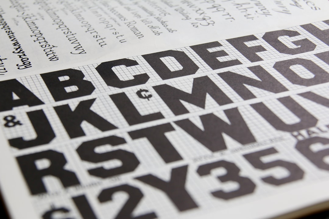
For its broader brand and editorial system, National Geographic has used the Geograph typeface family — a custom-commissioned set built for the organization’s magazines, channels, and digital products. We’d hedge on exact deployment, since brand systems evolve and specimens aren’t always public, but Geograph is the name associated with Nat Geo’s modern identity work, designed to carry both display headlines and running text consistently. Historically, the magazine’s body text has been set in classic serif faces in keeping with its editorial, documentary tone.
Geograph is a proprietary, commissioned family rather than something you can grab for free, which is why the free recommendations below aim at the feel rather than an exact file.
Where can I download the National Geographic font?
You can’t legitimately download the custom wordmark or the commissioned Geograph family — these are proprietary brand assets. Any “National Geographic font free download” is a fan approximation at best. The good news is that the look — a clean, classic serif inside a bold frame — is easy to evoke with free fonts. Stick to reputable sources; our guide on where to download fonts safely explains how to vet a source before installing.
What are the best free National Geographic font alternatives?
For that authoritative, editorial Nat Geo serif feel, a few free serifs get you close:
- Playfair Display (free) — a high-contrast display serif on Google Fonts. Its classic, confident letterforms make it a strong free stand-in for the Nat Geo wordmark mood.
- Source Serif 4 (free) — a clean, readable text serif; good for body copy and captions in the same trustworthy register.
- Libre Caslon or Lora (free) — traditional serifs that carry the heritage, documentary tone well across headings and text.
National Geographic font and free alternatives
| Use case | Official / source look | Free lookalike | Where to get it |
|---|---|---|---|
| Wordmark / display headline | Custom serif | Playfair Display | Google Fonts (free) |
| Body / editorial text | Geograph / classic serif | Source Serif 4 | Google Fonts (free) |
| Heritage / documentary tone | Classic serif | Libre Caslon / Lora | Google Fonts (free) |
| The iconic frame | Yellow rectangle border | Your own bright frame | Any design tool |
Is it free to use the National Geographic font?
The free fonts above (Playfair Display, Source Serif 4, Libre Caslon, Lora) are open-source and genuinely free for commercial typography. The wordmark and the Geograph family are proprietary. Either way, the key point holds: trademark and font licensing are separate. Even a fully free font does not grant any right to reproduce the National Geographic logo, the yellow frame, or imply affiliation. For commercial projects, read our font licensing guide and keep your design clearly your own.
How do I recreate the National Geographic look on a budget?
Set your title in Playfair Display for that authoritative serif feel, and use Source Serif 4 for captions and body text. Then add the element that really says “Nat Geo”: a bold rectangular frame around your image. Make the frame your own color or proportion rather than copying the exact yellow border, since that frame is the trademarked icon. The frame plus a clean serif does most of the work. To pair a display serif with a readable body face, our font pairing guide covers reliable combinations.
Comparing iconic media brands? See what font does SpaceX use and what font does Atari use for more recognizable-mark case studies.
Frequently Asked Questions
What font does National Geographic use?
National Geographic’s wordmark is a custom serif, and its broader brand has used the commissioned Geograph typeface family; the most iconic element is actually the yellow rectangle frame. There’s no free official Nat Geo font, but classic serifs like Playfair Display and Source Serif 4 get close to the look.
What is the National Geographic logo?
The National Geographic logo is best known for its bright yellow rectangle frame, which often appears alone as the brand’s icon. The accompanying “National Geographic” text is a custom, classic serif wordmark. The frame does most of the identifying work, which is why it’s so recognizable without any text.
What is the Geograph font?
Geograph is a custom-commissioned typeface family associated with National Geographic’s modern brand and editorial system, built to carry headlines and text consistently. It is proprietary rather than freely downloadable. Deployment can vary across the brand’s products, so treat free serifs as approximations of the feel.
Is there a free National Geographic font?
There’s no free official National Geographic font, but free open-source serifs get close to its editorial style. Playfair Display suits the display wordmark mood, while Source Serif 4, Libre Caslon, and Lora work for body and heritage tone. All are free on Google Fonts and commercial-safe.
Can I use a National Geographic font commercially?
You can use free serifs like Playfair Display or Lora commercially, but you cannot reproduce the National Geographic logo or its yellow frame. Trademark protection is separate from font licensing, so imitating the official mark for commercial use can create legal problems even with a properly licensed font.


