What Font Does Netflix Use?
If you’ve tried to match the Netflix font for a fan project, thumbnail, or mockup, you’ve probably discovered there’s no “Netflix” option in your font menu. That’s because the Netflix font is a proprietary typeface called Netflix Sans, made exclusively for the company. This article explains what the logo and app actually use, why you can’t install it, and which free fonts get closest.
This is one of the most recognizable brand identities in streaming, so it’s a useful case study in how big companies handle type. For the bigger picture, see our pillar on famous brand fonts and what the big logos use.
What font is the Netflix logo?
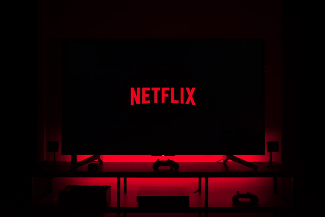
The current Netflix logo wordmark is set in Netflix Sans, a custom typeface the company commissioned and rolled out in 2018. It’s a clean, slightly condensed geometric sans-serif. The most identifiable detail is the flared terminal on the lowercase “t” and the tight, even spacing that keeps the wordmark compact on small screens and app icons.
Netflix built it in-house (with the type studio Dalton Maag) specifically to replace Gotham and to stop paying recurring licensing fees across its enormous device footprint. Owning the typeface also let Netflix tune it for TV interfaces, mobile, and the many languages it operates in.
What did Netflix use before Netflix Sans?
Before 2018, Netflix leaned heavily on Gotham, the popular geometric sans by Hoefler & Co. Gotham is a commercial font you can license, and its clean, American-modern feel suited Netflix’s branding. The switch to a bespoke face was largely about cost and control at scale rather than a dramatic stylistic change — Netflix Sans is recognizably in the same geometric family.
Can you download the Netflix font?
No. Netflix Sans is proprietary and is not distributed, sold, or licensed to the public. You will not find it on Google Fonts, Adobe Fonts, or any legitimate marketplace. Files claiming to be “Netflix Sans” on free-download sites are either misnamed clones or copies you have no legal right to use — and using the real typeface or imitating the logo can create trademark problems on top of licensing ones.
If you need that streaming-brand feel for your own project, the correct approach is to pick a properly licensed alternative. Before publishing anything commercial, review our font licensing guide so you choose the right desktop, web, or app license.
What’s a free Netflix font alternative?
The best substitute depends on which Netflix era you’re imitating:
- Bebas Neue (free) — tall, condensed, all-caps. Perfect for the bold, poster-style headlines associated with Netflix marketing. Available on Google Fonts.
- Montserrat (free) — a geometric sans with a similar modern, even feel to Netflix Sans for body and UI text. Wide weight range, also on Google Fonts.
- Oswald (free) — another condensed sans if you want a slightly narrower headline look than Bebas.
For pairing one of these with a readable body font, our font pairing guide walks through combinations that work. If you’re choosing type for an actual logo rather than a mockup, see best fonts for logos.
Netflix Sans vs. the free alternatives
| Font | Style | Best use | Cost | Where to get it |
|---|---|---|---|---|
| Netflix Sans | Custom geometric sans | Netflix logo & UI | Bespoke — not available | Not licensable |
| Gotham | Geometric sans | Closest commercial match | Paid | Hoefler & Co. / Typography.com |
| Bebas Neue | Condensed display sans | Poster-style headlines | Free | Google Fonts |
| Montserrat | Geometric sans | UI & body, modern feel | Free | Google Fonts |
What makes Netflix Sans distinctive?
Netflix Sans isn’t just “another geometric sans.” A few details make it recognizable once you know them. The lowercase “t” has a subtle flared, angled terminal rather than a flat cut, giving the wordmark a touch of warmth. The spacing is tighter than most off-the-shelf geometrics, which keeps “NETFLIX” compact and bold at small sizes — essential for an app icon and a TV interface viewed from across a room. The weights are tuned for screen rendering rather than print, with even stroke contrast that holds up on low-resolution displays.
These are exactly the kinds of optimizations a brand can only get from a bespoke typeface, and they’re why a free lookalike will get you close but never identical. If you need pixel-perfect fidelity to Netflix’s look, you simply can’t have it legally — the design choice for any real project is to commit to a strong alternative and make it your own.
How to get the Netflix look on a budget
If you’re building a streaming-style or entertainment brand and want that confident, modern Netflix energy without the bespoke typeface, here’s a practical approach:
- Pick your headline font by era. Use Bebas Neue for tall, condensed, poster-style impact, or Montserrat in a heavy weight for a cleaner, more current Netflix Sans feel.
- Tighten the spacing. Netflix’s wordmark is notably tight. Reducing letter-spacing slightly on your headline font instantly reads as more “premium streaming.”
- Use a single accent color with strong contrast — Netflix’s identity leans on bold red on near-black, and that contrast does as much work as the font.
- Pair with a neutral body font such as Inter or Roboto so the headline carries the personality. See our font pairing guide for combinations.
Customizing spacing and weight on a free font is both legal and effective — it’s a far better strategy than hunting for an unauthorized copy of Netflix Sans.
How does Netflix compare to other streaming brands?
Netflix’s move to a bespoke typeface mirrors what other tech and media giants have done — Spotify, Google, and others all run on custom fonts for the same reasons of cost, control, and exclusivity. If you’re researching this pattern across brands, two useful comparisons are what font does Spotify use and what font does Google use, both of which also rely on custom geometric sans typefaces with free lookalikes.
Frequently Asked Questions
What font does the Netflix logo use?
The Netflix logo uses Netflix Sans, a custom geometric sans-serif introduced in 2018 and developed with the type studio Dalton Maag. It replaced the brand’s earlier use of Gotham. Netflix Sans is bespoke and exclusive to Netflix, so it is not available to download or license.
Is Netflix Sans free to download?
No. Netflix Sans is a proprietary typeface owned by Netflix and is not sold or distributed publicly. Any “Netflix Sans” file on a free-download site is an unauthorized copy or a clone. For legitimate projects, use a free alternative such as Bebas Neue or Montserrat instead.
What font is closest to the Netflix font?
For the condensed, poster-style headlines, Bebas Neue is the closest free match. For a general Netflix Sans feel in body and interface text, Montserrat is the best free geometric sans alternative. Gotham is the closest commercial (paid) typeface, since Netflix used it before commissioning Netflix Sans.
What font did Netflix use before 2018?
Before 2018, Netflix primarily used Gotham, a commercial geometric sans-serif by Hoefler & Co. The company switched to its own Netflix Sans to reduce recurring licensing costs across its many devices and to gain full control over how the type renders on TVs, phones, and the web.
Can I use the Netflix font for my YouTube thumbnail or fan project?
You cannot legally use the real Netflix Sans, and imitating the logo can raise trademark issues. For a similar look on a thumbnail or fan project, use a free font like Bebas Neue or Montserrat, and avoid reproducing the actual Netflix wordmark or “N” mark.


