What Font Does Toyota Use? The Toyota Font Explained
Wondering what the Toyota font is? Toyota’s identity runs on a proprietary corporate typeface called Toyota Type, while the familiar “TOYOTA” wordmark under the three-ellipse emblem is its own custom lettering. Neither is a font you can install. This guide explains the brand face, the wordmark, and the free fonts that get you closest to Toyota’s clean, dependable look.
Toyota is a clear example of a global mass-market brand using neutral, friendly type to signal reliability and accessibility. For the wider picture, browse our overview of fonts used by famous brands.
What font is the Toyota logo?
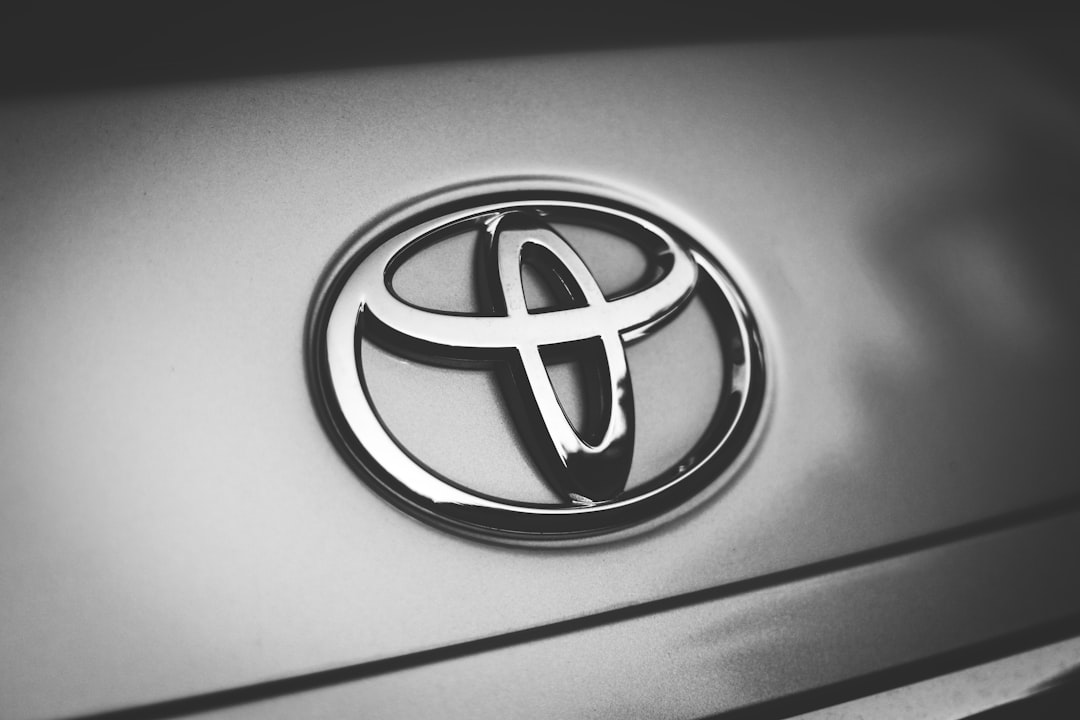
The “TOYOTA” letters beneath the oval emblem are custom lettering — a trademarked wordmark rather than typed from a stock font. The letters are wide, evenly weighted, and slightly squared, drawn for confident legibility at distance on signage and vehicles. Because the mark is bespoke and protected, it cannot be legally reproduced. The three-ellipse emblem and the wordmark together form a locked brand system, which is why the identity reads so consistently worldwide.
What is Toyota Type, the brand typeface?
For everything beyond the wordmark — advertising, signage, vehicle interfaces, and digital products — Toyota uses Toyota Type, a custom corporate typeface developed to unify the brand across markets and media. It is a clean sans-serif tuned for clarity and warmth: legible at small sizes, neutral enough to stay out of the way, but slightly humanist so it never feels cold. As a corporate face, Toyota Type is licensed for Toyota’s internal brand use and is not sold to the public, so you cannot download it for your own work.
Why does Toyota use a clean humanist sans?
A clean, slightly humanist sans communicates exactly what Toyota wants: dependability, accessibility, and modern confidence without luxury distance. The type has to read instantly on dealership signage, dashboard displays, owner’s manuals, and global advertising, so neutrality and legibility win over personality. That places Toyota in the same broad strategy as other engineering-led brands; compare it with our breakdown of the BMW font and the more premium Mercedes font.
Can I use the Toyota font?
No. Both the wordmark lettering and Toyota Type are proprietary brand assets, so you cannot license or reuse them for your own projects. The look is easy to approximate with free, legal sans-serifs, though. Before you ship, confirm the terms of whatever you choose — our font licensing guide walks through desktop, web, and app licensing so you do not get caught short.
Free and paid alternatives to the Toyota font
You cannot license Toyota Type, but several clean humanist and neo-grotesque sans-serifs deliver a similar feel. Helvetica (paid) is a solid paid reference for the neutral side. For free options, Inter, Source Sans 3, and Arimo are excellent stand-ins depending on how warm you want the result.
| Use case | Font (paid reference) | Free alternative |
|---|---|---|
| Toyota-style wordmark / headline | Helvetica Now (paid) | Inter (free) |
| Friendly, humanist body text | FF Mark (paid) | Source Sans 3 (free) |
| UI / dashboard text | Akkurat (paid) | Inter (free) |
| Condensed signage | Helvetica Condensed (paid) | Roboto Condensed (free) |
If you license a paid sans such as Helvetica Now, confirm your tier covers web embedding and app use as well as desktop, especially for dealership signage and interface work.
How do I get the Toyota look in my own design?
Set headlines and body in Inter or Source Sans 3, keep weights tight, and lean on clear alignment, generous spacing, and a simple palette. Toyota’s typographic warmth comes from neutrality plus a touch of humanist softness, not decoration. For a logistics-adjacent identity built on the same friendly grotesque logic, see our breakdown of the UPS font.
How has the Toyota identity evolved?
Toyota’s three-overlapping-ellipses emblem was introduced in 1989 to mark the company’s growing global ambitions, and the “TOYOTA” wordmark beside it has stayed wide, even, and confident ever since. The brand has periodically flattened and simplified the emblem for digital use — a cleaner, two-dimensional logo suits app icons and screens — while keeping the lettering instantly recognisable. The bigger typographic step was consolidating around a single bespoke Toyota Type family, which lets Toyota present one consistent voice across dozens of markets, languages, and media, from dealership signage to in-car interfaces. The motivation is the same one that drives most large global brands to commission custom type: consistency, control, and the ability to tune the face for every platform without paying per-use licensing on a third-party font. Through every refresh, Toyota’s typographic goal has stayed steady — friendly, legible, and dependable, never flashy.
Inter, Source Sans, or Arimo: which alternative fits?
All three approximate Toyota Type’s clean, accessible character. Inter is the best free all-rounder: screen-tuned, multi-weight, and ideal for UI, web, and modern brand work. Source Sans 3 is slightly warmer and more humanist, making it the closest match for Toyota Type’s friendly tone in longer text. Arimo is metrically compatible with Arial and Helvetica, so it is the safe free pick when substituting into existing layouts. For most new projects chasing the Toyota look, Inter or Source Sans 3 will get you there.
Frequently Asked Questions
What font does the Toyota logo use?
The “TOYOTA” wordmark is custom lettering — wide, evenly weighted, slightly squared letters drawn specifically for the brand. It is a trademarked, bespoke mark, not a downloadable retail font, so it cannot be legally reproduced for your own use.
What is Toyota’s brand font?
Toyota’s brand typeface is Toyota Type, a custom corporate family used across advertising, signage, interfaces, and digital products. It is a clean, slightly humanist sans-serif licensed for Toyota’s internal brand use rather than sold to the public.
Is the Toyota font free?
No. Both the wordmark and Toyota Type are proprietary and not publicly available. For a free, legal substitute with a similar clean, friendly feel, use Inter, Source Sans 3, or Arimo, or license Helvetica for a more neutral reference.
Is the Toyota font Helvetica?
No. Toyota Type is a custom typeface, not Helvetica, though it sits in the same broad family of clean sans-serifs. Helvetica, Inter, and Source Sans 3 all make convincing alternatives for the look, with the humanist options matching Toyota’s warmer tone.
Can I use the Toyota font for commercial work?
You cannot use the Toyota wordmark lettering or Toyota Type commercially, as they are protected brand assets. You can use free alternatives like Inter and Source Sans 3, or a licensed Helvetica, for your own projects as long as you hold the correct license.


