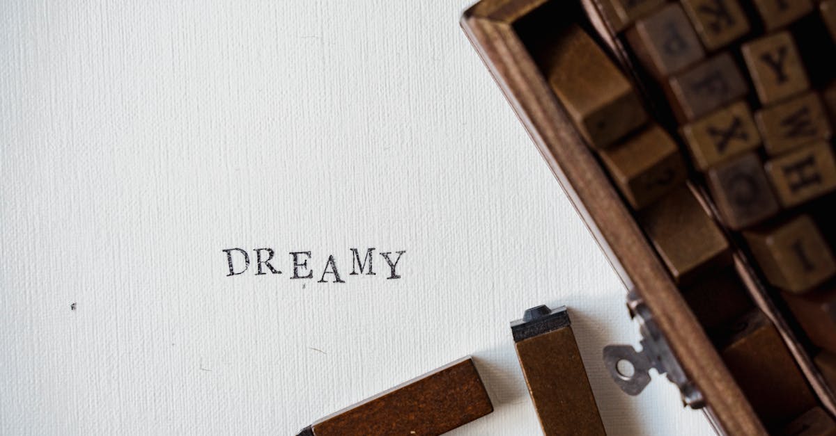
What Is Typography? A Designer’s Complete Guide
So what is typography, exactly? At its simplest, typography is the art and technique of arranging type to make written language legible, readable, and visually appealing. But that textbook definition barely scratches the surface. Typography is the invisible infrastructure of nearly every designed object you encounter — from the text you are reading right now to the street signs you follow, the apps you tap through, and the packaging you tear open. It is simultaneously an ancient craft rooted in fifteenth-century metalwork and a living, evolving digital discipline that shapes how billions of people consume information every single day. This guide will walk you through everything a designer needs to know about typography: its history, its anatomy, its classification systems, its rules, and its applications across print, web, branding, and user-interface design.
What Is Typography? A Clear Definition
Typography is the practice of selecting, arranging, and styling typefaces to communicate a message effectively. The word itself derives from the Greek typos (impression or mark) and graphein (to write). While lettering and calligraphy involve drawing or writing individual letters by hand, typography works with pre-designed letterforms — whether cast in metal, exposed on film, or rendered as digital outlines.
Understanding what typography means requires recognizing that it operates on two levels simultaneously. On a functional level, typography ensures that text can be read quickly and comfortably. On an expressive level, typography conveys tone, mood, era, and brand identity before a single word is consciously processed. A law firm’s website set in a refined serif communicates something fundamentally different from a children’s app set in a rounded, bouncy sans-serif — even if both say the same words.
Typography in graphic design is not merely a supporting element; it is often the primary visual element. Posters, book covers, logos, websites, and packaging frequently rely on type as the dominant design component. Mastering typography is therefore not optional for any serious designer — it is foundational.
A Brief History of Typography
To truly understand what typography is, you need to know where it came from. The history of typography is a story of technology driving aesthetic possibility, and aesthetic ambition pushing technology forward.
Gutenberg and Moveable Type (1440)
Typography as we know it begins in Mainz, Germany, around 1440, when Johannes Gutenberg developed a system of moveable metal type combined with a wooden screw press adapted from wine-making equipment. Gutenberg did not invent printing — woodblock printing had existed in East Asia for centuries, and moveable ceramic type had been developed in China by Bi Sheng around 1040. What Gutenberg achieved was a practical, scalable system for the Latin alphabet: individual metal letters cast from a hand mould using a lead-tin-antimony alloy, arranged into lines held in a composing stick, locked into a forme, inked, and pressed onto paper or vellum.
His masterpiece, the Gutenberg Bible (completed around 1455), was set in a blackletter typeface modeled on the formal liturgical handwriting of the period. The columns are justified, the spacing is remarkably even, and hand-painted rubrication was added after printing. It remains one of the most beautiful books ever produced, and it established the fundamental principle that typography should emulate and eventually surpass the quality of handwritten manuscripts.
Within fifty years of Gutenberg’s innovation, printing presses had spread across Europe. By 1500, an estimated twenty million volumes had been printed — more books than had been produced in all of European history before Gutenberg. Typography had triggered an information revolution comparable in scale to the internet.
The Renaissance and Roman Type
In Venice during the 1470s, Nicolas Jenson cut typefaces based on the humanist minuscule handwriting used by Italian scholars rather than the angular blackletter of northern Europe. These roman letterforms — with their upright posture, moderate stroke contrast, and graceful serifs — became the foundation of Latin typography that persists to this day. Shortly after, Aldus Manutius and his type cutter Francesco Griffo developed the first italic type (1501), originally conceived not as an emphasis style but as a space-saving text face for pocket-sized editions of classical literature.
The sixteenth and seventeenth centuries saw the emergence of the great type-founding dynasties: Claude Garamond in Paris, Christoffel van Dijck in Amsterdam, William Caslon in London. Each refined the roman and italic letter models, and their names survive as typeface families still in heavy use today.
Rationalism and the Transitional/Modern Shift
By the mid-eighteenth century, Enlightenment rationalism was reshaping typography. John Baskerville in Birmingham created types with sharper contrast between thick and thin strokes, smoother paper, and improved ink formulations. His work is classified as “transitional” — a bridge between the organic warmth of old-style faces and what came next.
That next step arrived with Giambattista Bodoni in Parma and Firmin Didot in Paris, who pushed stroke contrast to dramatic extremes: hairline-thin serifs, vertical stress, and stark geometric precision. These “modern” or “didone” typefaces were beautiful but demanding — they required high-quality printing to avoid the thin strokes breaking up. They became the typographic voice of fashion, luxury, and high culture, a role they maintain centuries later in mastheads like Vogue and Harper’s Bazaar.
The Industrial Revolution and Display Type
The nineteenth century brought an explosion of new type forms driven by advertising. The Industrial Revolution created consumer goods that needed to be marketed, and typography had to shout from posters, handbills, and shopfronts. This era produced the first slab serifs (also called Egyptians), the first sans-serifs, the first three-dimensional and decorative display faces, and the wood type that allowed enormous sizes unsuitable for metal casting.
This period was typographically chaotic and exuberant. A single poster might use eight or ten different typefaces in as many sizes. Aesthetic refinement gave way to commercial impact. But out of this chaos came typeform innovations — the bold weight, the condensed width, the outlined and shadowed variant — that remain central to the typographic toolkit.
The Twentieth Century: Reform, Modernism, and the International Style
The early twentieth century saw a reaction against Victorian excess. The Arts and Crafts movement, led by William Morris, looked backward to medieval craftsmanship. But the real rupture came from the avant-garde: the Bauhaus in Weimar (1919-1933) championed sans-serif typography, asymmetric layouts, and the integration of type with photography and geometric form. Jan Tschichold codified these principles in Die neue Typographie (1928), arguing for sans-serif type, flush-left/ragged-right alignment, and standardized paper sizes.
After World War II, Swiss designers including Max Miedinger, Josef Muller-Brockmann, and Emil Ruder developed the International Typographic Style — characterized by grid-based layouts, objective photography, and the relentless use of sans-serif typefaces, most famously Helvetica (1957). This approach dominated corporate identity, wayfinding, and editorial design for decades.
Phototypesetting and the Decline of Metal
From the 1950s onward, phototypesetting gradually replaced hot-metal composition. Type was no longer physical objects but photographic negatives projected onto light-sensitive paper. This made type cheaper and faster to set, enabled tighter letter-spacing (no physical metal bodies preventing overlap), and allowed easy scaling to any size. But it also began the erosion of typographic quality — the optical refinements built into metal type at specific sizes were often lost when a single master was photographically scaled.
The Desktop Publishing Revolution (1984)
In 1984, Apple introduced the Macintosh. In 1985, Aldus released PageMaker and Apple released the LaserWriter, which used Adobe’s PostScript page-description language. Suddenly, anyone with a few thousand dollars of equipment could set type and produce camera-ready layouts. Desktop publishing democratized typography but also flooded the world with poorly set type — “ransom note” designs using every font bundled with the system.
Yet the same technology enabled a new generation of type designers. Emigre, founded by Zuzana Licko and Rudy VanderLans, created typefaces that embraced the low resolution of early digital screens. FontShop, founded by Erik Spiekermann, pioneered the independent digital type foundry model. The explosion of available typefaces went from a few hundred in a typical print shop to tens of thousands on a designer’s hard drive.
Web Fonts and the Current Era
For the first decade of the web (roughly 1995-2009), typography was severely constrained. Designers could only reliably use a handful of “web-safe” fonts installed on most operating systems: Arial, Verdana, Georgia, Times New Roman, Courier New. Any other typeface had to be rendered as an image, which was terrible for accessibility, performance, and search engines.
The @font-face CSS rule, supported broadly by 2010, and services like Google Fonts (2010) and Adobe Fonts (formerly Typekit, 2009) finally brought real typography to the web. Designers could embed any licensed typeface directly into a web page. This single technical change elevated web design from a typographic wasteland to a medium capable of genuine typographic sophistication.
Most recently, variable fonts (introduced via the OpenType 1.8 specification in 2016) allow a single font file to contain an entire range of weights, widths, and other design axes. Instead of loading six separate files for light, regular, medium, semi-bold, bold, and extra-bold, a designer loads one file and dials in exactly the weight needed. Variable fonts reduce file sizes, improve performance, and enable fluid, responsive typographic systems that adapt to any screen.
Typeface vs Font: The Distinction That Matters
One of the most common points of confusion when people ask “what does typography mean?” is the difference between a typeface and a font. In everyday conversation, the words are used interchangeably, and in most contexts that is fine. But for designers, the distinction is worth understanding.
A typeface is the design — the creative work. Helvetica is a typeface. Garamond is a typeface. The typeface encompasses the entire visual concept: the shapes of the letters, the proportional relationships, the stylistic character.
A font is the delivery mechanism — historically, a specific size and style of a typeface cast in metal. In the metal-type era, Garamond Regular 12pt and Garamond Bold 18pt were two different fonts of the same typeface. Today, a font is a digital file (typically .otf or .ttf) containing the outlines, spacing metrics, and OpenType features for one specific style. Garamond-Regular.otf is a font. Garamond-BoldItalic.otf is a different font. Together, they are part of the Garamond typeface family.
Think of it this way: a typeface is to a font as a song is to an MP3 file. The song is the creative work; the MP3 is how you access it. In practice, most people say “font” in all contexts, and that is completely acceptable in casual usage. But when you are making professional typographic decisions, thinking in terms of typefaces and families helps you make more systematic, coherent choices.
The Anatomy of Letterforms
Understanding what typography is at a technical level requires learning the vocabulary of letterform anatomy. These terms allow designers to describe, compare, and evaluate typefaces with precision. Here are the essential terms every designer should know.
The Vertical Metrics
Baseline: The invisible line on which most letters sit. It is the fundamental reference line of typography. Round letters like “o” and “e” actually dip slightly below the baseline — a deliberate optical adjustment called overshoot that makes them appear to sit on the same line as flat-bottomed letters.
X-height: The height of the lowercase letter “x” and other lowercase letters without ascenders or descenders (a, c, e, m, n, o, r, s, u, v, w, z). The x-height is arguably the most important single measurement in a typeface because it determines apparent size. A typeface with a large x-height (like Verdana or Frutiger) appears significantly larger than a typeface with a small x-height (like Garamond or Bembo) even when both are set at the same point size.
Cap height: The height of flat-topped capital letters like H, I, and E. The cap height is usually slightly less than the ascender height. Round capitals like O and S overshoot the cap line slightly, just as round lowercase letters overshoot the baseline.
Ascender: The part of a lowercase letter that rises above the x-height, as in b, d, f, h, k, l, and t. Ascenders typically reach to or slightly above the cap height.
Descender: The part of a lowercase letter that drops below the baseline, as in g, j, p, q, and y. Descender depth varies considerably between typefaces and is a major factor in how much vertical space (leading) a typeface requires.
The Structural Parts
Stem: The main vertical stroke of a letter, as in the upright of d, the left stroke of H, or the vertical of l. In most typefaces, the stem is the thickest stroke.
Bowl: The curved, enclosed stroke that creates an interior space in letters like b, d, p, q, and the upper portion of g. The shape of the bowl — whether it is circular, oval, angular, or asymmetric — is one of the most distinctive characteristics of a typeface.
Counter: The enclosed or partially enclosed space within a letter. Counters can be fully closed (as in o, d, b) or open (as in c, e, s, h, n). Open counters contribute to legibility because they help the eye distinguish letterforms, especially at small sizes or low resolutions. Typefaces designed for screen use (like Verdana and Inter) tend to have large, open counters.
Serif: The small finishing stroke or projection at the end of a stem or other major stroke. Serifs can be bracketed (with a curved transition to the stem), unbracketed (meeting the stem at a sharp angle), hairline, slab, wedge, or any number of other forms. The presence, absence, and style of serifs is the primary basis for classifying typefaces.
Terminal: The end of a stroke that does not terminate in a serif. Terminals can be ball-shaped (as in many traditional typefaces like Bodoni), teardrop-shaped, straight-cut, or rounded. The style of terminals contributes significantly to a typeface’s personality — ball terminals feel classical; straight-cut terminals feel modern and geometric.
Crossbar: The horizontal stroke in letters like A, H, e, and f. In A, the position of the crossbar varies between typefaces and affects both legibility and style.
Shoulder: The curved stroke of h, m, and n that arches from the stem. Also sometimes called an arch.
Spine: The central curved stroke of the letter S, which reverses direction. The spine is one of the most challenging letter parts to design well, and its execution often reveals the skill of a type designer.
Swash: An extended or decorative flourish replacing a standard terminal or serif, most common in italic and display typefaces. Swash characters are accessed through OpenType features in professional typesetting.
Ligature: A single glyph formed by combining two or more characters that would otherwise collide or create awkward spacing. The most common ligatures are fi, fl, ff, ffi, and ffl. In high-quality typesetting, ligatures are essential for smooth texture in body text.
Type Classification: Understanding What Is Typography Through Categories
Typefaces can be classified into families based on their structural characteristics. Several classification systems exist, but the most widely recognized in professional typography is the Vox-ATypI classification, adopted by the Association Typographique Internationale in 1962 and expanded since. Understanding these categories is essential to knowing what typography is in practice — it gives you vocabulary to describe, compare, and select typefaces with precision.
Serif Categories
Humanist (Venetian Old-Style): The earliest roman typefaces, inspired directly by the pen-drawn letterforms of Renaissance humanist scribes. Characteristics include low stroke contrast, a slanted axis of stress (mimicking the angle of a held pen), small x-height, and bracketed serifs. Examples: Centaur, Jenson, Cloister. These faces have a warm, organic, calligraphic quality that connects readers to centuries of literary tradition.
Garalde (Aldine Old-Style): A refinement of the humanist model with greater stroke contrast, a more vertical axis of stress, and sharper detailing. Named for Claude Garamond and Aldus Manutius. Examples: Garamond, Palatino, Sabon. Garaldes are among the most popular typefaces for book typography because they are highly readable at text sizes and convey both elegance and approachability.
Transitional: A bridge between old-style and modern typefaces, with increased stroke contrast, a nearly vertical axis, and refined, somewhat flattened serifs. Examples: Baskerville, Times New Roman, Georgia. Transitional faces offer a balance of warmth and formality that makes them versatile for both text and display use. Times New Roman, while often dismissed as a default, is a well-crafted transitional face designed by Stanley Morison for The Times of London in 1931.
Didone (Modern): Extreme stroke contrast with hairline-thin serifs meeting stems at an abrupt, unbracketed angle. Vertical axis. Geometric construction. Examples: Bodoni, Didot, Walbaum. These typefaces are strikingly beautiful in display settings — fashion magazines, luxury branding, elegant invitations — but their thin strokes can break down at small sizes or on low-quality output devices. They demand good printing or high-resolution screens.
Slab Serif (Mechanistic/Egyptian): Thick, block-like serifs with minimal or no bracketing. Stroke contrast ranges from moderate to none. Examples: Rockwell, Clarendon, Archer, Roboto Slab. Slab serifs were born in the nineteenth century for advertising impact and retain that attention-grabbing quality. Contemporary slab serifs like Archer have softened the category with rounded forms and a friendlier personality, making them popular for editorial and branding work.
Sans-Serif Categories
Grotesque: The earliest sans-serifs, from the nineteenth and early twentieth century, with slight stroke contrast and some irregularity in curves and widths. Examples: Akzidenz-Grotesk, Franklin Gothic, News Gothic. These faces have a workmanlike, industrial quality that has experienced a revival among designers attracted to their pre-Modernist authenticity.
Neo-Grotesque: A refinement of the grotesque model with reduced stroke contrast, more uniform widths, and a neutral, objective character. Examples: Helvetica, Univers, Arial. Neo-grotesque typefaces are the quintessential corporate sans-serifs — clean, professional, and deliberately unobtrusive. Helvetica, designed by Max Miedinger and Eduard Hoffmann in 1957, became so ubiquitous that it inspired both a devoted following and a fierce backlash.
Geometric Sans-Serif: Constructed from geometric shapes — circles, squares, and triangles — with uniform stroke widths and minimal humanist influence. Examples: Futura, Avant Garde, Century Gothic, Poppins. Geometric sans-serifs have a striking, architectural quality but can be less readable in body text because the similar shapes of letters like a, o, d, q, and b create ambiguity at small sizes. They excel in headings, logos, and display settings.
Humanist Sans-Serif: Sans-serif typefaces with stroke contrast, varied letter widths, and proportions influenced by traditional roman letterforms. Examples: Gill Sans, Frutiger, Myriad, Open Sans, Lato. Humanist sans-serifs are often considered the most readable sans-serif category for body text because their varied strokes and open counters help the eye distinguish letterforms. They are extremely popular for UI design, signage, and any context where readability is paramount.
Typography Hierarchy: Guiding the Reader’s Eye
Typography hierarchy is the system of visual distinctions that tells readers what to read first, second, and third. Without hierarchy, a page is a wall of uniform text. With hierarchy, it becomes a structured, navigable communication.
Hierarchy is established through a combination of typographic variables:
Size: The most obvious differentiator. Headlines are larger than subheads, which are larger than body text, which is larger than captions. Effective hierarchies use clear, decisive size differences — not incremental steps of one or two points. A common approach is to use a modular scale (such as 1.25:1 or 1.5:1) to generate sizes that are mathematically related and visually harmonious.
Weight: Bold, semi-bold, medium, regular, light. Weight changes create contrast without changing size, making them useful for distinguishing elements that share the same text size — like a bold label followed by a regular-weight value in a data table.
Color and Contrast: Black text for primary content, dark gray for secondary, medium gray for tertiary. This “soft” hierarchy is particularly effective in UI design, where screen space is limited and multiple levels of information must coexist. Accent colors can draw attention to specific typographic elements like links, alerts, or calls to action.
Typeface and Style: Using a serif for headlines and a sans-serif for body text (or vice versa) creates clear visual separation. Italic style can set apart quotations, introductions, captions, or any text that functions differently from the main body.
Spatial Position: Items placed higher on the page, centered, or surrounded by white space receive more visual priority. A headline at the top of a page with generous margins above and below it commands attention even before size and weight enter the equation.
An effective typographic hierarchy typically includes three to five levels. More than that becomes difficult for readers to parse. A common web hierarchy might be: H1 (page title), H2 (section heading), H3 (subsection heading), body text, and small text (captions, metadata). Each level should be instantly distinguishable from adjacent levels — if a reader has to pause to figure out whether something is an H2 or an H3, the hierarchy needs more contrast.
Spacing in Typography: Kerning, Tracking, and Leading
Spacing is where good typography separates itself from mediocre typography. You can choose the perfect typeface and the ideal hierarchy, but if the spacing is wrong, the result will look amateurish.
Kerning
Kerning is the adjustment of space between specific pairs of characters. Certain letter combinations create awkward visual gaps when set at default spacing — the classic examples are AV, To, Ty, Wa, and LT. In these pairs, the shape of one letter leaves a visible hole next to the other that makes the spacing appear uneven even though the mechanical distance is consistent.
Professional typefaces include built-in kerning tables with adjustments for hundreds or thousands of letter pairs. In most design software, this “metrics” kerning is applied by default and produces good results. “Optical” kerning, offered in Adobe apps, uses an algorithm to adjust spacing based on the actual shapes of adjacent glyphs — it can be better for unusual typefaces or for mixing type from different families.
Manual kerning is most often necessary in headlines, logos, and display type, where the large size makes spacing imperfections highly visible. At body-text sizes, the built-in kerning of a well-made typeface is almost always sufficient.
Tracking (Letter-Spacing)
Tracking adjusts the uniform spacing between all characters in a block of text, as distinct from kerning, which adjusts individual pairs. In CSS, this is the letter-spacing property.
Tracking is most commonly used in two scenarios. First, all-caps text almost always benefits from increased tracking because capital letters are designed with word spacing in mind — when stacked together without lowercase letters to create rhythm, they appear cramped. Adding 50-100 units of tracking (or 0.05-0.1em in CSS) opens up all-caps settings and dramatically improves readability. Second, very small text (captions, legal disclaimers, footnotes) often benefits from slightly increased tracking to prevent letters from clumping together at reduced sizes.
Decreased tracking (tightening) is occasionally used in large display type to create a dense, impactful texture. Magazine covers and film posters frequently use tight tracking in headlines. But tightening must be applied carefully — if letters begin to touch or overlap, legibility collapses.
Leading (Line-Height)
Leading (rhymes with “bedding,” named for the strips of lead placed between lines of metal type) is the vertical distance between baselines of adjacent lines of text. In CSS, this is line-height.
Appropriate leading depends on typeface, size, line length, and medium. Body text typically needs a line-height of 1.4 to 1.6 times the font size. A typeface with a large x-height, long ascenders and descenders, or wide proportions generally needs more leading because the text feels denser. Long line lengths also require more leading — without it, the eye struggles to track back to the beginning of the next line.
Headlines need less leading than body text, often 1.0 to 1.2 times the font size. Large type at default body-text leading looks loose and disconnected — tightening the leading creates a cohesive headline unit.
Alignment: Choosing Your Text Edge
Text alignment affects both the visual texture and the readability of typeset content.
Left-aligned (flush left, ragged right): The most natural alignment for left-to-right languages. Word spacing is consistent because the right edge absorbs variation in line length. This is the default choice for body text in web design and is recommended for any context where readability is the priority.
Justified (flush left and right): Both edges align, creating a clean, rectangular text block. This is the traditional standard for books, newspapers, and magazines. However, justification requires adjusting word spacing (and sometimes letter spacing) to fill each line, which can create “rivers” of white space flowing vertically through the text — particularly in narrow columns or without hyphenation. Good justification requires a capable typesetting engine (like InDesign’s paragraph composer) and active use of hyphenation. CSS justification is generally inferior to print-focused tools and should be used cautiously on the web.
Right-aligned (flush right, ragged left): Used sparingly for captions, pull quotes, navigational elements, or design compositions where the right edge needs to anchor to a visual element. Extended right-aligned body text is difficult to read in left-to-right languages because the eye must search for the beginning of each new line.
Centered: Appropriate for short blocks of text — invitations, headings, title pages, posters. Centered text has a formal, symmetrical quality but becomes difficult to read in long passages because the varying left edge disrupts reading rhythm.
What Is Typography in Different Contexts?
Typography functions differently depending on the medium. Understanding these differences is part of knowing what typography truly means in practice.
Typography in Web Design
Web typography must account for variable screen sizes, unpredictable rendering engines, loading performance, and accessibility requirements. Responsive typography uses fluid sizing (often with CSS clamp() functions) to scale type smoothly between mobile and desktop viewports. System font stacks and variable fonts help optimize performance. Accessibility demands sufficient contrast ratios (WCAG AA requires 4.5:1 for body text), resizable text, and semantic HTML heading structure. [LINK: /best-fonts-for-websites/]
Typography in Print Design
Print typography benefits from fixed dimensions, predictable rendering, and the physical qualities of ink on paper. Print designers can use finer typographic details — optical margin alignment, precise kerning, sophisticated hyphenation and justification, microtypography — that are difficult or impossible on the web. Print also allows for special finishes: embossing, debossing, foil stamping, and letterpress, all of which add a tactile dimension to typography. [LINK: /best-fonts-for-print/]
Typography in Branding
In branding, typography carries identity. A brand’s typeface is often the single most consistently used visual element, appearing on everything from business cards to billboards to app interfaces. Many major brands commission custom typefaces — Apple’s San Francisco, Google’s Product Sans, Netflix Sans, IBM Plex — to achieve a distinctive voice that no competitor can replicate. For smaller brands, selecting a well-chosen typeface and applying it consistently across all touchpoints is one of the most cost-effective branding investments available. [LINK: /best-fonts-for-logos/]
Typography in UI/UX Design
User-interface typography prioritizes clarity, speed of scanning, and systematic consistency. Design systems typically define a type scale, a set of text styles (heading levels, body, caption, label, button), and rules for applying them. UI typefaces must perform well at small sizes, in both light and dark modes, and across platforms. Inter, SF Pro, Roboto, and similar UI-optimized typefaces are designed with large x-heights, open counters, and careful hinting for screen rendering. [LINK: /best-ui-fonts/]
Essential Typography Rules for Beginners
If you are just starting to learn what typography is and how to practice it, these rules will save you from the most common mistakes and accelerate your development as a designer.
1. Limit Your Typeface Choices
One or two typefaces per project is usually sufficient. A serif/sans-serif combination handles most design needs. Every additional typeface adds complexity and increases the risk of visual incoherence. Master the art of creating variety through size, weight, and style within a single typeface family before reaching for additional faces. [LINK: /how-to-pair-fonts/]
2. Establish Clear Hierarchy
Make your hierarchy obvious, not subtle. If two levels of hierarchy look similar, they are too close — increase the contrast. Use size, weight, and color together to create unmistakable distinctions between heading levels and body text.
3. Mind Your Line Length
Optimal line length for body text is 45-75 characters per line (including spaces), with 66 characters often cited as ideal. Lines that are too long cause reader fatigue as the eye travels a great distance. Lines that are too short cause excessive hyphenation and constant eye movement. On responsive websites, use max-width on text containers to prevent lines from stretching too wide on large screens.
4. Use Proper Typographic Characters
Straight quotes (” ‘) are inch and foot marks, not quotation marks. Use curly quotes (” ” ‘ ‘). Use an em dash (—) for parenthetical statements, an en dash (–) for ranges, and a hyphen (-) only for compound words. Use an ellipsis character (…) rather than three periods. These details separate professional typography from amateur text formatting.
5. Never Distort Type
Stretching or squishing a typeface horizontally or vertically distorts the carefully designed proportions of the letterforms. If you need condensed or extended type, choose a typeface that includes those widths as designed variants. Futura Condensed, for example, was drawn as a condensed face — it is not Futura squished to 70% width.
6. Choose Typefaces With Intention
Every typeface carries associations and connotations. A rounded, geometric sans-serif communicates something different from a high-contrast didone serif. Consider your audience, your message, your medium, and the emotional tone you want to establish. Then choose a typeface that supports those goals, rather than simply defaulting to whatever is familiar or trending. [LINK: /serif-vs-sans-serif/]
7. Test at Actual Size and Context
A typeface that looks beautiful in a specimen sheet may not work at 14px on a mobile screen. Always evaluate your typographic choices in the actual context where they will be used — at the real sizes, on the real screens or paper, with the real content. Lorem ipsum can approximate the texture of body text, but testing with actual content reveals line-break issues, awkward spacing, and readability problems that dummy text hides.
Typography Resources for Continued Learning
The study of typography is a lifelong pursuit. These resources will deepen your understanding beyond the fundamentals covered in this guide.
Essential Books: The Elements of Typographic Style by Robert Bringhurst is widely regarded as the definitive reference. Thinking with Type by Ellen Lupton is an excellent, visually rich introduction. Detail in Typography by Jost Hochuli focuses on microtypography — the fine details that distinguish expert typesetting.
Online Resources: Typewolf provides curated font recommendations and real-world examples. Google Fonts offers a massive free library with variable font support. The Font Review Journal publishes thoughtful critiques of new typeface releases.
Practice: The best way to learn typography is to set type. Take a passage of text and set it ten different ways, varying typeface, size, leading, alignment, and column width. Critique each version. Study typography you admire — books, magazines, websites, posters — and try to identify what makes it effective. Over time, you will develop the eye that separates competent designers from typographic masters.
Frequently Asked Questions
What is typography in simple terms?
Typography is the art and practice of arranging text so that it is easy to read, visually appealing, and communicates the right tone. It involves choosing typefaces, setting sizes, adjusting spacing, and creating a clear visual hierarchy. Every time you see text on a screen, a page, a sign, or a product, someone has made typographic decisions — whether skillfully or not — about how that text should look and function.
What is the difference between typography and lettering?
Typography uses pre-designed, repeatable letterforms (typefaces) arranged into text. Lettering is the art of drawing or painting individual letters for a specific purpose — a book cover, a mural, a logo. A typographer selects and arranges existing type; a letterer creates original letter-drawings. Both disciplines require deep knowledge of letterform structure, but the skills and workflows are different. Calligraphy, a related discipline, involves writing letters with specific tools (broad-edge pen, pointed pen, brush) following traditional scripts.
Why is typography important in design?
Typography accounts for the majority of most designed surfaces. On a typical website, type constitutes 80-95% of the visual content. Good typography makes information accessible, guides readers through content efficiently, establishes visual hierarchy, and communicates brand identity and emotional tone. Poor typography — even with well-written content — creates friction, reduces comprehension, and undermines credibility. Investing in typography is one of the highest-impact improvements any designer can make.
What are the four main types of typography?
While professional classification systems are more nuanced, the four broadest categories are serif typefaces (with small strokes at the ends of letter stems), sans-serif typefaces (without serifs), script and handwriting typefaces (mimicking cursive or calligraphic writing), and display or decorative typefaces (designed for large-size, attention-grabbing use rather than extended reading). Within each category, there are many subcategories — serif alone includes humanist, garalde, transitional, didone, and slab serif, each with distinct characteristics.
How do I get better at typography?
Start by learning the fundamentals: letterform anatomy, classification, hierarchy, and spacing. Then practice constantly — set real text in different typefaces and critique the results. Study typography you admire by analyzing the specific decisions the designer made (typeface selection, size relationships, spacing, alignment). Read The Elements of Typographic Style by Robert Bringhurst. Use sites like Typewolf and Fonts In Use to see how typefaces perform in real-world projects. Most importantly, develop the habit of noticing typography everywhere — on signs, menus, apps, books, packaging — and asking yourself what is working and what is not.


