Font Pairings for Canva: 20 Combinations That Actually Work in 2026
Good Canva font pairings are the fastest way to make a free template stop looking like a free template. The trick is contrast: pair a font with personality for headings against a quiet, readable font for body text, and let the two do different jobs. Below are 20 combinations you can build in Canva right now, with the exact font names as they appear in the picker and a note on when to reach for each.
Every pairing here is available on Canva Free unless flagged as Pro. If you want the underlying theory before you copy these, our complete guide to pairing fonts walks through contrast, hierarchy, and mood in depth.
How to Pair Fonts in Canva (The 30-Second Rule)
Canva makes pairing deceptively easy and deceptively easy to get wrong. The reliable approach: choose one font as your headline voice and one as your body/caption voice, then reuse them everywhere. Pull your headline from a display or characterful serif; pull your body from a clean sans-serif. If both fonts are fighting to be the star, the design feels noisy.
A quick gut-check that mirrors the classic serif and sans-serif pairing approach: if your two fonts look almost the same, swap one. You want either a clear serif-versus-sans contrast or a clear weight-and-size contrast, never a muddy middle.
Classic, Trustworthy Canva Font Pairings
These read as professional and calm. Use them for resumes, service businesses, consultants, and anything finance- or health-adjacent.
- Playfair Display + Source Sans Pro — A high-contrast serif headline over a neutral sans body. The editorial default; works for almost any premium brand.
- Lora + Lato — Lora’s soft serifs feel warm and bookish; Lato keeps the body grounded. Great for wellness and lifestyle.
- Cormorant Garamond + Proxima Nova (Pro) — Elegant and luxury-leaning. Cormorant is delicate, so set headlines large.
- Merriweather + Open Sans — Both designed for screens. The safest legibility-first combo on this list.
- Libre Baskerville + Work Sans — Traditional book serif against a modern geometric sans. Reliable for editorial layouts.
Modern and Minimal Pairings
Sans-on-sans pairings feel current and clean. The contrast here comes from weight and size rather than serifs, so commit to a bold headline and a light body.
- Montserrat + Hind — Montserrat’s geometric caps make confident headlines; Hind is quiet underneath. A startup staple.
- Poppins + Karla — Rounded, friendly, approachable. Good for apps, courses, and creator brands.
- Archivo + Inter — Archivo Black or Archivo Expanded for impact, Inter for body. Inter’s tall x-height keeps small text crisp.
- Bebas Neue + Roboto — Tall condensed caps for punchy headers, Roboto for everything else. Strong for fitness and events.
- DM Sans + DM Serif Display — From the same family system, so they harmonize automatically while still contrasting serif vs sans.
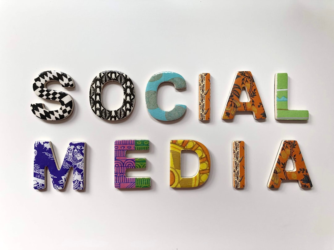
Bold and Editorial Pairings for Social Media
On Instagram and TikTok thumbnails you have a fraction of a second to land. Reach for personality and high contrast.
- Anton + Barlow — Anton is heavy and impossible to miss; Barlow stays legible at caption size.
- Abril Fatface + Josefin Sans — Dramatic fashion-magazine energy. Pair sparingly; Abril is loud.
- Oswald + Cabin — Condensed news-style headlines with a humanist body. Editorial and tidy.
- League Spartan + Mulish — Geometric, modern, bold. Reads well over photos.
- Fraunces + Inter — Fraunces brings “old-style with attitude” wonky serifs; Inter keeps it usable.
Playful and Handmade Pairings
For kids’ brands, crafts, food, and events you can loosen up, but keep one of the two fonts neutral so the layout stays readable.
- Pacifico + Nunito — Script headline accent with a round, friendly body. Use Pacifico only for short phrases.
- Sacramento + Quicksand — Delicate handwriting over a soft geometric sans. Wedding and stationery favorite.
- Lobster + Open Sans — Retro signage feel; pair with restraint or it dates quickly.
- Caveat + Raleway — Caveat reads like a marker note; Raleway keeps the surrounding text clean.
- Amatic SC + Montserrat — Tall, hand-drawn caps against a structured sans. Casual but organized.
Which Pairing Should You Choose?
Match the pairing to the job, not your mood. Use the table below as a shortcut.
| Use case | Recommended pairing | Why |
|---|---|---|
| Resume / CV | Merriweather + Open Sans | Maximum legibility, ATS-friendly feel |
| Premium brand | Playfair Display + Source Sans Pro | Editorial contrast reads as expensive |
| Startup / SaaS | Montserrat + Hind | Clean, modern, neutral |
| Instagram post | Anton + Barlow | High impact at small sizes |
| Wedding / event | Sacramento + Quicksand | Soft, personal, elegant |
If you want pairings organized by sector rather than mood, see our breakdown of heading and body font combinations by industry, which maps type choices to specific business categories.
Tips to Make Any Canva Pairing Look More Professional
- Limit to two fonts. A third should only ever be a subtle accent, never a third voice.
- Create real contrast in size. Headlines should be noticeably larger and heavier than body text, not one step up.
- Mind your letter spacing. Add tracking to all-caps headlines; tighten oversized display serifs slightly.
- Keep body text 16px or larger for anything meant to be read on screen.
- Lock your pair as Brand Kit fonts (Canva Pro) so every design stays consistent.
Saving Pairings as Reusable Brand Fonts
If you design more than the occasional one-off, stop re-selecting fonts on every project. On Canva Pro, open Brand Kit, set a heading font and a body font, and every new text element defaults to that pair. This does two things: it keeps a whole account of designs visually consistent, and it removes the small daily decision of “which fonts again?” that quietly leads to mismatched graphics over time. Teams benefit most — once the brand fonts are locked, anyone creating a design stays on-brand without needing to memorize the pairing.
For one-off designs on the free plan, the next-best habit is to copy a finished text element rather than starting fresh, so the font, size, and spacing carry over. It’s a manual version of the same consistency a Brand Kit enforces automatically, and it keeps a multi-page design from drifting.
Frequently Asked Questions
What is the best font pairing in Canva?
There is no single best, but Playfair Display with Source Sans Pro is the most versatile professional pairing, and both are free in Canva. It gives you elegant high-contrast headlines over a neutral, highly readable body, which suits almost any brand or document.
How many fonts should I use in a Canva design?
Two is the sweet spot: one for headlines and one for body text. You can add a third only as a small accent, such as a script for a single phrase. More than that and the design starts to feel disorganized and harder to read.
Are good font pairings free in Canva?
Yes. Most pairings here, including Montserrat, Lora, Poppins, Anton, and Merriweather, are available on Canva Free. A few like Proxima Nova require Canva Pro, but you can almost always find a free near-equivalent in the picker.
Can I upload my own fonts to Canva?
Yes, but only on Canva Pro or higher. Brand Kit lets you upload licensed font files and set permanent brand fonts, so every team member’s designs stay on-brand without re-selecting fonts each time.
Try it live: Use our free font pairing generator to preview these combinations and copy the CSS in one click.


