Calligraphy for Beginners: Tools and Basics
Calligraphy for beginners is far less mysterious than the polished wedding invitations make it look. At its core, calligraphy is the art of writing letters as deliberate sequences of thick downstrokes and thin upstrokes, controlled by how hard you press a flexible nib. Get the right starter kit, learn six or seven basic strokes, and you can produce clean, legible script within a few weeks of honest practice.
This guide is the canonical starting point for our Calligraphy & Lettering cluster. We will cover what to buy, how to hold the pen, the foundational strokes every script is built from, and the practice routine that turns shaky lines into confident letters.
What calligraphy actually is
Calligraphy means writing letters in a single, rhythmic motion of the hand, where the form of each letter comes from the tool and the stroke order rather than from drawing or filling in shapes. That distinction matters because it separates true calligraphy from hand lettering. If you are unsure which discipline you actually want, read our breakdown of lettering vs calligraphy and how the two differ before you spend money on tools.
For beginners, the most accessible and rewarding entry point is pointed pen calligraphy, the family of flexible-nib scripts that includes Copperplate and Spencerian. A pointed nib spreads under pressure to create wide downstrokes and snaps back to a hairline on the upstroke. That single mechanical fact produces the elegant contrast you associate with classic calligraphy.
The beginner tool kit
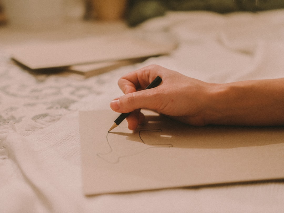
You do not need an expensive setup. A reliable beginner kit costs less than a nice dinner out. Here is exactly what to buy and why.
Nibs
- Nikko G — the standard recommendation for total beginners. It is stiffer than other pointed nibs, which makes it forgiving and less prone to catching on the paper. Start here.
- Zebra G — slightly more flexible than the Nikko G, giving you more dramatic stroke contrast once your control improves.
- Brause EF66 — very flexible and expressive, but snags easily. Save it for when you have the basics down.
Buy three or four of your chosen nib. Nibs are consumable and lose their spring over time.
Pen holders
You have two choices. A straight holder is cheap and fine for italic or broad-edge work. For pointed pen scripts like Copperplate, most people use an oblique holder, which angles the nib so you can hit the steep 55-degree slant of the script without contorting your wrist. If your goal is slanted scripts, start with an oblique holder.
Ink
- Sumi ink — dense, black, and beginner-friendly. It flows well and photographs beautifully.
- Walnut ink — a warm brown that is gentle on nibs and easy to clean. Many practitioners use it purely for practice because it is inexpensive.
- Avoid waterproof India inks with shellac at first; they clog nibs and are a chore to clean.
Paper
Cheap paper is the silent killer of beginner motivation. Fibrous or toothy paper causes feathering (ink bleeding into the fibers) and snagging. Use smooth, heavyweight paper — laser printer paper at 32 lb works, and Rhodia or HP Premium 32 are popular practice choices. Always print or place slant guide sheets underneath so your letters stay consistent.
Setting up before you write
Three small things prevent most beginner frustration:
- Prep a new nib. Fresh nibs have an oily coating that repels ink. Wipe it with a little toothpaste or pass it briefly through a flame, then rinse and dry.
- Dip correctly. Submerge the nib only up to the vent hole — the small round hole in the middle. Too much ink causes blobs; too little causes skipping.
- Angle your paper. Rotate the page so the slant lines run comfortably with your natural arm movement. This is normal, not cheating.
The basic strokes (the real foundation)
Every calligraphy alphabet is assembled from a small set of basic strokes. Master these and the letters build themselves. Practice each one in long rows before attempting any letters.
- Entrance stroke (upstroke): a light hairline. Zero pressure. This trains your hand to lift.
- Underturn: down with pressure, then curve up into a hairline. The “u” shape.
- Overturn: the reverse — up thin, over the top, down with pressure. The “n” shape.
- Compound curve: overturn into underturn in one motion.
- Oval: the heart of letters like o, a, d, g. Aim for a consistent slant and weight.
- Ascending and descending loops: tall loops above the x-height and below the baseline.
The single most important rule: apply pressure only on the downstroke, and release completely on the upstroke. Thick down, thin up. If your upstrokes are also thick, you are pressing too hard or moving against the nib’s tines.
Understanding the guidelines
Calligraphy sits on a system of horizontal lines. Knowing the vocabulary keeps your letters proportional.
| Line | What it controls |
|---|---|
| Baseline | Where most letters sit. |
| Waistline | The top of lowercase letters without ascenders. |
| X-height | The distance between baseline and waistline — the body height of the script. |
| Ascender line | The top of tall letters like b, d, h, l. |
| Descender line | The bottom of letters like g, p, y. |
| Slant lines | Diagonal guides (often 55°) keeping every letter at the same angle. |
A practice routine that works
Twenty focused minutes a day beats a two-hour session once a week. A reliable warm-up and drill sequence:
- Warm up with five rows of hairline upstrokes and five rows of pressured downstrokes.
- Drill the basic strokes — one full row each, watching for consistent slant and weight.
- Build letters in families (oval-based: a, c, d, g, o, q before moving on).
- Write words only after the letters feel automatic. Connecting letters smoothly is its own skill.
Photograph your work weekly. Progress in calligraphy is real but slow enough that a comparison shot is the best motivator you will find.
How the nib actually works
Understanding the mechanics removes most beginner frustration. A pointed nib has two tines that meet at a fine point, with a vent hole above them acting as an ink reservoir. When you pull the nib downward and press, the tines spread apart, releasing more ink and laying down a wide line. When you push upward with no pressure, the tines stay closed and deposit only a hairline.
This is why direction matters so much. The nib is designed to be pulled, never pushed hard. Forcing it upward against pressure jams the tines into the paper, causing the dreaded snag and ink splatter. Once you feel this rhythm — press-and-pull down, release-and-glide up — calligraphy stops fighting you. Spend real time here; it is the difference between a frustrating first month and a satisfying one.
Ink flow and paper troubleshooting
Most “my calligraphy looks bad” complaints trace back to ink and paper, not skill. A quick diagnostic table:
| Problem | Likely cause | Fix |
|---|---|---|
| Ink won’t stick to nib | Factory oil coating | Clean the new nib before first use |
| Lines feather and bleed | Toothy, absorbent paper | Switch to smooth, heavyweight stock |
| Skipping mid-stroke | Too little ink or speed too high | Re-dip to the vent hole; slow down |
| Blobs at stroke starts | Over-dipped nib | Tap off excess; dip only to vent hole |
| Scratchy, catching nib | Pushing against the tines | Adjust paper angle; lighten upstrokes |
Keep a small jar of water and a lint-free cloth beside you. Wipe and rinse your nib every few minutes — dried ink on the tines is a leading cause of poor flow. A clean nib is a happy nib.
Choosing your first script
Beginners do well to commit to one script rather than dabbling. Your options break down roughly like this:
- Copperplate — the formal pointed-pen classic. Steep slant, high contrast, used on wedding stationery. Demanding but deeply rewarding.
- Modern calligraphy — the looser, more personal evolution of pointed pen that relaxes Copperplate’s strict rules. The friendliest on-ramp for most people. See our full beginner’s guide to modern calligraphy for a structured start.
- Italic and broad-edge hands — written with a flat, chisel-shaped nib instead of a pointed one. A different mechanic worth exploring later.
- Spencerian — an American business hand, lighter and more flowing than Copperplate, with monoline letters and dramatic flourished capitals. A graceful next step once a pointed-pen script feels comfortable.
- Uncial — a rounded, broad-edge historical hand with no lowercase, used in medieval manuscripts. Beautiful, beginner-accessible, and a complete change of pace from pointed pen.
Our advice: pick one and stay with it for at least a month. Skill in calligraphy comes from depth, not breadth. Jumping between scripts every week guarantees that none of them ever clicks.
No nibs yet? Start without them
You can build real skill before any ink touches paper. Faux calligraphy recreates the thick-and-thin look with any pen by outlining and filling the downstrokes — a great way to learn letterforms risk-free. Our walkthrough on how to fake the calligraphy look with faux calligraphy shows the method step by step.
Two adjacent skills also pay off fast. If your everyday writing is messy, the muscle control you build by improving your handwriting transfers directly to the pen. And if you want to apply lettering at scale — menus, signage, welcome boards — our guide to chalk lettering for signs and boards is a fun, forgiving playground.
Common beginner mistakes
- Pressing on upstrokes. Hairlines must be feather-light.
- Gripping too hard. A death grip kills the nib’s flex and tires your hand. Relax.
- Writing too fast. Calligraphy is slow and deliberate. Speed comes later, on its own.
- Skipping drills. Jumping straight to words guarantees inconsistent letters. Drill first.
- Blaming the tools. A scratchy nib is usually a prep, paper, or angle problem — not a defective nib.
Frequently Asked Questions
What is the best calligraphy pen for beginners?
For pointed pen calligraphy, start with a Nikko G nib in a straight or oblique holder. It is stiff and forgiving, so it snags less than flexible nibs while still producing clear thick-and-thin contrast. Pair it with sumi or walnut ink and smooth paper for the easiest first experience.
How long does it take to learn calligraphy?
With twenty focused minutes of daily practice, most beginners write legible, consistent basic strokes within two to four weeks and confident words within two to three months. Progress depends far more on consistent short sessions and deliberate drills than on natural talent or expensive supplies.
Can I learn calligraphy with a regular pen?
Yes. Faux calligraphy lets you mimic the thick-down, thin-up look with any pen by outlining and filling your downstrokes. It is an excellent way to learn letterforms and spacing before investing in nibs, holders, and ink, and the lettering skills transfer directly.
Do I need an oblique holder?
Not for everything. A straight holder works fine for broad-edge hands like italic. But for steeply slanted pointed-pen scripts such as Copperplate, an oblique holder lets the nib meet the paper at the correct angle without straining your wrist, so it is worth buying if those scripts are your goal.
Why does my nib keep skipping and snagging?
Three usual culprits: the nib still has its factory oil coating (clean it before first use), the paper is too toothy (switch to smooth, heavyweight paper), or you are pushing the nib against its tines on upstrokes. Adjust your paper angle and use light pressure going up.


