Lettering vs Calligraphy: What’s the Difference?
The lettering vs calligraphy question trips up nearly everyone who picks up a brush pen. Here is the clean answer: calligraphy is the art of writing letters in fluid, rhythmic strokes, while lettering is the art of drawing letters as constructed shapes. One is handwriting elevated to an art form; the other is closer to illustration.
Understanding the distinction tells you which tools to buy, which skills to practice, and which discipline actually fits the work you want to make. If you are new to both, start with our foundational guide to calligraphy for beginners and the essential tools and strokes, then use this article to pick your lane.
The core difference: writing vs drawing
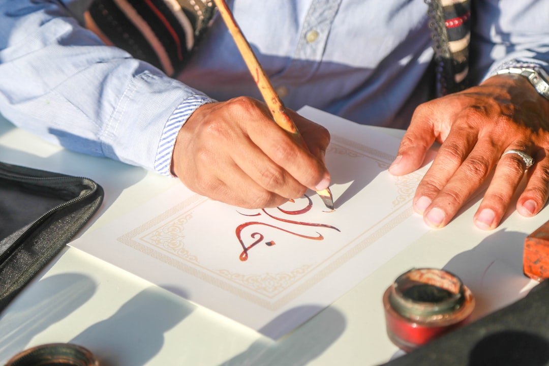
Calligraphy is written. Each letter is produced in a continuous, practiced motion, and its form comes directly from the tool — a flexible nib or brush that swells on the downstroke and thins on the upstroke. You do not go back and fix a calligraphy letter; you commit to the stroke.
Lettering is drawn. Each letter is a constructed shape that you sketch, refine, outline, and fill. A letterer might pencil a word, redraw it three times, then ink it. The letters are illustrations of letterforms rather than handwriting. This is why hand lettering and faux calligraphy overlap — both build letters by drawing and filling rather than by single strokes.
A side-by-side comparison
| Aspect | Calligraphy | Lettering |
|---|---|---|
| Core action | Writing letters in strokes | Drawing/constructing letters |
| How contrast is made | Tool pressure (nib or brush flex) | Drawn in by hand (outline and fill) |
| Process | One committed motion per stroke | Sketch, refine, ink, fill |
| Editing | Minimal — you live with the stroke | Extensive — redraw freely |
| Typical tools | Pointed pen, oblique holder, brush pen | Pencil, fineliner, brush, digital |
| Closest relative | Handwriting | Illustration / type design |
Where typography fits in
A third term often joins the confusion: typography. Typography is the arrangement of pre-made, repeatable type — fonts and typefaces. The simple way to keep all three straight:
- Calligraphy — you write the letters by hand, once.
- Lettering — you draw the letters by hand for a single, custom use.
- Typography — you set existing fonts that can be reused infinitely.
Calligraphy and lettering produce one-off artwork. Typography arranges a designed system. A wedding monogram drawn once is lettering; the same shapes turned into a reusable font become typography.
The gray areas
The line blurs in practice, and that is normal:
- Faux calligraphy looks like calligraphy but is technically lettering — you draw the contrast in rather than writing it. Our walkthrough of faux calligraphy and the outline-and-fill method shows exactly why it sits on the lettering side.
- Brush lettering with markers like the Tombow Dual Brush or Pentel Fude is often written in strokes (calligraphy-like) but freely retouched (lettering-like). It comfortably straddles both.
- Modern calligraphy is genuine calligraphy — written with pressure — but borrows the playful, drawn aesthetic of lettering. See our beginner’s guide to modern calligraphy for that overlap in action.
Which should you learn?
Pick based on what you want to make and how you like to work.
- Choose calligraphy if you enjoy rhythm, repetition, and the meditative flow of writing; you want elegant scripts for invitations, envelopes, and certificates; and you do not mind a slower technical learning curve.
- Choose lettering if you like sketching, problem-solving layouts, and total control over every shape; you want bold logos, posters, quote art, and signage; and you would rather draw and refine than commit to a single stroke.
- Do both — most professionals do. The skills reinforce each other, and many projects combine written scripts with drawn display letters.
Skills that help either way
Whichever path you choose, baseline motor control matters. The steadiness you build by improving your everyday handwriting makes both written strokes and drawn outlines cleaner. And if you want a forgiving, large-format playground that uses lettering technique, chalk lettering for signs and boards is an excellent place to apply what you learn.
Frequently Asked Questions
What is the main difference between lettering and calligraphy?
Calligraphy is writing letters in fluid, rhythmic strokes where the tool creates the thick-and-thin contrast through pressure. Lettering is drawing letters as constructed shapes that you sketch, refine, outline, and fill. In short: calligraphy is elevated handwriting, while lettering is closer to illustrating letterforms.
Is hand lettering the same as calligraphy?
No. Hand lettering means drawing letters — building each one as a custom shape you can sketch and redraw. Calligraphy means writing letters in committed strokes. They look similar and often appear together, but the process differs: one draws and refines, the other writes in a single fluid motion.
Is brush lettering calligraphy or lettering?
Brush lettering sits between the two. When you create thick-and-thin contrast through brush pressure in one stroke, it behaves like calligraphy. When you freely retouch and reshape the letters afterward, it behaves like lettering. Most practitioners treat brush lettering as its own hybrid discipline that borrows from both.
Which is easier to learn, lettering or calligraphy?
Lettering is often more forgiving for beginners because you can sketch, erase, and redraw until a letter looks right. Calligraphy demands committed strokes and pressure control, so mistakes are harder to fix. That said, both reward consistent practice, and learning one makes the other noticeably easier to pick up.


