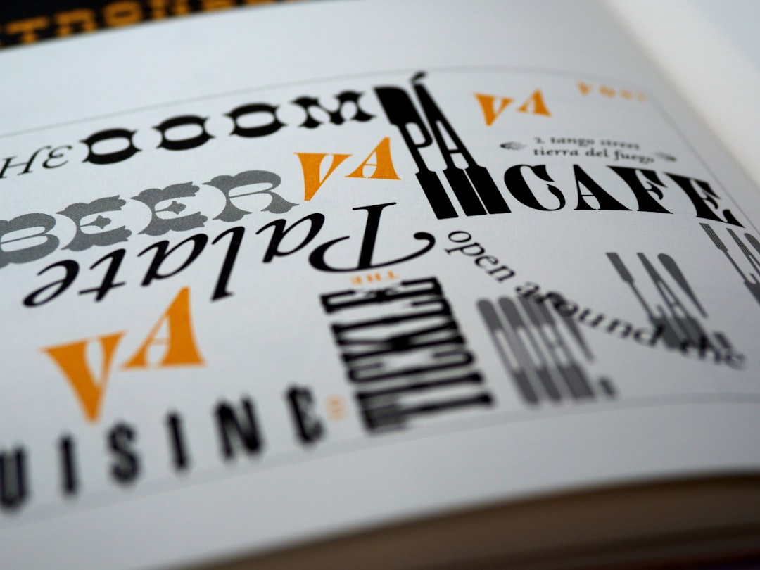
Typography Terms: A Glossary for Designers
Most bad type isn’t bad because of taste, it’s bad because the designer didn’t have the vocabulary to name what was wrong. This glossary of typography terms gives you that vocabulary: the anatomy, the measurements, and the controls that let you describe, diagnose, and fix type with precision. Read it top to bottom once, then keep it open as a reference.
This is the hub page for the Made Good Design Collective typography fundamentals cluster. Every term that deserves a full deep-dive links out to its own article, so you can skim the definitions here and branch off wherever you want detail.
Typeface vs Font: The Distinction Worth Getting Right
These two words are used interchangeably in daily speech, and that’s fine in casual conversation. But the precise distinction still matters when you’re buying licenses or briefing a foundry.
- Typeface — the design itself: the shared visual concept across all its styles. Helvetica is a typeface.
- Font — a specific instance of that typeface: one weight, one style, one delivery. Helvetica Bold Italic at a given format is a font.
The classic analogy: a typeface is the song, a font is the MP3 file. In 2026, most designers say “font” for both and nobody blinks, but knowing the difference is part of speaking the language fluently.
Type Anatomy: The Parts of a Letter
Letterforms are built from named parts, and learning them is the fastest way to start seeing type instead of just reading it. The core anatomy:
- Baseline — the invisible line letters sit on. Round letters like “o” overshoot it slightly.
- X-height — the height of lowercase letters without ascenders or descenders, measured by the lowercase “x.” This single measurement drives how large and how legible a typeface feels.
- Cap height — the height of the capital letters from the baseline.
- Ascender — the part of a lowercase letter rising above the x-height, as in “b,” “d,” “h.”
- Descender — the part dropping below the baseline, as in “g,” “p,” “y.”
- Serif — the small finishing stroke at the end of a letter’s main strokes. Typefaces with them are serifs; those without are sans-serifs.
- Counter — the enclosed or partially enclosed negative space inside letters like “o,” “e,” and “a.”
- Bowl — the curved stroke enclosing a counter, as in “b” or “p.”
- Terminal — the end of a stroke that has no serif.
- Aperture — the opening of a partially enclosed counter, as in “c” or “e.” Wide apertures generally aid legibility at small sizes.
X-height earns its own full treatment because it quietly controls so much. We unpack it in our guide to x-height and why it matters.
Measuring Type: Point, Em, and Leading
Type measurement carries a lot of historical baggage, which is exactly why people get it wrong. The essentials:
- Point — the base unit of type size. One point is 1/72 of an inch in digital contexts. “12pt type” refers to the size of the type body, not the visible height of any single letter, which is why two fonts at the same point size can look wildly different.
- Em — a relative unit equal to the current font size. A 1em margin in 16px type is 16px. Ems scale with the type, which makes them invaluable on the web.
- Leading (rhymes with “wedding”) — the vertical space between lines of text, measured baseline to baseline. The term comes from the strips of lead once placed between lines of metal type.
- Set width — the horizontal space a glyph occupies, including its side bearings.
Because point size is an unreliable guide to apparent size, designers increasingly set type with a modular type scale instead of eyeballing it. Our type scale calculator builds a harmonious size hierarchy from a single base size and ratio.
Spacing Terms: Kerning, Tracking, and Word Space
Spacing is where amateur work most often falls apart, and the three terms below are constantly confused. They are not the same thing.
| Term | What it adjusts | When you use it |
|---|---|---|
| Kerning | Space between two specific letters | Fixing awkward pairs like “AV” or “To” in headlines and logos |
| Tracking | Uniform space across a run of text | Loosening all-caps, tightening dense display type |
| Word spacing | Space between words | Rarely touched; mostly for justified text fixes |
Rule of thumb: kerning is surgical and pair-by-pair, tracking is a global dial. Tighten tracking slightly on large display type; never letterspace lowercase body text.
Weight, Width, and Style
A typeface family spans a range of weights (stroke thickness) and widths (how condensed or extended the letters are), plus style variations like italic and oblique.
- Weight — from Thin through Black, mapped to numeric values from 100 to 900. This numeric system is now standard across CSS and variable fonts.
- Width — Condensed, Normal, Extended. Useful for fitting type into tight or wide spaces without distorting the design.
- Italic — a genuinely redrawn, often more cursive style; not just a slanted Roman.
- Oblique — a mechanically slanted version of the upright, common in sans-serifs like Helvetica.
- Roman — the upright, regular style, the default of most families.
The full weight system, including the Thin-to-Black naming and the 100-900 numeric map, gets its own breakdown in font weights explained.
OpenType Features: Ligatures, Figures, and Alternates
Modern fonts ship with OpenType features, optional typographic behaviors you turn on per project. The ones worth knowing:
- Ligatures — single glyphs replacing problem letter combinations, most commonly “fi” and “fl,” where the dot of the “i” or the arm of the “f” would otherwise collide. Standard ligatures (
liga) are usually on by default; discretionary ones (dlig) are decorative and opt-in. - Oldstyle figures — numerals with ascenders and descenders that sit naturally in running text, versus lining figures that align to the cap height.
- Tabular figures — numerals of equal width, essential for aligning columns of numbers, versus proportional figures for prose.
- Small caps — true capital forms drawn at roughly x-height, far better than faking them by scaling down full caps.
- Stylistic alternates — optional variant glyphs (a single-story “a,” a different “g”) for tuning a typeface’s character.
Ligatures cause endless confusion, especially the standard-versus-discretionary split, so we cover them in full in ligatures in typography explained.
Classifying Typefaces: Display vs Text
One of the most useful working distinctions is between type built for small sizes and type built for big ones.
- Text faces — designed for sustained reading at small sizes: sturdy, open, and forgiving. Think Georgia, Source Serif, or Inter.
- Display faces — designed for headlines and large sizes, where fine detail and dramatic contrast can shine but would clog up at body size.
- Optical sizing — the practice of adjusting a design for the size it’s set at; high-end families ship separate optical cuts (a “Display” and a “Text” version), and variable fonts can do this on a slider.
Knowing when a display face will break at small sizes, and when a text face looks limp blown up, is a core craft skill. We cover it in our guide to display fonts.
Hierarchy, Pairing, and Perception
The final cluster of terms is about how type behaves in combination and in the reader’s mind.
- Hierarchy — the visual ordering of content by importance, built with size, weight, spacing, and color so the eye knows where to go first.
- Pairing — combining two or more typefaces that contrast usefully without clashing, typically a distinctive display face with a neutral text workhorse.
- Contrast — the difference between thick and thin strokes within a letter (high-contrast like Didot, low-contrast like Futura), and also the broader visual difference between paired faces.
- Legibility — how easily individual characters are distinguished.
- Readability — how comfortably whole blocks of text can be read over time. A font can be legible but tiring to read at length.
Pairing is its own discipline, and our font pairing guide covers the working principles in depth. The emotional side, why a serif reads as trustworthy or a geometric sans as modern, is the domain of font psychology.
Alignment, Justification, and Paragraph Terms
Once individual letters and words are sorted, the next layer of terms governs how blocks of text behave on the page.
- Flush left / ragged right — text aligned to the left margin with an uneven right edge. The default for most reading; the rag should be gently uneven, never lumpy.
- Justified — text aligned to both margins, creating straight edges on both sides by varying word spacing. It looks formal but risks “rivers” of white space if set in narrow columns without hyphenation.
- Rivers — distracting vertical streaks of white space that snake down justified text when word spaces happen to line up.
- Widow — a single word or very short line left stranded at the end of a paragraph.
- Orphan — the first line of a paragraph stranded alone at the bottom of a column, or the last line pushed alone to the top of the next.
- Measure — the width of a column of text. The classic readable measure is roughly 45-75 characters per line; much wider and the eye loses its place returning to the next line.
These paragraph-level decisions are where good typography either holds together or quietly falls apart, even with a great typeface and perfect spacing, a too-wide measure or a page full of widows undermines the whole thing.
How to Actually Use This Glossary
Vocabulary only helps if you put it to work. A practical sequence for applying these terms:
- When type looks “off,” name the problem first, is it spacing, weight, hierarchy, or the wrong class of face entirely?
- Diagnose with anatomy: a too-small x-height makes body text feel small even at the right point size.
- Fix with the right control: kerning for pairs, tracking for runs, leading for line spacing, weight for emphasis.
- Check your OpenType features are doing their job, ligatures on, the right figure style for the context.
Master the words and you’ll find you can finally see the decisions other designers make, which is the first step to making better ones yourself.
Frequently Asked Questions
What is the difference between a typeface and a font?
A typeface is the overall design concept shared across all its styles, like Helvetica. A font is one specific instance of it, such as Helvetica Bold Italic at a given size or format. In everyday use the words are interchangeable, but the distinction matters when licensing.
What is x-height in typography?
X-height is the height of lowercase letters without ascenders or descenders, measured by the lowercase “x.” It strongly influences how large and legible a typeface appears, two fonts at the same point size can look very different depending on their x-heights.
What’s the difference between kerning and tracking?
Kerning adjusts the space between two specific letters, used to fix awkward pairs like “AV.” Tracking applies uniform spacing across a whole run of text, used to loosen all-caps or tighten display type. Kerning is surgical; tracking is a global dial.
What are ligatures?
Ligatures are single glyphs that replace problematic letter combinations, most commonly “fi” and “fl,” where letters would otherwise collide. Standard ligatures are usually enabled by default, while discretionary ligatures are decorative and turned on deliberately for display work.
What does font weight mean?
Font weight is the thickness of a typeface’s strokes, ranging from Thin to Black. It maps to numeric values from 100 to 900, where Regular is 400 and Bold is 700. This numeric system is now standard across CSS and variable fonts.


