Display Fonts: When and How to Use Them
Display fonts are typefaces designed to be seen, not read for long stretches: built for headlines, posters, logos, and any place where type works at large sizes and high impact. They carry personality that body fonts deliberately suppress, and used well they set the entire tone of a design. Used badly, they’re the single fastest way to make work look amateur.
This is part of the Made Good Design Collective typography fundamentals cluster. For the broader terminology, start with our typography terms glossary.
What Makes a Font a Display Font
The defining trait of a display font is that it’s optimized for large sizes. That optimization shows up in several ways:
- Fine detail and high contrast — dramatic thick-to-thin stroke variation, sharp serifs, delicate hairlines that look spectacular big and disappear small.
- Tight default spacing — display faces often expect to be set large, where letters need to sit closer together to read as words rather than separate shapes.
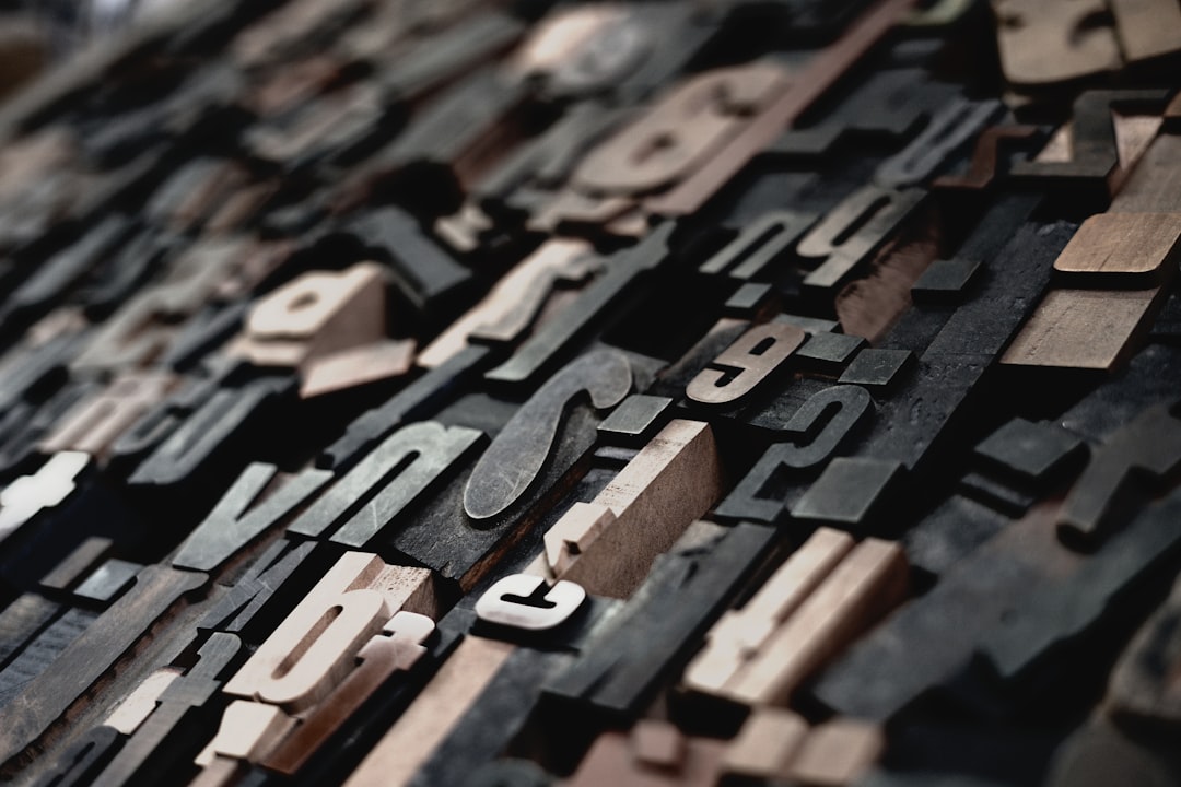
- Strong personality — exaggerated proportions, distinctive quirks, decorative flourishes. The whole point is to be noticed.
This is the opposite of a text face, which is engineered to be sturdy, even, and invisible across thousands of words. The two are tuned for completely different jobs, and that difference is the heart of using either one well.
Display vs Text Fonts
The clearest way to understand display fonts is to contrast them directly with text fonts.
| Trait | Display fonts | Text fonts |
|---|---|---|
| Designed for | Large sizes, headlines | Small sizes, long reading |
| Stroke contrast | Often high, dramatic | Moderate, even |
| Personality | Strong, distinctive | Neutral, invisible |
| Spacing | Tight by default | Open, optimized for reading |
| Readability at length | Poor | Excellent |
| Examples | Playfair Display, Abril Fatface | Georgia, Source Serif, Inter |
Some superfamilies provide both: a “Display” cut and a “Text” cut of the same design, tuned for their respective sizes. This is called optical sizing, and it’s the professional answer to the display-versus-text question.
Why Display Fonts Break at Small Sizes
Set a high-contrast display face like Playfair Display or Didot at 12px and watch what happens: the hairline strokes thin out to almost nothing, the delicate serifs blur or vanish, and the tight spacing crowds the letters into an unreadable smear. Detail that’s gorgeous at 80px becomes noise at body size.
This isn’t a flaw, it’s the design working as intended for its size range. The fine features that give a display face its elegance simply have no room to render at small sizes. The lesson: never use a display font for body text, captions, or UI labels. It will look bad and read worse.
What optical sizing does about it
Optical sizing is the practice of adjusting a typeface’s design for the size it’ll be used at. A well-made optical “Text” cut thickens the hairlines, opens the spacing, and tames the contrast so the design survives at small sizes, while the “Display” cut keeps all the drama for large use. High-end families ship separate optical cuts; modern variable fonts can even put optical size on a slider that adjusts automatically.
Categories of Display Fonts
Display is a broad bucket. The main families you’ll encounter:
- High-contrast serifs — Playfair Display, Didot, Bodoni. Elegant, editorial, fashion-friendly.
- Slab serifs — heavy, blocky serifs with strong presence; great for confident, modern headlines.
- Geometric and grotesque sans display cuts — bold, clean, impactful; the staple of poster and brand headlines.
- Script and handwritten — decorative, personal; powerful in small doses, exhausting in large ones.
- Decorative and novelty — themed faces (retro, condensed, stencil). Use with restraint and a clear reason.
How to Use Display Fonts Well
Display fonts reward discipline. The working rules that separate polished work from amateur:
- Use them only at large sizes, headlines, hero text, logos, posters. Never body copy.
- Pair a display face with a neutral text face. The classic structure is one expressive display font for headlines and one quiet workhorse for everything else. Our font pairing guide covers how to choose that combination.
- Limit yourself to one display font per project. Two competing personalities fight; one focused voice wins.
- Tune the spacing. Even display faces often need their tracking tightened or loosened at the specific size you’re using.
- Mind the weight. The heaviest, most expressive weights live in display territory, see font weights explained for how to deploy them.
Common Display Font Mistakes
Most display-font failures come from a handful of repeatable errors. Watch for these and your headlines will instantly look more professional:
- Using a display font for body text. The single most common mistake, and the most damaging. Fine details collapse and reading becomes a chore.
- Stacking two display fonts together. Two strong personalities compete and the design feels chaotic. One expressive face, one neutral face, that’s the formula.
- Leaving default spacing untouched. Display faces almost always need their tracking adjusted at the specific size you’re using; the default rarely fits your layout exactly.
- Setting display type too small. If a “display” font is being used below roughly 24px, it’s probably the wrong tool, either size it up or switch to a text face.
- Chasing novelty over fit. A quirky decorative face is fun, but if its personality doesn’t match the message, it undermines the whole piece. Choose for tone, not just for the thrill of something different.
Real Display Fonts Worth Knowing
A few standouts, with what they’re good for and where to get them:
- Playfair Display (free, Google Fonts) — a high-contrast transitional serif with strong editorial elegance. The default reach for “sophisticated headline.”
- Abril Fatface (free, Google Fonts) — a heavy Didone display serif, dramatic and magazine-like at large sizes.
- Bebas Neue (free, Google Fonts) — a tall, condensed all-caps sans, ubiquitous in posters and bold headlines for good reason.
- Archivo Black (free, Google Fonts) — a sturdy, grotesque-style heavy sans for confident, modern headlines.
- Didot / Bodoni (paid, various foundries) — the classic high-fashion Didones; gorgeous large, unusable small.
Because display faces are all about personality and tone, they’re inseparable from font psychology, the high-contrast serif that reads as luxury, the condensed sans that reads as urgent and bold. Pick the display font that says what your headline means.
Frequently Asked Questions
What are display fonts?
Display fonts are typefaces designed for large sizes, headlines, posters, logos, and titles, rather than long-form reading. They feature strong personality, often high stroke contrast, and tight spacing. Their detailed, expressive forms look striking at large sizes but break down and become unreadable at small body-text sizes.
Can I use a display font for body text?
No. Display fonts are optimized for large sizes; at body-text sizes their fine details blur, hairlines vanish, and tight spacing crowds the letters into an unreadable smear. Always pair a display font for headlines with a separate, neutral text font for body copy and captions.
What’s the difference between display and text fonts?
Display fonts are built for large sizes and impact, with strong personality and high contrast. Text fonts are built for small sizes and sustained reading, with even, neutral, invisible forms. Some superfamilies ship both as separate optical cuts of the same design, tuned for each size range.
Why do display fonts look bad when small?
Display fonts rely on fine details, delicate hairlines, sharp serifs, dramatic contrast, that need room to render. At small sizes those features thin out, blur, or disappear entirely, and the tight default spacing crowds the letters. The drama that works at 80px becomes illegible noise at 12px.
What is optical sizing?
Optical sizing is adjusting a typeface’s design for the size it’s used at. A “Text” optical cut thickens hairlines and opens spacing for small sizes, while a “Display” cut keeps the drama for large use. High-end families ship separate cuts; variable fonts can adjust it automatically.


