Cover Letter Design: Layout and Tips
Strong cover letter design does something most applicants overlook: it makes the page look like an extension of the resume, not a separate afterthought. A matching header, the same typeface, and the same accent signal that you are organized and detail-oriented before a single word is read. This guide covers the layout, margins, fonts, and structure that turn a cover letter into a polished companion document.
The cover letter is part of one coherent application package. Build it to share visual DNA with your resume, and lean on the same discipline laid out in our resume design guide.
Why Cover Letter Design Matters
A cover letter earns its place by adding context a resume cannot: why this company, why now, and the one story that proves you fit. But that argument only lands if the document looks credible. A cover letter set in a mismatched font, with awkward margins and a cramped block of text, undercuts its own message. Design is the frame that makes the writing worth reading.
The goal is a page that feels effortless to scan: a clear header, readable paragraphs with breathing room, and a structure the eye can follow from greeting to sign-off. You are not decorating; you are removing friction.
Cover Letter Page Setup
The mechanics mirror a resume so the two documents read as a set.
- Page size: US Letter (8.5 × 11 in) in North America, A4 elsewhere — match whatever your resume uses.
- Margins: 1 inch on all sides is the standard; 0.75 inch is acceptable if you need a little more room. Keep them equal.
- Length: One page, always. Three to four short paragraphs, roughly 250 to 400 words.
- Spacing: Single or 1.15 line spacing within paragraphs, with a clear blank line between them. Left-align the body; do not justify, which creates uneven rivers of space.
- File format: Export a text-based PDF so the layout holds across devices.
The Header: Match Your Resume
The single highest-impact design move is reusing your resume’s header. Copy the exact name treatment, font, size, and accent color, along with your contact details, so the two documents are visibly siblings. This is the cleanest way to make your application look like a designed system rather than two unrelated files.
Below your header, a traditional letter includes the date and, where you have it, the hiring manager’s name and the company address. If you do not have a named contact, a simple “Dear Hiring Manager” is fine; avoid the dated “To Whom It May Concern.”
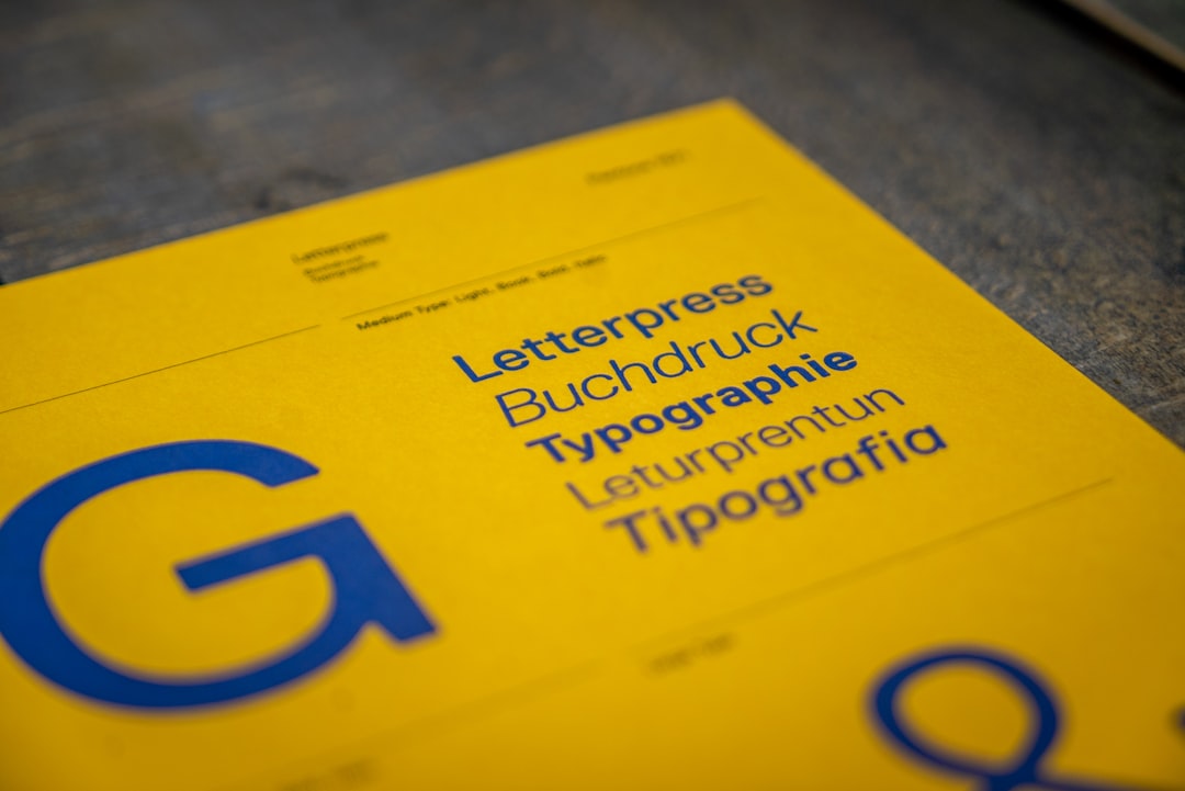
Fonts and Type for Cover Letters
Use the same typeface as your resume. If your resume is set in Calibri, your cover letter is set in Calibri. Consistency is the entire point. The safe, professional set is identical to the resume list, chosen for legibility at small sizes and clean PDF rendering.
| Font | Character | Source |
|---|---|---|
| Calibri | Friendly, modern, highly legible | Bundled with Microsoft Office |
| Helvetica | Neutral and authoritative (Arial as a free stand-in) | System font on macOS |
| Georgia | Warm serif, excellent on screen and in print | System font, widely available |
| Garamond | Classic, elegant, space-efficient serif | Bundled with Office; free cuts exist |
| Inter | Crisp open-source sans for digital-first applications | Free, Google Fonts |
Set the body at 10.5 to 12 points. Avoid Times New Roman as a tired default and never use Comic Sans. If you want to understand how a serif heading and sans body can complement each other, our font pairing guide covers the logic.
Structure and Layout of the Body
Within the page, the writing carries a clear, predictable shape. Design supports that shape with spacing and restraint.
- Opening (1 short paragraph): State the role and a sharp hook — a result, a connection, or genuine enthusiasm grounded in specifics.
- Body (1–2 paragraphs): Prove your fit with concrete evidence tied to the job’s needs. This is where you add the story a resume bullet only hints at.
- Closing (1 short paragraph): Reiterate interest, point to your attached resume, and invite next steps.
- Sign-off: “Sincerely” or “Best regards,” then your name set in the same style as your header.
Keep paragraphs short — three to five lines each — so the page never reads as a wall. White space between paragraphs is what makes a cover letter feel approachable.
Cover Letter Design Tips That Work
- Reuse the resume header verbatim. The fastest way to look intentional and organized.
- One accent color, used once. Echo the resume’s accent in your name or a thin rule under the header — nowhere else.
- Left-align everything. Justified text creates uneven spacing; left alignment is cleaner and more readable.
- Leave generous white space. A short, well-spaced letter is more inviting than a dense full page.
- Address a real person when you can. A named greeting signals research and effort.
- Proofread ruthlessly. A typo in a cover letter is more damaging than in a resume because it sits in full sentences.
Designing the Letter for Different Submission Methods
How your cover letter reaches the reader changes a few design decisions. The same content adapts to three common channels, and getting the format right for each prevents your careful layout from arriving broken.
- Attached PDF: The default and the safest. Your full designed letter — matching header, accent, and typeface — arrives exactly as built. Name the file clearly, such as “FirstName-LastName-Cover-Letter.pdf,” so it is easy to find in a folder of applications.
- Pasted into an application form: Many portals offer only a plain-text box. Here your visual design is stripped away entirely, so lead with the strongest sentence and keep paragraphs short, since formatting will not carry the structure for you. Keep a designed PDF ready in case there is also an upload field.
- Email body: When the letter is the email itself, drop the formal letterhead and date block. Open with a clear subject line naming the role, keep the greeting and three tight paragraphs, and attach your resume as a PDF. Treat the email as the letter rather than duplicating it as an attachment.
Whatever the channel, the writing has to survive without the design, because you can never assume formatting will travel. Design is the bonus that makes a strong letter look polished; it is never a substitute for a strong opening line.
A Quick Pre-Send Checklist
Before any cover letter goes out, run a final pass. These are the errors that slip through most often and the ones a hiring manager notices fastest.
- Does the header match the resume exactly? Same name treatment, font, size, and accent.
- Is the company and role correct? A leftover company name from a previous application is an instant rejection.
- Is it one page with comfortable margins? Roughly 250 to 400 words, never cramped to fit more.
- Is the greeting right? A real name where possible, “Dear Hiring Manager” otherwise.
- Is it a text-based PDF? Selectable text, layout locked, file clearly named.
- Has someone else proofread it? Full sentences make typos far more visible than on a resume.
Common Cover Letter Design Mistakes
- Mismatched fonts. A resume in one typeface and a cover letter in another reads as careless.
- Overcrowding the page. Shrinking margins or font size to add more words defeats the purpose; cut words instead.
- Decorative templates. Borders, watermarks, and clip art distract from the message and look unprofessional.
- Going over one page. Length signals you cannot prioritize; keep it tight.
- Forgetting the file format. Send a PDF, not an editable document that may re-flow.
Keeping the Whole Application Consistent
Your cover letter, resume, and online profiles should feel like one designed identity. Pull the same header and typeface across all of them, and pair the package with a polished, correctly sized LinkedIn banner design so a recruiter who clicks through finds the same visual voice. That consistency is the heart of a deliberate personal branding system.
Frequently Asked Questions
Should my cover letter match my resume design?
Yes, closely. Reuse the same header treatment, typeface, font sizes, and accent color so the two documents read as one designed package. This consistency signals organization and attention to detail before a hiring manager reads a word, and it is the single highest-impact cover letter design decision you can make.
How long should a cover letter be?
One page, roughly 250 to 400 words across three to four short paragraphs. Anything longer signals that you cannot prioritize, and recruiters rarely read past the first page. Keep paragraphs to three to five lines each, with white space between them, so the page stays inviting and easy to scan.
What font should I use for a cover letter?
Use the same font as your resume for consistency. Safe, professional choices include Calibri, Helvetica or Arial, Georgia, Garamond, and Inter, all legible at 10.5 to 12 points. Avoid Times New Roman as a tired default and never use Comic Sans. Limit the whole letter to a single typeface.
Should a cover letter be a PDF or Word document?
Send a text-based PDF unless the job posting explicitly requests a Word file. PDF locks your layout so the header, margins, and spacing look identical on every device, while Word documents can re-flow unpredictably. Confirm the text in your PDF is selectable rather than flattened into an image.


