Photography for Designers: A Complete Guide
Photography for designers is not about becoming a professional shooter. It is about understanding images well enough to choose, art-direct, edit, and place them so they carry a layout instead of decorating it. A designer who can read light, judge composition, and grade color makes faster, sharper calls than one who treats every photo as interchangeable filler.
This guide walks through the whole pipeline: how a camera actually records an image, the composition rules that hold any frame together, where to source pictures legally, how to shoot product and brand imagery without a studio, and how to grade color so a set of photos looks like one coherent system. Treat it as the map; the supporting guides linked throughout go deep on each leg.
Why Designers Need to Understand Photography
Type and layout get most of the attention in design education, but imagery is usually the single largest visual element on a page, a slide, or a hero section. A weak photo undermines strong typography; a strong photo can carry mediocre type. Because images dominate visual weight, every decision you make about them ripples through the rest of the composition.
There are three jobs a designer does with photography, and they require different skills:
- Selecting images, usually from stock or a brand library, which means judging quality, license, and fit fast.
- Directing images, briefing a photographer or shooting yourself, which means knowing what is technically possible and what reads on screen.
- Editing and grading images so a mixed set looks intentional and on-brand.
You rarely need to master all three at expert level, but you need working fluency in each. The rest of this guide builds that fluency.
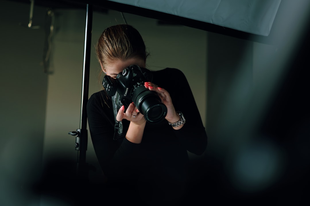
Camera Basics Every Designer Should Know
You do not need to own a camera to understand one, and the vocabulary pays off whether you are briefing a shoot or reading metadata on a stock file. Three controls form the exposure triangle, and together they decide how bright an image is and how it looks.
Aperture (f-stop)
Aperture is the size of the lens opening, written as an f-stop like f/1.8 or f/11. Counterintuitively, a smaller number means a larger opening and more light. Aperture also controls depth of field: a wide aperture (f/1.8) throws the background into soft blur and isolates a subject, while a narrow aperture (f/11) keeps more of the scene sharp. When a product shot has a creamy, defocused backdrop, that is a wide aperture at work.
Shutter speed
Shutter speed is how long the sensor is exposed, from fractions of a second to several seconds. Fast shutter speeds freeze motion; slow ones blur it and require a tripod to avoid camera shake. For most static design work, shutter speed matters less than aperture, but it is the reason a handheld interior shot can come out soft.
ISO
ISO is the sensor’s sensitivity to light. Low ISO (100–200) gives the cleanest image; high ISO (3200 and up) lets you shoot in dim rooms but adds visible noise (grain). When you evaluate a stock image at full size and notice mushy, speckled shadows, that is high-ISO noise, and it will show worse in print than on screen.
White balance
White balance tells the camera what “neutral white” looks like under the current light, correcting the orange cast of tungsten bulbs or the blue cast of shade. Get it wrong and skin tones go sickly. Designers fix white balance constantly in post, which is the first step of any color grading workflow for beginners.
Composition Rules That Make Any Image Stronger
Composition is where designers have a natural edge, because the same principles that govern a page govern a frame. A handful of rules will sharpen your eye immediately, and they apply equally to choosing stock and to cropping in layout.
- Rule of thirds: place key elements along lines that divide the frame into thirds, not dead center. This is the most reliable quick win.
- Leading lines: roads, fences, shadows, and edges that guide the eye toward the subject.
- Negative space: deliberate emptiness that gives a subject room to breathe — and conveniently, room for your headline.
- Symmetry and framing: balanced compositions and natural frames (doorways, windows) that focus attention.
- Golden ratio: a slightly more sophisticated cousin of the rule of thirds, useful for refined, classical balance.
The most designer-relevant of these is negative space, because copy has to live somewhere. When you select a hero image, you are really selecting the empty region your text will occupy. Our full breakdown of photo composition rules every designer should know covers how each rule works and when to break it.
Where to Get Images: Stock vs Original
Most design work runs on a mix of stock photography and original (commissioned or in-house) imagery. Each has a place, and choosing wrong wastes either money or credibility.
| Factor | Stock photography | Original / commissioned |
|---|---|---|
| Cost | Free to moderate per image | High upfront (shoot day, talent) |
| Speed | Immediate | Days to weeks |
| Uniqueness | Low — others use the same files | High — fully your own |
| Brand fit | Approximate | Exact |
| Best for | Blogs, decks, fast campaigns | Brand sites, hero shots, products |
Stock is the default for volume work. The skill is sourcing it well: knowing which libraries are genuinely good and which licenses you actually have. Start with our practitioner overview of stock photography for designers, then use the curated list of the best stock photo sites in 2026 when you need a source for a specific job.
Understanding Image Licensing
Licensing is where designers get themselves and their clients into trouble. “Found it on Google” is not a license. The categories you need to recognize:
- Royalty-free (RF): pay once (or use a subscription), then use the image many times within the license terms. Most stock falls here. It does not mean free.
- Rights-managed (RM): licensed for a specific use, region, duration, and medium. More restrictive, often more expensive, sometimes exclusive.
- Editorial-only: usable in news and commentary contexts but not for advertising or promotion, because the people or property shown have not signed releases.
- Free licenses (e.g., Unsplash/Pexels terms): generous, but read them — some restrict reselling the unmodified image or require care with recognizable people.
The two releases that matter for commercial work are the model release (permission to use a recognizable person’s likeness) and the property release (permission for recognizable private property, art, or logos). Editorial-only files generally lack these, which is why you cannot put one in an ad.
Shooting Your Own: Product and Brand Photography
Designers are increasingly asked to shoot, especially product photos for small brands and e-commerce. The good news is that product work is the most learnable photography because the subject does not move and you control the light.
The core setup is simple: a lightbox or a window for soft, diffused light, a clean seamless background, and a steady camera or phone on a tripod. Two reliable angles cover most needs: the 45-degree hero angle that shows form and depth, and the flat-lay (straight down) that suits arrangements and small goods.
Understanding soft vs hard light is the highest-leverage concept here. Soft light (large, diffused source) wraps around a product and minimizes harsh shadows — flattering for most goods. Hard light (small, direct source) creates crisp shadows and drama — good for texture and edge, risky for clean catalog shots. Our step-by-step on product photography basics for brands covers the full lightbox setup, backgrounds, and angles.
Editing and Color Grading for Consistency
Raw images, even good ones, rarely match each other. Color grading is how you make a set look like one family — the difference between an amateur gallery and a brand system. The fundamentals:
- White balance first: neutralize casts before anything else, or every later edit fights the wrong baseline.
- Curves and contrast: set black point and white point, then shape midtones.
- HSL: adjust individual colors’ hue, saturation, and luminance for control.
- LUTs: reusable color “looks” you can apply consistently across a batch.
The dominant tools are Adobe Lightroom (best for batch grading photo libraries), Adobe Photoshop (precise, per-image work), and Capture One (favored for tethered product and studio shoots). Build a preset or LUT once, apply it across a set, and your imagery instantly looks deliberate.
Building a Photography Workflow as a Designer
Pull the pieces into a repeatable process and image work stops being ad hoc:
- Brief: define mood, aspect ratios, and where copy and negative space need to land.
- Source or shoot: choose stock for speed and volume, original for brand-critical hero and product shots.
- Clear the rights: confirm the license covers your use and that releases exist for any people or property.
- Grade: apply a consistent look so the set coheres.
- Place and crop: compose in layout using the rule of thirds and negative space; export at the right resolution for screen or print.
Run this loop a few times and the vocabulary in this guide becomes instinct. From there, the supporting articles let you go as deep as any single project demands.
Frequently Asked Questions
Do designers need to know photography?
Yes, at a working level. Designers select, direct, and edit images constantly, and imagery is usually the largest element in a layout. You do not need to shoot professionally, but understanding light, composition, licensing, and color grading lets you make faster, stronger choices and brief photographers credibly.
What camera settings matter most for design work?
Aperture and white balance matter most. Aperture controls depth of field, which decides whether a background is sharp or softly blurred for subject isolation. White balance controls color accuracy, preventing the orange or blue casts that make skin tones look wrong and undermine an otherwise good image.
Is stock photography good enough for professional design?
Often yes, for blogs, decks, and fast campaigns. Stock falls short for brand-defining hero shots and product imagery, where uniqueness and exact brand fit matter. The trade-off is uniqueness versus speed and cost, so reserve original photography for the images that truly carry your brand.
What is the difference between editing and color grading?
Editing covers all adjustments — exposure, cropping, retouching, cleanup. Color grading specifically shapes the color and tonal mood: white balance, curves, HSL, and LUTs. Designers grade to make a varied set of images share one consistent, on-brand look rather than appearing as unrelated photos.
Which software should a designer learn first for images?
Adobe Lightroom is the most practical starting point because it batch-grades whole libraries quickly and keeps edits non-destructive. Add Photoshop for precise per-image retouching. Capture One is worth learning later if you shoot tethered product or studio work and need finer control.


