Visual Identity Design: A Complete Guide
A visual identity is the full set of design elements that make a brand recognizable on sight: the logo, colors, typography, imagery, layout, and the rules that govern how they work together. It is not one asset but a system. Get the system right and a customer can recognize you from a single Instagram tile, a shipping box, or a half-second glimpse of an ad.
This guide covers every component of a visual identity, how they relate, and the order to build them in. Whether you are designing your first brand or auditing one that has drifted out of sync, treat this as the map of the territory — each section links to a deeper guide on that specific piece.
What Is a Visual Identity?
Your brand identity is the whole impression a company makes — its voice, values, positioning, and design. Visual identity is the seeable part of that: the elements your audience can actually look at. People often use “visual identity,” “brand identity,” and “logo” interchangeably, but they nest inside each other. The logo is one element of the visual identity; the visual identity is one part of the broader brand.
The distinction matters because it changes what you invest in. A logo alone gives you a mark and nothing to surround it with. A complete visual identity gives you a kit you can apply to a website, packaging, a pitch deck, and a social feed without re-inventing the look every time. Consistency is the entire point — the same elements, used the same way, building familiarity through repetition.
The Components of a Visual Identity
A working identity system is built from a predictable set of parts. You do not need all of them on day one, but you should know what each does so nothing important is missing.
- Logo system — not a single logo, but a family: a primary lockup, a secondary or stacked version, a standalone symbol or monogram, and a favicon-scale mark.
- Color palette — a primary brand color, one or two secondaries, and a small set of accents, plus neutrals for text and backgrounds.
- Typography — one to three typefaces with defined roles (display, body text, UI) and a type scale.
- Imagery and photography — a consistent treatment for photos, illustration style, or both.
- Iconography — a coherent icon set that matches the weight and corner style of the rest of the system.
- Layout and grid — spacing, margins, and composition rules that give every page the same rhythm.
- Voice and tone — the verbal counterpart; how the brand sounds in headlines and captions.
The sections below take the visual pieces one at a time. Three foundational decisions — mood, color, and type — usually come first, because almost everything else inherits from them.
Start With a Mood Board
Before you draw anything, you need a direction. A mood board collects references — colors, type, photography, textures, competitor work, things from outside your industry — into one surface so you can see and defend a visual direction before committing to it. It is the cheapest place to course-correct: moving a Pinterest pin costs nothing, redoing a finished logo costs days.
A good mood board is curated, not a dumping ground. Aim for a tight, intentional collection that communicates one clear feeling. For the full process — digital versus physical boards, the tools to use, and how to present one to a client — see our guide on how to make a mood board.
Choosing Brand Colors
Color is the fastest-acting element of an identity — people register it before they read a word. A strong palette is structured, not just “colors we like.” Most brands work from a primary color that carries the identity, one or two secondary colors for support, and an accent reserved for calls to action and highlights, all balanced against neutral grays.
The classic balancing tool is the 60-30-10 rule: roughly 60% of a layout in a dominant color (often a neutral), 30% in a secondary, and 10% in an accent. Color also has to clear accessibility — text must meet contrast ratios against its background so it stays legible. For the full method, including color associations as cultural conventions rather than hard science, read how to choose brand colors.
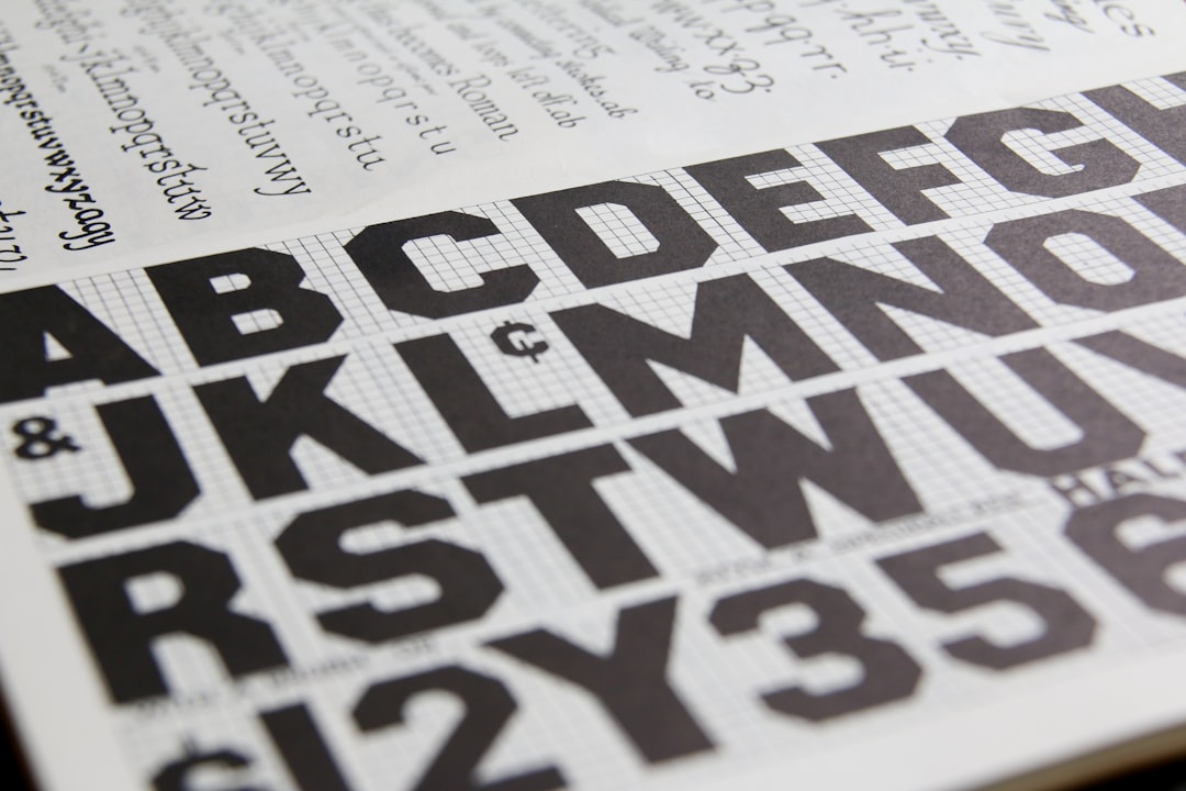
Choosing Brand Fonts
Typography does as much heavy lifting as color, and it is where most DIY identities fall apart. The discipline is restraint: limit yourself to one to three typefaces, give each a clear job, and make sure you are licensed to use them. A common structure is a display face for headlines, a comfortable text face for body copy, and sometimes a dedicated UI face for interfaces.
Licensing trips people up constantly — a desktop license does not automatically cover embedding a webfont on your site, and commercial use often needs its own tier. Our full breakdown of how to pick families, pair them, and stay licensed lives in how to choose brand fonts. If you want to go deeper on pairing specifically, the font pairing guide covers contrast, hierarchy, and combinations that hold up.
Writing a Tagline
Visual identity has a verbal partner. A tagline is the short phrase that sits beside your logo and crystallizes what you stand for — think of how a few words can do the work of a paragraph. The best taglines are short, lead with a benefit or an emotion, and are simple enough to remember after a single exposure.
A tagline is not a slogan you change per campaign; it is a durable line that earns its place next to the mark. For the craft of writing one — the rhythm, the editing, and what separates a line that sticks from one that evaporates — see how to write a memorable tagline.
How the Components Work Together
Individually, these elements are just assets. What turns them into an identity is the relationship between them. The logo’s geometry should echo the typeface’s character. The icon set should share the line weight and corner radius of the logo. Photography should be shot or filtered so it never fights the palette. The grid should give every layout the same breathing room.
This coherence is what people mean when a brand “feels designed.” It rarely happens by accident. The way you enforce it is by deciding the rules once and writing them down — which is the job of brand guidelines.
Documenting It: Brand Guidelines
An identity that lives only in the head of the person who designed it will not survive contact with a second designer, a freelancer, or a printer. Brand guidelines are the document that records every decision: logo usage and clearspace, exact color values in HEX, RGB, CMYK, and Pantone, the type scale, imagery rules, and a clear set of do’s and don’ts.
Guidelines are what keep an identity consistent as more hands touch it. They are also what make handoff possible — a new vendor can produce on-brand work without a single meeting. For exactly what to include and how to structure it, read brand guidelines: what to include.
The Build Order: A Practical Sequence
You can technically design these elements in any order, but there is a sequence that minimizes rework. Each step constrains the next, so decisions made early should be the most foundational.
- Strategy and positioning — who you are, who you serve, and how you differ. Everything visual should express this.
- Mood board — agree on a direction before producing finished assets.
- Color and typography — the two systems most other elements inherit from.
- Logo system — designed to live happily inside the chosen color and type.
- Supporting elements — iconography, imagery treatment, grid, patterns.
- Tagline and voice — the verbal layer that travels with the visuals.
- Brand guidelines — capture every rule so the system can scale.
Common Visual Identity Mistakes
The same problems sink most weak identities. Watching for them is half the battle.
| Mistake | Why it hurts | Fix |
|---|---|---|
| Logo with no system | Breaks at small sizes and on busy backgrounds | Build primary, stacked, and symbol versions |
| Too many fonts | Looks chaotic, weakens recognition | Limit to one to three families with set roles |
| Palette with no hierarchy | Nothing draws the eye; layouts feel flat | Apply the 60-30-10 rule |
| Inconsistent imagery | Feed and site look like different brands | Define a single photo treatment |
| No written guidelines | Drift the moment a second person contributes | Document everything in a brand book |
Frequently Asked Questions
What is the difference between visual identity and brand identity?
Brand identity is the whole impression a company makes, including its voice, values, and positioning. Visual identity is the seeable subset of that — logo, color, type, imagery, and layout. The visual identity expresses the brand identity but does not replace it; both work together.
What are the main components of a visual identity?
The core components are a logo system, a color palette, typography, imagery and photography, iconography, and a layout grid, supported by a defined voice and tone. A complete identity also includes brand guidelines that document how each element is used so the system stays consistent.
Do I need all these elements for a small business?
Not on day one. Start with a logo, a small color palette, and one or two typefaces — that covers most early needs. Add iconography, photography rules, and full guidelines as you grow and more people begin producing materials in your name.
How long does it take to design a visual identity?
A focused identity project typically runs from a couple of weeks to a few months, depending on scope and how many rounds of feedback are involved. The strategy and mood board phases protect the timeline by settling direction before any finished assets are produced.
What software do I need to build a visual identity?
Most professional identities are built in vector software such as Adobe Illustrator or Figma for the logo and layout, with mood boards assembled in Pinterest, Milanote, or Figma. The tool matters less than the process: agree on direction first, then design to it.