App Design: A Complete Guide for 2026
App design is the discipline of shaping how a mobile product looks, feels, and behaves so people can do real things with the fewest taps possible. Good apps are not decorated screens; they are systems of layout, navigation, type, and motion that respect platform conventions and the physical reality of a thumb on glass. This guide walks through the full stack of decisions, from your first wireframe to the icon on the home screen, with concrete iOS and Android specs you can build against.
We will keep the advice opinionated and grounded in Apple’s Human Interface Guidelines and Google’s Material Design, the two reference systems every serious mobile team works from. Where there is a clear best practice, we will name it.
What App Design Actually Covers
People often collapse “app design” into “making it pretty,” but the work spans several connected layers. Treat them as a stack, because a weakness in a lower layer cannot be fixed by polishing an upper one.
- Information architecture — what content and features exist, and how they are grouped.
- Navigation — how people move between those groups (tab bars, stacks, gestures).
- Interaction design — what happens on tap, swipe, and long-press, including states and feedback.
- Visual design — type, color, spacing, iconography, and the overall brand expression.
- Motion — transitions that explain spatial relationships rather than show off.
- Content design — the words on buttons, empty states, and error messages.
Strong app design is the alignment of all six. A beautiful screen with a confusing tab bar still fails.
Start With Platform Conventions, Not a Blank Canvas
The fastest way to build something that feels broken is to ignore the platform. iOS and Android users have years of muscle memory, and fighting it costs you trust on the first launch. Read the two canonical sources early and revisit them often.
| Concern | iOS (Human Interface Guidelines) | Android (Material Design) |
|---|---|---|
| Minimum touch target | 44×44 pt | 48×48 dp |
| Primary navigation | Tab bar (bottom), 3–5 items | Navigation bar / bar, 3–5 destinations |
| Back behavior | Top-left back + edge swipe | System back gesture / button |
| System font | SF Pro | Roboto |
| Spacing unit | 8 pt grid (common) | 8 dp grid |
You do not need to make iOS and Android look identical. You need each to feel native. Shared brand, platform-appropriate mechanics.
Layout and the Grid
Almost every modern mobile UI is built on an 8-point grid: spacing, padding, and component sizes are multiples of 8 (with 4 as a half-step). This keeps rhythm consistent across screens and makes handoff to engineers predictable. Define your margins once — 16 pt/dp side margins are a safe default — and let components breathe inside them.
Respect safe areas. Modern phones have notches, dynamic islands, rounded corners, and home indicators. Keep interactive elements and critical text out of those zones. Both platforms expose safe-area insets; design to them rather than hard-coding positions.
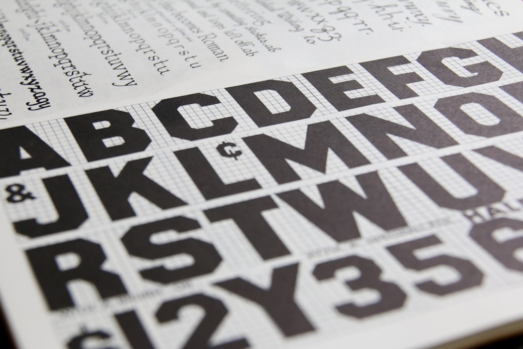
Typography in apps
Body text should rarely drop below 16 pt/dp, and you should support Dynamic Type (iOS) and scalable text (Android) so users who increase their system font size are not punished. For UI work that needs a neutral, highly legible typeface beyond the system fonts, Inter is a strong free choice (from rsms.me / Google Fonts) thanks to its high x-height and broad language coverage. Use a clear type scale — a handful of sizes, not a dozen.
Navigation: Get People Around Without Friction
Navigation is the single most consequential structural choice in app design. For most consumer apps, a bottom tab bar with three to five top-level destinations is the default, because it keeps primary sections one thumb-tap away. Reserve the hamburger menu for secondary or rarely used items — hiding primary navigation behind it measurably reduces discovery and engagement.
Plan for gesture navigation too: edge-swipe back on iOS and the system back gesture on Android are expectations, not extras. We cover the full set of patterns, including when a tab bar beats a drawer, in our dedicated breakdown of mobile navigation design patterns.
First Impressions: Splash and Onboarding
The opening seconds set the tone. A splash screen is a brief brand moment shown while the app initializes — not a place to park a slow load. On Android 12 and later you should adopt the system splash screen API rather than rolling your own, so the transition into the app is consistent and fast. See concrete examples in our guide to splash screen design.
After the splash, onboarding earns or loses the user. The best onboarding is benefit-led, skippable, and uses progressive disclosure — ask for permissions and information only at the moment they make sense, not all at once on screen one. We detail the patterns that convert in our piece on onboarding screen design.
The App Icon
The icon is your app’s face on a crowded home screen, and it follows strict platform rules. For iOS you create a single 1024×1024 px master for the App Store; the system rounds the corners for you, so never pre-round your artwork. Android uses adaptive icons built on a 108×108 dp canvas with a 72 dp safe zone, letting the launcher mask your icon into different shapes. Get the full size matrix and export workflow in our reference on app icon design.
Build Faster With a Design System
Once you have more than a few screens, stop drawing buttons by hand. A UI kit — a library of reusable components, styles, and design tokens — keeps your app consistent and your team fast. In Figma or Sketch, these live as shared component libraries that update everywhere at once. If you are deciding whether to adopt or build one, start with our explainer on UI kits and how to use them.
Design for States, Not Just Screens
Junior designs show the happy path. Production app design accounts for everything that can happen on a real device with a real network.
- Empty states — what a list looks like with zero items, with a clear next action.
- Loading states — skeletons or progress indicators, not frozen screens.
- Error states — plain-language messages and a way to recover.
- Offline — what works without a connection and what is queued.
- Permissions denied — graceful fallbacks when the user says no to camera, location, or notifications.
Accessibility Is Part of the Design
Accessible apps are simply better apps. Hit the basics every time: maintain at least 4.5:1 contrast for body text, never rely on color alone to convey meaning, keep touch targets at 44 pt / 48 dp, label every control for screen readers (VoiceOver and TalkBack), and test with the largest system text size. These are not edge cases; they are how a meaningful share of your users experience the product.
A Workable App Design Process
You do not need a heavyweight process, but you do need a repeatable one.
- Define the jobs users hire your app to do, in plain sentences.
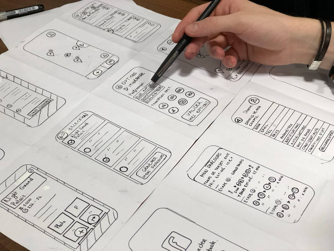
- Sketch flows before screens — map the path through a core task.
- Wireframe in grayscale to settle structure without color bias.
- Apply the system — type, color, components from your UI kit.
- Prototype the key flow in Figma and test it on an actual phone.
- Spec the edges — every state, every platform difference.
- Hand off with tokens and redlines, then design-review the build.
Common App Design Mistakes
- Tiny tap targets crammed together — fingers are not cursors.
- Burying primary navigation in a hamburger menu.
- Pre-rounding iOS icon corners or shipping a single icon size for Android.
- Front-loading onboarding with permission requests before showing value.
- Designing only the happy path and ignoring empty, error, and offline states.
- Inventing custom controls where a native pattern already exists.
Frequently Asked Questions
What is the difference between app design and web design?
App design targets native mobile platforms with their own conventions, gestures, and hardware constraints, while web design works across browsers and screen sizes. Apps rely on platform guidelines like Human Interface Guidelines and Material Design, native navigation patterns, and tighter touch-target rules than most websites require.
Which tool is best for app design?
Figma is the current default for most teams because of real-time collaboration, components, variables for tokens, and strong prototyping. Sketch remains capable on macOS. The tool matters less than maintaining a shared component library so your screens stay consistent as the product grows.
How long does it take to design an app?
A focused MVP with a handful of core flows can take two to six weeks of design work, depending on scope and how much of a design system already exists. Reusing a UI kit, prototyping early, and testing on real devices dramatically shortens the path from idea to a buildable spec.
Do I really need to support both iOS and Android conventions?
If you ship on both platforms, yes. Users expect native back behavior, navigation, and controls. You can share one brand and visual language while adapting mechanics per platform. Forcing one platform’s patterns onto the other is a common reason apps feel awkward and lose trust on first launch.
What should I design first when starting an app?
Start with the core task flow, not individual screens. Map how a user accomplishes the single most important job, wireframe that path in grayscale, then prototype and test it on a phone. Visual polish, icons, and onboarding come after the structure proves it works.