Resort Branding: Luxury and Escape
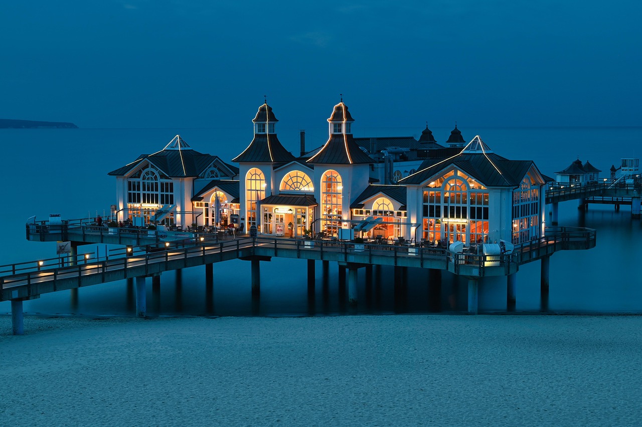
Resort branding sells a feeling that is hard to put into words — escape, indulgence, time slowing down — and then proves it in a thousand small details. Unlike a city hotel, a resort is usually a destination in itself, so the brand has to carry the entire fantasy: the arrival, the grounds, the spa, the restaurants, the quiet of the room. This guide covers the luxury and escapism cues that justify premium rates and earn the kind of loyalty that brings guests back year after year.
Resort branding is the high end of the hospitality identity spectrum. For the strategic foundations — positioning, tier cues, and touchpoint mapping — start with our pillar on hotel branding, then return here for the escapism-specific craft.
What Makes Resort Branding Different
A resort is not a place you pass through; it is a place you surrender to. That changes the branding job in three ways. First, the brand has to sustain a mood across days, not minutes, so consistency and depth matter more than a single strong impression. Second, the property usually is the destination, so the brand competes on experience and atmosphere rather than location convenience. Third, expectations are high — guests are paying a premium specifically for a feeling of escape, and any off-brand or cheap-feeling detail breaks the spell faster than at a budget property.
The Core Cue: Escapism
Escapism is the emotional product a resort sells. Every design decision should answer one question: does this make the guest feel further from ordinary life? That principle pushes resort branding toward calm, space, and sensory richness rather than urgency or efficiency. Where a city hotel might emphasize speed and connectivity, a resort emphasizes slowness, privacy, and immersion. The brand should feel like an exhale.
- Calm over urgency — slow, confident pacing in copy and imagery.
- Space over density — generous whitespace and uncrowded layouts.
- Sensory richness — branding that hints at texture, light, sound, and scent.
- Privacy and exclusivity — a feeling of being somewhere set apart.
Luxury Visual Cues
Luxury in resort branding is communicated mostly through restraint. The visual language signals tier before a guest reads a single word, so the cues have to be right.
| Element | Luxury cue | Avoid |
|---|---|---|
| Palette | Restrained neutrals, one quiet accent | Loud, saturated color |
| Type | Refined serif or elegant sans, generous spacing | Trendy or cramped lettering |
| Layout | Abundant whitespace | Crowded, busy compositions |
| Imagery | Atmospheric, light-led, unhurried | Stocky, over-edited shots |
| Materials | Tactile — foil, emboss, heavy stock | Cheap finishes and flat print |
Restraint is the through-line. Luxury rarely shouts; it trusts the guest to notice quality. A resort brand that tries to signal premium with gold gradients and busy ornament usually achieves the opposite.
Typography for Resorts
Type sets the tone immediately. Many luxury resorts use a refined serif for the name and headlines to read as established and timeless, paired with a clean, well-spaced sans for practical text and wayfinding. Generous letter-spacing in display type reads as calm and confident — a small detail that does a lot of tier signaling. For body and digital interfaces, a highly legible humanist sans such as Inter keeps the booking flow and in-room directory effortless to read. Choose the pairing carefully; our font pairing guide covers how to balance an elegant display face with a dependable workhorse.
Photography and Art Direction
For a resort, photography is the brand. It has to transport the viewer before they ever arrive, so art direction is paramount. Favor atmospheric, light-led imagery — golden hour, soft shadows, a sense of space and quiet — over busy, literal documentation. Show the experience and the feeling: a lone lounger by still water, a table set for two at dusk, light falling across a room. Consistency across the website, social, and print is what makes the fantasy believable. Inconsistent or over-edited photography is the single fastest way to make a luxury resort look ordinary.
The Touchpoint System
Because a resort stay unfolds over days, the brand has to hold across an unusually rich set of touchpoints, and the small ones matter as much as the grand ones. Map them and design each to sustain the escapism.
- Pre-arrival: website, booking, anticipation emails that build the fantasy.
- Arrival: the approach, signage, the welcome ritual — the moment the spell is cast.
- Stay: room, spa, dining, menus, amenities, wayfinding, uniforms — the immersion.
- Details: key cards, robes, toiletries, turndown notes — proof of care.
- Departure and after: a graceful goodbye and a reason to return.
The tactile details — the weight of a key card, the embossed monogram on a robe, the heavy menu stock — are where luxury becomes real. These are the moments guests remember and describe to others. For the underlying identity craft behind these touchpoints, see our broader visual identity design guide.
Voice: Calm and Assured
Resort copy should sound like the experience feels — calm, generous, and quietly confident. Avoid hard-sell urgency and exclamation; let the language slow down. The welcome message, the spa menu, and the in-room directory all do emotional work, so write them with care. A confident brand does not beg for a booking; it describes an experience worth having and trusts the reader to want it.
Connecting the Cluster
Resort branding shares DNA with the rest of travel design. The logo work that anchors the identity is covered in travel logo design, and the consistency-at-scale discipline that keeps a multi-property group coherent is explored in airline branding. Together with the pillar, these guides cover the full arc from the mark to the moment a guest exhales on arrival.
Frequently Asked Questions
What makes resort branding different from hotel branding?
A resort is usually a destination in itself, so the brand must sustain a complete escapist mood across days rather than minutes. It competes on experience and atmosphere rather than location, and expectations are higher because guests pay a premium for a feeling of escape. Depth and consistency matter more than a single strong impression.
How do you signal luxury in resort branding?
Mostly through restraint: a quiet neutral palette, refined and well-spaced typography, abundant whitespace, atmospheric photography, and tactile materials like foil, embossing, and heavy stock. Luxury rarely shouts; it trusts guests to notice quality. Loud color, busy ornament, and cheap finishes undercut the premium feeling rather than reinforce it.
Why is photography so important for resort branding?
For a resort, photography is effectively the brand because it transports the viewer before they arrive. Atmospheric, light-led imagery sells the feeling of escape, while inconsistent or over-edited shots make a luxury property look ordinary. Consistency across the website, social, and print is what makes the fantasy believable enough to book.
What typography suits a luxury resort?
A refined serif for the name and headlines reads as established and timeless, paired with a clean, well-spaced sans for practical text and wayfinding. Generous letter-spacing in display type signals calm confidence. For digital interfaces and body copy, a highly legible humanist sans keeps the booking flow and in-room directory effortless to read.
Which resort touchpoints matter most?
The pre-arrival website and photography drive the booking, and the arrival ritual casts the spell. But the tactile in-stay details — the weight of a key card, an embossed robe monogram, heavy menu stock, a handwritten turndown note — are where luxury becomes real and memorable, so they deserve as much attention as the grand gestures.


