Community Event Flyer Design Guide
A community event flyer has one job: get the right people to show up at the right place and time. That sounds simple, but most flyers fail it, burying the date, shrinking the venue, or looking so generic that nobody stops scrolling. A great community flyer is clear, accessible, and inviting, and it answers every practical question before someone has to ask. This guide walks through exactly how to design one that fills the room.
Flyers are most effective when they reflect a consistent identity. If your event is run by a church, nonprofit, or charity, tie the flyer to your wider brand using our pillar guide to church branding (or our visual identity design guide for the general case), and lean on our flyer design guide for layout fundamentals.
The five things every flyer must answer
Before any aesthetic decisions, a community event flyer has to deliver the essential facts instantly. If a reader cannot find these in three seconds, the design has failed regardless of how nice it looks.
- What: the event name and a one-line description of what it is.
- When: the date, day of week, and start time, large and unmissable.
- Where: the venue name and address, specific enough to navigate to.
- Who it’s for and cost: all ages, free, ticketed, RSVP required.
- Next step: a QR code or short link to register, plus a contact.
Build a clear visual hierarchy
The most common flyer mistake is treating every element as equally important. It is not. A reader’s eye should land on the event name, then the date and time, then the venue, then the call to action, in that order. Make that path obvious with size and weight: the event name largest, the key facts next, supporting details smallest. White space is your friend here. A flyer crammed edge to edge reads as chaotic and gets ignored, while generous spacing makes the important information pop.
Accessibility: large type and high contrast
Community events are for everyone, so the flyer has to be readable by everyone, including older attendees and people with low vision. Accessibility is not a constraint on good design, it is good design.
- Use large, legible type, especially for the date, time, and venue.
- Keep strong contrast between text and background, and never lay small text over a busy photo.
- Choose clear fonts over decorative ones for the essential details.
- If the flyer is digital, include real alt text describing the event and its key facts.
For choosing fonts that stay legible at a glance, our font pairing guide helps you pick a strong display-and-body combination.
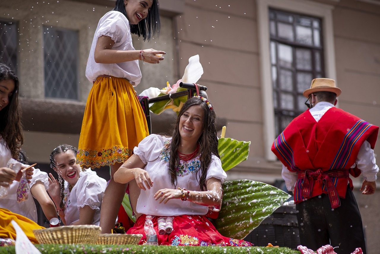
Inclusive, authentic imagery
Imagery sets the tone before anyone reads a word. For a community event, use inclusive images that reflect the actual people you hope to welcome, in age, background, and ability. Real photos of past events almost always outperform generic stock photos of strangers, which read as impersonal and can quietly signal that the event is not really for the people looking at it. If you must use stock, choose images that feel candid and representative rather than staged and polished.
The QR code: make the next step effortless
A flyer should never be a dead end. The point is to convert interest into attendance, and a QR code is the fastest bridge from a printed flyer to a registration page, map, or calendar add. A few rules keep it working:
- Make the QR code large enough to scan easily, with a clear label like “Scan to register.”
- Keep quiet space around it and avoid placing it over a busy background.
- Always pair it with a short human-readable link for people who will not scan.
- Test it with a phone before printing, every time.
Print and digital versions
The same event usually needs both a printed flyer and digital versions for social and email, and they are not identical files. Plan for both from the start.
| Aspect | Print flyer | Digital / social |
|---|---|---|
| Resolution | High-resolution for crisp printing | Optimized for fast loading on screens |
| Format | Standard paper sizes with print margins | Square and vertical sizes for feeds and stories |
| Call to action | QR code plus a short link | Tappable link in bio, caption, or button |
| Text amount | Can hold a little more detail | Trim to the essentials for small screens |
Tools to design it
You can produce a polished community flyer without professional software. Canva is the most accessible option, with flexible templates and easy resizing for print and social, making it ideal for volunteers and small teams. Adobe InDesign is the professional choice for print-perfect layouts, and Adobe Illustrator works well for more graphic, illustration-led flyers. Whatever you use, build from your brand colors and fonts so the flyer looks like it belongs to your organization, not like a one-off.
A quick pre-print checklist
- Can you read the date, time, and venue from across a room?
- Is the QR code tested and paired with a short link?
- Does the imagery reflect the community you want to attract?
- Is there a contact for questions?
- Does it match your brand so people recognize who is hosting?
From single flyer to full campaign
A flyer rarely works alone. The biggest results come from pairing it with social posts, email, and a clear giving or sign-up path, all carrying the same look. If your event is part of a larger giving push, our fundraising campaign design guide shows how to coordinate the flyer with a multi-channel campaign, and for the identity behind it all, see our pillar on nonprofit branding.
Frequently Asked Questions
What information must a community event flyer include?
Every flyer needs five things: what the event is, when it happens (date, day, and time), where it is held (venue and address), who it is for and any cost, and a clear next step such as a QR code or short link to register. If a reader cannot find these in three seconds, the flyer needs revision.
How big should the text on a flyer be?
Make the event name the largest element, followed by the date, time, and venue, all large enough to read from across a room. Prioritize legibility over decoration for these essentials, keep strong contrast against the background, and avoid placing small text over busy photos. Large type also makes the flyer accessible to older attendees.
Should I put a QR code on a community flyer?
Yes. A QR code is the fastest bridge from a printed flyer to a registration page, map, or calendar entry. Make it large with a clear label like “Scan to register,” keep quiet space around it, always pair it with a short readable link, and test it on a phone before printing.
What is the best tool to design a community event flyer?
Canva is the most accessible option for volunteers and small teams, with flexible templates and easy resizing for print and social. Adobe InDesign is best for print-perfect layouts, and Illustrator suits graphic, illustration-led designs. Whichever you choose, build from your brand colors and fonts so the flyer looks consistent.
How do I make a flyer feel inclusive?
Use authentic imagery that reflects the people you hope to welcome across age, background, and ability, favoring real photos of past events over generic stock. Pair that with accessible large type, strong contrast, and plain language. Inclusive design signals that the event genuinely belongs to the whole community.


