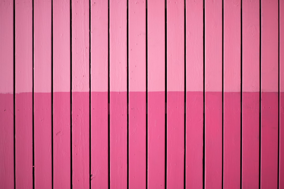
Shades of Pink: Names and Hex Codes
There are dozens of recognized shades of pink, from pale blush tints to electric hot pinks and warm coral-pinks. Below is a practitioner reference: each shade with its name, hex code, RGB value, and a note on where it works best. Use it as a swatch library when building a palette, and pair it with our guide to what the color pink means when you need the symbolism behind the swatch.
A quick note on terminology, because it clarifies what pink actually is. Pink is not a spectral color of its own — it is fundamentally a tint of red, meaning red mixed with white. From there, a cooler pink leans toward blue and magenta, while a warmer pink leans toward orange, giving you corals and salmons. Throughout this guide, “shades of pink” is used loosely to cover the whole family: soft blush tints, vivid hot-pink saturations, and muted dusty-rose tones alike. Pink has shed much of its one-note “sweet and girly” reputation in recent years, with muted blush and rose tones now central to gender-neutral, premium, and editorial design. The hex codes below are established web, X11, and common values you can copy straight into your tools.
Each entry below gives three values so you can use it anywhere: the hex code (for CSS, HTML, and most design tools), the RGB triplet (for screen-based tools that ask for red, green, and blue channels separately), and a short note on the mood and best use of that shade. If you need a print match, convert from the hex value to CMYK or Pantone in your design software, and check a physical proof — soft blush tones in particular can drift toward gray or peach on press depending on the paper stock.
Light shades of pink
Light pinks feel soft, romantic, and delicate — ideal for beauty, weddings, and gentle pastel branding.
| Shade name | Hex | RGB | Notes / use |
|---|---|---|---|
| Pink (Web) | #FFC0CB | 255, 192, 203 | CSS named pink; soft, classic. |
| Light Pink | #FFB6C1 | 255, 182, 193 | Pale tint; gentle backgrounds. |
| Pale Pink | #FADADD | 250, 218, 221 | Near-white pink; airy, soft. |
| Baby Pink | #F4C2C2 | 244, 194, 194 | Soft warm pink; tender, sweet. |
| Misty Rose | #FFE4E1 | 255, 228, 225 | Pale blush tint; page backgrounds. |
| Pink Lace | #FFDDF4 | 255, 221, 244 | Light cool pink; delicate accents. |
Bright and hot pinks
Bright pinks are bold, fun, and youthful — the go-to for beauty, fashion, and high-energy branding.
| Shade name | Hex | RGB | Notes / use |
|---|---|---|---|
| Hot Pink | #FF69B4 | 255, 105, 180 | Vivid playful pink; bold, fun. |
| Deep Pink | #FF1493 | 255, 20, 147 | Saturated bright pink; energetic. |
| Fuchsia / Magenta | #FF00FF | 255, 0, 255 | Pure pink-purple; electric, bold. |
| Rose | #FF007F | 255, 0, 127 | Vivid red-pink; striking, modern. |
| Shocking Pink | #FC0FC0 | 252, 15, 192 | Neon pink; loud, attention-grabbing. |
| Barbie Pink | #E0218A | 224, 33, 138 | Iconic bright pink; playful, bold. |
Warm, coral, and salmon pinks
Warm pinks lean toward orange and peach — fresh, inviting, and flattering for lifestyle and food brands.
| Shade name | Hex | RGB | Notes / use |
|---|---|---|---|
| Coral | #FF7F50 | 255, 127, 80 | Warm pink-orange; lively, fresh. |
| Salmon | #FA8072 | 250, 128, 114 | Soft pink-orange; warm, inviting. |
| Light Salmon | #FFA07A | 255, 160, 122 | Peachy pink; gentle, warm. |
| Peach Pink | #FFDAB9 | 255, 218, 185 | Soft peach tint; warm backgrounds. |
| Coral Pink | #F88379 | 248, 131, 121 | Muted coral; flattering, trendy. |
| Rose Pink | #FF66CC | 255, 102, 204 | Bright cool pink; cheerful, modern. |
Muted, dusty, and deep pinks
Desaturated and deep pinks feel grown-up and sophisticated — the backbone of modern, elegant palettes.
| Shade name | Hex | RGB | Notes / use |
|---|---|---|---|
| Blush | #DE5D83 | 222, 93, 131 | Muted rosy pink; soft, refined. |
| Old Rose | #C08081 | 192, 128, 129 | Dusty muted pink; vintage, calm. |
| Dark Pink | #E75480 | 231, 84, 128 | Deep rosy pink; bold yet warm. |
| Rose Gold | #B76E79 | 183, 110, 121 | Muted metallic pink; luxe, trendy. |
| Mountbatten Pink | #997A8D | 153, 122, 141 | Grayish mauve-pink; understated. |
| Medium Violet Red | #C71585 | 199, 21, 133 | Deep magenta-pink; rich, vivid. |
What are the most popular shades of pink?
The most-used named pinks in design are blush, hot pink, rose, coral, and fuchsia. Blush and pale pink dominate beauty, wedding, and wellness branding for their soft elegance; hot pink and fuchsia bring bold, youthful energy to fashion and entertainment; coral and salmon offer warm, flattering versatility; rose gold has become a signature luxe metallic. The deeper psychology is covered in our color psychology guide.
The pink that dominates a given era says a lot about design trends. “Millennial pink” — a muted, slightly beige blush close to #F4C2C2 — became a defining neutral for direct-to-consumer brands precisely because it felt soft without being saccharine. More recently, saturated hot pinks and fuchsias surged back through fashion and entertainment, proving the same hue can read as either understated or loud depending entirely on saturation. For designers, that range is the value: pink is one of the few colors that can anchor both a minimalist luxury palette and a maximalist, playful one.
How to use shades of pink in design
Pink ranges from playful to refined depending on saturation, so choose intentionally. Pair soft blush with charcoal and cream for an elegant editorial look, or let hot pink lead a bold, energetic palette balanced by white space. Pink’s warm tones pair beautifully with sage green, navy, and gold. For warmer coral-pinks, lean into peach and terracotta.
Practical guidance: to avoid the “bubblegum” cliché, mute your pink toward dusty rose or old rose and pair it with a sophisticated neutral like charcoal or warm gray. Pale pinks fail contrast checks as text, so keep them for backgrounds and reserve deeper pinks like medium violet red (#C71585) for type. Hot pink and fuchsia are superb accent colors but tiring at scale, so deploy them on small surfaces, buttons, and highlights. Watch undertone: a cool fuchsia and a warm coral clash in the same palette, so commit to one temperature unless the contrast is intentional. Explore neighboring families in our reference on shades of red and shades of purple.
Frequently Asked Questions
How many shades of pink are there?
There is no fixed number — screens can render millions of pink gradations. In practical design terms, around 30 to 40 named shades of pink are widely recognized, from pale blush and baby pink through hot pink, fuchsia, coral, salmon, and rose gold.
What is the hex code for blush pink?
A widely used hex code for blush is #DE5D83, a muted rosy pink (RGB 222, 93, 131). In lighter “blush” palettes the value is often softer, around #FFB6C1 or #FADADD, so confirm whether you need the deeper named blush or a pale blush tint.
What is the difference between pink and rose?
Pink (#FFC0CB) is a soft, light tint of red. Rose (#FF007F) is a more saturated red-pink that sits between pink and red on the wheel. Pink reads as gentle and sweet; rose reads as vivid and romantic.
Which shade of pink is best for a logo?
For beauty and wellness, soft blush (#DE5D83) or light pink (#FFB6C1) feel premium and calming. For bold fashion or entertainment, hot pink (#FF69B4) and fuchsia (#FF00FF) command attention. Coral works well for fresh, friendly lifestyle brands. Match saturation to the energy you want.
What colors go well with pink?
Pink pairs beautifully with navy, charcoal, and white for a crisp, modern look, and with gold or cream for elegance. Sage green and teal complement it as fresh contrasts, while burgundy and deep red create a rich tonal palette with deeper pinks.