What Font Does Rolex Use? The Rolex Font Explained
Wondering what the Rolex font really is? The famous wordmark — the word “ROLEX” beneath the crown — is custom lettering built on an old-style serif foundation that owes its proportions to Garamond-family typefaces. It is bespoke and trademarked, so there is no official “Rolex font” file to install. This guide explains the logotype, the brand’s wider serif language, and the free fonts that get you closest.
Rolex is a textbook case of heritage typography doing quiet, expensive work. To see how other heavyweight names approach this, start with our roundup of fonts used by famous brands.
What font is the Rolex logo?
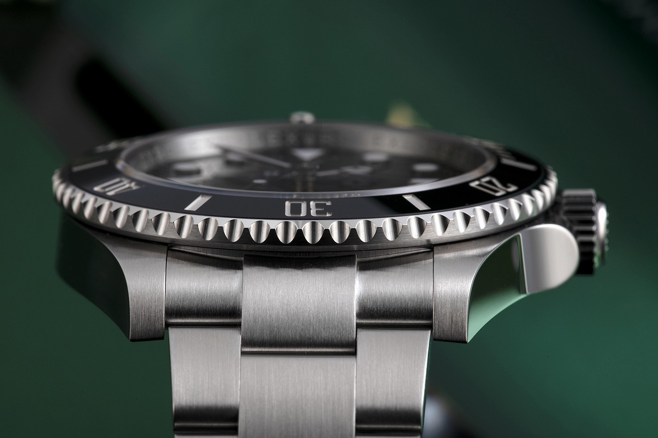
The Rolex logo uses a custom serif wordmark drawn in an old-style (Garalde) idiom. Old-style serifs — the lineage that includes Garamond — are defined by moderate stroke contrast, bracketed serifs, and an angled stress, giving them a warm, classical, trustworthy character. Rolex’s letters are spaced wide and set in clean capitals, paired with the instantly recognisable crown above. Like most luxury marks, it has been refined over decades into a precise, proprietary asset rather than a typed line of an off-the-shelf font.
Because it is bespoke and trademarked, you cannot legally reproduce the Rolex wordmark. The practical move is to reach for a high-quality Garamond or similar old-style serif to echo the same dignified tone.
What typeface does Rolex use in its branding?
Beyond the logo, Rolex’s communications lean on refined serifs for headlines and a restrained, legible supporting type for body copy and technical detail. The brand’s typographic register is consistently classical: serifs that feel established and understated rather than fashionable. As with most luxury houses, exact cuts vary across campaigns and aren’t publicly documented, so it’s most accurate to describe the family — a classic old-style serif — rather than name one fixed retail font.
Why does Rolex use a classic serif?
Serifs signal heritage, and heritage is Rolex’s entire pitch. An old-style serif carries centuries of association with books, institutions, and permanence — exactly what a watchmaker selling multi-generational ownership wants to evoke. The wide letterspacing adds formality and breathing room, making the mark feel calm and assured. This is the same instinct that drives other luxury brands toward bespoke type; compare how the fashion world handles it in our guide to the Vogue font.
Free and paid alternatives to the Rolex font
You cannot license the Rolex wordmark, but you can capture its old-style serif spirit with widely available fonts. EB Garamond (free, Google Fonts) is the standout substitute — a faithful Garamond revival with the warmth and proportion the Rolex mark draws on. For a sharper, more contemporary serif, free options like Cormorant Garamond work well too.
| Use case | Font | Free alternative |
|---|---|---|
| Rolex-style wordmark / headline | Garamond (paid, e.g. Adobe Garamond) | EB Garamond (free) |
| Elegant display serif | Sabon (paid) | Cormorant Garamond (free) |
| Luxury body serif | Minion Pro (paid) | Source Serif 4 (free) |
| Clean supporting sans | Avenir (paid) | Inter (free) |
If you license a paid Garamond, make sure your license covers the right contexts — desktop, web, app, or logo use. Our font licensing guide explains each tier so you stay compliant.
How do I get the Rolex look in my own design?
Set your mark in clean capitals using EB Garamond or a licensed Garamond, add generous, even letterspacing, and keep the weight modest — old-style serifs lose their grace when forced too bold. Favour symmetry, plenty of white space, and a single accent colour. Restraint is the point: the whole effect reads as confidence rather than noise. For another bespoke-serif case study, see our look at the Ferrari font.
What makes the Rolex wordmark feel so timeless?
Three things do most of the work. First, the old-style serif foundation: bracketed serifs and gentle stroke contrast read as warm and established rather than trendy, so the mark never looks tied to a particular decade. Second, the wide, even letterspacing, which slows the eye down and lends the word a deliberate, ceremonial pace — the typographic equivalent of an unhurried gesture. Third, the restraint. There is no italic, no novelty, no heavy weight shouting for attention; the confidence is in the calm. A wordmark like this is designed to look identical on a 1950s advertisement and a 2026 boutique window, and that refusal to chase fashion is precisely what signals permanence to a buyer thinking in generations rather than seasons.
How does Rolex’s type compare to other luxury brands?
Luxury splits roughly into two typographic camps. Fashion houses and magazines tend toward high-contrast Didone serifs — sharp, glamorous, a little cold — as you can see in our breakdown of the Vogue masthead above. Heritage makers like Rolex sit in the other camp: old-style serifs that prioritise warmth, trust, and continuity over drama. Neither is “better”; they signal different things. Didone says modern glamour and editorial authority. Garamond-style old-style serifs say lineage, craft, and quiet wealth. Knowing which message you want is the first decision in any luxury identity, and it usually settles your typeface family before you have looked at a single specific font.
Frequently Asked Questions
What font does the Rolex logo use?
The Rolex logo uses a custom serif wordmark derived from the old-style, Garamond-influenced serif tradition, paired with the five-point crown. It is bespoke, trademarked lettering rather than a downloadable retail font, so the official mark cannot be legally reproduced.
Is the Rolex font free?
No. The Rolex wordmark is proprietary custom lettering. For a free, legal alternative that captures its classic old-style serif character, use EB Garamond from Google Fonts, or license a premium Garamond for a closer match.
Is the Rolex font Garamond?
Not exactly. The Rolex wordmark is custom lettering, but its proportions and old-style serif character draw on the Garamond tradition. That is why a Garamond revival like EB Garamond is the most convincing free substitute for the look.
What is the closest free alternative to the Rolex font?
EB Garamond is the closest free alternative. It is a faithful Garamond revival with the warm, classical proportions the Rolex mark is built on. Cormorant Garamond is a strong free option if you want a slightly higher-contrast, more refined feel.
Can I use the Rolex font for commercial work?
You cannot use the actual Rolex wordmark commercially, as it is a registered trademark. You can use Garamond-style serifs such as a licensed Garamond or free EB Garamond in your own projects, as long as you hold the correct license for your use case.